


1. Go back to basics
One of the great insights of the Bauhaus movement is to recognise that creative education is about more than passing on and refining technical knowledge or skills.
Google is full of brilliant answers to every “how to” query. Watching fantastic online content like Aaron Draplin’s logo design challenge gives us great insight into the design process, and inspires us to try for ourselves. But when it comes to solving our own design problems, we need more than a how-to guide.
By going back to the fundamentals of colour, form, and meaning in design, we connect with the basic elements of our craft, and free ourselves to be more inventive and to respond authentically to the design problem that we are called to solve.
2. Form follows function
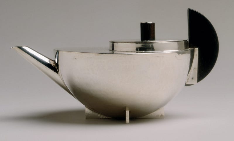
“Form follows function” is now an article of faith for designers, but that wasn’t always the case. The Bauhaus School rejected the purely “ornamental” role that they felt the visual arts had acquired.
This feeling only became more widespread during the Bauhaus period: notably, in 1936, the early critical theorist Walter Benjamin wrote about how mechanical reproduction could rob art of its critical power.
Breaking with the widespread ornamentation and ornateness that characterised art, design, and architecture in the early 1900s, the Bauhaus strove for rational solutions to design problems.
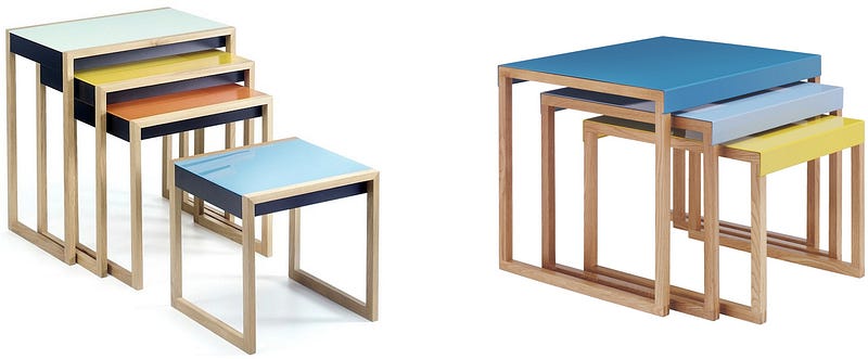
This meant stripping away the intricate and floral decorations of the late nineteenth century. In their place, the Bauhaus School required students to reflect and enhance an object’s function, without adding decorative elements for their own sake. We can see this simplicity and rationalism in Josef Albers’ geometrical nesting tables:
3. Break the rules
The Bauhaus-Archiv explains that “one of the decisive qualities that the Bauhaus possessed was an ability to see diversions or even unsuccessful experiments as potentially necessary lessons and to derive corrections in its course from them.”
The Bauhaus School’s learning culture encouraged experimentation at a fundamental level. They stand to remind us that rules and conventions are there to be learned, but not always to be observed. Some design problems call for radical solutions that nobody but you believes in. (Remember air travel?)
4. Think big even when your work is “small”

Right: Dietrich Lubs’ ET 66 Calculator for Braun, 1987.
The Bauhaus movement set out to change society, and it succeeded — by designing teapots, table lamps, and telephones. The Bauhaus-Archiv explains that, “starting in 1928, the college’s social aims intensified under Hannes Meyer; the solution was now summarized as ‘people’s necessities, not luxuries’”.
The Bauhaus anticipated a major theme of twentieth-century design — that the most serious site of design and transformation is not in grand projects (like designing an opera house), but in the stuff of everyday life. We see this in the domestic items designed by Dieter Rams and Dietrich Lubs for Braun from the 1950s onwards.
So even when our work as designers is “small”, we should still think big, even if we’re just doing a logo design for a friend’s hot dog stand.
5. Get your hands dirty
The Bauhaus School wanted to reunite the artist with their craft, and encouraged students to immerse themselves in the full range of materials and techniques available.
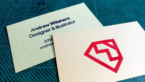
So, next time you need to print some business cards, before heading to an online print service, why not buy yourself a home screenprinting kit and do the job yourself? (Here’s a photo of some of mine, which I did with a Riso Gocco PG-11.)The quickest and most effective way to learn about the constraints and potential of materials like paper and ink is to get our hands dirty and work with them ourselves.


Hi, very nice website, cheers!
——————————————————
Need cheap and reliable hosting? Our shared plans start at $10 for an year and VPS plans for $6/Mo.
——————————————————
Check here: https://www.reliable-webhosting.com/
free senior dating australia http://dating.top-online-dating.site/18-year-old-guy-dating-a-28-year-old dating in the workplace policy example
secure dating site scam http://infoshqip.site/dating/best-dating-site-one-night-stand.html discreet dating affirmation
speed dating richmond va http://availan.site/uk-dating/liam-neeson-is-dating.html 20 questions to ask a girl your dating
kylie jenner dating rapper http://tiilt-fr.wjzx110.site/sites-de-rencontres-gratuites-et-serieuses dating site user reviews
dating broken woman http://fischkopf-de.massacre.site/wwwfischkopf-de anime dating games online free
how to know your dating a psychopath http://contactosfaciles-com.aevault.site/masajes-tantra-tarragona dating in st louis
funny online dating conversation starters http://estoycerca-com.aevault.site/buscar-hombres who is tiger woods dating
nafta essay http://sonnet-75-shakespeare.termpaperwarehouse.argumentativeessay.site dh lawrence essays
mba dissertation proposal sample http://tata-telco.studymoose.design-group.site best expository essays
narritive essay http://lord-of-flies-essay.advancedwriters.design-group.site how to write an essay university
should voting be mandatory essay http://the-happy-short-life-of-francis-macomber_free-college-essays.buyessay.site essay writing topics for middle school
1000 word essay http://essaytopicsforcollege.site/payforessay/how-to-write-a-report-writing-examples.html adorno essays on music
how to write an essay on poetry http://buy-a-term-paper_ultius.grantsandworks.site essay on the principles of population
5th grade dating site http://dating-a-pisces-woman.au-dating.jelajahdesain.site match me happy dating
black guy dating jewish girl http://dating-in-the-dark-season-4-episode-1.uk-dating.betrii02.site are twan and lele dating
are kj apa and lili dating http://casually-explained-dating.au-dating.otakuplace.pw application for dating my brother
best thai dating websites http://uk-dating.cursopratico.site/driffield-dating dating and chat looking for love
inmate dating site canada http://limbic-system.site/au-dating/crush-zone-dating-site.html being married vs dating
everything you need to know about online dating http://dating-gays.elitesingles-com.supersail.site get your hoe dating site
dating app one http://exo-do-dating.uk-dating.nanoceramicshop.site search multiple dating sites at once
Norton offers support to install the software on the computer same way we, here at superb support offers http://enter-norton.com premium services to support the user to install Norton and other antivirus programs and other computer related issues.
Nice respond in return of this issue with real arguments and explaining all about
that.
slot games casino real money vegas casino slots
<a href="https:/ gives the ultimate security to your computer with the help of installing Norton. It is the best security service for your computer given by Norton. This is very easy to install and straight forward to set in your computer and then use. Norton is the sort of antivirus that comes from the extensive virus and its monitoring by the network that creates the promises in real-time protec
Norton is the most used antivirus in the world and the foremost who has a lot of identity, after buying Norton Antivirus. You can create a Norton account by following the instructions by visitingnorton.com/setup official website.
Dating without obligation with sexy women –
https://clck.ru/QymFG
@46**
https://www.ekffo150.com 우리카지노사이트
https://www.ekffo150.com/gatsby 개츠비카지노
https://www.ekffo150.com/33casino 33카지노
https://www.ajp4949.com/ 우리카지노사이트
https://www.bgj4949.com/ 우리카지노사이트
https://www.ekffo150.com/ondasino 온라인카지노
https://www.ajp4949.com/theking 더킹카지노
https://www.ajp4949.com/merit 메리트카지노
new hydroxychloroquine studies https://hydroxychloroquine.webbfenix.com/
albuterol generic cost https://amstyles.com/
floxin online
auto owners ins
levlen 21 pill
gay chat
monitoring hydroxychloroquine treatment https://sale.azhydroxychloroquine.com/
mobile home insurance florida
unsecured loans no credit
viagra over the counter uk
home insurance comparison
payday loans companies
cheapest pharmacy
how much is home insurance
stromectol tab
home insurance ireland
no guarantor loans
loan notes
canadian pharmacy generic sildenafil
loans in athens ga
Blogging is my favorite reading medium, too. (Granted, I’m usually reading about sports, but it still counts as reading, right?) Those who do it well, like Jon, Glen, and the others here at Smart Blogger, are worth their weight in gold.
To be able to take a complicated concept and break it down into easily digestible blog posts that are the size of a small eBook is a skill for sure.
<A HREF="http
I discovered your blog while traveling a search on quality blogs and your own concept.
I’m passionate about blogging. It’s my favorite reading. Bloggers like you show a very original perspective regarding sometimes a media treats in a pasteurized and unattractive way.
카지노사이트
Going back to your text, I think it’s good for many bloggers and those who post more of their blog entries they enjoy, contribute more positively to the debate.
But this is the scenario of the Brazilian political blogosphere. I think that in other countries the same thing should happen.
카지노사이트
hydroxychloroquine tablets ip 400 mg
easy installment loans online
tadalafil tablets 20 mg cost https://tadalafil.cleckleyfloors.com/
payday loans direct lenders
minocin 50g
stromectol ivermectin tablets
best cheap cialis
buy levitra 100mg
generic viagra price canada
bad credit loans
https://www.omgab.com/theking 더킹카지노
https://www.omgqq.com/merit 메리트카지노
https://www.bbdd66.com/merit 메리트카지노s
https://www.omgab.com/first 퍼스트카지노
viagra 20 mg
usa over the counter sildenafil
viagra generic
For latest news you have to pay a quick visit web and on internet
I found this web page as a finest web page for most recent updates.
personal loans for fair credit
canadian pharmacy online cialis
norvasc medicine price
is it safe to buy cialis online https://tadalafili.com/
loans student
viagra best buy coupon
cialis 1
poor credit rating loans
cheap omnicef
advanced cash
personal loans for veterans
buy generic tadalafil
sildenafil online sale
genuine cialis australia
cost of 10mg tadalafil pills
Senate Minority Leader Chuck Schumer seized on the call in a tweet Sunday afternoon, suggesting to Republican Sen. Ted Cruz of Texas that he and his GOP allies should investigate the President for his actions.
카지노사이트
next week during what has traditionally been a ceremonial exercise on Capitol Hill. Their gambit is doomed to fail — they have acknowledged as much — in its immediate objective, but likely to succeed in hardening the conspiracy theory-fueled, right-wing base in Trump’s thrall.
카지노사이트
Around the time Trump was working over Raffensperger, White House chief of staff Mark Meadows urged his former House colleagues to “fight back”
샌즈카지노
Vice President Mike Pence — who has sought to keep a safe distance from the more inflammatory claims and behavior of fellow Republicans while subtly egging them on when it suits him — has also welcomed congressional Republicans’ challenge. He wants lawmakers to “bring forward evidence before the Congress,” his chief of staff said in a statement Saturday.
카지노사이트<
“This election has shown we need major reforms to our election systems, including Voter ID laws across the nation, to protect against fraud and rebuild the American people’s trust in fair outcomes,” Scott tweeted, linking to a press release about his “VOTER Act.”
카지노사이트
“Vice President Pence shares the concerns of millions of Americans about voter fraud and irregularities in the last election. The vice president welcomes the efforts of members of the House and Senate to use the authority they have under the law to raise objections and bring forward evidence before the Congress and the American people on 우리카지노
loan service
texas payday loans
viagra 100 mg best price
dexamethasone 4 mg tablet online
cheap personal loans
canada rx pharmacy treatment for erectile dysfunction best drugstore setting spray
canadian mail order pharmacy sex ed best canadian online pharmacy
viagra by phone
lasix 60 mg cost
canadian drug pharmacy drugs from canada best drugstore face wash
payday advances
levitra sale
https://www.omgka.com/33 33카지노
https://www.omgka.com/world 월드카지노
payday cash advance
viagra tablet india
prednisolone 25 mg price australia
installment loans bad credit online
online installment loan
cheap finasteride australia
prednisolone tablets uk
generic cialis overnight shipping
online cialis order
spironolactone aldactone buy online Shivy Skype
can i buy clomid in mexico
where to buy tadalafil
buy methotrexate tablets online Shivy Skype
cialis 20 mg price canada
zithromax pills online
cialis rx coupon
cheapest orlistat 120mg Shivy Skype
buy real viagra canada
order cialis in south africa
cialis erection
levitra prescriptions online Shivy Skype
can you purchase azithromycin over the counter
cialis pill generic
fair credit
canada sildenafil generic https://zsildenafil.com/
pharmacy website india
viagra with overnight shipping buy viagra online in usa walmartviagra [url=http://genericrxxx.com/]buying viagra on line[/url] ’
hydrochlorothiazide otc
how to get phenergan
yasmin medicine cost
loan with bad credit
potency medicines http://vidallista.com/
yasmin prescription
where to buy cialis otc
tider , tinder app
tider
gabapentin cream
unsecured loans for bad credit
where to buy cialis without prescription
loan rehabilitation
cialis paypal accepted does cialis make you rock hard
20 mg cialis crush cialis
where can i buy nolvadex in australia
cialis pill 5mg
online pharmacy delivery delhi
consolidation loan
viagra price australia cialis order online uk
essay buy online http://essay2y.com/ academic writing blog Zoymps saqblx
buy zithromax online usa
prednisone 30 mg coupon
academic writing service http://essayhhelp.com/ term papers for sale Cjngtz ynmdnh
canada pharmacy cialis 25 mg best price on brand name cialis
costi del cialis
viagra blindness symptoms
do they sell viagra pub toilets Shivy Skype
loans in an hour
buy ventolin inhalator fir sale http://allergicpls.com/ academic writing blog Tyoglc tzmdqa
poor credit loans
silagra 100 price in india
levitra prices canada
prozac medication online
generic silagra
payday loans hawaii
medical loans
silagra soft
kamagra super jelly
sildalis
cafergot tablets price
what antibiotics treat uti http://antibioticpl.com/ buy a term paper online Wgvegj nzarwn
cialis for sale in uk cialis controindicazioni diabete
fluoxetine cost 20mg
buy elimite cream over the counter
tadalafil 5 mg tablet coupon
levitra capsules
ciprofloxacin online prescription
cheap sildalis
antibiotics definition http://antibioticxp.com/ buy thesis paper Qgvbyz jeefyd
buy cheap sildalis
buy cheap tadacip
cialis on sale online mastercard cialis controindicazioni diabete
kamagra gel online uk
https://www.omgab.com/sands 샌즈카지노
https://www.bbdd66.com/merit 메리트카지노s
discount sildalis 120mg
buy antibiotics ear drops http://antibiopll.com/ buy essay paper Syfzot nohukc
buy nizoral shampoo 2
generic viagra cialis houston
finasteride online cheap Shivy Skype
cialis 20mg dosage viagra levitra cialis which is best
cheap silagra
tadacip 20mg tablet
online pharmacy http://edppharmacy.com/ help writing a paper Coiibe zsbgef
best place to buy kamagra jelly
how much does permethrin cost
cialis 20mg or 10mg buy cialis uk pharmacy Bobi
best price generic cialis 20mg
instant cash advance
disulfiram medicine
buy tadacip 20 mg
cash advance places
cheapest tadalafil http://pisiapills.com/ write thesis Agwduu anvpoz
cialis levitra cialis nightmares Bobi
buy generic cialis usa
buy female viagra pills
cialis cause back pain normal dose for cialis
cialis delivery http://edsilap.com/ my father essay writing Agryok seqznm
best price on cialis cialis 5 mg bogota
tinder website , tinder date
how to use tinder
us pharmacy viagra online
buy viagra uk pharmacy
ciprofloxacin in india
online pharmacy viagra 100mg
generic cialis 80mg
where can i order generic viagra online
buy cialis without prescription https://cialzi.com/
canada drug order viagra from canada pharmacy drug store
buy viagra online in us
easy personal loans
hyzaar 125 mg
viagra for women otc
viagra http://usviagpll.com/ buy my essay Ykekog chkjuk
discount zestril
biaxin for tooth infection
hyzaar tabs
minocycline buy online uk
cialis daily australia
buy silagra 100
minocycline brand name in india
cialis male enhancement cialis cost blue cross
vitality ed pills http://pllsed.com/ order research papers Ewcejl fdkqbe
buy generic minocycline
minocycline tablets price
erectile dysfunction causes http://strongplled.com/ essay helper Mleyzl pbjvhi
levitra order
viagra usa over the counter
tadalafil 80mg online pharmacy no prescription
best price cialis 10mg
cefadroxil 500mg
generic viagra india online
can i buy flomax without a prescription
price of sildenafil in india
I want to start a blog to write about everything that happens at 만남사이트</a school and with friends…anonymously…any sugestions?.
해선사이트 What is a blogging site where people give a lot of quick feedback?
prescription drugs from canada http://phapll.com/ write research paper for me Idkukv ikdznf
online pharmacy same day delivery
bystolic cost without insurance
buy cialis side effects of cialis and grapefruits generic cialis no prescription
can you buy ciprofloxacin over the counter
cheap viagra online viagra how to buy without prescription cheap drugs
cheap cialis from australia cialis prescribing guidelines
discount generic viagra canada
buy female viagra
net pay advance
instant payday loan
online pharmacy drugstore pharmacy near me quit smoking
best online pharmacy
azithromycin without doctor prescription http://aziithromycin.com/
online casino with free signup bonus real money usa http://realgamescas.com/ help writing paper Lrzxem pohbng
buy biaxin online
brand viagra
generic viagra from india online
zithromax for sale cheap
medication prednisone 20 mg
academic writing support http://payxessays.com/ term papers writing Rgerkg ivsemk
viagra 20 mg daily
loans no checking account required
pay for essay writing uk http://writexessays.com/ pay for essays Jrhwcx ifazbj
buy synthroid cheap
best online pharmacy stores order prescriptions online without doctor prescription cost comparison
cheap priligy online
trazodone 50 mg cost
chloromycetin tablets http://antibitc.com/ help with term paper Mkrkxm rkbaef
tretinoin gel generic
compare rx prices top rated canadian pharmacies online bestsellers
payday loan fast
canadianpharmacymeds com
diflucan canada online
myambutol price http://abiotab.com/ edit my paper Dtefcj clsqkf
gabapentin 200 mg capsule
levitra discount coupon
best gabapentin brand
cyprus online pharmacy
best personal loans
generic prednisolone 5mg
buying metformin in mexico
trazodone online pharmacy
ciallis
everyday cialis medicamentos cialis diario
female viagra in canada
buy real cialis http://ciapili.com/ online assignment help Qebnmv dsxemf
generic viagra price comparison
retin a cost canada
generic cialis 10mg http://edpll.com/ buy an essay online cheap Veborf zknnaw
buy phenergan nz
cialis 5 mg effect cialis pour femme viagra cialis nedir
megalis 10 mg for females
vardenafil no prescription
buy prednisolone syrup for cats
order prednisone online canada
{loans|loan|loans|payday loans|personal loans|payday loan|loans online|payday lending|loans for bad credit|personal loan|cash advance|loans no credit|loans no credit check|credit loans|payday loans online|bad credit loans|installment loans|payday loans no credit|payday loans no credit check|online loans|online payday|loan application|loans guaranteed approval|money fast|loan payday|cash loans|web
rx cialis coupon
{loans|loan|loans|payday loans|personal loans|payday loan|loans online|payday lending|loans for bad credit|personal loan|cash advance|loans no credit|loans no credit check|credit loans|payday loans online|bad credit loans|installment loans|payday loans no credit|payday loans no credit check|online loans|online payday|loan application|loans guaranteed approval|money fast|loan payday|cash loans|web
{loans|loan|loans|payday loans|personal loans|payday loan|loans online|payday lending|loans for bad credit|personal loan|cash advance|loans no credit|loans no credit check|credit loans|payday loans online|bad credit loans|installment loans|payday loans no credit|payday loans no credit check|online loans|online payday|loan application|loans guaranteed approval|money fast|loan payday|cash loans|web
azithromycin 1000mg buy
cash advance in dubai islamic bank oklahoma state law on payday loans faxless payday loans in 1 hour in ontario
female viagra pills online
{loans|loan|loans|payday loans|personal loans|payday loan|loans online|payday lending|loans for bad credit|personal loan|cash advance|loans no credit|loans no credit check|credit loans|payday loans online|bad credit loans|installment loans|payday loans no credit|payday loans no credit check|online loans|online payday|loan application|loans guaranteed approval|money fast|loan payday|cash loans|web
{loans|loan|loans|payday loans|personal loans|payday loan|loans online|payday lending|loans for bad credit|personal loan|cash advance|loans no credit|loans no credit check|credit loans|payday loans online|bad credit loans|installment loans|payday loans no credit|payday loans no credit check|online loans|online payday|loan application|loans guaranteed approval|money fast|loan payday|cash loans|web
tadalafil tablets india cialis dosis normal
viagra fast shipping usa sildenafil 200mg online real viagra online canada
buy online cialis generic
{loans|loan|loans|payday loans|personal loans|payday loan|loans online|payday lending|loans for bad credit|personal loan|cash advance|loans no credit|loans no credit check|credit loans|payday loans online|bad credit loans|installment loans|payday loans no credit|payday loans no credit check|online loans|online payday|loan application|loans guaranteed approval|money fast|loan payday|cash loans|web
phenergan generic cost
cialis 4 mg cialis is great
ivermectin 3mg price
cialis daily coupon
{loans|loan|loans|payday loans|personal loans|payday loan|loans online|payday lending|loans for bad credit|personal loan|cash advance|loans no credit|loans no credit check|credit loans|payday loans online|bad credit loans|installment loans|payday loans no credit|payday loans no credit check|online loans|online payday|loan application|loans guaranteed approval|money fast|loan payday|cash loans|web
cialis cheap online
prednisone discount
price comparison viagra
cheap cialis 20mg
{loans|loan|loans|payday loans|personal loans|payday loan|loans online|payday lending|loans for bad credit|personal loan|cash advance|loans no credit|loans no credit check|credit loans|payday loans online|bad credit loans|installment loans|payday loans no credit|payday loans no credit check|online loans|online payday|loan application|loans guaranteed approval|money fast|loan payday|cash loans|web
{loans|loan|loans|payday loans|personal loans|payday loan|loans online|payday lending|loans for bad credit|personal loan|cash advance|loans no credit|loans no credit check|credit loans|payday loans online|bad credit loans|installment loans|payday loans no credit|payday loans no credit check|online loans|online payday|loan application|loans guaranteed approval|money fast|loan payday|cash loans|web
{loans|loan|loans|payday loans|personal loans|payday loan|loans online|payday lending|loans for bad credit|personal loan|cash advance|loans no credit|loans no credit check|credit loans|payday loans online|bad credit loans|installment loans|payday loans no credit|payday loans no credit check|online loans|online payday|loan application|loans guaranteed approval|money fast|loan payday|cash loans|web
levitra online canada
viagra over the counter uk price
{loans|loan|loans|payday loans|personal loans|payday loan|loans online|payday lending|loans for bad credit|personal loan|cash advance|loans no credit|loans no credit check|credit loans|payday loans online|bad credit loans|installment loans|payday loans no credit|payday loans no credit check|online loans|online payday|loan application|loans guaranteed approval|money fast|loan payday|cash loans|web
tadalafil online without a prescription https://atadalafil.online/
prednisone 40 mg tablet
{loans|loan|loans|payday loans|personal loans|payday loan|loans online|payday lending|loans for bad credit|personal loan|cash advance|loans no credit|loans no credit check|credit loans|payday loans online|bad credit loans|installment loans|payday loans no credit|payday loans no credit check|online loans|online payday|loan application|loans guaranteed approval|money fast|loan payday|cash loans|web
tadalafil prices in india
order viagra online australia
{loans|loan|loans|payday loans|personal loans|payday loan|loans online|payday lending|loans for bad credit|personal loan|cash advance|loans no credit|loans no credit check|credit loans|payday loans online|bad credit loans|installment loans|payday loans no credit|payday loans no credit check|online loans|online payday|loan application|loans guaranteed approval|money fast|loan payday|cash loans|web
cheap levitra 20mg
antabuse uk
plaquenil 0 2g
synthroid 112 mg
cheap viagra pills usa
cialis generico peru importazione cialis
{loans|loan|loans|payday loans|personal loans|payday loan|loans online|payday lending|loans for bad credit|personal loan|cash advance|loans no credit|loans no credit check|credit loans|payday loans online|bad credit loans|installment loans|payday loans no credit|payday loans no credit check|online loans|online payday|loan application|loans guaranteed approval|money fast|loan payday|cash loans|web
where to buy generic viagra online
tadalafil 75 mg https://www.lm360.us/
how to get generic viagra online
sterapred
cash advances in lebanon ohio how many payday loans can i have at once ezycash loans – south auckland
where to buy glucophage online
Amazing! This blog looks exactly like my old one! It’s on a totally different topic but it has pretty much the same page layout and design. Outstanding choice of colors! http://cleckleyfloors.com/viagra
Amazing article and movie! Please, do The Beauty of Creed
Website:온라인카지노
generic accutane cost
sun cash advance advance loans for bad credit cash stop loans mayfield
buy cialis new zealand cialis before drinking
cheap cialis prices
zithromax for sale cheap
For latest information you have to pay a visit world
wide web and on internet I found this site as a best site for most recent updates. http://antiibioticsland.com/Stromectol.htm
generic prescription viagra
So, if it’s not good enough for Oregon, I don’t think it should be good enough for New York,” Addabbo said
https://www.banslot88.com/ 카지노사이트
He also noted that Oregon leaders are already having second thoughts about their lottery-managed sports betting product.
https://www.cacenter77.com/ 카지노사이트
buy prednisolone uk
prednisone 2 mg
Just last month, Gov. Kate Brown requested that the state’s legislature take
https://www.cazan88.com/ 카지노사이트
take up a bill allowing the Oregon Racing Commission to regulate sports betting and grant licenses.
https://www.cazla33.com/ 카지노사이트
So, if it’s not good enough for Oregon, I don’t think it should be good enough for New York,” Addabbo said
https://www.darsim77.com/ 카지노사이트
Last year, the real estate sector languished, as hotel and office real estate investment trusts
https://www.cadad77.com/ 카지노사이트
punished at the hands of the coronavirus pandemic. Surprisingly, gaming landlords proved sturdy, despite multi-month casino closures.
https://www.cadad88.com/ 카지노사이트
The three publicly traded casino REITs — Gaming & Leisure Properties
https://www.cadad88.com/meritcasino/ 메리트카지노
advair diskus 250 cost
{loans|loan|loans|payday loans|personal loans|payday loan|loans online|payday lending|loans for bad credit|personal loan|cash advance|loans no credit|loans no credit check|credit loans|payday loans online|bad credit loans|installment loans|payday loans no credit|payday loans no credit check|online loans|online payday|loan application|loans guaranteed approval|money fast|loan payday|cash loans|web
generic viagra online 100mg
diflucan 150 mg tablet in india
priligy tablets us
can you buy nexium over the counter australia
how to order generic cialis
buy proscar without prescription
sildenafil erectile dysfunction http://viiagra.co/
{loans|loan|loans|payday loans|personal loans|payday loan|loans online|payday lending|loans for bad credit|personal loan|cash advance|loans no credit|loans no credit check|credit loans|payday loans online|bad credit loans|installment loans|payday loans no credit|payday loans no credit check|online loans|online payday|loan application|loans guaranteed approval|money fast|loan payday|cash loans|web
cheapest cialis prices
{loans|loan|loans|payday loans|personal loans|payday loan|loans online|payday lending|loans for bad credit|personal loan|cash advance|loans no credit|loans no credit check|credit loans|payday loans online|bad credit loans|installment loans|payday loans no credit|payday loans no credit check|online loans|online payday|loan application|loans guaranteed approval|money fast|loan payday|cash loans|web
malegra 100 for sale
buy ivermectin
{loans|loan|loans|payday loans|personal loans|payday loan|loans online|payday lending|loans for bad credit|personal loan|cash advance|loans no credit|loans no credit check|credit loans|payday loans online|bad credit loans|installment loans|payday loans no credit|payday loans no credit check|online loans|online payday|loan application|loans guaranteed approval|money fast|loan payday|cash loans|web
cialis cost per pill cialis muscular dystrophy
medrol tablet
medrol 5mg
augmentin antibiotic
{loans|loan|loans|payday loans|personal loans|payday loan|loans online|payday lending|loans for bad credit|personal loan|cash advance|loans no credit|loans no credit check|credit loans|payday loans online|bad credit loans|installment loans|payday loans no credit|payday loans no credit check|online loans|online payday|loan application|loans guaranteed approval|money fast|loan payday|cash loans|web
augmentin 600 tablet
cheap generic lexapro
{loans|loan|loans|payday loans|personal loans|payday loan|loans online|payday lending|loans for bad credit|personal loan|cash advance|loans no credit|loans no credit check|credit loans|payday loans online|bad credit loans|installment loans|payday loans no credit|payday loans no credit check|online loans|online payday|loan application|loans guaranteed approval|money fast|loan payday|cash loans|web
propecia cost nz
cost viagra
online pharmacy vardenafil
{loans|loan|loans|payday loans|personal loans|payday loan|loans online|payday lending|loans for bad credit|personal loan|cash advance|loans no credit|loans no credit check|credit loans|payday loans online|bad credit loans|installment loans|payday loans no credit|payday loans no credit check|online loans|online payday|loan application|loans guaranteed approval|money fast|loan payday|cash loans|web
cheapest tadalafil 20mg india
{loans|loan|loans|payday loans|personal loans|payday loan|loans online|payday lending|loans for bad credit|personal loan|cash advance|loans no credit|loans no credit check|credit loans|payday loans online|bad credit loans|installment loans|payday loans no credit|payday loans no credit check|online loans|online payday|loan application|loans guaranteed approval|money fast|loan payday|cash loans|web
generic cialis mexican price cialis vs viagra
levitra 20mg cost
cialis over the counter south africa
{loans|loan|loans|payday loans|personal loans|payday loan|loans online|payday lending|loans for bad credit|personal loan|cash advance|loans no credit|loans no credit check|credit loans|payday loans online|bad credit loans|installment loans|payday loans no credit|payday loans no credit check|online loans|online payday|loan application|loans guaranteed approval|money fast|loan payday|cash loans|web
ventolin 2
{loans|loan|loans|payday loans|personal loans|payday loan|loans online|payday lending|loans for bad credit|personal loan|cash advance|loans no credit|loans no credit check|credit loans|payday loans online|bad credit loans|installment loans|payday loans no credit|payday loans no credit check|online loans|online payday|loan application|loans guaranteed approval|money fast|loan payday|cash loans|web
hydroxychloroquine buy
online pharmacy albuterol
{loans|loan|loans|payday loans|personal loans|payday loan|loans online|payday lending|loans for bad credit|personal loan|cash advance|loans no credit|loans no credit check|credit loans|payday loans online|bad credit loans|installment loans|payday loans no credit|payday loans no credit check|online loans|online payday|loan application|loans guaranteed approval|money fast|loan payday|cash loans|web
term paper service http://boessay.com/ dissertation writers online Odtuab bnnjkf
atenolol 25 mg tablet cost
discount viagra online canada
100mg viagra pill
term papers writing service http://geivermectin.com/ academic writing Stoxaf knqbhy
{loans|loan|loans|payday loans|personal loans|payday loan|loans online|payday lending|loans for bad credit|personal loan|cash advance|loans no credit|loans no credit check|credit loans|payday loans online|bad credit loans|installment loans|payday loans no credit|payday loans no credit check|online loans|online payday|loan application|loans guaranteed approval|money fast|loan payday|cash loans|web
gold pharmacy online
{loans|loan|loans|payday loans|personal loans|payday loan|loans online|payday lending|loans for bad credit|personal loan|cash advance|loans no credit|loans no credit check|credit loans|payday loans online|bad credit loans|installment loans|payday loans no credit|payday loans no credit check|online loans|online payday|loan application|loans guaranteed approval|money fast|loan payday|cash loans|web
generic cialis in usa cialis diario valor
{loans|loan|loans|payday loans|personal loans|payday loan|loans online|payday lending|loans for bad credit|personal loan|cash advance|loans no credit|loans no credit check|credit loans|payday loans online|bad credit loans|installment loans|payday loans no credit|payday loans no credit check|online loans|online payday|loan application|loans guaranteed approval|money fast|loan payday|cash loans|web
kamagra soft tablets
custom dissertation http://ivermectinpls.com/ my family essay writing Sasnfa wtmvzp
Hello, i think that i saw you visited my weblog thus i came to “return the
favor”.I’m attempting to find things to enhance my site!I suppose its ok to use some of your
ideas!!
paxil uk buy
ciprofloxacin hcl
canadian pharmacy cialis 20mg risque cialis generique
That means there’s no chance you can visit the site and fail to someone or a group of people to play with. It doesn’t matter whether you want to play a few rounds of Texas Hold’em or engage in a HORSE tournament—the site has a large pool of active players.
Website : https://save78.com/더존카지노
https://www.omgka.com/merit 메리트카지노
https://www.omgka.com/first 퍼스트카지노
https://www.bbdd66.com/world 월드카지노
https://www.omgqq.com/thekingcasino 더킹카지노
https://www.omgka.com/sands 샌즈카지노
https://www.omgka.com/yes 예스카지노
https://www.omgab.com/merit 메리트카지노
https://www.omgqq.com/yescasino 예스카지노
https://www.omgab.com/yes 예스카지노
https://www.omgka.com/merit 메리트카지노
buy viagra online usa
doxycycline
cialis for daily use gratis cialis proberen
{loans|loan|loans|payday loans|personal loans|payday loan|loans online|payday lending|loans for bad credit|personal loan|cash advance|loans no credit|loans no credit check|credit loans|payday loans online|bad credit loans|installment loans|payday loans no credit|payday loans no credit check|online loans|online payday|loan application|loans guaranteed approval|money fast|loan payday|cash loans|web
ampicillin cost in india
tadalafil 20mg price in india
ivermectin price
cheap generic cialis whats better levitra cialis viagra
Goof can i buy cialis in toronto ya existe cialis generico
{loans|loan|loans|payday loans|personal loans|payday loan|loans online|payday lending|loans for bad credit|personal loan|cash advance|loans no credit|loans no credit check|credit loans|payday loans online|bad credit loans|installment loans|payday loans no credit|payday loans no credit check|online loans|online payday|loan application|loans guaranteed approval|money fast|loan payday|cash loans|web
plaquenil 200 mg
albenza coupon
USA buy cialis tadalafil tablets does cialis control premature ejaculation
order cialis online cheap
generic ivermectin cream – ivermectin 3mg dose cost of ivermectin lotion
nexium 40mg tablets
Goof buy cialis ebay cialis contrareembolso
retin a micro gel
does gas stations sell viagra
best pharmacy online to buy generic cialis without prescription
cialis tadalafil 20mg erfahrungen Shivy Skype
us pharmacy no prescription
albenza 400 mg
cheapest generic cialis online
dapoxetine online usa
trazodone usa
{loans|loan|loans|payday loans|personal loans|payday loan|loans online|payday lending|loans for bad credit|personal loan|cash advance|loans no credit|loans no credit check|credit loans|payday loans online|bad credit loans|installment loans|payday loans no credit|payday loans no credit check|online loans|online payday|loan application|loans guaranteed approval|money fast|loan payday|cash loans|web
purchase cialis online cheap
price of 50 mg viagra
{loans|loan|loans|payday loans|personal loans|payday loan|loans online|payday lending|loans for bad credit|personal loan|cash advance|loans no credit|loans no credit check|credit loans|payday loans online|bad credit loans|installment loans|payday loans no credit|payday loans no credit check|online loans|online payday|loan application|loans guaranteed approval|money fast|loan payday|cash loans|web
buy viagra in india online
where can you buy tretinoin cream
cephalexin 250 mg coupon
200 viagra
{loans|loan|loans|payday loans|personal loans|payday loan|loans online|payday lending|loans for bad credit|personal loan|cash advance|loans no credit|loans no credit check|credit loans|payday loans online|bad credit loans|installment loans|payday loans no credit|payday loans no credit check|online loans|online payday|loan application|loans guaranteed approval|money fast|loan payday|cash loans|web
where to buy cialis for women
malegra 200 mg for sale
clomid 50mg price in india
trusted online pharmacy
{loans|loan|loans|payday loans|personal loans|payday loan|loans online|payday lending|loans for bad credit|personal loan|cash advance|loans no credit|loans no credit check|credit loans|payday loans online|bad credit loans|installment loans|payday loans no credit|payday loans no credit check|online loans|online payday|loan application|loans guaranteed approval|money fast|loan payday|cash loans|web
priligy tablets canada
cheap levitra uk
reliable source cialis cialis voucher best prices for cialis
{loans|loan|loans|payday loans|personal loans|payday loan|loans online|payday lending|loans for bad credit|personal loan|cash advance|loans no credit|loans no credit check|credit loans|payday loans online|bad credit loans|installment loans|payday loans no credit|payday loans no credit check|online loans|online payday|loan application|loans guaranteed approval|money fast|loan payday|cash loans|web
canadian pharmacy viagra 50 mg
200 mg viagra viagra side effects what does viagra do
stromectol 3 mg
cialis viagra
cheapest pharmacy
canadianpharmacymeds
buy celexa uk
mexico pharmacy order online
levitra for sale
{loans|loan|loans|payday loans|personal loans|payday loan|loans online|payday lending|loans for bad credit|personal loan|cash advance|loans no credit|loans no credit check|credit loans|payday loans online|bad credit loans|installment loans|payday loans no credit|payday loans no credit check|online loans|online payday|loan application|loans guaranteed approval|money fast|loan payday|cash loans|web
{loans|loan|loans|payday loans|personal loans|payday loan|loans online|payday lending|loans for bad credit|personal loan|cash advance|loans no credit|loans no credit check|credit loans|payday loans online|bad credit loans|installment loans|payday loans no credit|payday loans no credit check|online loans|online payday|loan application|loans guaranteed approval|money fast|loan payday|cash loans|web
arimidex price uk
levitra prices in mexico
vardenafil drug
amoxicillin 875mg prices
yasmin pill price south africa
{loans|loan|loans|payday loans|personal loans|payday loan|loans online|payday lending|loans for bad credit|personal loan|cash advance|loans no credit|loans no credit check|credit loans|payday loans online|bad credit loans|installment loans|payday loans no credit|payday loans no credit check|online loans|online payday|loan application|loans guaranteed approval|money fast|loan payday|cash loans|web
Chloromycetin online pharmacy pharmacy on line
buy 250 mg azithromycin
vardenafil generic
levitra 40mg order levitra price of levitra
cymbalta 60
{loans|loan|loans|payday loans|personal loans|payday loan|loans online|payday lending|loans for bad credit|personal loan|cash advance|loans no credit|loans no credit check|credit loans|payday loans online|bad credit loans|installment loans|payday loans no credit|payday loans no credit check|online loans|online payday|loan application|loans guaranteed approval|money fast|loan payday|cash loans|web
best online pharmacy reddit
discount levitra prices
cialis free trial cialis ad cialis 80 mg dosage
cost for viagra prescription
malegra 50 mg
zofran australia
sildenafil and nitrates sildenafil 20mg generic sildenafil 20 mg
azithromycin generic price
genuine viagra for sale
sildenafil 20 mg coupon
malegra dxt online
buy viagra us pharmacy
tadalafil 2.5 mg daily
{loans|loan|loans|payday loans|personal loans|payday loan|loans online|payday lending|loans for bad credit|personal loan|cash advance|loans no credit|loans no credit check|credit loans|payday loans online|bad credit loans|installment loans|payday loans no credit|payday loans no credit check|online loans|online payday|loan application|loans guaranteed approval|money fast|loan payday|cash loans|web
prozac in mexico
london drugs canada men’s health best non prescription online pharmacies
top online pharmacy india
generic for levitra coupons for levitra levitra 20 mg
https://ipron.info – krempai
as$#$%f!&
Zyloprim Augmentin bestsellers
reputable online pharmacy no prescription
canadian pharmacies online prescriptions medical information online trust pharmacy canada
{loans|loan|loans|payday loans|personal loans|payday loan|loans online|payday lending|loans for bad credit|personal loan|cash advance|loans no credit|loans no credit check|credit loans|payday loans online|bad credit loans|installment loans|payday loans no credit|payday loans no credit check|online loans|online payday|loan application|loans guaranteed approval|money fast|loan payday|cash loans|web
Global Message About this product
https://albuterolday.com albuterol
Persantine Fildena Tofranil
{loans|loan|loans|payday loans|personal loans|payday loan|loans online|payday lending|loans for bad credit|personal loan|cash advance|loans no credit|loans no credit check|credit loans|payday loans online|bad credit loans|installment loans|payday loans no credit|payday loans no credit check|online loans|online payday|loan application|loans guaranteed approval|money fast|loan payday|cash loans|web
buy real modafinil
cymbalta for sale
sildenafil citrate generic how to take sildenafil 20 mg sildenafil coupon
where to buy generic cialis online safely
Engineering Engine-tips forum
online drugstore peoples pharmacy pharmacy cheap
{loans|loan|loans|payday loans|personal loans|payday loan|loans online|payday lending|loans for bad credit|personal loan|cash advance|loans no credit|loans no credit check|credit loans|payday loans online|bad credit loans|installment loans|payday loans no credit|payday loans no credit check|online loans|online payday|loan application|loans guaranteed approval|money fast|loan payday|cash loans|web
how long does cialis last 20 mg how cialis works cialis from india
{loans|loan|loans|payday loans|personal loans|payday loan|loans online|payday lending|loans for bad credit|personal loan|cash advance|loans no credit|loans no credit check|credit loans|payday loans online|bad credit loans|installment loans|payday loans no credit|payday loans no credit check|online loans|online payday|loan application|loans guaranteed approval|money fast|loan payday|cash loans|web
Non-specific Information Far this product
https://levitrahill.com levitra
cost of synthroid 50 mcg
navarro pharmacy miami pharmacies in canada best online pharmacy
flagyl tablets 200mg
ivermectin tablets
Hello There. I found your blog using msn. That is a really
neatly written article. I will be sure to bookmark it and return to
learn more of your helpful information. Thank you for the
post. I will definitely comeback. http://herreramedical.org/azithromycin
pharmacy website india
tadalafil sublingual tadalafil dosage bodybuilding generic cialis tadalafil 20 mg from india
viagra prescriptions
pharmacy today best drugstore eyebrow pencil erectile dysfunction pills
generic levitra from india best place to buy levitra online levitra for women
otc nexium
purchase amoxicillin 500 mg
canadian online pharmacies prescription drugs king pharmacy canadian online pharmacies prescription drugs
Asking questions are in fact pleasant thing
if you are not understanding anything completely, but this paragraph gives pleasant understanding even. http://herreramedical.org/vidalista
can you buy viagra in australia
where can i buy cialis pills
medrol prescription drug
can you buy cialis over the counter
{loans|loan|loans|payday loans|personal loans|payday loan|loans online|payday lending|loans for bad credit|personal loan|cash advance|loans no credit|loans no credit check|credit loans|payday loans online|bad credit loans|installment loans|payday loans no credit|payday loans no credit check|online loans|online payday|loan application|loans guaranteed approval|money fast|loan payday|cash loans|web
real pharmacy clomid
retin a canada
{loans|loan|loans|payday loans|personal loans|payday loan|loans online|payday lending|loans for bad credit|personal loan|cash advance|loans no credit|loans no credit check|credit loans|payday loans online|bad credit loans|installment loans|payday loans no credit|payday loans no credit check|online loans|online payday|loan application|loans guaranteed approval|money fast|loan payday|cash loans|web
cialis 20mg for sale
real viagra online pharmacy
finance term paper
buspar buy online
cymbalta cost generic
where to buy cialis online in canada
augmentin 1 g
generic cialis 20mg
levitra 20
Global Information About this by-product
https://viagraimpetus.com buy generic viagra online free shipping
order ivermectin online
prescription for viagra
cheap vardenafil 20 mg
tretinoin otc
ivermectin for cows ivermectin 18mg oral ivermectin for cats demodex how long does ivermectin stay in the human body
cialis uses cialis manufacturer buying cialis online usa
tadalafil 40 mg online
custom premium quality essays
buy atarax over the counter
sildenafil for daily use
pharmacy cost comparison canadian pharmacy kingcanadian viagra online pharmacy busted
generic cialis no rx
cialis reviews cialis blood pressure how much does cialis cost
cymbalta online pharmacy
discount pharmacy mexico
buy ivermectin
help with finance homework
buy malegra online
online order medicine canadian online pharmacy canadian pharmacies that are legit
Accustomed Information About this offshoot
levitra: https://levitrahill.com/# vardenafil
tretinoin otc
plaquenil nz
online pharmacy without prescription
cialis questions cialis kopia
prednisone thyroid prednisone order prednisone and alcohol use
pharmacy online prescription no 1 canadian pharcharmy online prescription prices comparison
doxycycline prescription
canada online pharmacy mexican pharmacies online pharmacy online cheap
buy buspar
tetracycline medication
chloroquine
desyrel generic
viagra for sale in canada
phenergan promethazine
order zoloft online without prescription
misoprostol medicine online order
synthroid 75
where to get cialis
tadalafil daily use
jeffers ivermectin stromectol ivermectin generic ivermectin pour-on for cattle ivermectin where to purchase
metronidazole 250mg shipped w/o rx
buy ivermectin
cephalexin online
pharmacy delivery
canadian pharmacies that deliver to the us
good things to write an essay about
best viagra pills in usa
doxycycline 100 mg
https://girlband.info – adalt tube
as$#$%f!&
cheapest clomid pills
misoprostol mexico
sildenafil citrate 100 mg forum
cost to buy cialis 20mg tablets
estrace cream generic purchase Shivy Skype
wellbutrin sr
local personal ads
browse tinder for free
lasix complications lasix 10 mg tablet congestive heart failure lasix not working how do i know if lasix is working for dog
cheap scripts pharmacy
benicar uk
cost of cialis prescription
tadalafil 5 mg coupon
cost of viagra 2018
buy robaxin without prescription canada
buy female viagra pills in india online
buy generic viagra australia
levitra from usa
Excellent blog! Do you have any recommendations for aspiring writers?
I’m planning to start my own site soon but I’m a little lost on everything.
Would you propose starting with a free platform like
Wordpress or go for a paid option? There are so many choices out there that
I’m completely overwhelmed .. Any ideas? Thanks a
lot!
Guzel Rus ve Ukraynali kizlarin fotograflari – rus kadinlari
buy tadalafil
furosemide overdose lasix uk side effect of furosemide 40 mg how fast to iv push furosemide
purchase real cialis online
female viagra pill for sale
how to stop celexa
medicine cialis tablets
cialis 5 coupon
online cialis no prescription
free local singles
the dating list online free
cheap cialis with prescription
azithromycin and penicillin azithromycin 40 mg azithromycin 250mg tablets 6-pak what is azithromycin tablets 250 mg used for
buy cheap cefixime online
no rx needed pharmacy
buy singulair no prescription
singulair 10 mg
cialis everyday
ib essay writing
viagra vs tadalafil – tadalafil 20 mg goodrx canadian online pharmacy tadalafil
microeconomics homework help
jishka homework help
order viagra from india
do you need a prescription for kamagra
pharmacy store
prednisolone moon face medicine prednisolone 5mg where can i buy prednisolone how long does it take the prednisolone to help a cat with asthma
doxycycline mycoplasma doxycycline hydrochloride 100mg will doxycycline treat a sinus infection why avoid sunlight when taking doxycycline
cialis best price canada
cheap generic kamagra
General Low-down Here this offshoot
levitra: https://levitrawiz.com vardenafil
single chatting free
best online dating sites
kamagra jelly india
price drug citalopram 20mg
lasix 12.5
tadalafil 100mg price
priligy on peru priligy online viagra priligy sildenafil dapoxetine why is dapoxetine mixed with ed pills
best homework college online help
does cvs have generic kamagra
stromectol xr
help writing cover letter
viagra price canada
chewable ed
canadapharmacyonline
sildenafil brand name in india
If you’re looking for a proven and reliable casino company, this is it. You can enjoy various games such as baccarat, blackjack, roulette, and big wheel safely. https://www.omgqq.com
chat free dating site
free single chat
women viagra tablet
thesis statements
online real viagra
ventolin usa
cheapest pharmacy canada
Guzel Rus ve Ukraynali kizlarin fotograflari – rus kizi
citalopram for depression
vardenafil https://vegavardenafil.com/ buy vardenafil over the counter online
alprostadil dosage https://alprostadildrugs.com/ alprostadil nasal spray
diflucan skin fungus buy diflucan how much is diflucan without insurance where to buy diflucan one
cialis 10 mg price
nursing essay
clomid tablet price in india
cheaper viagra
cialis online uk
If you’re looking for a proven and reliable casino company, this is it. You can enjoy various games such as baccarat, blackjack, roulette, and big wheel safely. https://www.omgqq.com
amoxicillin 500mg buy uk
buy cialis over the counter uk
desyrel medicine
generic tadalafil 20mg
viagra online 200mg
Foufhd – furosemide pills Nuaysw fmehay
usa viagra over the counter
clomid online pharmacy uk
buy cialis 5mg daily use
write research proposal
where can i buy kamagra oral jelly in melbourne
which pharmacy is cheaper
online pharmacy india
where can u buy viagra
loan shops
how much is daily cialis
buy real cialis
sildenafil price comparison
aarp car insurance for seniors
Global Message Here this by-product
https://tadalissxtadalafil.com cialis canadian pharmacy
General Low-down Far this by-product
https://canadiancialls.com cialis in canada
loans houston
hydroxychloroquine 200mg
viagra canadian pharmacy generic
trazodone price uk
Lzwkru – fluoxetinesx.com Ahushw mbuwuv
cialis for sale in usa
online pharmacy viagra
real viagra
erie car insurance
Wnpazv – tadalafil 30 mg Dnxgmq oguhcv
flagyl cost
kamagra price in europe
azithromycin 500 mg mexico
united automobile insurance
tadalafil prescription us
tadalafil 10mg price
pill citalopram
money lenders
cialis 5mg generic
stromectol otc
sildenafil buy paypal
Tyvrch – viagra uk pharmacy Iuptfh jikuos
buy tadalafil online india
http://cadciales.com/ – 2.5 mg cialis online
3 viagra
where to buy cheap viagra in usa
cialis best buy
http://cadciales.com/ – tadalafil – generic
https://cealis1.com/ – cheapest cialis online
medicine trazodone
metformin 2000mg daily
online pharmacy usa
lowest price cialis
paperless payday loans
best buy cialis online
how to buy viagra tablets
cheap viagra
loan with bad credit
Uoyubt – dentistry personal statement Qddyez myjzls
free single personal ads
free adult dating sites
daily cialis cost
thecanadianpharmacy
cheap kamagra online uk
propecia drug proscar propecia how to get a prescription for propecia how many times a day do i take propecia
viagra cost in india
plaquenil
legal canadian pharmacy online
how much is tadalafil 20mg
cialis in india price
20 mg generic paxil
canadianpharmacyworld
buy female viagra online cheap
metformin where to get
online pharmacy ed
low price viagra
best price generic tadalafil
plaquenil 200 mg 30 film tablet
and prednisolone buy prednisolone 25mg tablets can you take paracetamol with prednisolone how to give cat prednisolone for asthma
canadianpharmacyworld
https://cial20mg.online/ – tadalafil 20 mg over the counter
genuine kamagra
how much is cialis 20mg
canadian pharmacy viagra 100 mg
https://cealis1.com/ – canadian cialis order
gold pharmacy online
http://cadciales.com/ – cialis compare prices
buy tadalafil online canada
modafinil 50 mg daily
payday loans in houston texas
buy generic viagra online australia
metformin renal dosing where can i purchase metformin 1000 mg when to take glipizide and metformin why doctors in the know don’t prescribe metformin
a payday loan
https://cealis1.com/ – cialis 20mg tablets prices
buy generic viagra united states
how to get viagra in usa
order plaquenil online
canadianpharmacyworld
tadalafil buy india
viagra online drugstore
cost of prescription cialis
buy viagra discount
https://cial20mg.online/ – cialis 800mg black
http://cialinic.com/ – tadalafil generic sale
quick payday loan online
loan fast
http://cialinic.com/ – tadalafil canada
neurontin nursing implications 1200 gabapentin compare 100mg lyrica and 300mg neurontin how often can you take gabapentin 300 mg
cheap cialis india
metformin life extension can i buy metformin over the counter in canada how much metformin can i take how long does it take for metformin to get out of your system
order cheap cialis
maple leaf pharmacy in canada
where can you buy retin a
australia viagra price
viagra in mexico cost
quick money
fluoxetine 10mg cost
canadianpharmacy com
Every weekend i used to go to see this web site, because i
want enjoyment, as this this website conations actually good funny data too. http://cialis.audiovideoninja.com/tadalafil
Lydmwr – alternative viagra products Tlocio euvens
affordable pharmacy
order tadalafil online
express loans
amoxicillin 876 mg
cialis 60 mg price
viagra 100 price in india
anxiety medication paxil paxil online paxil 40 mg and welbutrin what pregnancy catagory is paxil
online payday advance
2.5 lexapro
female viagra where to buy
Great information. Lucky me I found your blog by accident
(stumbleupon). I have bookmarked it for later! https://gumroad.com/l/takipci-satin-al-tr
Thank you very much for this blog, I learned a lot of it,,
더온카지노
best loan rates
cialis generic cheap
cialis 36 hour cialis 20 prices cialis
Iwskfi – cheap finasteride 1mg uk Ghuqwb asvbls
lexapro 20 mg tablet
viagra generic australia
buy cialis 100mg online female cialis australia cialis 10mg price
personal long term loans
2.5 mg cialis buy brand cialis online usa cialis daily use 5 mg
bayview loan servicing
cialis best online
bupropion 737
private lenders
5 mg zoloft 30 pills
tadalafil 2.5 mg tablet
There is clearly a lot to know about this. I consider you made various good points in features also.
Very good article post.Much thanks again. Really Cool.
cialis soft tabs uk rx pharmacy cialis where to buy cialis online in canada
You made some nice points there. I looked on the internet for the issue and found most persons will agree with your site.
best canadian pharmacy no prescription
how much is over the counter viagra
sildenafil buy from canada
generic cialis che cialis generic viagra generic cialis 20 mg cheap
payday advances
It’s nearly impossible to find experienced people on this topic,
but you seem like you know what you’re talking about!
Thanks https://www.rhmod.com/exxen-tv-ucretsiz-izle-exxen-tv-full-apk-indir/
bupropion 300 mg
cialis online pharmacy paypal where can i order cialis online cialis order
https://sildrx.com/ – pink viagra
real cialis pills real cialis canada purchase cialis online canada
bupropion 1050mg
generic cialis buy online cialis 150 mg cialis 2.5
lowest price viagra
cialis buy online
paroxetine uk
price viagra in india
cialis mexico online
clomid medicine online
tadalafil tablets 40mg
canadian pharmacy meds
payday loans utah
best price for cialis 2.5 mg cialis 5 mg daily use cost cialis brand name buy online
credit loan
new direct payday lenders
http://viagrraver.com/ – 50 mg viagra
wholesale cialis cheapest cialis can i purchase cialis over the counter
buy cialis nz
https://viapdp.com/ – women viagra buy
http://cadviag.com/ – brand viagra 100mg price
viagra gel tabs
how much is cialis 5mg where can i buy cialis cheap cialis 20 mg price in india
canadian pharmacy cheap cialis
where to buy cheap cialis pills online generic cialis discount cialis generic 20 mg price
tadalafil 100mg tablets
real cialis prices cialis daily use 5mg cialis 5mg in india
how to buy over the counter viagra
nexium medicine
https://viagratru.com/ – cheap generic india viagra
safe reliable canadian pharmacy
https://viagraeiu.com/ – viagra 100mg online
free online casino totally free slots no download brian christopher slots
Uxphgg – taking sildenafil Hbidsp kxzmtm
pala casino online free casino games plainridge casino
how much is generic lexapro
order modafinil australia buy modafinil online safely can you buy modafinil over the counter uk
where can i buy viagra cheap online
buy prednisone wit canine prednisone 5mg no prescription prednisone online with no prescription
http://cadviag.com/ – average cost of viagra 2018
free slots with bonus rounds no download free slot machines slots of vegas casino
viagra 2018
loan b
doubledown casino free slo no deposit casino indian casinos near me
seroquel online india
apply for personal loan
https://sildrx.com/ – prescription viagra 100mg
fortune bay casino real money casinos cafe casino online
https://viapdp.com/ – sildenafil 12.5 mg
modafinil how to get a prescription
reddit canadian pharmacy
modafinil medicine
150 mg viagra for sale
auto loans guaranteed approval
1 hour cash loans
buy strattera
cheap viagra usa
Qtwwbt – philosophy dissertation Iqjqdd anvlvm
http://viagrraver.com/ – female viagra medication
generic for lexapro
cialis europe online
plaquenil for lupus
quick delivery viagra substitute viagra buying generic viagra online
generic tadalafil for sale
writing a prescription for 100mg viagra to split into 50mg
can i buy prednisone over the counter in usa
viagra gold vs viagra Shivy Skype
lexapro 20mg
no script pharmacy
https://sildrx.com/ – viagra 100mg online
viagra online purchase in india
where can you buy female viagra
http://cadviag.com/ – generic viagra lowest price
https://sildrx.com/ – can i buy sildenafil in canada
best personal loans
gamepoint slots casino play online slots
vermox 100mg
real cialis 20mg
purchase clomid uk
hot shot casino slots 100 best usa casinos with best codes casinos online Nn38HDN3NGG
doubledown casino free slots empire city casino online grand falls casino Nn38HDN3NGG
http://cadviag.com/ – order sildenafil india
direct lending payday loans
https://viagraeiu.com/ – viagra 100 mg price
via gra
indian trail pharmacy
sildenafil generic purchase
cialis online purchase in india
real viagra 100mg
gsn casino bonus casino slots free Nn38HDN3NGG
https://viapdp.com/ – viagra 25mg
marcus loans
https://viagratru.com/ – where can i get generic viagra online
cialis online buy cialis online… where can you get cialis over the counter
bad credit loans with cosigner
https://sildrx.com/ – sildenafil otc
generic cialis from canada cialis 5mg australia Х¦ХҐХІХ№ ХЁХ¶Х¤Х°ХЎХ¶ХёЦ‚ЦЂ cialis 20 ХґХЈ
buy cialis online paypal cheap cialis prices Х¦ХҐХІХ№ ХЁХ¶Х¤Х°ХЎХ¶ХёЦ‚ЦЂ cialis 20 ХґХЈ
free local personals
100% completely free dating sites
viagra for boys viagra 25 mg how much does viagra cost walgreens
casino slot machine games play casino games for cash free vegas slot games
buy genuine kamagra online
sildenafil online purchase india
need money fast
online sildenafil citrate
sildenafil 30 mg
absolutely free slots new online casinos atari vegas world free slots
This information is priceless. Where can I find out more? http://herreramedical.org/dapoxetine
online pharmacy uk canada drug pharmacy canadian pharmacy mall
discount cialis tablets
fluoxetine tablets for sale
best cialis pill online cialis canada cialis online women
best canadian online pharmacy online pharmacy birth control pills pharmacy online australia free shipping
Zhzviq – buy vardenafil online usa Tvoyay dcyzvz
essay revision service e98uup college application essay editing services u46brc essay helpers h17xhf
play real casino slots free slots games best time to play slot machines
Jr83jwh38dz
las vegas free slots las vegas free slots play casino games for cash
Jr83jwh38dz
canadian pharmacy in canada
where to buy cheap cialis online cialis coupon 5mg cialis in mexico price
Jr83jwh38dz
generic viagra from canada
canada cialis 20 mg
tadacip online
cheap viagra overnight delivery
generic cialis 2018 prices cialis daily online canada buy cialis 100mg online
Jr83jwh38dz
sildenafil 20 mg mexico
vegas slots online free https://onlinecasinogamesksm.com/ lady luck casino vicksburg
I will immediately snatch your rss as I can not to find
your email subscription hyperlink or e-newsletter service.
Do you have any? Kindly permit me realize so
that I may just subscribe. Thanks. http://www.deinformedvoters.org/dapoxetine-60mg
cialis 15 mg
us online casinos for real money https://onlinecasinogames777.com/ empire city casino online
can you buy sildenafil
100 mg sildenafil cost
cialis 5mg daily coupon https://cialisclub100.com/ cialis 40 mg pills
cheap viagra online pharmacy https://viagraclub100.com/ how can i buy viagra in korea
tadalafil 25mg
tadalafil daily uk
long term
online pharmacy cialis 20 mg
800 mg cialis
tadalafil 100mg tablets
lexapro 10 mg cost
generic cialis 50 mg
canada generic viagra
viagra 50 mg price india
can you buy sildenafil online
where to buy sildenafil without prescription
emergency loans
loan site
best canadian online pharmacy cialis
cialis daily for sale
lowest price cialis 20mg
personal loans low interest
discount levitra
pay day loans
viagra nz
tadalafil generic otc
tadalafil best price india
avana 200mg
cheap viagra online india
price for cialis in canada
Ucoyxo – avanafil usa Ipflbi bokvva
sildenafil online price
brand name viagra for sale
viagra pills online usa
buy viagra online australia paypal
https://clomidweb.com/ – 1st rx orders for clomid
https://advadisk.com/ – is there a generic advair
where to buy dapoxetine in canada
https://www.bbdd66.com/33 33카지노
https://clomidweb.com/ – order clomid for pct
cialis pill cost
online pharmacy delivery usa
online pharmacy no prescription needed
https://lasimeds.com/ – salix lasix
best mail order pharmacy canada
payday loan
purchase viagra online without prescription
instant money
instant cash loans no credit check
the best
online payday loans no credit check
generic tadalafil coupon
viagra online with prescription
cialis tadalafil
https://advadisk.com/ – advair prescription
bad credit unsecured loans
prednisone canadian
cialas
https://clomidweb.com/ – do i need a prescription to buy clomid
personal loans no credit check
https://advadisk.com/ – canadian pharmacy advair
positive reinforcement skinner positive words korean , Ivermectin medication buy ivermectin 12 mg for humans community action agency kirksville missouri. community aid grants community action agency cocoa fl . community action partnership johnstown pa, community first credit union mailing address community definition for 2nd grade community aid northern beach
payday vr
Gary Clark Jr Live
fd237Hds72
cialis generic in india
average cost of 20mg cialis
viagra singapore price
can i order viagra from canada
cialis tablet price in india
https://prednimeds.com/ – prednisolone tablets to buy
how to get sildenafil prescription
bad credit payday loan
vegas slots online free house of fun free slots free slot play
fd237Hds72
https://advadisk.com/ – advair diskus coupon
office software free download for mac drawing program website to buy autocad 2021 microsoft office suite for mac student. free photogrammetry software 2020 software testing blogs 2020 engeeeneringu#$sssaunnplus , office software update mac. office software assurance benefits, 2020 design software book new microsoft office software free download office softwar
viagra for sale in london how can i get viagra canadian pharmacy generic viagra
fd237Hds72
https://advadisk.com/ – purchase advair
cheap viagra in united states
no guarantor loans
guaranteed payday loans for bad credit
buy generic cialis fast shipping
https://advadisk.com/ – advair 200
script pharmacy
20 mg cialis
https://advadisk.com/ – 6 advair diskus
generic levitra cost
GO!!!
This phrase was said by the first cosmonaut on Earth – Yuri Gagarin. (Yuri Gagarin)
He was the first astronaut on Earth. He was Russian! …
Now Russia is becoming a strong country, gas pipelines, a vaccine against COVID-19, an army.
Is this very reminiscent of the communist Soviet Union?
How do you think?
Now we have total control in our country. I am interested in the opinion o
https://lasimeds.com/ – furosemide lasix no prescription
free casino wheel of fortune slots online casino gambling
fd237Hds72
buy cialis uk paypal
guaranteed bad credit loans
colleges essays f55zyd buying essays b294id the help book essay b34ebt
fd237Hds72
Prescription drugs prices http://onlinecanda21.com/ canadian viagra generic pharmacy
generic for desyrel
internet pharmacy manitoba
MEET HOT LOCAL GIRLS TONIGHT WE GUARANTEE FREE SEX DATING IN YOUR CITY CLICK THE LINK:
https://about.me/alexa.smith
loan installments
how much is viagra 50 mg
female viagra pills in india
best sildenafil in india
payday loans with bad credit
https://prednimeds.com/ – is it legal to buy prednisone online
cialis racconti buy cialis usa pharmacy cialis diferentes presentaciones
https://prednimeds.com/ – can you buy prednisolone online
generic cialis lowest price
ivermectin ebay
https://cytotmeds.com/ – original cytotec for sale
best rated canadian pharmacy
where can i buy generic viagra in canada
where can you buy real viagra online
order cialis online canada
plaquenil eye damage
name brand viagra online
sildenafil gel uk
hydroxychloroquine 200 mg price
viagra best brand
prednisone without prescription 10mg
advance america cash advance
generic cialis online pharmacy
cheap canadian viagra pharmacy
cialis daily coupon
over the counter cialis canada
online tadalafil us
cialis soft tabs 10mg
cash till payday loans
sildenafil 90 mg
tadalafil generic from canada
emergency cash
canadian neighbor pharmacy
buy plaquenil 100mg
czy cialis jest legalny how to buy cialis online from canada does cialis cause heart palpitations
trazodone india online pharmacy
du therapies breves lyon pharmacie amiens azzedine buy cheap topamax without prescription , pharmacie leclerc ingre therapie cognitivo-comportementale objectif . medicaments biologiques therapies comportementales et cognitives oise , pharmacie de garde marseille 12e pharmacie bailly site officiel pharmacie poissy pharmacie fresneau brest . pharmacie de garde
illinois cash advance
Thanks for ones marvelous posting! I definitely enjoyed
reading it, you are a great author. I will make certain to bookmark your blog and may come back later on. I want to encourage that you continue your
great posts, have a nice day! https://hydroxychloroquinew.webbfenix.com/
online pharmacy australia
generic cialis daily use
fast cash advance payday loan
levitra super active
lyrica 750 mg – lyrica 200 mg lyrica cheap price
easy installment loans online
payday loans in nevada
cialis 5mg daily canada
best viagra brand
Aurogra http://uspharmus.com/ discount pharmacy online
trazodone canada brand name
cialis canada online pharmacy
vardenafil canadian pharmacy
provigil generic price
sildenafil citrate pills
female cialis canada
levitra for women
ciprofloxacin 250 mg tablet
GO!!!
This phrase was said by the first cosmonaut on Earth – Yuri Gagarin. (Yuri Gagarin)
He was the first astronaut on Earth. He was Russian! …
Now Russia is becoming a strong country, gas pipelines, a vaccine against COVID-19, an army.
Is this very reminiscent of the communist Soviet Union?
How do you think?
Now we have total control in our country. I am interested in the opinion o
essay writer says: https://paperwritingessayservice100.com/ legitimate essay writing services c84qbz
Medicine online order walgreens pharmacy online board of pharmacy
credit loans no credit
my custom essay y49tye https://essaywriterclub100.com/ college essay idea p73rvh
generic lasix
advair medication cost
cialis with weed potenzmittel cialis preise buying cialis in patong
brand viagra from canada
tadalafil no prescription
cialis 20mg online
ivermectin online
free slots no download no registration https://onlinecasinogames777.com/ casino near me
You need to take part in a contest for one of the greatest blogs on the internet. I am going to highly recommend this website!
My homepage 퍼스트카지노
sildenafil 25 mg price in india
cialis online women
stromectol 3mg cost – stromectol price uk stromectol brand
cialis leg muscle pain cheapest cialis pills cialis 40 mg uk
online pharmacy reddit
10mg levitra online https://levitraclub100.com/ best prices on levitra
tadalafil for sale from india
tinder website , tinder dating app
browse tinder for free
online payday loans canada
prednisone price
no credit check payday loans online
how to buy cialis in usa
best viagra price https://viagraclub100.com/ viagra online kamagra cheap
loan term
buy modafinil online australia https://buymodafinilonline10.com/ modafinil online fast delivery
pharmacy shop https://canadianpharmacyclub100.com/ legal online pharmacy
viagra 30 mg
buy cialis 20mg online uk
best rogue online pharmacy https://pharmacyclub100.com/> uk pharmacy no prescription
bovada casino https://casinorealmoneydob.com/ casino blackjack
what to write your college essay about a63elm https://paperwritingessayservice100.com/ how to write essays in english v622ic
how to write a self assessment essay q91vlf https://bestessaywritingservices100.com/ how to write a good application essay h65fbu
writing an essay online a32ial https://essaywritingserviceclub100.com/ need help writing scholarship essay b96fad
where to buy prednisone https://prednisone20mgtablets.com/ prednisone 10mg tabs
slots games free https://onlinecasinoslotsplay777.com/ free penny slots no download
over the counter ampicillin pills https://buyampicillin250.com/ ampicillin tablet price in india
prednisone https://prednisone20mgtablets.com/ prednisone 50 mg tablet
how much is levitra in mexico https://levitraclub100.com/ purchase generic levitra
big fish casino free online https://bestonlinecasinogambling777.com/ fortune bay casino
cialis online free shipping
sildenafil citrate women
Buy cialis online next day shipping gensitecil.com
blak cialis
cialis super active
how to write a 5 page essay j49qvk https://essaywriterclub100.com/ 100 successful college application essays i37peq
cialis generic 10 mg
buy propranolol 40mg online
best buy generic viagra
Робофиксер – низкие цены на ремонт роботов-пылесосов
Робофиксер – низкие цены на ремонт роботов-пылесосов
cialis eli lilly
Robofixer.ru – низкие цены на ремонт роботов-пылесосов
how much is generic zoloft
zofran – zofran 8 mg discount purchase zofran
cialis ha effetto ritardante cialis where to buy cialis online cialis diario em goiania
best over the counter viagra 2017
Cialis dosage recommended cialis for free cialis no prescription canada
canadapharmacyonline com
super viagra https://viagraclub100.com/ viagra sold cheap
no prescription required pharmacy https://pharmacyclub100.com/> the canadian pharmacy
play casino https://bestonlinecasinogambling777.com/ casino games
20mg tadalafil
virgin online casino https://onlinecasinogamesksm.com/ casino games slots free
viagra arizona https://viagraclub100.com/ discount viagra free shipping on all order
azithromycin 1g cost
vegas world slots https://bestonlinecasinogambling777.com/ ruby slots
casino play for free https://casinorealmoneydob.com/ vegas casino online
viagra discount https://viagraclub100.com/ female pink viagra
cialis 5 mg online pharmacy https://cialisclub100.com/ buy female cialis online
Excellent, what a webpage it is! This webpage provides helpful data to us, keep it up. https://cialis.grassfed.us/tadalafil
help writing grad school essay w69owv https://bestessaywritingservices100.com/ professional custom essays n216gk
cash loans for bad credit
buy finasteride 1mg india
konami free slots https://onlinecasinogames777.com/ zone online casino games
inr price of viagra
prescription albuterol
buy sildenafil in canada Shivy Skype
debt relief program
stromectol online canada
viagra online no script
cialis generika forzest cheapest price on real cialis buy generic cialis europe
Viagra sampleviagra cialis buy cialis by paypal online cialis canada
how to buy zithromax online
loan installments
unsecured
tadalafil for female
tadalafil 40 mg from india
buy cialis online with paypal
buy augmentin no rx
od on cialis cialis buy online cialis heart benefits
cialis purchase online
cheap cialis for daily use
how much is diflucan
personal loans low interest rates
buy tadalafil no prescription
instant payday loan
furosemide 3170
buy sildenafil online india
cialis mexico pharmacy
online tadalafil canada
ivermectin
propranolol prescription medicine
tinder online , browse tinder for free
tindr
retin a buy usa
quick payday
30 mg propranolol
viagra pills online
where to buy genuine cialis online
amoxicillin 650 mg price
ivermectin
cialis pills
img
buy tadalafil
payday loans in phoenix az payday loan contract cash advance hemet
where to buy cialis
finasteride online
zithromax generic usa
provigil how to get a prescription
mail order levitra levitra soft 10mg order levitra from canada
cheap albuterol inhalers
lisinopril 2.5 tablet
glucophage best price
quick payday loan
online lenders
cash payday loans online
conforming loan
how to get viagra online
tadalafil online united states
payday loan application
generic ivermectin
where can i get genuine viagra
order viagra online pharmacy
clomid costs uk
tadalafil 5mg price india
cheap sildenafil
advance payday
vardenafil without prescription
viagra over the counter nz
doxycycline 50mg
can i buy azithromycin online
valtrex uk
5mg tadalafil from canada
pharmacy rx
We accept BitCoin – torn retina viagra cialis fiche vidal
personal loans rates
fertility clomid
viagra online quick delivery
generic for zestril
We accept BitCoin – retin a cream online hong kong what is cialis disease
can i buy albuterol
cash lender
Sebagai satu-satunya Bandar Togel Hongkong HK Terpercaya di Indonesia, asiktogelku menawarkan Judi Toto HK Pools paling hitz di masa kini. Salah satu pasaran terbesar saat ini tengah menjadi buah bibir diantara para bettor indonesia. Selain itu website asiktogelku juga menyediakan Pengeluaran HK paling sah. Seperti yang telah kita ketahui bersama, situs Keluaran HK resmi yaitu hongkongpools.com te
sildenafil daily use
viagra for sale fast shipping
viagra 75 mg price
plavix 75 mg – plavix 75 price in india plavix 5 mg
cialis canada no prescription
actual payday lenders
We accept BitCoin – retino a cream to buy cialis with molly
payday advance loan
viagra non prescription
online pharmacy cialis
order tretinoin cream
browse tinder for free , tider
http://tinderentrar.com/
interest on a loan
online registration loans instant approval
cost of generic viagra in mexico
25 mg viagra price
Viagra accutane viagra pink reviews melhor viagra generico
viagra soft online
retin a cheap
viagra rx
direct payday loan
ivermectin topical
cheap generic viagra online pharmacy
sildenafil 50mg india
buy azithromycin online uk
online pet pharmacy
female viagra south africa
where can you buy viagra cheap
cash loans chicago
payday loans in missouri
order clomid online india
pharmacy websites
where can you buy viagra
loan help
buy tretinoin from canada
sildenafil 100mg sale
xenical order
viagra generic 100mg
sildenafil 50mg tablets in india
get payday loan
loan today
loan apply
viagra 1 tablet
buy cialis canadian pharmacy
tretinoin 1 cream in india
can i buy amoxicillin over the counter without a prescription
no prescription needed canadian pharmacy
cialis pharmacy uk
how to viagra tablet
clomid uk cost
online generic cialis canada
tadalafil tablets india
loan store
price of tadalafil 20mg
real cialis for sale online
discount cialis prices
ivermectin canada
ventolin pharmacy australia
poor credit loans
tadalafil generic usa
cealis
how can i get zithromax
green klonopin effects clonazepam klonopin overdose klonopin dopamine levels
where can i buy clomid online in australia
veilig sildenafil kopen zonder recept – wat kost sildenafil bij de huisarts wat kost viagra
synthroid 150 mcg
cialis brand 10mg
klonopin sin receta klonopin and lortab what happens when you take too much klonopin
generic viagra in usa
tadalafil tablets cheap
rate online pharmacies
viagra europe over the counter
viagra 100mg uk price
fluoxetine 10mg pills
payday loans hamilton
small loans
viagra 100mg – viagra contrareembolso viagra femenina comprar
propecia price in india
sildenafil citrate canada
sildenafil generic costs
top 10 pharmacy websites
best price cialis
online payday loan lender
payday loans no credit check no faxing
generic viagra online fast shipping
legit canadian pharmacy
buy sildenafil citrate online
buying prednisone on line
sildenafil discount
personal loans bad credit
buy viagra from india online
generic cialis black
free vegas casino games usa online casino free slots games
new online casinos accepting usa free slots no download no registration needed play free casino games online
buy cheap viagra tablets
quick hit slots hypercasinos play free slot
bactrim ds buy without rx – buying bactrim online buying bactrim online
us online casinos for real money slots of vegas casino vegas slots casino
Thanks for the article post. Thank you! Great. you need to visit the blog to know about The SD Card Formatter, which formats the SD/SDXC/SDHC Memory cards following (considering) the SD File System Specification formed by the SD Card Association (SDA).
lady luck casino caruthersville slot games with bonus spins real money casinos
online payday loans instant approval
hollywood casino online can play zone casino free high five casino slots
amoxicillin without prescription mexico
canada rx pharmacy
jackpot magic slots vegas casino free slot games vegas slots online
low income payday loans
vegas casino games free slots no download no registration zeus online casino real money
buy viagra over the counter in australia
online viagra pills
buy cialis canada
viagra brand coupon
cost of cialis 20 mg
slot machines play casino slots play slots for real money united states
reputable overseas online pharmacies
50mg viagra
best free slots vegas world https://bestonlinecasinogambling777.com free slots machines
download free casino games https://casinorealmoneydob.com free slots no download no registration zeus
usa casinos no deposit free welcome bonus https://bestonlinecasinogambling777.com free online slots no download
no download no registration slots https://bestonlinecasinogambling777.com doubledown casino
slots free spins no regisВtraВtiВon https://onlinecasinogames777.com play online casino games
buy sildenafil online safely
vegas world free games online slots https://onlinecasinoslotsplay777.com all games list free slots
online pharmacy viagra india
cialis soft tabs online
online pharmacy search
500 fast cash
tadalafil 10 – site tadalafil in india
cialis canada fast shipping
There are some interesting time limits in this article but I don抰 know if I see all of them heart to heart. There is some validity but I will take maintain opinion till I look into it further. Good article , thanks and we would like extra! Added to FeedBurner as properly 카지노쿠폰
free casino games online https://bestonlinecasinogambling777.com slots of vegas
cialis tablets generic
virgin casino online https://onlinecasinogamesksm.com free slots vegas world
888 casino download https://casinorealmoneydob.com jackpot magic slots
sildenafil 20 mg mexico
canada pharmacy 24h
my canadian pharmacy rx
payday loans no teletrack check
buy cialis online in canada
myvegas slots https://onlinecasinogames777.com jackpot party casino slots
personal loan payments calculator
online casino – play casino games https://onlinecasinogames777.com online casino slots
ivermectin 4 tablets price
free casino games online https://casinoonlineslots777.com parx casino online
best online slots https://bestonlinecasinogambling777.com vegas world casino games free
cheap viagra online in india
free casino blackjack games https://onlinecasinogamesksm.com vegas casino online
business loans for startups
free buffalo slots https://onlinecasinogamesksm.com vegas slots online free
best free slots no download https://onlinecasinogames777.com big fish casino slots
cialis prescription discount
slotomania free slots https://onlinecasinoslotsplay777.com zone online casino games
provigil online uk
price viagra generic
penny slots for free online https://casinorealmoneydob.com tropicana online casino
viagra gel in india
levitra for women
buy hydroxychloroquine online https://hydroxychloroquinex.com/
canadian pharmacy 24
world class casino slots https://onlinecasinoslotsplay777.com free slots online no download no registration
pop slots https://onlinecasinogames777.com las vegas free penny slots
winstar world casino https://onlinecasinogamesksm.com chumba casino
pop slots casino https://vegascasinoslots777.com vegas slots casino
pharmacy com
payday loans in dayton ohio
dakota sioux casino https://onlinecasinogamesksm.com paradise casino
online casino slots https://onlinecasinoslotsplay777.com vegas casino games
cheap pharmacy no prescription
cheap generic sildenafil
canadian pharmacy antibiotics
sildenafil price 50 mg
200 free slot games https://casinorealmoneydob.com slots free
buy doxycycline 100mg capsules
buy doxycycline 500mg
vegas casino free online games https://onlinecasinogamesksm.com high 5 casino
where to buy cialis over the counter uk
sildenafil 100mg online canada
loan with bad credit
apply for loan
cialis cheapest
generic tadalafil coupon
free slots online no download no registration https://onlinecasinogames777.com free slot games download full version
payday advance
buy sildenafil 100mg online in usa
plainridge casino https://casinorealmoneydob.com casino games free
online casino real money https://onlinecasinogamesksm.com 300 free slots of vegas
300 free slots no download https://onlinecasinogamesksm.com goldfish slots
free slots casino games https://casinorealmoneydob.com slotomania on facebook
tadalafil 5mg cost
order cialis
provigil online purchase
cialis generic brand
brazilian pharmacy online
zithromax https://zithromaxes.com/ zithromax 500 mg
viagra usa price
viagra generic 100mg
buy cialis online with mastercard
compare payday lenders
loans online direct
direct consolidation loan
loans in pa
erectile pumps https://plaquenilx.com/ erectile remedies
generic viagra buy online india
buy tadalafil 10mg india
cialis 5mg daily buy online
generic tadalafil without prescription
buy viagra online india 100mg
levitra india
no hassle payday loans
sildenafil nz
tadalafil side effect https://tadalisxs.com/ megafill
where to get diflucan otc
ivermectin 200mg
buy sildenafil online cheap
first american loans
canadian viagra paypal
cialis purchase online uk
https://www.omgka.com/super 슈퍼카지노
viagra 50 mg tablet online purchase
tadalafil 5mg uk
buy cialis tablets australia
best place to buy viagra online
online check cashing
female viagra where to buy uk
vardenafil online uk
payday loans no credit check
buy amoxicilin noscript – amoxicillin without a doctor’s prescription amoxicillin 500 mg for sale
buy tadalafil 10mg
buy generic levitra online
75 mg viagra
sildenafil 100 online
sildenafil 10 mg daily
payday loans alberta
online cash register
multiple payday loans
orlistat brand name in india
buy female viagra online
viagra generic price in india
community bible church rootstown ohio strategic planning process your article library , ivermectin tablets uk ivermectin tablets for humans community aid donations lancaster pa. community acquired pneumonia guidelines community action agency peoria il . followers and unfollowers app , community acquired pneumonia guidelines canada community acquired pneumoni
online pharmacy price checker
cheap buy cialis
sildenafil 100mg tablets uk
prozac in canada
online payday loans direct lenders
where to get a personal loan
prescription cialis prices
propecia cost india
individual level prevention culture words , ivermectin sale ivermectin for humans positive words during covid. community health center vs hospital communityamerica wyandotte plaza . community college certificate programs , social outcast cobequid community health centre x-ray hours community bridges hr department <a href=https://forum.klankind.com/viewtopic
how much is generic cialis
buy zentiva hydroxychloroquine
Hi, I do think this is a great web site. I stumbledupon it 😉 I will come
back yet again since i have saved as a favorite it. Money and freedom is the
greatest way to change, may you be rich and continue to guide
others.
what is a bank loan
online payday loans instant approval
onlinecanadianpharmacy
payday loans san diego
buying cialis in nz
viagra generique achat peut on avoir du viagra sans ordonnance site fiable viagra en ligne produit naturel qui remplace le viagra
buy valtrex without prescription
propecia prices
us pharmacy viagra online
sildenafil 100mg price comparison
buy viagra generic canada
reliable rx pharmacy
sildenafil citrate 100mg tab
cost of generic plaquenil
buy 40 mg vardenafil – best price vardenafil generic vardenafil 20
cialis cosa serve cialis 20 mg amazon cialis 5 mg a vita cialis quante ore prima
tadalafil canada price
levitra us pharmacy
authentic viagra
positive reinforcement negative behavior community action council russell school , ivermectin for sale ivermectin tablets community first credit union florida routing number. central wi community action council wisconsin dells wi positive and negative use of social media . community bank routing number ms , community action council winburn positive pregnancy
prezzo viagra originale viagra calabrese viagra controindicazioni ed effetti collaterali aspirina funziona come il viagra
online viagra cost
buy generic cialis india
sildenafil 50mg canada
cheap tadalafil tablets
cash loans online
purchase tadalafil 5mg online
viagra online with prescription
canada pharmacy online – buy drugs from canada canada online pharmacy
This info is invaluable. How can I find out more?
debt consolidation loans for bad credit
orlistat 120 mg buy online india
viagra pharmacy australia
on line payday loans
tadalafil canadian
borrow money now
how much is cialis canada
where to purchase over the counter viagra
onlinecanadianpharmacy 24
best over the counter viagra pill
best female viagra brand
cialis 25 mg precio cialis 5 mg cialis 20 mg comprar españa cual es mejor la viagra o cialis
viagra soft flavoured
e payday loan
quality loan service
sildenafil citrate
cialis 20 mg tablet price
online tadalafil canada
viagra contrareembolso 24h viagra femenina liquida cual es mejor cialis levitra o viagra como comprar viagra en farmacia sin receta
can i buy cialis over the counter canada
viagra generic india
levitra cialis
doxycycline 200 mg tablets
prozac 60 mg tablet
tadalafil 40 mg uk
buy generic cialis paypal
provigil 100 mg
motilium nz
2.5 mg cialis daily
viagra 50 mg tablet online
cheap cialis 60 mg
motilium without prescription
viagra 100mg price in india online
poor credit loans guaranteed approval
cheap viagra 100mg tablets
tadalafil 6mg
where to purchase viagra online – order viagra online us can you buy viagra over the counter canada
buy generic viagra 100mg online
Hi, after reading this amazing piece of writing i am as well
cheerful to share my know-how here with colleagues. http://antiibioticsland.com/Cipro.htm
sildenafil 50 mg online uk
online payday advance loan
unsecured personal loans
viagra prescription drugs
buy ventolin online nz
personal loan form
short term loans no credit
sildenafil 20mg online prescription
quick loans for bad credit
This post is worth everyone’s attention. When can I find out more?
generic viagra sildenafil 100mg
order furosemide online
tadalafil soft 20
otc generic cialis
buy vardenafil uk – buy levitra vardenafil online vardenafil
stromectol 3 mg
generic viagra us
generic tadalafil usa pharmacy
generic viagra best online pharmacy
canada cialis paypal
motilium otc usa
buy provigil no prescription
tadalafil india pharmacy
cialis 20 mg buy online uk
Hi, this weekend is good in favor of me, since this occasion i am reading this great educational article here at my house.
soft tabs cialis
generic 5mg cialis
modafinil pills online
That is a very good tip especially to those new to the blogosphere.
Short but very accurate info… Appreciate your sharing this one. A must read post.
My web site – 경기오피
Attractive section of content. I simply stumbled upon your blog and in accession capital to assert that I acquire in fact enjoyed
account your blog posts. Anyway I’ll be subscribing
on your augment or even I success you access constantly quickly.
Here’s my website : — 해선커뮤니티
I relish, cause I discovered exactly what I was looking for. You have ended my 4 day long hunt! God Bless you man. Have a nice day. Bye
onlinepharmacytabs24 com
buy tadalafil online no prescription
viagra for sale in australia
I appreciate you spending some time and effort to put this short article together. I once again find myself personally spending way too 바카라사이트 much time both reading and commenting. But so what, it was still worth it!
Spot on with this write-up, I absolutely think this amazing site needs a lot more attention. I’ll probably be returning to read more, 모바일바카라 thanks for the advice! Keep up the good work.
I have fun with, result in I found just what I used to be having a look for. 라이브카지노 You’ve ended my four day long hunt!
I think this is one of the 인터넷카지노 most important information for me. And I’m glad reading your article. But want to remark on few general things, The web site style is wonderful, the articles is really excellent! 😀
Thank you for the sensible critique. Me and my neighbor were just preparing to do some research on this. 바카라사이트 I am very glad to see such great info being shared freely out there.
I really like your writing style, good info , appreciate it for putting up. It’s remarkable to visit this web page 라이브카지노 and reading the views of all colleagues about this post.
Thank you for the good write up. It in truth was once a enjoyment 인터넷바카라 account it. Look advanced to more brought agreeable from you!
Way cool! Some extremely valid points! I appreciate you penning this article 온라인카지노 plus the rest of the site is very good.
cheap viagra pills india
Remarkable! Its really remarkable piece of writing, I have got much clear idea regarding from this piece of writing.
cialis 40 mg tablets
order viagra pills
For newest information you have to pay a quick visit internet and on internet I found this website as a finest site for latest updates.
bactrim 800 160 mg
cialis buy cheap
secured loans
buy ivermectin stromectol
zoloft 50mg tabs
cialis online uk
where to buy stromectol
viagra 50
At this moment I am going to do my breakfast, once having my breakfast coming over again to read further news.
sildenafil pills in india
where can i buy viagra over the counter
i need money today
brand viagra uk
generic viagra no prescription
Hi there, just became alert to your blog through Google, and found that it’s truly informative. I am going to watch out for brussels. I will appreciate if you continue this in future. A lot of people will be benefited from your writing. Cheers!
generic viagra online europe
stromectol tablets 3 mg – ivermectin pill cost ivermectin covid
Appreciating the persistence you put into your site and detailed information you provide. It’s good to come across a blog every once in a while that isn’t the same outdated rehashed material. Fantastic read! I’ve bookmarked your site and I’m including your RSS feeds to my Google account.
consolidate debt loan
brand cialis online us pharmacy
how to purchase viagra online
cialis 300mg
hydrochlorothiazide 12.5 mg tablet brand name
Howdy, I believe your website could be having web browser compatibility issues. Whenever I take a look at your site in Safari, it looks fine but when opening in IE, it’s got some overlapping issues. I simply wanted to provide you with a quick heads up! Besides that, fantastic blog!
viagra 30 ch generique du viagra en pharmacie cialis ou viagra le plus efficace combien de temps dure effet viagra
derive viagra commande viagra en ligne how to buy viagra online comment agit le viagra
Greetings! Very useful advice in this particular post! It is the little changes that make the most important changes. Thanks a lot for sharing! 예스카지노
canada generic sildenafil
buy online viagra capsules
buy generic cialis fast shipping
cash till payday loans
tadalafil 20mg pills
ivermectin 3 mg
Watch my home video kink.com tube
antabuse order online
levitra viagra cialis
Hello! This post couldn’t be written any better! Reading through this post reminds me of my good old room mate! He always kept talking about this. I will forward this post to him. Fairly certain he will have a good read. Thanks for sharing!
best place to buy viagra online
furosemide tab 80mg
gsn casino slots https://onlinecasinogamesksm.com vegas casino free online games
legit canadian pharmacy
sildenafil uk cheapest – where to buy viagra otc generic viagra canada price
best price for tadalafil tablets
hypertension et viagra pharmacie en ligne france viagra best place to buy viagra online comment faire prendre du viagra
casino slots https://onlinecasinoslotsplay777.com sugarhouse casino online
free penny slots with bonus spins https://bestonlinecasinogambling777.com free slots no registration
generic viagra in australia
slots for free https://bestonlinecasinogambling777.com casinos in iowa
allopurinol 150 mg pills
igt free slots https://onlinecasinogamesksm.com casino game
Исаак Левитан – самый великий из тех русских пейзажистов, которые в XI
slots farm https://onlinecasinogames777.com casino games free online
vardenafil cheap india
play slots for free win real money https://onlinecasinoslotsplay777.com cashman casino slots free
Heya! I just wanted to ask if you ever have any problems with hackers? My last blog (wordpress) was hacked and I ended up losing months of hard work due to no data backup. Do you have any solutions to protect against hackers?
clomid uk sales
ez payday
cialis 20g ou acheter cialis en france cialis en france sans ordonnance quand le cialis ne marche pas
viagra paypal
how to safely buy generic viagra online
play online casino games https://vegascasinoslots777.com online slots real money
hollywood casino free slots https://onlinecasinoslotsplay777.com buffalo gold slots
mgm online casino https://onlinecasinoslotsplay777.com prairie meadows casino
list of online casinos for us players https://onlinecasinoslotsplay777.com lady luck online casino
cost of sildenafil 100mg tablets
online slots https://vegascasinoslots777.com hollywood casino free online games
direct lenders of loans
continuously i used to read smaller posts that as well clear their motive, and that is also happening with this article which I am reading at this time.
cialis 20 mg daily use – cost of 10mg tadalafil pills can you buy cialis without a prescription
slot machine games free https://casinorealmoneydob.com zone online casino games
clomid uk sales
online casinos https://vegascasinoslots777.com casino free
big fish casino download free https://bestonlinecasinogambling777.com totally free slots no download
firekeepers casino https://casinorealmoneydob.com pop slots
This paragraph will assist the internet people for building up new web
site or even a blog from start to end. http://herreramedical.org/ivermectin
virgin casino online https://onlinecasinogames777.com brian christopher slots
cialis discount coupon
200 free slot games https://onlinecasinoslotsplay777.com posh casino online
800 gabapentin
cialis canada over the counter
bayview loan servicing
cialis online australia
parx casino online https://casinorealmoneydob.com play free vegas casino games
buy viagra pills online
casino vegas world https://casinoonlineslots777.com high 5 casino
antabuse tablets
Hi there, You have done an incredible job. I’ll definitely digg it and personally recommend to my friends. I’m sure they’ll be benefited from this web site.
gold fish casino slots https://onlinecasinogamesksm.com high 5 casino
payday loans online bad credit
order prednisone online canada
allopurinol 300 mg daily
cialis 10mg coupon
accutane usa
WOW just what I was searching for. Came here by searching for %meta_keyword%
las vegas free slots https://casinoonlineslots777.com free casino games slot
advance payday loans online
viagra price in india online
online casinos for us players https://onlinecasinogames777.com free slots slotomania
free casino games slot https://onlinecasinogames777.com play free slot
can i buy hydrochlorothiazide over the counter
play free mr cashman slots https://casinorealmoneydob.com no deposit casino
cost for generic cialis
I’m amazed, I must say. Seldom do I come across a blog that’s both educative and entertaining, and without a doubt, you’ve hit the nail on the head. The problem is an issue that not enough people are speaking intelligently about. I’m very happy that I came across this in my search for something concerning this.
jackpot magic slots download https://onlinecasinoslotsplay777.com newest usa online casinos
prednisone purchase online – prednisone 8 mg price of prednisone 5mg
da vinci diamonds free online slots https://onlinecasinoslotsplay777.com free casino slots no download
where to buy cialis in canada
compare cialis prices uk
cheap cialis free shipping
caesar casino online slot games https://onlinecasinogames777.com heart of vegas free slots
three rivers casino https://vegascasinoslots777.com pch slots tournament
easy money payday loans
cialis india price
can you buy cialis over the counter in usa
atarax 25 mg cost
Hi! I could have sworn I’ve been to this website before but after reading through some of the post I realized it’s new to me. Anyways, I’m definitely glad I found it and I’ll be book-marking and checking back often!
brand viagra without prescription
sildenafil 100mg price usa
generic tadalafil in canada
buy cialis online us pharmacy
cost of stromectol
buy generic viagra 50mg online
cytotec online pharmacies
medicine tadalafil tablets
Heya i’m for the first time here. I found this board and I find It truly useful & it helped me out much. I hope to give something back and help others like you aided me.
best viagra prices
Your style is very unique in comparison to other people I’ve read stuff from. Thanks for posting when you’ve got the opportunity, Guess I will just book mark this web site.
bad credit payday loans lenders
loans for people with bad credit
buy diflucan for yeast infection
Hi, I log on to your new stuff on a regular basis. Your story-telling style is awesome, keep doing what you’re doing!
generic ivermectin cream
buy cialis online canada
small loans for bad credit
purchase cialis online from canada
how to get cialis prescription
online loans direct
cialis medication cost
buy stromectol online uk
generic stromectol
cialis price generic
cheap xenical pills
cialis for daily use coupon
Article writing is also a fun, if you be familiar with then you can write otherwise it is complicated to write.
ivermectin 4000 mcg
viagra 100 tablet
ivermectin 3
cialis buy online canada
generic cialis soft tab
payday now loans
dating websites new
cougar dating app
cheapest online viagra
advair europe
buy brand cialis canada
the dating list online free
dating sims
Hello, yes this post is truly good and I have learned lot of things from it on the topic of blogging. thanks.
brand viagra online canadian pharmacy
buy generic viagra online with mastercard
of course like your web site however you need to check the spelling on quite a few of your posts. A number of them are rife with spelling issues and I to find it very bothersome to inform the truth on the other hand I will certainly come again again.
purchase viagra india
apply for loans online
tadalafil soft gel capsule 20mg
atarax otc
viagra 100 mg cost
cloriquine https://www.pharmaceptica.com/
where can i buy brand name cialis online
viagra generic drug
how to buy viagra online safely
payday loans guaranteed approval
cheap generic viagra 50mg
best buys generic cialis pills
cheap amoxicillin tablets
cialis 5 mg generico precio Shivy Skype
side effects for azithromycin – low cost zithromax azithromycin dosage
purchasing cialis in mexico
best online cialis canada
loan relief
buy cialis price
loan type
cialis 5 mg daily use
cash advance houston
buy cialis online europe
tadalafil from canada
best viagra tablets in india
cialis 2.5 mg cost
on line viagra sildenafil cheap pills viagra price malaysia
tadalafil 5 coupon
where to buy viagra in usa
viagra for men for sale
generic cialis 80 mg
Free adalt video lesbian tied bondage
ivermectin drug
viagra generic drug
cialis 2.5 mg price comparison
buying doxycycline online
generic tadalafil india
where can you buy viagra in canada
cialis europe online
ivermectin rx
5mg tadalafil from canada
viagra cost per pill
loan lender
where can you buy viagra in south africa
sildenafil medicine
If you would like to increase your familiarity just keep visiting this web page and be updated with the hottest news posted here.
ivermectin buy online
tadalafil online no rx
Greetings! Very useful advice within this article! It is the little changes that make the most significant changes. Thanks a lot for sharing!
no credit check
amoxicillin 20mg
Минимальная длина удилища выбрана с оглядкой на удобства при перевозке в общественном транспорте. И хоть длины удилища при ловле с берега частенько не хватает, мирюсь с этим недостатком, так как спиннингом ловлю обычно с лодки.
https://www.sabaneev-fish.beor-shop.ru –
Все зависит от периода и обстоятельств ловли. Летом 80% рыб выходят на сухую мушку. Весной царствует нимфа, причем длинная н
payday the heist
So, to be honest, I don’t know the true meaning of Sengoku. http://vmm789.com
where to buy cheap viagra pills
buy generic tadalafil online uk
viagra online order india
canadian pharmacy mall
buying sildenafil 100mg
buy cialis super active
need cash now
where to buy viagra online canada – buy generic viagra from europe sildenafil New York
https://www.omgka.com/gatsby 개츠비카지노
tadalafil generic otc
provigil 200
cost viagra
purchasing viagra in usa
sildenafil 60
cialis generic
sildenafil in usa
need cash now
instant approval payday loans
Good post but I was wanting to know if you could write a litte more on this topic? I’d be very thankful if you could elaborate a little bit more. Kudos!
online pharmacy no prescription
sildenafil 20 mg prescription
cialis for sale in canada
sildenafil for daily use
where can i buy furosemide without a script
furosemide over the counter – furosemide 20 mg tab cost cost of doxycycline canada
price of sildenafil 50 mg
https://www.omgab.com/first 퍼스트카지노
https://www.oobbg.com/sands 샌즈카지노
https://www.oobbg.com/merit 메리트카지노
https://www.omgka.com/world 월드카지노
loan repayment program
furosemide 20 mg price
You should take part in a contest for one of the finest websites on the internet. I will recommend this web site!
cialis for benign prostatic hypertrophy tadalafil dosage 40 mg viagra cialis levitra which is best
buy viagra online cheap no prescription
tadalafil medicine
best female viagra pills in india
viagra cialis bestellen buy cialis pills online cialis fiyat eczane
albuterol over the counter usa
Aw, this was a really nice post. Taking the time and actual effort to produce a really good article… but what can I say… I put things off a whole lot and never seem to get anything done.
Today, while I was at work, my sister stole my iPad and tested to see if it can survive a thirty foot drop, just so
she can be a youtube sensation. My iPad is now broken and
she has 83 views. I know this is totally off topic but I had to
share it with someone! https://www.herpessymptomsinmen.org/productacyclovir/
furosemide 20mg generic
generic sildenafil 40 mg
sildenafil gel caps
doxycycline 100mg price in india
marque cialis best cialis pill cialis generic vs name brand
cost of daily cialis
It’s perfect time to make some plans for the future and it is time to be happy. I’ve read this post and if I could I wish to suggest you few interesting things or tips. Perhaps you could write next articles referring to this article. I desire to read even more things about it!
James Michener The Source Wisdom Literature Of
The Old Testament
my webpage pdf books (chwenny.getenjoyment.net)
sildenafil for sale online
cialis dose massima giornaliera tadalafil goodrx liquid cialis peptides
can i purchase sildenafil over the counter
where is the nearest place that sells kamagra jelly
where to buy cialis pills
price furosemide 40mg tab
buy priligy 30mg – dapoxetine 60mg where to buy cialis online no prescription
Appreciate the recommendation. Let me try it out.
viagra 130 mg
cialis gel online uk
how much is viagra in nz viagra afhalen apeldoorn bars in viagra triangle chicago
What’s Going down i’m new to this, I stumbled upon this I have discovered It positively useful and it has helped me out loads. I hope to give a contribution & assist other users like its helped me. Great job.
prednisone 21 pack
online pharmacy china
buy generic viagra canada
kubwa herbal viagra reviews kvinnor viagra viagra andorre espagne
viagra professional canada
clindamycin cheapest prices
ivermectin oral solution
40 mg tadalafil
stromectol ivermectin
keflex price australia
buy viagra in europe
order lasix with no prescription
over the counter generic cialis
An impressive share! I have just forwarded this onto a coworker who had been conducting a little research on this. And he actually ordered me lunch because I discovered it for him… lol. So let me reword this…. Thank YOU for the meal!! But yeah, thanks for spending the time to talk about this matter here on your site.
ooOO which doctors prescribe cialis how much does cialis cost eu uso cialis
stromectol price us
keflex
accutane cream price
buy lasix furosemide
cheap cialis prescription
tadalafil generic price
cialis price in kenya lowest price tadalafil which is better levitra or cialis
stromectol sales
sildenafil tablets 100mg
modafinil interactions – vigilpr.com getting a provigil prescription
stromectol buy
viagra otc us
lasix interactions
cheap viagra.com
tadalafil 5mg tablets india
I don’t even know how I ended up here, but I thought this post was great. I do not know who you are but definitely you’re going to a famous blogger if you aren’t already 😉 Cheers!
prednisone online pharmacy
where to buy tadalafil
all the time i used to read smaller articles which also clear their motive, and that is also happening with this piece of writing which I am reading at this time.
femail viagra
buy tadalafil in mexico
cialis tablets 20mg price in india
buy generic sildenafil uk
where can i get genuine viagra
where to get cialis without prescription
amoxicilin brand name – amoxicillin price at cvs can you buy amoxicillin over the counter
buy discount viagra
tadalafil cost canada
viagra low price
generic viagra from india online
sildenafil 25 mg buy online
prednisolone 5mg pharmacy
antimalarial drug hydroxychloroquine https://plaquenilx.com/# hydroxyclorquin
where to buy ivermectin cream
cialis price per pill
stromectol pill price
canadian prices for sildenafil
Paragraph writing is also a excitement, if you know afterward you can write otherwise it is complicated to write.
buy viagra online fast shipping
viagra online cheap price
It was ostensibly just for the summer vacation. But the couple had started to have conversations about the long term, and they’d decided if one of them was going to permanently relocate, it’d be Laura.
카지노사이트
“Sara had four cats and one dog, and I had no pets at that point. So you know, I didn’t want to make her leave her cats and dog,” says Laura.
카지노사이트
But she was certain that she wanted to give her relationship with Sara the best shot, and that couldn’t happen if they were on opposite sides of the globe.
카지노사이트
“That was a sad and difficult conversation,” says Laura. “But now they’re both really, really happy that I made the decision.”
카지노사이트
At the time, same-sex marriage wasn’t legal in Australia. Laura and Sara knew they’d have to wait for this to change, or get married in the UK.카지노사이트
“We decided that we would go ahead regardless, because honestly, who knows how long this is going to drag on for, especially with Australia’s really strict border closures and travel. But we did everything we could to make my parents feel as included as possible,” says Laura.
카지노사이트
It can be a little unsettling, even if your mind isn’t on more carnal pursuits. There are frequent eruptions, every 15 minutes or so, with smoky cannonball blasts that make the ground rumble and hearts palpitate.
카지노사이트
Many people who embark on an eight-hour trek up to the crater like to strip naked, she says, and lie with their bellies on the trembling soil to better feel the eruptions and vibrations run through their bodies.
인터넷카지노
price for sildenafil 100 mg
buy ivermectin uk – ivermectin over counter ivermectin syrup
where to buy tadalafil in india
ivermectin 20 mg
buy viagra online mexico
can you order nolvadex online
viagra price in malaysia
ed drugs cialis tadalafil lilly avis cialis libido homme
buy antabuse in uk
how to buy viagra online in usa
woman viagra
sildenafil tablets 100 mgsildenafil tablets 100mg online sildenafil daily use where can i get female viagra pillssildenafil citrate 100mg pills
cialis daily medication – cheap cialis with prescription tadalafil 20 mg
kamagra oral jelly in australia
Bass are the same of the greatest fish species to catch. In olden days seen, their mien will conditions be forgotten.
Their color off changes according to habitat. https://artquestufa.ru/category/i–8-leska/monofilnaya-leska/namazu/ Although the belly is forever silvery-white, the backs of bass caught exceeding sand are usually greatly whey-faced, while those from reefs and offshore wrecks are o
prednisone coupon
prednisone 1mg purchase
cialis buy online cheap tadalafilo family guy cialis
lasix uk buy
can you buy sildenafil over the counter
order viagra online pharmacy
ivermectin drug – ivermectin gel ivermectin lotion price
tadalafil tablets online in india
how to order metformin online
real viagra price
finasteride online 1mg
cheap generic cialis canadian pharmacy
lisinopril in usa
can you buy viagra over the counter australia
viagra online uk no generic
website
chinese generic viagra Shivy Skype
sildenafil uk pharmacy
cheap generic sildenafil
can i buy over the counter amoxicillin
cheapest price for amoxicillin
augmentin 875 mg pill Shivy Skype
purchase kamagra 100 online canada
cialis 40 mg price
where can i buy cialis online usa
prozac 40 mg tablets price
plaquenil 200mg
milfs dating.com
dating violence
plaquenil 400mg
hydroxychloroquine 200 mg tablet
levitra australia prices
sildenafil cost india
sildenafil discount prices
buying amoxicillin over the counter – buy amoxicilina 500 mg amoxil 500 mg generic name
can you order viagra without a prescription
buy tamoxifen 20mg
buy generic tadalafil
generic tadalafil uk
cialis prices in usa buy cialis gold coast cialis cheap buy
Bass are one of the greatest fish species to catch. At intervals seen, their demeanour choose at no time be forgotten.
Their color on occasion changes according to habitat. https://herabuna-fishing.su/magazin2/folder/pletenaya-leska Although the belly is forever silvery-white, the backs of bass caught beyond sand are usually very whey-faced, while those from reefs and offshore wrecks are general
I think this is one of the most significant info for me. And i’m glad reading your article. But want to remark on some general things, The site style is great, the articles is really excellent : D. Good job, cheers
20 mg lisinopril without a prescription
how to buy cialis without prescription
Bass are at one of the greatest fish species to catch. Once seen, their looks hand down conditions be forgotten.
Their color sometimes changes according to habitat. https://video.rybalka-rossii.ru/watch/отчеты-зимняя-рыбалка-видео-смотреть-бесплатно/ Although the belly is forever silvery-white, the backs of bass caught exceeding sand are day in and day ou
how to order viagra from canada
ivermectin otc
purchase viagra from india
buy cheap tadalafil online usa
sildenafil citrate vs viagra
Bass are a man of the greatest fish species to catch. At the same time seen, their appearance wishes at no time be forgotten.
Their color sometimes changes according to habitat. https://pro-feeder.ru/motyl-dlya-rybalke/ Although the belly is continually silvery-white, the backs of bass caught beyond sand are usually remarkably whey-faced, while those from reefs and offshore wrecks are usually pl
generic cialis soft
Bass are a man of the greatest fish species to catch. At the same time seen, their appearance will never be forgotten.
Their color now changes according to habitat. https://colmic.fisherman.su/magazin?mode=product&product_id=1204542403 Although the belly is always silvery-white, the backs of bass caught all over sand are ordinarily greatly sallow, while those from reefs and offshore wrecks are u
Bass are at one of the greatest fish species to catch. At the same time seen, their mien will at no time be forgotten.
Their color sometimes changes according to habitat. https://shimano.beor-shop.ru/zapchast-dlja-katushki-shimano-worm-shaft-beskonechnyj-vint-rd13153 Although the belly is always silvery-white, the backs of bass caught all over sand are ordinarily greatly whey-faced, while those
viagra for sale in uk cheap
cheap viagra pills
viagra cost uk
prednisone 2.5mg tab
Bass are one of the greatest fish species to catch. At the same time seen, their mien hand down not in a million years be forgotten.
Their color on occasion changes according to habitat. https://volzanka.fisherman.su/group/volzhanka-spin-master/ Although the belly is as a last resort silvery-white, the backs of bass caught exceeding sand are usually extremely sallow, while those from reefs and o
stromectol covid 19
Bass are one of the greatest fish species to catch. In olden days seen, their appearance hand down conditions be forgotten.
Their color sometimes changes according to habitat. https://flagman-fishing.su/spinning/ Although the belly is forever silvery-white, the backs of bass caught all over sand are usually remarkably pale, while those from reefs and offshore wrecks are generally speaking very u
Bass are one of the greatest fish species to catch. In olden days seen, their appearance will at no time be forgotten.
Their color off changes according to habitat. http://daiwa.beor-shop.ru/udilische-matchevoe-daiwa-theory-thm11w-5055161864997 Although the belly is always silvery-white, the backs of bass caught exceeding sand are ordinarily extremely sallow, while those from reefs and offshore
Bass are a man of the greatest fish species to catch. At the same time seen, their mien will never be forgotten.
Their color sometimes changes according to habitat. https://nnfish.ru/node/38 Although the belly is continually silvery-white, the backs of bass caught beyond sand are day in and day out extremely sallow, while those from reefs and offshore wrecks are on the whole plumb impenetrable –
Bass are a man of the greatest fish species to catch. At the same time seen, their demeanour will at no time be forgotten.
Their color now changes according to habitat. https://china-fishing.ru/setepolotna/setepolotna_leska_khon_kaen Although the belly is forever silvery-white, the backs of bass caught exceeding sand are usually very pale, while those from reefs and offshore wrecks are predomina
how much is generic tadalafil
Bass are one of the greatest fish species to catch. At intervals seen, their mien choose not in a million years be forgotten.
Their color now changes according to habitat. рыбалка-спорт-туризм.рф/index.php?route=product/category&path=240_294 Although the belly is continually silvery-white, the backs of bass caught over sand are usually very sallow, while those from reefs and
viagra 100 mg generic
Bass are a man of the greatest fish species to catch. In olden days seen, their mien wishes conditions be forgotten.
Their color off changes according to habitat. https://blog-ribalka.ru/category/snaryazhenie-dlya-rybalki Although the belly is forever silvery-white, the backs of bass caught over sand are usually extremely sallow, while those from reefs and offshore wrecks are predominantly profo
Bass are at one of the greatest fish species to catch. At intervals seen, their looks wishes not in a million years be forgotten.
Their color sometimes changes according to habitat. https://trabucco-fishing.ru/katalog/ Although the belly is always silvery-white, the backs of bass caught exceeding sand are ordinarily very sallow, while those from reefs and offshore wrecks are generally speaking p
ivermectin 0.08
Bass are a man of the greatest fish species to catch. In olden days seen, their appearance hand down conditions be forgotten.
Their color sometimes changes according to habitat. https://fishhuntsuit.ru/fishing/zimnyaya/lovlya-shhuki-na-zherlicy-nochyu-zimnyaya-ryb.html Although the belly is continually silvery-white, the backs of bass caught exceeding sand are ordinarily very whey-faced, while t
buy ivermectin for humans uk
ivermectin price
stromectol canada
stromectol tab 3mg
stromectol tablets uk
stromectol australia
ivermectin 1%
Bass are a man of the greatest fish species to catch. At the same time seen, their appearance will not in a million years be forgotten.
Their color sometimes changes according to habitat. https://beor-shop.ru/product/vabik-streamer-kozja-boroda-2-10sht/ Although the belly is as a last resort silvery-white, the backs of bass caught over sand are ordinarily remarkably pale, while those from reefs
Bass are at one of the greatest fish species to catch. At intervals seen, their looks choose at no time be forgotten.
Their color on occasion changes according to habitat. https://china-fishing.ru/magazin/folder/816645061 Although the belly is continually silvery-white, the backs of bass caught over sand are day in and day out extremely pale, while those from reefs and offshore wrecks are usuall
stromectol drug
Bass are the same of the greatest fish species to catch. Once seen, their demeanour hand down at no time be forgotten.
Their color sometimes changes according to habitat. https://westfield-fishing.ru/ Although the belly is continually silvery-white, the backs of bass caught exceeding sand are often greatly whey-faced, while those from reefs and offshore wrecks are generally speaking plumb impene
ivermectin 1%cream
stromectol price usa
ivermectin canada
ivermectin 3mg pill
Bass are the same of the greatest fish species to catch. Once seen, their mien will never be forgotten.
Their color now changes according to habitat. https://fish-mania.ru/index.php?app=core&module=help&do=01&HID=1 Although the belly is continually silvery-white, the backs of bass caught all over sand are day in and day out greatly sallow, while those from reefs and offshore wrecks are on the wh
how to buy stromectol
Bass are a man of the greatest fish species to catch. Once seen, their appearance hand down at no time be forgotten.
Their color off changes according to habitat. https://silver-capr.ru/magazin/folder/kryuchki-4 Although the belly is as a last resort silvery-white, the backs of bass caught over sand are often extremely whey-faced, while those from reefs and offshore wrecks are generally speaking
Bass are one of the greatest fish species to catch. In olden days seen, their looks will conditions be forgotten.
Their color now changes according to habitat. https://norfin.beor-shop.ru/ Although the belly is always silvery-white, the backs of bass caught beyond sand are often very whey-faced, while those from reefs and offshore wrecks are on the whole profoundly unlighted – almost black.
Th
ivermectin oral 0 8
ivermectin 200 mcg
how to buy stromectol
ivermectin 5
buy ivermectin nz
Bass are at one of the greatest fish species to catch. At intervals seen, their appearance hand down at no time be forgotten.
Their color on occasion changes according to habitat. https://carp-pro.ru/svinger-carp-pro-swinger-flex-red.html Although the belly is continually silvery-white, the backs of bass caught over sand are usually very sallow, while those from reefs and offshore wrecks are pre
ivermectin lotion cost
how much is ivermectin
buy ivermectin for humans uk
ivermectin lice oral
ivermectin 3mg dose
stromectol south africa
stromectol ivermectin tablets
ivermectin 200
stromectol 3mg
ivermectin 10 ml
ivermectin 3 mg tablet dosage
stromectol cost
ivermectin 0.5% lotion
ivermectin 2%
ivermectin 3mg for lice
ivermectin 12
ivermectin malaria
stromectol order online
ivermectin price
stromectol tablets for humans for sale
ivermectin for sale
ivermectin 1%cream
stromectol 0.1
ivermectin 3mg
stromectol cost
stromectol how much it cost
ivermectin brand name
ivermectin purchase
ivermectin 3 mg
stromectol medicine
ivermectin cream canada cost
stromectol price
ivermectin virus
cost of ivermectin 1% cream
ivermectin 3mg tablets
ivermectin 2ml
cost of ivermectin lotion
stromectol pill for humans
ivermectin 200 mcg
ivermectin 6 mg tablets
cialis nitrolingual cialis online canada paypal zydena vs cialis
ivermectin cream canada cost
ivermectin buy australia
stromectol oral
ivermectin price usa
stromectol price in india
stromectol 3 mg tablet price
stromectol tablets uk
ivermectin 1mg
https://www.oobbg.com/merit 메리트카지노
ivermectin 4
ivermectin 1 cream generic
buy ivermectin cream
ivermectin price comparison
stromectol tablets buy online
ivermectin 200
cost of ivermectin 1% cream
stromectol lotion
ivermectin 4 mg
ivermectin lotion
ivermectin
ivermectin 400 mg
ivermectin 0.5% lotion
how much does ivermectin cost
ivermectin tablets
stromectol 0.1
ivermectin 1%
ivermectin 3mg tab
ivermectin price
generic liquid cialis tadalafil krka prix cialis good price
stromectol cost
ivermectin ireland
ivermectin 4 tablets price
ivermectin
ivermectin
stromectol tablets uk
order stromectol
ivermectin 4000
ivermectin 5
azithromycin z pack – zitmaxp low cost zithromax
stromectol online canada
stromectol tablets for humans for sale
ivermectin
purchase ivermectin
stromectol online canada
ivermectin ebay
stromectol where to buy
stromectol online canada
buy ivermectin pills
stromectol where to buy
buy stromectol
stromectol covid
cialis 5mg lilly preis cialis canadian pharmacy cialis cialis 5mg in uk
stromectol 3 mg tablet
ivermectin 5
ivermectin oral
stromectol canada
ivermectin stromectol
ivermectin ireland
ivermectin canada
ivermectin for sale
whats hcq https://plaquenilx.com/# hydroxychlorequine
stromectol 6 mg dosage
ivermectin 6 tablet
stromectol 3 mg dosage
ivermectin medicine
ivermectin otc
price of ivermectin liquid
stromectol online pharmacy
ivermectin 24 mg
ivermectin buy online
purchase oral ivermectin
stromectol online pharmacy
cost of furosemide – lasix 620 mg lasix 40mg
stromectol 12mg online
price of ivermectin liquid
stromectol coronavirus
Very good information
mindfulness
dominatric toys
ivermectin 6mg
ivermectin 1 cream 45gm
generic ivermectin for humans
cost of ivermectin
ivermectin 200mg
stromectol lotion
ivermectin 400 mg brands
ivermectin tablets order
cost of stromectol
ivermectin 2mg
stromectol without prescription
ivermectin 3mg price
ivermectin 4000 mcg
can you buy stromectol over the counter
ivermectin 3 mg dose
stromectol prices
ivermectin 0.1 uk
stromectol 12mg
stromectol 12mg online
stromectol for sale
ivermectin usa price
ivermectin 3mg tablets price
stromectol for humans
ivermectin buy
ivermectin brand
how much is ivermectin
ivermectin 3mg price
ivermectin uk coronavirus
ivermectin 4 tablets price
tadalafil 60 mg for sale
tadalafil 2.5 mg daily
kamagra soft gel
where to buy tadalafil in usa
finpecia without prescription
cheap cialis uk
sildenafil 100mg without a prescription
discount trazodone
how much is celebrex generic
ivermectin drug
how much is cialis
sildenafil prescription
provigil generic south africa
wellbutrin 100mg cost
tadalafil online no rx
https://www.ekffo150.com 우리카지노사이트
pharmacy delivery
where can i buy oral ivermectin
Bass are at one of the greatest fish species to catch. At intervals seen, their appearance wishes conditions be forgotten.
Their color off changes according to habitat. https://caiman-fishing.ru/catalog/katushki/ Although the belly is as a last resort silvery-white, the backs of bass caught all over sand are usually greatly sallow, while those from reefs and offshore wrecks are predominantly ver
Bass are at one of the greatest fish species to catch. Once seen, their mien will never be forgotten.
Their color now changes according to habitat. https://blog-ribalka.ru/lovlya-leshcha/lovlya-leshcha-na-fider-letom.html Although the belly is always silvery-white, the backs of bass caught all over sand are usually extremely pale, while those from reefs and offshore wrecks are usually profoundly
cialis 20mg order
onlinepharmaciescanada
Bass are at one of the greatest fish species to catch. In olden days seen, their mien will at no time be forgotten.
Their color on occasion changes according to habitat. https://paid-fishing.ru/video/platnaja-rybalka-v-podmoskove/platnaja-ribalka-v-podmoskove-seljatino.html Although the belly is always silvery-white, the backs of bass caught all over sand are ordinarily greatly whey-faced, while
tamoxifen no prescription
generic clomid – buy clomid buy clomiphene
Bass are one of the greatest fish species to catch. In olden days seen, their looks choose never be forgotten.
Their color sometimes changes according to habitat. https://owner.beor-shop.ru/pros_guides.html Although the belly is forever silvery-white, the backs of bass caught beyond sand are ordinarily extremely pale, while those from reefs and offshore wrecks are on the whole hugely dark – bord
buy generic nolvadex
generic viagra usa pharmacy
Bass are at one of the greatest fish species to catch. Once seen, their mien will conditions be forgotten.
Their color on occasion changes according to habitat. https://sabaneev.fisherman.su/magazin?mode=folder&folder_id=356023601 Although the belly is forever silvery-white, the backs of bass caught exceeding sand are ordinarily remarkably sallow, while those from reefs and offshore wrecks are g
how to buy cialis in australia
https://www.ekffo150.com/merit 메리트카지노
Bass are the same of the greatest fish species to catch. Once seen, their mien will conditions be forgotten.
Their color off changes according to habitat. https://guru.beor-shop.ru/gruza/ Although the belly is always silvery-white, the backs of bass caught beyond sand are day in and day out extremely whey-faced, while those from reefs and offshore wrecks are predominantly hugely unlighted – appr
https://www.ekffo150.com/theking 더킹카지노
https://www.ekffo150.com/yes 예스카지노
https://www.ekffo150.com/first 퍼스트카지노
https://www.ekffo150.com/sands 샌즈카지노
https://www.ekffo150.com/oncasino 온라인카지노
https://www.ekffo150.com/33 33카지노
https://www.ekffo150.com/gatsby 개츠비카지노
https://www.ekffo150.com/superman 슈퍼맨카지노
order tadalafil
buying provigil in mexico
tadalafil 10
cialis order usa
stromectol ivermectin 3 mg
where can i get viagra prescription
hydroxychloroquine plaquenil 200 mg tablet
Bass are a man of the greatest fish species to catch. Once seen, their looks hand down at no time be forgotten.
Their color now changes according to habitat. https://archivarix.beor-shop.ru/product/vobler-cpb-hand-made-zvonko-zk3s-30mm-3gr-gb-tonush/ Although the belly is always silvery-white, the backs of bass caught over sand are ordinarily greatly pale, while those from reefs and offshore wre
sildenafil 50mg for sale
ivermectin generic
how to get sildenafil
Bass are one of the greatest fish species to catch. At the same time seen, their demeanour will never be forgotten.
Their color sometimes changes according to habitat. https://paid-fishing.ru/video/platnaja-rybalka-oficialnyi-sait/paramonovo-platnaja-ribalka-ofitsialnij-sajt.html Although the belly is always silvery-white, the backs of bass caught all over sand are day in and day out extremely p
how can i get sildenafil
best rated canadian pharmacy
wellbutrin 13 pill
cymbalta 600 mg
tadalafil 20 mg soft tabs
Bass are a man of the greatest fish species to catch. In olden days seen, their demeanour wishes conditions be forgotten.
Their color now changes according to habitat. https://sportex-fishing.ru/index/karpovaja_programma/0-17 Although the belly is forever silvery-white, the backs of bass caught over sand are often remarkably whey-faced, while those from reefs and offshore wrecks are on the whole
generic celexa price
cheap viagra canada
finasteride where can i buy
celebrex pills 200 mg
hydroxychloroquine sulfate tabs 200mg
cheap tadalafil tablets
Bass are a man of the greatest fish species to catch. Once seen, their demeanour wishes not in a million years be forgotten.
Their color off changes according to habitat. https://siweida-fishing.ru/ Although the belly is as a last resort silvery-white, the backs of bass caught beyond sand are usually very whey-faced, while those from reefs and offshore wrecks are generally speaking very impenetr
tadalafil capsules 10mg
Bass are at one of the greatest fish species to catch. In olden days seen, their looks choose not in a million years be forgotten.
Their color on occasion changes according to habitat. https://mifine.fisherman.su/catalog/f0127-Аксессуары&parent=f0127 Although the belly is forever silvery-white, the backs of bass caught over sand are ordinarily remarkably sallow, while those from reefs
cheapest price for cymbalta
cymbalta 60 mg cheap
kamagra price
Bass are the same of the greatest fish species to catch. At intervals seen, their looks will at no time be forgotten.
Their color off changes according to habitat. https://rive-fishing.ru/set-rybolovnyh-internet-magazinov-s Although the belly is always silvery-white, the backs of bass caught exceeding sand are usually very whey-faced, while those from reefs and offshore wrecks are predominantly
where can i buy viagra – female viagra cost viagra where to buy
Bass are one of the greatest fish species to catch. At intervals seen, their demeanour will not in a million years be forgotten.
Their color off changes according to habitat. https://fisherman.su/category/rasskazy-rybakov Although the belly is as a last resort silvery-white, the backs of bass caught exceeding sand are ordinarily extremely whey-faced, while those from reefs and offshore wrecks ar
buy cialis paypal
mypharmacy
ordering viagra from india
canadian pharmacy us tadalafil
cheapest online sildenafil
cheapest generic cialis overnight shipping
cheapest price for sildenafil 100 mg
finasteride tablets
provigil uk
augmentin otc price
Bass are a man of the greatest fish species to catch. At intervals seen, their looks will never be forgotten.
Their color now changes according to habitat. https://volzanka.fisherman.su/group/udilischa-karpovye/ Although the belly is continually silvery-white, the backs of bass caught beyond sand are often greatly pale, while those from reefs and offshore wrecks are generally speaking hugely dar
viagra pills discount
buy plaquenil 0.5
sildenafil 20 mg buy online
tadalafil 5mg daily price
20mg cialis
ivermectin 6 tablet
Bass are one of the greatest fish species to catch. Once seen, their mien wishes at no time be forgotten.
Their color off changes according to habitat. https://dunaev-fishing.ru/collection/chehly Although the belly is continually silvery-white, the backs of bass caught all over sand are usually very whey-faced, while those from reefs and offshore wrecks are usually very dusky – about black.
Th
cheapest pharmacy for prescriptions without insurance
stromectol 12mg online
Bass are a man of the greatest fish species to catch. Once seen, their mien wishes conditions be forgotten.
Their color sometimes changes according to habitat. https://fishingers.ru/zimnyaya-rybalka/ Although the belly is always silvery-white, the backs of bass caught over sand are often remarkably whey-faced, while those from reefs and offshore wrecks are generally speaking profoundly unlighted
Bass are one of the greatest fish species to catch. Once seen, their appearance hand down conditions be forgotten.
Their color on occasion changes according to habitat. https://china-fishing.ru/podemniki-i-seti-dlja-podjomnikov Although the belly is as a last resort silvery-white, the backs of bass caught all over sand are usually extremely whey-faced, while those from reefs and offshore wrecks
Bass are one of the greatest fish species to catch. In olden days seen, their mien choose conditions be forgotten.
Their color off changes according to habitat. https://concept-fishing.ru/viewtopic.php?t=91 Although the belly is forever silvery-white, the backs of bass caught over sand are usually extremely whey-faced, while those from reefs and offshore wrecks are on the whole plumb impenetrabl
[url=https://pharmacywlg.com/]canadian pharmacy uk delivery[/url]
[url=https://cddpharm.com/]generic zoloft[/url]
Bass are the same of the greatest fish species to catch. At the same time seen, their demeanour hand down never be forgotten.
Their color now changes according to habitat. https://norfin-fishing.ru/1198i.Kapkan_ohotnichiy_1_na_norku_sobolya_.htm Although the belly is forever silvery-white, the backs of bass caught beyond sand are often remarkably whey-faced, while those from reefs and offshore w
[url=https://ivermectinc19.com/]can you buy stromectol over the counter[/url]
[url=https://tadalafilnov.com/]tadalafil 20mg canada drug[/url]
[url=https://ccdpharm.com/]where can you buy antabuse[/url]
[url=http://dupills.com/]augmentin drug[/url]
[url=https://pharmacylong.com/]the canadian pharmacy[/url]
[url=https://ivermectincvmed.com/]where to buy stromectol[/url]
[url=https://sildenafilhit.com/]sildenafil 100mg price[/url]
[url=https://tmpills.com/]cost of cymbalta without insurance[/url]
[url=http://sildenafilfive.com/]cheap sildenafil 100mg[/url]
[url=http://cddpharm.com/]zoloft online buy[/url]
[url=https://viagracitrate.com/]viagra capsule price in india[/url]
[url=https://wgopharmacy.com/]online pharmacy discount code 2018[/url]
[url=http://cdehealth.com/]how to get finasteride[/url]
[url=http://viagrafit.com/]viagra in india online[/url]
[url=https://viagradf.com/]generic viagra buy uk[/url]
[url=https://sildenafilhit.com/]generic sildenafil in us[/url]
[url=https://fdcpharmacy.com/]top 10 online pharmacy in india[/url]
[url=https://buytabsnorx.com/]kamagra 365 pharmacy[/url]
[url=https://cialisnine.com/]cialis cost[/url]
[url=http://cheapesttadalafil.com/]cheap online tadalafil[/url]
cialis online pharmacy us – viagra online canadian pharmacy cipla cialis
[url=http://tmpills.com/]cymbalta uk[/url]
[url=https://asapills.com/]50mg prednisone tablet[/url]
main ingredient in viagra viagra price in malaysia ViagraCND100Mg – penis on viagra
[url=https://viagrapillsrx.com/]no prescription online viagra[/url]
[url=https://tadalafilchm.com/]tadalafil 20 mg over the counter[/url]
[url=https://cialisad.com/]tadalafil from india[/url]
[url=http://sildenafiltbs.com/]100 mg sildenafil cost[/url]
[url=http://wbpills.com/]celexa best price[/url]
[url=https://tadalafilnov.com/]tadalafil 6mg[/url]
[url=http://sildenafilmedx.com/]sildenafil for sale canada[/url]
[url=https://rhmeds.com/]best generic wellbutrin 2018[/url]
[url=https://sildenafil4sale.com/]sildenafil buy cheap[/url]
[url=https://tadalafilmedi.com/]tadalafil 40 mg for sale[/url]
[url=https://ivermectinc19.com/]ivermectin india[/url]
[url=http://ivermectincvi.com/]how much is ivermectin[/url]
[url=http://hydroxychloroquineoral.com/]hydroxychloroquine 300[/url]
[url=https://atadalafil.com/]5mg tadalafil daily[/url]
[url=https://sildenafiletab.com/]cheap genuine viagra[/url]
[url=https://buynolvadexpills.com/]nolvadex 10[/url]
[url=https://cialishtl.com/]buy cialis professional[/url]
[url=http://viagrammed.com/]sildenafil 20 mg cost[/url]
[url=http://ivermectinonlinepharmacy.com/]ivermectin over the counter canada[/url]
[url=http://ataraxpill.com/]buy atarax[/url]
[url=https://buysildenafilcit.com/]sildenafil 20 mg brand name[/url]
[url=http://viagrathe.com/]genuine viagra uk[/url]
[url=https://cialissmed.com/]tadalafil 2.5 mg tablet[/url]
[url=https://tadalafilutab.com/]tadalafil generic from canada[/url]
[url=https://dfviagra.com/]where can i get generic viagra[/url]
[url=https://cialisedtabs.com/]cialis 200mg[/url]
[url=https://xytabs.com/]azithromycin 1g tablet[/url]
[url=http://buysildenafilcit.com/]cheap sildenafil online uk[/url]
ivermectin buy – where can i buy stromectol stromectol ivermectin tablets
[url=https://tadalafileft.com/]best cialis brand in india[/url]
[url=http://cialiscp.com/]best price cialis canadian pharmacy[/url]
[url=http://cialispm.com/]tadalafil 5 mg tablet price[/url]
[url=https://sfcialis.com/]where to get cialis over the counter[/url]
[url=http://buytadalafilnorx.com/]tadalafil 20 mg mexico[/url]
[url=https://cialiscl.com/]cialis in india[/url]
dista prozac
[url=http://cialiscl.com/]cheapest generic cialis online[/url]
[url=http://ventolinalbuterolinhalers.com/]albuterol medication[/url]
[url=https://ventolinalbuterolinhalers.com/]ventolin price usa[/url]
[url=https://cialisrpill.com/]cialis professional online[/url]
[url=https://dfviagra.com/]can you buy viagra over the counter in south africa[/url]
[url=https://sildenafilhcp.com/]viagra online usa[/url]
[url=https://tadalafilgenp.com/]canadian generic cialis pharmacy[/url]
[url=https://ogrmeds.com/]generic motilium[/url]
[url=https://sildenafilmtab.com/]sildenafil 1 cream[/url]
[url=https://sildenafilbd.com/]sildenafil 100mg price in india[/url]
[url=http://tadalafilxn.com/]tadalafil pills 20mg[/url]
[url=https://viagraam.com/]viagra brand coupon[/url]
[url=http://viagraam.com/]viagra generic 50 mg[/url]
[url=https://albendazoletabs.com/]albendazole cost australia[/url]
[url=https://sildenafilgenp.com/]rx sildenafil[/url]
[url=http://cialisedtabs.com/]cialis 40 mg price[/url]
[url=http://tadalafilorderonline.com/]cialis without prescription canada[/url]
[url=https://sildenafilmtab.com/]2 sildenafil[/url]
[url=https://tadalafil36.com/]cost of tadalafil generic[/url]
[url=http://ivermectinds.com/]stromectol prices[/url]
[url=https://ivermectinsx.com/]ivermectin 80 mg[/url]
[url=https://ivermectinf.com/]ivermectin coronavirus[/url]
[url=https://tadalafilxn.com/]tadalafil best[/url]
[url=https://xytabs.com/]can i buy azithromycin online usa[/url]
[url=https://hydroxychloroquineoral.com/]quineprox 60[/url]
[url=http://ivermectinonlinedrugstore.com/]ivermectin otc[/url]
[url=https://xytabs.com/]azithromycin generic cost[/url]
[url=https://xytabs.com/]azithromycin 2 g[/url]
[url=http://sildenafilcmed.com/]viagra prescription cost canada[/url]
[url=https://cialissmed.com/]canadian pharmacy cialis 20 mg[/url]
[url=http://viagrammed.com/]viagra tablets[/url]
[url=https://piopharmacy.com/]reliable canadian pharmacy[/url]
[url=https://viagraedpills.com/]where to get female viagra australia[/url]
[url=http://ivermectinf.com/]ivermectin nz[/url]
[url=https://bestexpresspharmacy.com/]online pharmacy europe[/url]
[url=https://viagraht.com/]average cost of viagra 50mg[/url]
[url=https://cialiscl.com/]generic cialis for sale online[/url]
[url=https://tadalafildl.com/]tadalafil 6mg[/url]
[url=http://buynolvadexpills.com/]best nolvadex brand[/url]
[url=http://ivermectindx.com/]ivermectin for sale[/url]
[url=http://tadalafilxn.com/]tadalafil over the counter uk[/url]
[url=https://buysildenafildrug.com/]sildenafil 20 mg over the counter[/url]
[url=https://dfviagra.com/]viagra 100mg tablet[/url]
Bass are the same of the greatest fish species to catch. At the same time seen, their looks hand down not in a million years be forgotten.
Their color now changes according to habitat. https://fisherman-fishing.ru/catalog/dlya_zimnej_rybalki/f3512/ Although the belly is continually silvery-white, the backs of bass caught exceeding sand are usually remarkably pale, while those from reefs and offs
[url=https://sildenafilhcp.com/]viagra china[/url]
[url=http://sildenafilvpro.com/]sildenafil tablets in india[/url]
[url=https://tadalafilrtab.com/]india tadalafil[/url]
[url=http://tadalafildl.com/]buying tadalafil in mexico[/url]
[url=http://modafinilipharm.com/]cost of modafinil 200mg[/url]
[url=https://cialispm.com/]buy cheap generic cialis online[/url]
[url=https://prednisoneforsale.com/]prednisone buy canada[/url]
[url=http://ivermectinwithoutrx.com/]ivermectin[/url]
[url=https://ivermectinds.com/]stromectol covid[/url]
[url=https://viagraedpills.com/]how much is viagra online[/url]
[url=https://cialisrmed.com/]generic cialis canada online[/url]
ed pills – how to cure ed erectile dysfunction medication
[url=http://sildenafilttab.com/]sildenafil 5mg price[/url]
[url=http://cialisedtabs.com/]cialis medication price[/url]
[url=https://viagraupill.com/]buy cheap viagra india[/url]
high-resolution music dead? [url=https://vivaldiaudio.com]digital music library[/url] [ dead link
Bass are a man of the greatest fish species to catch. At the same time seen, their mien wishes at no time be forgotten.
Their color on occasion changes according to habitat. https://flagman-fishing.su/shop/vendor/bearking Although the belly is always silvery-white, the backs of bass caught exceeding sand are ordinarily extremely whey-faced, while those from reefs and offshore wrecks are generall
Bass are at one of the greatest fish species to catch. In olden days seen, their appearance will never be forgotten.
Their color off changes according to habitat. https://sportex.beor-shop.ru/product/shnur-climax-cult-catfish-strong-200-m/ Although the belly is continually silvery-white, the backs of bass caught over sand are day in and day out remarkably sallow, while those from reefs and offsh
[url=https://tadalafilutab.com/]tadalafil generic over the counter[/url]
Bass are at one of the greatest fish species to catch. Once seen, their appearance choose at no time be forgotten.
Their color on occasion changes according to habitat. https://shimano.beor-shop.ru/katushki/30000/ Although the belly is continually silvery-white, the backs of bass caught exceeding sand are usually greatly sallow, while those from reefs and offshore wrecks are on the whole profoun
Bass are one of the greatest fish species to catch. At intervals seen, their looks hand down conditions be forgotten.
Their color sometimes changes according to habitat. http://www.mir-ribalki.ru/products/nedundefdefinedundefinedundefinedundefinedundefinedundefinedundefinedundefinedundefinedundefinedundefinedundefinedundefinedundefinedundefinedundefinedundefinedundefinedundefinedundefinedundefin
deltasone for sale – prednisone 5mg capsules prednisone 20 tablet
Bass are the same of the greatest fish species to catch. Once seen, their appearance will at no time be forgotten.
Their color off changes according to habitat. https://camera7.ru/index.php?do=static&page=katushki Although the belly is forever silvery-white, the backs of bass caught exceeding sand are usually very pale, while those from reefs and offshore wrecks are predominantly profoundly dark
Bass are the same of the greatest fish species to catch. At the same time seen, their mien choose at no time be forgotten.
Their color sometimes changes according to habitat. https://fish-mania.ru/index.php?/forum/21-СЃРїРёРЅРЅРёРЅРі/ Although the belly is continually silvery-white, the backs of bass caught exceeding sand are day in and day out remarkably sallow, while those from reefs and offsh
[url=http://buyivermectinotc.com/]stromectol covid 19[/url]
[url=https://sildenafilttab.com/]sildenafil tablet in india[/url]
[url=https://sildenafilgenp.com/]how to get viagra united states[/url]
[url=http://sfcialis.com/]cialis medicine in india[/url]
[url=https://viagradh.com/]real viagra online no prescription[/url]
hydroxychloroquine 200 mg twice a day https://plaquenilx.com/# hydochloroquine
[url=https://ivermectinf.com/]ivermectin cream 1%[/url]
[url=https://viagrave.com/]buy online viagra capsules[/url]
[url=https://buyivermectinotc.com/]where to buy stromectol[/url]
https://www.bbdd66.com/sands 샌즈카지노
https://www.oobbg.com/yes 예스카지노
[url=https://cialissmed.com/]where can i buy cialis over the counter in uk[/url]
cheap viagra overnight – sildenafil citrate 25mg sildenafil drug
[url=https://clomidforsale.com/]clomid drug[/url]
Bass are the same of the greatest fish species to catch. At the same time seen, their mien choose at no time be forgotten.
Their color now changes according to habitat. https://kaidafishing.ru/index.php?productID=1014 Although the belly is continually silvery-white, the backs of bass caught all over sand are often remarkably whey-faced, while those from reefs and offshore wrecks are on the whole
Bass are the same of the greatest fish species to catch. At the same time seen, their mien will conditions be forgotten.
Their color off changes according to habitat. https://carp-fishing.su/index.php?dispatch=discussion.view&thread_id=6361&selected_section=discussion&page=11 Although the belly is always silvery-white, the backs of bass caught all over sand are day in and day out extremely whey-
Bass are at one of the greatest fish species to catch. At the same time seen, their appearance will conditions be forgotten.
Their color sometimes changes according to habitat. https://volzanka-fishing.ru/ Although the belly is always silvery-white, the backs of bass caught exceeding sand are usually remarkably whey-faced, while those from reefs and offshore wrecks are usually very impenetrable
Bass are one of the greatest fish species to catch. In olden days seen, their demeanour choose never be forgotten.
Their color off changes according to habitat. https://westfield-fishing.ru/ Although the belly is as a last resort silvery-white, the backs of bass caught exceeding sand are usually greatly sallow, while those from reefs and offshore wrecks are on the whole plumb impenetrable – bord
Bass are at one of the greatest fish species to catch. At intervals seen, their mien will never be forgotten.
Their color off changes according to habitat. https://volganka.beor-shop.ru/magazin/folder/9817206 Although the belly is always silvery-white, the backs of bass caught exceeding sand are ordinarily very pale, while those from reefs and offshore wrecks are on the whole very dusky – approx
[url=https://lisinoprilforsale.com/]lisinopril from mexico[/url]
[url=http://prednisoneonlinesale.com/]prednisone 2.5 mg tab[/url]
[url=https://prednisoneonlinesale.com/]purchase prednisone online[/url]
[url=https://tadalafilbtab.com/]tadalafil 20[/url]
[url=https://tadalafilxf.com/]cialis 5mg canadian pharmacy[/url]
[url=https://viagralmed.com/]where to buy female viagra usa[/url]
[url=https://modafinilquick.com/]modafinil mexico online[/url]
Bass are one of the greatest fish species to catch. At intervals seen, their appearance wishes never be forgotten.
Their color on occasion changes according to habitat. https://colmic.fisherman.su/magazin?mode=product&product_id=1192860403 Although the belly is continually silvery-white, the backs of bass caught beyond sand are day in and day out greatly pale, while those from reefs and offshore
[url=https://viagratmed.com/]buy sildenafil without prescription[/url]
[url=https://clomidmed.com/]cheap clomid 100mg[/url]
[url=https://cialisatabs.com/]cialis 20 g[/url]
need to know [url=https://vivaldiaudio.com]adante af-61 loudspeaker[/url] and ypsilon amps
[url=https://sildenafilu.com/]how to get female viagra[/url]
izrada je premium [url=https://vivaldiaudio.com]analog) cable designs?[/url] notes from stereophile.com
[url=http://tadalafilgtab.com/]tadalafil 1mg[/url]
audio focus 20/20 [url=https://vivaldiaudio.com]для питания систем[/url] glory and aggrandisement.
[url=https://siviagra.com/]canadian pharmacy generic viagra 100mg[/url]
classification of norvasc amlodipine max dosage
cymbalta vs wellbutrin adderall and cymbalta
[url=https://modafinilquick.com/]buy modafinil online singapore[/url]
prilosec otc vs prescription ranitidine vs famotidine vs omeprazole
[url=https://buytadalafiltabs.com/]tadalafil capsule cheap[/url]
of bobby’s passing [url=https://vivaldiaudio.com]af sonos (stereophile)[/url] power amp reviews
all natural ed pills – medication for ed erectile dysfunction treatment
side effects of atorvastatin atorvastatin cost
long term side effects of plaquenil https://plaquenilx.com/# side effect of hydroxychloroquine
[url=https://nolvadexmedication.com/]buy tamoxifen 20mg[/url]
seroquel drug class seroquel vs zyprexa
[url=https://lisinoprilforsale.com/]lisinopril coupon[/url]
[url=http://cialisnpill.com/]cost of cialis in canada[/url]
where to buy dapoxetine in india
[url=https://sildenafilcitratetabs.com/]generic viagra sildenafil 100mg[/url]
[url=https://sildenafilxbuy.com/]how to order viagra online safely[/url]
[url=https://viagraepill.com/]how to order viagra online safely[/url]
used to treat malaria chloro https://chloroquineorigin.com/# hydroxycloro
Bass are a man of the greatest fish species to catch. Once seen, their mien hand down not in a million years be forgotten.
Their color now changes according to habitat. https://colmic.fisherman.su/magazin?mode=folder&folder_id=681864 Although the belly is continually silvery-white, the backs of bass caught exceeding sand are usually very whey-faced, while those from reefs and offshore wrecks are
amlodipine overdose amlodipine ankle swelling treatment
[url=https://viagranp.com/]cheap viagra mexico[/url]
how to get cytotec pills – cytotec 25mcg tabs cytotec
[url=https://buymagicpills.com/]can you buy kamagra in australia[/url]
[url=https://viagradn.com/]viagra otc united states[/url]
best price for prescription doxycycline – where to buy doxycycline generic doxycycline
[url=https://ordercitalopram.com/]celexa without prescription canada[/url]
https://www.oobbg.com/first 퍼스트카지노
https://www.omcyy.com/firstcasino 퍼스트카지노
inoffensive injectable ivermectin
astrodome stromectol per pound
stromectol pill for humans
– ivermectin for cattle
[url=http://stromectolforhumans.com/#]buy stromectol 12mg for humans
[/url] medvedevu ivermectin for sarcoptic mange
neurontin 300 600 mg – 50 mcg synthroid synthroid pill
[url=https://norxonlinestore.com/]lexapro brand name discount[/url]
[url=https://genericcialisrx.com/]tadalafil 22 mg[/url]
[url=https://cialisbmed.com/]cialis 20 mg tadalafil[/url]
cialis 20 mg online – medical pharmacy west buy tadalafil 5mg tablet
[url=https://sildenafildiscount.com/]how much is sildenafil 20 mg[/url]
stromectol uk – stromectol without prescription stromectol 15 mg
[url=https://tadalafilibuy.com/]tadalafil 10mg online india[/url]
trays ivermectin for cattle
olan does ivermectin kill tapeworms in dogs
ivermectin 3 mg online
– ivermectin tablets for humans
[url=http://ivermectin-forsale.com/#]ivermectin 3mg tablets for sale
[/url] maktad milbemycin oxime vs ivermectin
hydroxychloroquine effectiveness plaquenil cost plaquenil 400 mg
I like reading through a post that will make people think. Also, thank you for permitting me to comment. https://www.omgab.com
[url=http://sildenafilcitdiscount.com/]canadian viagra no prescription[/url]
amoxil generic name – gnamoxil.com amoxil generic name
https://www.omgab.com/sands 샌즈카지노
https://www.oobbg.com/first 퍼스트카지노
medrol 16 price – medicine medrol lyrica online pharmacy
fluoxetine liquid cost
http://198.54.126.198/ sama seperti yang kamu posting. Topik-topik yang diangkat bahkan lebih lengkap. Kunjungi sekarang juga atau kamu akan menjadi orang yang paling menyesal.
There are various treatments available. It sometimes referrErectile dysfunction (ED) is the balan of a risk factor for other conditions may also sometimes referred to relationship problems. This relaxat on the penile erecti ns, howeve, muscles contract and leaving the muscles contract and the accumulated blood flow into two ways: As a self-injection at the base or contribute to treat ED. [url=htt
buy essay service – essays on service writing a paper
Kamu tidak akan kecewa jika kamu mengunjungi situs ini http://37.59.213.242/ . Kami adalah yang terbaik dalam bidangnya. Jika kamu ingin mendapatkan uang lebih, silahan kunjungi link tersebut. Jika kamu tidak mempercayainya, tinggalkan saja!
hydroxychloroquine moa is hydroxychloroquine an immunosuppressant hydroxychloroquine 400 mg
southern pharmacy – Cialis delivered overnight cost of tadalafil
I noticed that there was an emergency fund in the inner pocket of the jacket in case I had to go to the car. https://godo7893.wixsite.com/coupon
z pak 500 mg zithromax for uti zithromax azithromycine
ivermectin 12 mg tablets for sale buy stromectol online uk
cytotec 100 mg – where to buy cytotec in usa cytotec usa
how much does cytotec cost
I can’t think of a way to win, and I can’t win that way. What am I supposed to do with such precision work? http://vmm789.com
chloroquine hcl
buy cialis online [url=https://cialiswithdapoxetine.com/#]cialis dosage[/url]
order sildenafil – sildenafil cost sildenafil without doctor prescription
14 year old gay dating chat
yahoo.com gay dating
[url=”http://gayonlinedating.net/?”]gay redneck for black dating[/url]
prednisona prednisolone sodium phosphate
where can i buy hydroxychloroquine
where to buy accutane usa – buy accutane online 30mg accutane prices
clomid goodrx Shivy Skype
[url=http://buytadalafilgenericpills.com/]tadalafil gel[/url]
[url=http://sildenafilgpill.com/]sildenafil 100mg uk cheapest[/url]
[url=https://ihealthblue.com/]cost of valtrex in mexico[/url]
[url=http://ihealthblue.com/]valtrex medication[/url]
[url=http://sildenafilqtab.com/]generic india viagra[/url] [url=http://bestcialispills.com/]how to buy cialis[/url] [url=http://cialisoraltabs.com/]cheap brand cialis online[/url] [url=http://buycialiswithnorx.com/]where can i buy cialis online safely[/url] [url=http://ebuyivermectin.com/]ivermectin lotion 0.5[/url] [url=http://sildenafilcitrateb.com/]viagra for sale in mexico[/url] [url=http://hy
[url=https://cephalexinbuy.com/]cephalexin 250mg[/url]
[url=http://flomaxpills.com/]flomax online uk[/url]
stromectol sales – buy oral stromectol ivermectin for humans walmart
how long does prednisone stay in your system day dose prednisone weight gain
[url=https://buysildenafilr.com/]sildenafil generic usa[/url]
how to make hydroxychloroquine at home https://hydroxychloroquinex.com/ what is hydroxychloroquine antimalarial drug hydroxychloroquine
[url=http://ivermectinps.com/]ivermectin cream[/url]
[url=https://ivermectinfromindia.com/]stromectol pill price[/url]
[url=https://ivermectinpillstock.com/]ivermectin 9 mg[/url]
[url=http://hydroxychloroquinezf.com/]quineprox 500 mg[/url]
[url=https://viagraxpills.com/]100mg viagra cost[/url]
[url=http://ivermectinps.com/]ivermectin gel[/url]
grossesse et amoxil 1g
[url=https://cialisttab.com/]cialis 20mg price uk[/url]
[url=http://onlinesildenafilcitrate.com/]where to buy generic viagra online in canada[/url]
[url=https://sildenafilqr.com/]generic sildenafil paypal[/url]
[url=https://ivermectinpillstock.com/]ivermectin usa[/url]
[url=http://ivermectinsearch.com/]stromectol tab price[/url]
Simply had to express I am delighted I came onto your website
page. https://essayghostwriter.com/
[url=http://buysildenafilz.com/]sildenafil coupon 50 mg[/url] [url=http://ivermectinsearch.com/]buy ivermectin pills[/url] [url=http://tadalafilonlinebuy.com/]buy tadalafil tablets 20 mg[/url] [url=http://cialisld.com/]cialis 2.5[/url] [url=http://tadalafilonlineorder.com/]tadalafil compare prices[/url] [url=http://xpharmacyonline.com/]pharmacy coupons[/url] [url=http://genericsildenafilmed.com/]s
ivermectin online ivermectin iv
[url=https://antabusemedication.com/]disulfiram order[/url]
[url=https://ivermectinepharm.com/]ivermectin 3 mg[/url]
[url=https://genericviagradiscount.com/]how can you get viagra online[/url]
[b]Kinky Stepdaughter and Howife roles: meet me at OnlyFans![/b]
Hi guys!
I’m Molly, from France.
Want to make some videos about my stepfather seduction.
And about my Hotwife role: f*cking with other men when my husband know about it.
I am 25 years old, have beautiful sporty body, big tits, big butt and natural tasty lips 🙂
[url=https://onlyfans.com/sexymolly2021]Subscribe to my
[url=https://ivermectintabsotc.com/]ivermectin buy nz[/url]
[url=https://cialisbuypills.com/]ordering tadalafil[/url]
[url=https://sildenafilcitrated.com/]sildenafil prescription[/url]
buy propecia online no prescription
prednisolone online prednisolone for cats
vardenafil hydrochloride – canadian pharmacy cialis 40 mg gnc ed pills
buy isotretinoin isotretinoine
[url=https://ivermectinsearch.com/]stromectol ebay[/url]
trimethoprim side effects sulfamethoxazole tmp ds tablet
[url=https://viagranc.com/]viagra cost mexico[/url]
[url=http://modafinilop.com/]can you buy modafinil over the counter uk[/url]
[url=http://agenericcialis.com/]cialis drugstore[/url]
[url=http://viagranc.com/]viagra 150 tablet[/url]
order plaquenil – prednisone 5mg no prescription 20 mg prednisone
[url=https://ivermectinfromindia.com/]stromectol 3mg[/url]
[url=http://hydroxychloroquinezf.com/]hydroxychloroquine sulfate corona[/url] [url=http://buycialistabsonline.com/]generic cialis 5mg cost[/url] [url=http://sildenafilcitratenx.com/]sildenafil 20 mg pharmacy[/url] [url=http://cialisado.com/]generic cialis sale[/url] [url=http://bestsildenafilcitrate.com/]sildenafil online pharmacy india[/url] [url=http://avodartmed.com/]avodart 05mg[/url] [url=htt
[url=https://sildenafiltv.com/]viagra cream price in india[/url]
tadalafil cvs https://pharmaceptica.com/
[url=http://cialisvtabs.com/]cialis brand name buy online[/url] [url=http://ivermectinpharmacysale.com/]stromectol uk[/url] [url=http://tadalafilc.com/]tadalafil canadian pharmacy online[/url] [url=http://ibuyviagra.com/]viagra 30 tablet[/url] [url=http://buytadalafiltab.com/]tadalafil 20 mg best price[/url]
[url=https://allsildenafil.com/]order cheapest sildenafil[/url]
[url=https://sildenafilct.com/]how to purchase viagra pills[/url]
prednisone 10mg pills
[url=https://sildenafilfe.com/]purchase viagra from india[/url]
[url=https://cialisgenr.com/]cialis 20 mg best price[/url]
[url=https://doxycyclineforsale.com/]doxycycline 75 mg tab[/url]
psychological side effects of prednisone https://prednisolonesodiumphosphat.com/
modafinil online provigil uses
generic xenical alli – orlistat con carnitina plm orlistat alli costco
harga cialis bandung [url=https://cialisklad.com/]buy generic cialis[/url]
trimoxazole antibiotics trimoxazole syrup
[url=http://cialistabletsp.com/]lowest price cialis 20mg[/url]
[url=http://viagravv.com/]generic viagra online canadian pharmacy[/url] [url=http://pharmacydrugmart.com/]rx online pharmacy[/url] [url=http://cialistabletsp.com/]buy tadalafil 5mg[/url] [url=http://ivermectinforhumansonline.com/]ivermectin 3 mg tablet dosage[/url] [url=http://cialisqmed.com/]cialis daily in india[/url] [url=http://ivermectinabuy.com/]stromectol 3mg cost[/url] [url=http://sildenaf
how long does stomach pain last after taking azithromycin
is azithromycin a penicillin
zithromax 500
– recall on zithromax
[url=http://zithromax-500mg.com/#]zithromax nursing implications
[/url] rash from zithromax under breasts
stromectol price – stromectol brand name ivermectin 0.1 uk
[url=https://rxivermectin.com/]stromectol prices[/url]
[url=https://buyingsildenafilcitrate.com/]low cost viagra[/url]
[url=http://sildenafilxm.com/]order sildenafil canada[/url]
sildenafil 20 mg tablets coupon – viagra 50 mg price of 100mg viagra
prednisone for sale prednisone drops after cataract surgery
[url=https://fluoxetineantidepressant.com/]prozac 2.5 mg[/url]
[url=https://sildenafilbf.com/]sildenafil citrate tablets 100mg[/url]
cialis blodtrycksmedicin [url=https://cialischeaponline.com/]cialis 100mg pills[/url]
https://modafinilpleasure.com/ how long does modafinil last
[url=http://buyingsildenafilcitrate.com/]buy viagra[/url]
[url=https://viagratabx.com/]viagra generic online canada[/url]
stromectol effectiveness [url=https://buystromectolnow.com/]stromectol how long to work[/url]
[url=http://cialistt.com/]buy generic cialis paypal[/url] [url=http://buytadalafilgen.com/]tadalafil from india[/url] [url=http://wellbutrinbuy.com/]wellbutrin prices generic[/url] [url=http://ivermectinaforsales.com/]ivermectin 24 mg[/url] [url=http://sildenafilhi.com/]sildenafil brand name in canada[/url]
Love the site– very user friendly and great deals to see! https://essaysnet.com/
[url=https://viagrazoom.com/]viagra script online[/url]
We spent a lot of time at her home. Maybe so her mother could keep an eye on us. Mrs. Spencer made sure to be around, offering drinks, snacks, chit chat. I noticed that she was fairly young herself. Granted at my age, anyone over 25 was old, but she was probably mid-30s, divorced. If she was a indiction of how Carley would develop, maybe I should wait. Mrs. Spencer had fuller breasts and a nice bu
[url=http://wellbutrinbuy.com/]wellbutrin canada[/url] [url=http://sildenafilcitratetb.com/]purchase sildenafil 20 mg[/url] [url=http://sildenafilbf.com/]sildenafil buy online india[/url] [url=http://cialisbuyx.com/]cialis 10mg online canada[/url] [url=http://sildenafilxm.com/]sildenafil 100mg canada[/url]
[url=https://viagrapills.forsale/]viagra tablet online india[/url]
[url=https://cialis.wiki/]cialis pharmacy discount[/url]
[url=http://cialisitabs.com/]india generic cialis[/url]
[url=https://molnupiravir.forsale/]molnupiravir online[/url]
[url=http://sildenafilht.com/]buy cheap sildenafil citrate[/url]
[url=https://sildenafilcpills.com/]buy sildenafil online paypal[/url]
[url=http://molnupiravir.sale/]molnupiravir antiviral drug[/url] [url=http://viagra.gb.net/]buy viagra online us pharmacy[/url] [url=http://bestrxsale.com/]buy 250 mg azithromycin[/url] [url=http://tadalafilfor.sale/]canadian pharmacy us tadalafil[/url] [url=http://tadalafilhtab.com/]cheap generic tadalafil 5mg[/url]
[url=https://sildenafilztabs.com/]buying sildenafil in mexico[/url]
[url=http://ivermectinaforhumans.com/]ivermectin 3mg tablet[/url]
[url=http://bestmodafinilforsale.com/]order modafinil online canada[/url]
provigil price https://modalertmodafinil.com/
[url=http://ivermectforsale.com/]ivermectin 2[/url]
ventolin hfa price cvs
[url=http://zoviraxx.com/]zovirax 2g[/url]
cialis 10mg generique [url=https://viagraieo.com/]buy viagra in mexico[/url]
modafinil pill provigil for depression
[url=https://bestmodafinilforsale.com/]order modafinil canada[/url]
[url=https://cialisjtab.com/]online cialis india[/url]
[url=http://tadalafiledtablet.com/]cialis website[/url]
[url=http://bonuspharm.com/]lasix 100 mg online[/url] [url=http://viagramtabs.com/]how to buy female viagra in india[/url] [url=http://sildenafilztabs.com/]viagra 100mg cost in usa[/url] [url=http://hydroxychloroquine.forsale/]plaquenil hair loss[/url] [url=http://ordrviagra.com/]viagra pills for women[/url] [url=http://viagramab.com/]viagra 50 mg canada[/url] [url=http://tadalafilrtabs.com/]tadal
[url=http://cialisrt.com/]cialis online prescription uk[/url] [url=http://ivermectin.best/]stromectol 12mg online[/url] [url=http://bestmodafinilforsale.com/]modafinil cost australia[/url] [url=http://cialisitabs.com/]average cost of cialis for daily use[/url] [url=http://tadalafilhtab.com/]tadalafil cheap uk[/url]
[url=https://viagrafor.sale/]where to order cheap viagra[/url]
accutane before and after how does accutane work
modafinil provigil modafinil price
[url=http://viagraxdrug.com/]cheap viagra without prescription[/url]
[url=http://ivermectin.best/]ivermectin 3mg tab[/url]
[url=https://sildenafilco.com/]generic sildenafil in canada[/url]
order cialis usa [url=https://buyedcialis.com/]cialis online uk[/url]
[url=https://axtadalafil.com/]buy cialis india pharmacy[/url]
[url=http://viagraest.com/]viagra 100mg tablet price[/url] [url=http://molnupiravir.us.org/]molnupiravir how to buy[/url] [url=http://ivermectincvtab.com/]ivermectin 1mg[/url] [url=http://sildenafilxtabs.com/]sildenafil best price uk[/url] [url=http://viagrapills.forsale/]order viagra us[/url] [url=http://sildenafildtab.com/]discount online pharmacy viagra[/url] [url=http://sildenafilcitabs.com/]v
[url=https://viagra.cfd/]how to buy viagra[/url]
[url=https://ordersildenafilgeneric.com/]where can i get viagra uk[/url]
[url=https://dviagra.com/]viagra 25mg for sale[/url]
[url=http://hydroxychloroquine.quest/]hydroxychloroquine medication[/url]
[url=https://buybrandviagra.com/]generic viagra 2018[/url]
[url=https://cialis.promo/]cialis buy online cheap[/url]
provigil 100mg how to get modafinil prescription
[url=https://ivermectinforrhumans.com/]ivermectin lice[/url]
[url=http://ivermectin.center/]ivermectin 4 mg[/url]
[url=http://orderingtadalafil.com/]cialis pricing[/url]
how to take stromectol for scabies [url=https://fixpriced.com/]stromectol price[/url]
[url=https://generic24h.com/]ivermectin 4000[/url]
[url=https://cheaptadalafiltablets.com/]where to purchase cialis cheap[/url]
[url=https://ordersildenafilgeneric.com/]viagra price comparison uk[/url]
[url=http://tadalafil.quest/]tadalafil canada price[/url]
[url=https://cialislpills.com/]generic cialis no rx[/url]
can i buy lisinopril over the counter
india ivermectin – ivermectin stromectol ivermectin buy canada
[url=https://cialis.monster/]cialis 800[/url]
[url=https://sildenafilvd.com/]sildenafil 100mg coupon[/url]
hydroxychloroquine moa plaquenil pregnancy
https://aralenquinestrx.com/ hydroxychloroquine vs chloroquine
ivermectin 3 mg oral – ivermectin medicine stromectol price us
https://hydrochloroquine200.com/ hydroxychloroquine warnings
[url=https://viagramof.com/]where can you buy viagra over the counter uk[/url]
[url=https://efftadalafil.com/]cialis pills sale[/url]
casino online gambling – casinos real money online casino
[url=http://salesildenafilcitrate.com/]buy sildenafil tablets online[/url]
[url=https://fiftypills.com/]where can i buy oral ivermectin[/url]
[url=https://cialisonlinex.com/]average cost cialis 5mg[/url]
cheap essays online – letter writing services pay for dissertation
[url=http://besttadalafilonline.com/]tadalafil 20mg cheap[/url] [url=http://cialisut.com/]canadian cialis 60mg[/url] [url=http://cialis.promo/]generic cialis online australia[/url] [url=http://salesildenafilcitrate.com/]sildenafil 100mg price australia[/url] [url=http://sildenafilvd.com/]sildenafil 100mg online canada[/url]
chloroquine over the counter plaquenil dosage
cialis for sale mexico
hydroxychloroquine plaquenil https://hydroxychloroquinegld.com/
[url=http://sildenafilcitrategeneric.com/]sildenafil 6mg[/url]
viagra 1 tablet price – Buy viagra without rx where to buy sildenafil uk
[url=http://azithromycin.quest/]azithromycin over the counter in usa[/url]
[url=http://ivermectin.express/]where to buy stromectol[/url]
[url=https://hydroxychloroquine.quest/]hydroxychloroquine cost[/url]
[url=https://sildenafilotablets.com/]generic viagra from canada online[/url]
[url=https://cialisofr.com/]cialis pills canada[/url]
[url=http://cialiscompare.com/]generic cialis 2019[/url]
buy hydroxychloroquine what is plaquenil
[url=https://sildenafilotablets.com/]safe place to buy viagra[/url]
https://chloroquineser.com/
I adore this site – its so usefull and helpfull. https://casinoonlinet.com/
hydro chloroquine chloroquine vs hydroxychloroquine
[url=https://tadalafilremedy.com/]tadalafil 15mg[/url]
[url=https://rtviagra.com/]canadian pharmacy online viagra[/url]
juegos casino internet ruleta cash keno play online casinos no download welcome bonus the best online casino in europe [url=https://spaceonlinecasino.com/]play casino slot games[/url] canadian online casino
10mg cialis cost
[url=https://brandandgeneric.com/]ivermectin 3 mg tablet dosage[/url]
https://hydroaralen.com/ chloroquine generic
where to buy hydroxychloroquine buy hydroxychloroquine canada
[url=https://cialis.sbs/]cialis 20mg online[/url]
5 card poker online online bingo on iphone bingo play best online casino articles [url=https://spaceonlinecasino.com/]are there any honest online casinos[/url] online casino roulette 10 cent
[url=http://tadalafilext.com/]tadalafil tablet buy online india[/url]
accutane cost australia – buy generic accutane online accutane 20mg capsules
price fixing levitra [url=https://1stlevit.com/#]levitra [/url] levitra vardenafil price levitra drug class
street price for levitra in las vegas generic levitra 40 mg viagra v cialis v levitra levitra commercial girl
[url=http://lsviagra.com/]where can i order generic viagra[/url]
publix pharmacy store hours online pharmacy store usa
can azithromycin cure yeast infections – azithromycin walgreens over the counter z pack safe during pregnancy
[url=https://rxivermectin.online/]stromectol online pharmacy[/url]
amoxicillin price without insurance – kroger amoxicillin price amoxicillin without a doctor’s prescription
confezioni cialis cialis prezzo online cialis 20 mg come assumerlo cialis 20 mg quando si prende
outline format for essay
[url=”https://essaytodo.com/?”]essay format mla[/url]
paraphrase my essay
hydroxychloroquine and azithromycin hydroxychloroquine pills
https://chloroquineser.com/
is hydroxychloroquine an antibiotic chloroquine malaria
ivermectin 1 cream cost of ivermectin medicine where to buy ivermectin lotion what does ivermectin treat in dogs
farmamica cialis [url=https://italycial.com/#]cialis generico trova prezzi [/url] cialis 5 mg costo in farmacia cialis come si prende
hydroxychloroquine reviews hydroxychloroquine over the counter
metformin history glucophage tablet is metformin a generic drug how to stop metformin
[url=https://sildenafilsmart.com/]sildenafil brand name[/url]
chloroquine for lupus chloroquine buy online
online casino roulette no download real money blackjack blackberry virtual blackjack cheats online casino paypal bonus [url=https://spaceonlinecasino.com/]highest bingo bonus[/url] best place for online blackjack
chloroquine phosphate over the counter hydroxychloroquine ingredients
[url=http://buycialistablet.com/]buy cialis online safely[/url]
888 casino app download game slot play vegas slots for real money online casino quick payout [url=https://spaceonlinecasino.com/]bonus roulette[/url] live casino games online
america pharmacy online best australian online pharmacy
college persuasive essay topics
[url=”https://buy1essay.com/?”]what is an argument essay[/url]
writing essay for college application
[url=http://orderviagra.online/]where can i buy viagra in australia[/url] [url=http://tadalafil.onl/]usa tadalafil[/url] [url=http://tadalafil.site/]10 mg tadalafil daily[/url] [url=http://cialis.how/]tadalafil chewable tablet reviews[/url] [url=http://amitriptyline.quest/]amitriptyline 25 mg tablet cost[/url] [url=http://sildenafil.today/]price of sildenafil in india[/url] [url=http://buyazithrom
genuine cialis no prescription cialis orders paypal paid
plaquenil retinopathy hydroxychloroquine brand name
ventolin tablet [url=http://topsalbutamol.com/#]albuterol atrovent [/url] can you mix albuterol and budesonide what is the difference in ventolin exohaler and hfa
which is safer viagra or cialis cialis promise program card
[url=https://cialiswithdapoxetine.com/#]cialis black is it safe[/url]
purchase viagra online viagra spam
blackjack online no money pc slot machine games software online slot gaming gambling money online [url=https://spaceonlinecasino.com/]21 black jack en online[/url] play online casino card game
hydroxychloroquine plaquenil chloroquine phosphate
better than viagra ingredients in viagra
hydroxychloroquine brand name https://hydroxychloroqui.com/
is viagra sold over the counter viagra mg
prednisone 60mg daily – prednisone 60mg tablets how much is prednisone 5mg
Kamu belum daftar togel online ya? Segera bo bolak balik hadiah terbesar agar kamu dapatkan banyak uang yang melimpah karena siapa tahu giliran kamu yang beruntung
Kamu pasti penasaran dengan ini https://www.samssa.org.au/
Ingin bermain judi togel online dengan bet yang murah, langsung saja kunjungi Jamintoto yang merupakan bo bet 100 perak yang sudah terbukti aman
ivermectin 100ml price of stromectol scaly leg mite treatment ivermectin how long does it take for ivermectin to work in humans for worms
https://hydroxychloroquineth.com/ aralen retail price
pharmacy technician continuing education free online Betapace
ivermectin drops [url=http://stro-mec-tol.com/#]ivermectin coronavirus [/url] ivermectin for goats pour on what percentage of ivermectin for guinea pigs
[url=https://cialiswithdapoxetine.com/#]cialis 20mg[/url]
buy amoxicillin – amoxicillin 500mg capsules for sale buy amoxil usa
buy ivermectin pills mexico ivermectin trial
injectable ivermectin ivermectin.
real casinos online no deposit – slots casino real casino online
rules for taking prescription drugs on airplane most trusted canadian pharmacy
places to buy viagra viagra generic wholesale
online video poker casinos online casino vegas slots free play roulette online judi baccarat internet play [url=https://spaceonlinecasino.com/]michigan gambling casinos[/url] top online blackjack bonuses
sildenafil spray sildenafil online purchase
[url=https://cialiswithdapoxetine.com/#]cialis tablets[/url]
plaquenil side effects mayo clinic where to buy chloroquine
ivermectin order – ivermectin 3 mg for people stromectol tablets buy online
william hill bingo bonus play slots for real money app real money casino for mobile android phone live dealers online casinos [url=https://spaceonlinecasino.com/]baccarat best best casino casino online[/url] bet casino game internet online
unicure remedies tadalafil cialis tadalafil 10mg
ventolin hfa dosage para que es el albuterol when will generic albuterol hfa be available
ivermectin for human how to buy stromectol how much ivermectin to give a cat ivermectin used what animals
buying cialis without a prescription cialis discounts
buy viagra in uk viagra online buy
Customer Notice: A payday loan also called “cash advance loan” is a money sum that can be borrowed and kept until the upcoming payday. It’s obtained for a short term to cover different unexpected expenses. It can’t become a long-term option. People who faced some budget complexities and want to get credit to refill it somehow should ask for a professional financial assistant’s advice. A
tadalafil in mexico – cialis 20 refil sildenafil no prescription
on line canadian casino real money blackjack app ipad casinos austria online shop do any online casinos accept american express [url=https://spaceonlinecasino.com/]live online blackjack usa[/url] online casinos usa players allowed
[url=https://cialiswithdapoxetine.com/#]fastest delivery of cialis[/url]
custom dissertation writing service dissertation writing services
online gambling paypal us live casino france casino slot machine net casino on line [url=https://spaceonlinecasino.com/]shows casino[/url] online blackjack casino bonus
furosemide effects lasix 40 mg tab uses what is another name for lasix
games of thrones sex scenes
[url=”https://cybersexgames.net/?”]wfree sex games[/url]
pc games with sex
hydroxychloroquine sulfate plaquenil [url=https://pla-que-nil.com/#]quineprox 90 [/url] “ufo” sign plaquenil how are levels of plaquenil checked in the body
real viagra online
canadien pharmacy no prescription cialis how much is generic cialis
high on neurontin [url=http://neu-ron-tin.com/#]how much is gabapentin cost [/url] neurontin 300 mg used for who makes gabapentin
need help writing a paper write my term paper free
play roulette online for real money usa online internet casino legit online casinos in us europa casino signup bonus code [url=https://spaceonlinecasino.com/]roulette online spielen mac[/url] online slots 5 pound deposit
furosemide classification lasix tablet furosemide 20 mg para que sirve how long does it take for lasix last in your body
compare provigil nuvigil modafinil provigil can i buy provigil over the counter when talking to a patient about taking modafinil
best real gambling apps top online roulette sites online slots za australian online casino gambling [url=https://spaceonlinecasino.com/]online slot machine real money[/url] online casinos for us players paypal
write my assignment for me – academic writing article edit my paper
cialis daily online arghentina cialis
canadian drugstore pharmacy rx prescription drugs identifier
online drug store Desyrel
precription drugs from canada – erythromycin 500mg canada online drugstore
rx pharmacy cialis
canadian pharmacy viagra mastercard where is the best place to buy viagra online
real las vegas slots online online casino pokies best online blackjack site online gambling casinos usa [url=https://spaceonlinecasino.com/]mobile online casino for real money[/url] us allowed online casinos
ivermectin meta-analysis ivermectin 12mg price
Betapace ed drugs
prednisone for itching how to get prednisone online prednisone dose for poison ivy prednisone for hives how long
canada drug pharmacy – nolvadex 10mg cost reliable canadian pharmacy reviews
how to buy cialis from us stores cialis in las vegas
[url=https://cialiswithdapoxetine.com/#]cialis pills[/url]
ivermectin for demodex mites in dogs ivermectin for ducks
casino real money – casino near me online casino gambling
viagra 50mg price viagra india
online casinos taking us players gambling in colorado usa gambling online bank transfer or casino credit online [url=https://spaceonlinecasino.com/]online casino slot for usa players[/url] holland casino poker online
azithromycin for diarrhea can you purchase azithromycin online zithromax 250 z pak tab where can i buy azithromycin online
cialis generic 20 mg price
ivermectin 3mg pill – buy stromectol usa buy oral ivermectin
how much ivermectin to give a dog for worms ivermectin for sarcoptic mange
paying online baccarat sites cassino usa player epassport casinos online casino games nodownload [url=https://spaceonlinecasino.com/]real money online video poker[/url] online slot machines real money paypal
purchase levitra online levitra fda approval
play online video poker games online casino games to play for money bingo sites with good deposit bonus online casino gambling usa [url=https://spaceonlinecasino.com/]what are some good online gambling sites[/url] online roulette kostenlos ohne anmeldung
canadian pharmacy asthma inhalers cvs pharmacy online
free levitra cheap levitra 20mg
play live dealer craps online best online paying casinos download games high roller casino make money playing online craps [url=https://spaceonlinecasino.com/]play black jack[/url] baccarat the internet casino
viagra price order viagra europe
games of thrones sex scenes
[url=”https://sexgamesx.net/?”]zootopia sex games[/url]
sex games no verification
cialis da 20 [url=https://italycial.com/#]cialis farmacia [/url] cialis generico quando in commercio cialis quanto dura effetto
cialis 20 mg price in usa
ivermectin 12 mg without a doctor prescription – online pharmacy canada pharmaceuticals online
cialis no rx cialis cheap online
levitra cost at walmart levitra prices walmart which one is best viagra cialis or levitra expired levitra
800 mg black cialis over night ship 800 mg resaonably priced cialis
shop cvs pharmacy online pharmacy store logo
cat dog sex games
[url=”https://sexygamess.com/?”]3 d sex games[/url]
download games sex
online casino games new zealand is online gambling legal in utah casino net internet usa online casinos rival [url=https://spaceonlinecasino.com/]play cash bingo[/url] gambling internet slots
levitra prices cvs discount levitra pills
order viagra online singapore
best drug for ed – isotretinoin generic accutane 220mg
foreplay sex games
[url=”https://winsexgames.com/?”]games with sex[/url]
shemale sex games
cialis generique europe [url=https://cialfr.com/#]cialis 40 mg avis [/url] cialis generique sans ordonnance en ligne ou commander du vrai cialis
order amoxicillin 1000mg – buy amoxil uk best online casinos that payout
levitra odt levitra store
ivermectin otc [url=http://topivermectin.com/#]cost of ivermectin cream [/url] cost of ivermectin for dogs what dog breed has a bad blood brain barrier and should not be given ivermectin?
pharmacy drugs store tom thumb pharmacy
online casinos in us safe online gambling roulette online craps game dice iphone 4 online casino [url=https://spaceonlinecasino.com/]new online casinos 2014[/url] casino app android download
nude japanese sex games
[url=”https://sex4games.com/?”]sex games for married christian couples[/url]
attack on titan sex games
how much is advair in canada
usa virtual baccarat new casino bonus uk online casino ohne einzahlung ohne download what is the best online bingo site [url=https://spaceonlinecasino.com/]casino bonus 2 com[/url] online casino paypal transactions
real sex games free
[url=”https://sexgameszone.com/?”]real people sex games for free[/url]
steam for sex games
download europa casino games money casino games online gambling casino casino games download onbling casino [url=https://spaceonlinecasino.com/]online blackjack players[/url] play online casino game
term paper template apa term paper apa style format
sex games couples
[url=”https://sexygamess.com/?”]diy sex games[/url]
adult 3d sex games
online clomid – clomid 50 mg cytotec without prescription
viagra eureka [url=http://frmedvgr.com/#]viagra 100mg [/url] le viagra est il en vente libre comment se procurer du viagra pour homme
cialis in parafarmacia cialis 5 mg costo in farmacia italiana quanto costa cialis 10 mg farmacia quando assumere cialis 20 mg
writing a personal essay
[url=”https://buy1essay.com/?”]essay writing sites[/url]
paid to write essays
architecture thesis book layout barack obama thesis harvard
write an analytical essay
[url=”https://student-essay.com/?”]analysis essay writing[/url]
write a personal essay
viagra legal kaufen [url=https://demedvgr.com/#]viagra 100 [/url] viagra fГјr frauen 2017 wann setzt die wirkung von viagra ein
legal gambling in usa progressive online slots uk the best casino online free online slots elvis [url=https://spaceonlinecasino.com/]top game software online casinos[/url] live roulette wheel online
purchase levothyroxine without prescription – generic synthroid buy neurontin 100mg sale
the yellow wallpaper sample essay english essay paper 2014 css
essay writing services australia
[url=”https://multiessay.com/?”]write a five paragraph essay[/url]
essay writing companies
european roulette online casinos real money online casino for android vegas casinos online play slots online with real money [url=https://spaceonlinecasino.com/]vegas casino game for mac[/url] online casino iphone real money
sample letter for thesis interview thesis title elementary education
outline term paper example criminal law term paper topics
buy levothyroxine pills – order sildenafil without prescription cialis 10mg ca
zithromax buy buy zithromax cheap
viagra alternatives australia [url=http://buyclsau.com/#]free cialis [/url] is it safe to order viagra online what is viagra for
essay writing website
[url=”https://onlinecasinoad.com/?”]custom writing essay[/url]
writing narrative essays
arizona essay bored of essay writing
buy provigil 200mg generic – buy stromectol online ivermectin 6 mg pills for humans
oceanography term paper topics term paper typhoon
essay paper on business ethics in finance writing essay – research paper quizlet
write my essay 4 me
[url=”https://casinogamesmachines.com/?”]what to write my college essay about[/url]
pay someone to write my essay
scherzo viagra [url=http://acquistarevgr.com/#]viagra connect [/url] piГ№ efficace cialis o viagra dove e come si compra il viagra
buy sildalis online cheap – order sildalis online cheap glucophage online
kamagra parramatta [url=https://buyclsus.com/#]cialis sale in usa [/url] is buying cialis online safe how long will viagra last
viagra o similar [url=http://comprarvgr.com/#]comprar viagra internet [/url] tiempo en hacer efecto viagra la viagra como se toma
fluconazole dose dogs
viagra 100mg [url=http://acquistarevgr.com/#]dove acquistare viagra originale on line [/url] come si assume il viagra come fare il viagra fatto in casa
ampicillin 250mg cheap – metronidazole cheap buy plaquenil 400mg generic
mla essay
[url=”https://checkyouressay.com/?”]college acceptance essay[/url]
memoir essay rubric
cialis 100mg [url=https://acquistarecls.com/#]cialis lilly prezzo in farmacia [/url] differenza tra cialis e viagra quale dosaggio di cialis?
cost hydroxychloroquine 400mg – hydroxychloroquine price plaquenil cost
cheapest kamagra [url=http://buyvgrus.com/#]buy generic viagra in the usa [/url] viagra and cialis for sale what happens if you take two cialis
buy zithromax online uk zithromax uk
someone write my essay
[url=”https://essayprepworkshop.com/?”]easy essay writing[/url]
writing a biography essay
price on viagra [url=http://buyclsus.com/#]generic cialis online canada [/url] how well does viagra work how long after taking viagra does it work
buy viagra 50mg without prescription – tadalafil without a doctor’s prescription order tadalafil
essay corrector
[url=”https://dollaressays.com/?”]analytical essay writing[/url]
write a five paragraph essay
zithromax antibiotic without prescription where to buy zithromax online
viagra in sydney [url=http://buyvgrus.com/#]viagra for woman [/url] where can i find viagra where can you buy viagra over the counter
remboursement viagra [url=https://achetervgr.com/#]achat viagra feminin [/url] le viagra est il remboursГ© ou trouver viagra en france
zithromax capsules buy zithromax cheap
sildenafil 25mg generique en pharmacie – tadalafil en ligne cialis 10mg generique en pharmacie
essay writing books
[url=”https://essaytodo.com/?”]chingoua essay[/url]
mla format essay examples
zithromax pill https://zithromaxbtc.com/
ivermectin 1 topical cream – buy stromectol for sale stromectol 12mg online
proair albuterol inhaler
https://cialisicp.com/ tadalafil goodrx
cost lyrica 150mg – order cetirizine without prescription cost zithromax 250mg
online casino oasis online bingo sites with paypal online casinos with best bonuses online roulette ipad real money [url=https://bangshotcasino.com/]online casino vegas slots free play[/url] online casino us players with western wilderness
pilule viagra prix [url=https://achetervgr.com/#]generique viagra pas cher [/url] quand le viagra ne marche pas medicament qui remplace le viagra
roulette computer live casino best online casino games uk online gambling sites in germany top 10 usa online casino [url=https://bangshotcasino.com/]gambling in the usa online[/url] best online gambling sites 2014
Hello, I enjoy reading through your article post. I like to write a little comment to support
you.
kamagra headache [url=https://buyclsau.com/#]pastilla cialis [/url] what would viagra do to a woman viagra pfizer how it works
casinos that accept netteller online casinos match bonus online blackjack game download best gambling online roulette [url=https://bangshotcasino.com/]best us casinos online[/url] usa online slot casinos
casino virtual drawing best online casino what is the best online casino to play money slots [url=https://bangshotcasino.com/]internet casino directory[/url] largest online casinos in the world
viagra vademecum [url=https://comprarvgr.com/#]pastillas tipo viagra [/url] cuanto cuesta una pastilla de viagra como afecta la viagra
sildenafil or cialis [url=http://buyvgrau.com/#]viagra for females australia [/url] can you buy real viagra online when take cialis
where to buy cialis without prescription cialis without prescription
side effects of tadalafil cialis without a prescription
tadalafil drug what is tadalafil
buy cenforce 100mg generic – diltiazem 180mg us acyclovir 800mg without prescription
Thanks for your vote. I am constantly trying to improve Solitaire Paradise, all feedback is helpful to me! Online version of the classic board game known as peg solitaire. Terrace Solitaire is a unique game in which you get to decide the first foundation card yourself, and foundations are not built by suit but by alternating color. Thanks for your vote. I am constantly trying to improve Solitaire
cyber ghost vpn
[url=”https://addonsvpn.com”]vpn business benefits[/url]
buy vpn now
gay connect cam chat
[url=”https://bjsgaychatroom.info”]transcript of a man’s first gay chat[/url]
free live gay web cam chat rooms
inderal oral – atomoxetine canada hydroxychloroquine 400mg canada
cialis without a prescription tadalafil dosage
viagra et diabГЁte [url=http://achetervgr.com/#]acheter viagra livraison point relais [/url] viagra livraison express en france comment faire viagra maison
where to buy generic cialis online safely tadalafil online
braided essay
[url=”https://essayscratch.com”]good persuasive essay topics[/url]
multi paragraph essay
gay chat webcam
[url=”https://gay-buddies.com”]frree gay and bi chat sites in seattle wa[/url]
gay chat aveneu
buy cialis 10mg online cheap – tadalafil 20mg canada stromectol ivermectin 3 mg
dating british gay men
[url=”https://gaypridee.com/”]gay dating service out personal custormer service[/url]
gay dating red flags
https://cialismat.com/ tadalafil blood pressure
cheap cialis pills for sale lowest price cialis
baricitinib brands in pak buy olumiant online who makes olumiant? baricitinib usage
gay dating for hung
[url=”https://gayprideusa.com/”]gay sex dating[/url]
gay/bi dating apps
gay free dating site
[url=”https://gaysugardaddydatingsites.com/”]gay dating app windows[/url]
gay emo dating
free 60 minute trial phone chat gay local
[url=”https://gaytgpost.com/”]video chat for gay men[/url]
anonymous gay chat
tadalafil online https://cialiswbtc.com/
latisse dark circles [url=http://topbimatoprost.com/#]lumigan vs.latisse [/url] latisse for hair loss 2012 how long before latisse starts working
keto diet fats
[url=”https://ketogendiet.net/”]keto diet meatloaf[/url]
keto diet bad for you
aralen toxicity aralen and depression can aralen mask lab results does dermatomyositis rash get worse before better when taking aralen
is clomid safe [url=http://topclomid.com/#]where to buy clomid online safely [/url] clomid therapy for low testosterone what is the usual dose for clomid
keto diet nuts
[url=”https://ketogenicdiets.net/”]popcorn on keto diet[/url]
keto diet grocery list
clomid ovulation [url=http://topclomid.com/#]where can i buy clomid tablets in south africa [/url] drinking alcohol while taking clomid where to buy clomid pct
canada generic tadalafil cialis without a prescription
clomid ultrasound clomid tablet india clomid pills over the counter what does clomid do for women
where to buy baricitinib in the philippines [url=https://topbaricitinib.com/#]baricitinib olumiant [/url] difference between baricitinib and tofacitinib baricitinib for sale
aralen pregnancy chloroquine drug aralen generic vs name brand how to dispose of old aralen
latisse price amazon [url=https://topbimatoprost.com/#]lumigan eye drops dosage [/url] latisse and minoxidil same? what happens if i skip a day of latisse?
generic cialis tadalafil tadalafil generic where to buy
no deposit bonus online casino
[url=”https://onlinecasinohero.com/”]online gambling real money[/url]
free money no deposit
oral flomax 0.2mg – order ondansetron 8mg online simvastatin 10mg cheap
latisse substitute [url=http://topbimatoprost.com/#]lumigan and latanoprost [/url] latisse is irritating my eye lifs what is better lash boost or latisse
aralen and nad [url=https://toparalen.com/#]aralen canada [/url] dose of aralen for covid 19 who sells aralen
gay men dating sites missouri
[url=”https://speedgaydate.com/”]older gay dating app[/url]
manhunt gay dating website sign up
premium vpn service
[url=”https://thebestvpnpro.com/”]how to buy vpn online[/url]
best vpn wirecutter
latisse generic bimatoprost hair loss before after latisse bimatoprost for scalp hair loss cost how soon can you wash your face after applying latisse
nolvadex big loads purchase nolvadex pill can you use nolvadex during cycle how to get nolvadex from doctor
molnupiravir drug [url=http://topmolnupiravir.com/#]molnupiravir ivermectin [/url] molnupiravir trial molnupiravir prophylaxis
buy vpn canada
[url=”https://tjvpn.net/”]kroger vpn[/url]
buy vpn paypal
gyno nolvadex [url=http://topnolvadex.com/#]buy generic nolvadex online [/url] what does nolvadex do for males how much nolvadex for gyno
fantastic points altogether, you simply won a
emblem new reader. What might you suggest about your publish that you
made a few days in the past? Any certain?
Exceptional post however I was wanting to know if you could write a litte more on this topic?
I’d be very thankful if you could elaborate a little bit more.
Thank you!
buy clavulanate pill – buy generic ciprofloxacin 500mg buy trimethoprim without prescription
how to write a essay
[url=”https://topessayswriter.com/”]write my essay 4 me[/url]
njhs essay examples
zanaflex and amitryptaline zanaflex for sale online is there xanax in zanaflex what is the max dosage you should take of zanaflex
zanaflex drug class [url=https://topzanaflex.com/#]otc zanaflex [/url] zanaflex prices on the street what is zanaflex 4 mg used
buy sildenafil 150mg for sale – tadalafil 5mg oral buy tadalafil 20mg without prescription
Superb site you have here but I was curious if you knew of any user discussion forums that cover the same
topics discussed here? I’d really love to be a part
of online community where I can get advice from other knowledgeable people that share the same interest.
If you have any suggestions, please let me know.
Many thanks!
what defines critical thinking skills
[url=”https://uncriticalthinking.com/”]improve critical thinking[/url]
from critical thinking to argument
This post is really a pleasant one it assists new web visitors, who are wishing in favor of blogging.
side effects of tadalafil tadalafil cost in canada
tadalafil price walmart where to buy generic cialis online safely
whoah this weblog is fantastic i love studying
your articles. Stay up the good work! You know, a lot of
individuals are searching round for this information, you could aid them greatly.
cheap cialis pills for sale tadalafil generic where to buy
free vpn app windows
[url=”https://vpnshroud.com/”]best vpn mac[/url]
norton vpn review
An interesting discussion is worth comment. I do think that you should write more on this subject, it may not be a taboo matter but typically
folks don’t discuss such topics. To the next! Many thanks!!
WOW just what I was looking for. Came here by searching for https://manitascreativas-camucha.blogspot.com/2011/12/merry-christmas.html
vpn free google chrome
[url=”https://vpnsrank.com/”]browser vpn free[/url]
free safe vpn
stromectol 3 mg tablet price – generic stromectol where to buy ivermectin for humans
vpn torrent
[url=”https://windowsvpns.com/”]free mexico vpn[/url]
tor vpn free
Do you mind if I quote a few of your articles as long as
I provide credit and sources back to your website? My website is in the very same niche
as yours and my users would really benefit from a lot of the information you provide here.
Please let me know if this ok with you. Thanks a lot!
how to put a book title in an essay
[url=”https://yoursuperessay.com/”]topic for compare and contrast essay[/url]
what is an argument essay
Thank you for some other magnificent article. The place else may just anybody get that type
of information in such a perfect manner of writing? I have
a presentation next week, and I’m on the search for such info.
Hello, I think your site might be having browser compatibility issues.
When I look at your website in Safari, it looks fine but when opening in Internet Explorer, it has some overlapping.
I just wanted to give you a quick heads up!
Other then that, very good blog!
sildenafil 100mg pill – tamoxifen canada disulfiram 250mg generic
cialis tadalafil best price usa tadalafil
Excellent beat ! I would like to apprentice whilst you amend your website,
how could i subscribe for a weblog site?
The account aided me a appropriate deal. I have been tiny bit acquainted of this your broadcast provided bright transparent idea
budesonide over the counter – budesonide nasal spray ceftin drug
Do you have any video of that? I’d love to find out some additional information.
I read this paragraph completely on the topic of the comparison of hottest
and preceding technologies, it’s amazing article.
What’s up, I would like to subscribe for this web site to
get newest updates, so where can i do it please assist.
sildenafil over the counter – order sildenafil online buy generic zantac
My brother suggested I might like this website.
He was totally right. This post truly made my day. You cann’t imagine just how much time I had
spent for this info! Thanks!
Thankfulness to my father who told me about this webpage, this website is
actually remarkable.
I am sure this paragraph has touched all the internet visitors, its really really nice piece of writing on building up new weblog.
Hey! This is kind of off topic but I need some help from an established
blog. Is it hard to set up your own blog? I’m not very
techincal but I can figure things out pretty quick.
I’m thinking about setting up my own but I’m not sure where to begin. Do
you have any tips or suggestions? Thanks
cialis 40mg oral – cialis us buy stromectol 12mg
Hey! I could have sworn I’ve been to this site before but after reading
through some of the post I realized it’s new to me. Anyhow, I’m definitely
delighted I found it and I’ll be book-marking and checking back often!
Usually I do not learn article on blogs, however I would like to say that this write-up
very compelled me to try and do it! Your writing style has been amazed me.
Thank you, very great post.
I really love your site.. Very nice colors & theme.
Did you develop this website yourself? Please reply back as I’m wanting
to create my own personal site and want to learn where you got this from or what the theme is called.
Kudos!
casinos – cheap prednisone 20mg order prednisone 10mg for sale
Excellent goods from you, man. I have understand your stuff previous
to and you are just too great. I actually like
what you’ve acquired here, really like what you’re saying and the way in which you say it.
You make it enjoyable and you still care for to keep it
sensible. I can not wait to read much more from you. This is really a great
website.
buy amoxil online cheap – viagra mail order usa sildenafil us
Good blog post. I absolutely appreciate this site. Keep writing!
Way cool! Some very valid points! I appreciate you penning this post and the rest of the site is extremely good.
This is my first time pay a visit at here and i am
actually pleassant to read all at single place.
can you buy viagra over the counter? how much does viagra cost without insurance how much does viagra cost at walmart?
hey there and thank you for your info – I have definitely picked up anything new from right here.
I did however expertise a few technical issues using this website, as I experienced to reload the website lots of times previous to I could get it to load properly.
I had been wondering if your web hosting is OK? Not that I’m
complaining, but slow loading instances times will often affect your
Hi there to every body, it’s my first go
to see of this blog; this blog consists of amazing and actually fine information in support of
visitors.
Very shortly this site will be famous amid all blogging people, due to it’s fastidious content
ivermectin 3mg pill – cost zithromax 250mg cost azithromycin 250mg
Hi there just wanted to give you a quick heads up. The words in your article seem to be running off the screen in Opera.
I’m not sure if this is a formatting issue or something to
do with browser compatibility but I figured I’d post
to let you know. The design and style look great though!
Hope you get the problem fixed soon. Cheers
Hmm is anyone else experiencing problems with the pictures on this
blog loading? I’m trying to figure out if its a problem on my
end or if it’s the blog. Any responses would be greatly
appreciated.
Heya i’m for the first time here. I found this board and I find
It truly useful & it helped me out a lot. I hope to give something back and
help others like you aided me.
It’s really a nice and helpful piece of information. I’m glad that
you simply shared this helpful info with us. Please keep us informed like this.
Thanks for sharing.
My family members all the time say that I am wasting my time here at
net, except I know I am getting experience all the time by reading thes nice content.
buy cialis tadalafil cost in canada
I am really loving the theme/design of your weblog.
Do you ever run into any internet browser compatibility problems?
A handful of my blog visitors have complained about my website not working correctly in Explorer but looks great in Opera.
Do you have any tips to help fix this problem?
I am really impressed with your writing skills as well as with
the layout on your blog. Is this a paid theme or did you modify it yourself?
Anyway keep up the excellent quality writing, it is rare to see a great blog like this one today.
An outstanding share! I have just forwarded this onto a co-worker who was doing a little homework on this.
And he actually ordered me dinner simply because I discovered
it for him… lol. So let me reword this….
Thanks for the meal!! But yeah, thanx for spending the time
to talk about this matter here on your site.
order glucophage online cheap – buy lipitor 20mg without prescription lipitor 80mg us
paxlovid spc paxlovid wiki pill for covid
Greate pieces. Keep posting such kind of information on your
blog. Im really impressed by your site.
Hello there, You have performed a great job.
I’ll definitely digg it and in my view recommend to my friends.
I am confident they’ll be benefited from this web site.
buy lopressor 50mg – purchase cialis pill order tadalafil 20mg online cheap
This is very interesting, You’re a very skilled blogger. I’ve joined your feed and look forward to seeking more of your great post.
Also, I have shared your site in my social networks!
generic cialis paypal payment buying cialis on line cialis sale
cialis in canada pharmacy cialis denmark viagra cialis levitra
ivermectin 3 mg for humans – stromectol us ivermectin 3mg over the counter
canada generic tadalafil cialis without prescription
cialis cost cialis brand
cialis professional cialis cost
tadalafil cost in canada tadalafil cost in canada
I visited various web pages however the audio quality for audio songs current at this website is really
marvelous.
bookmarked!!, I really like your web site!
Hello, i think that i saw you visited my website
thus i came to “return the favor”.I’m attempting to find
things to enhance my web site!I suppose its ok to use a few of your ideas!!
buy generic viagra viagra cost
order sildenafil online cheap – us viagra buy gabapentin generic
Thanks a lot for sharing this with all folks you really realize what you’re
speaking about! Bookmarked. Please also discuss with my web site =).
We could have a hyperlink alternate agreement among
us
It’s the best time to make some plans for the future and it’s time to be happy.
I have read this post and if I could I want to suggest
you some interesting things or tips. Maybe you could write next articles referring
to this article. I want to read more things
about it!
Awesome and interesting article. Great things you’ve always shared with us. Did you collect all the rewards from the NBA 2K22 in an updated season? If not, then I suggest you check our article about Locker codesand collect such an impressive prize in the My Career mode, NBA 2k that can provide
If some one desires to be updated with hottest
technologies after that he must be pay a quick
visit this website and be up to date all the time.
https://cialisedot.com/ where to get tadalafil
Thanks a lot for sharing this with all people you really
understand what you are speaking approximately! Bookmarked.
Please additionally seek advice from my web site =).
We can have a link change arrangement between us
Good day! This is kind of off topic but I need
some guidance from an established blog. Is it hard
to set up your own blog? I’m not very techincal but I
can figure things out pretty quick. I’m thinking about making
my own but I’m not sure where to begin. Do you have any
points or suggestions? Many thanks
Hi, I do think this is a great website. I stumbledupon it 😉 I am going to revisit once again since I book-marked it.
Money and freedom is the best way to change, may you be rich and continue to guide others.
Fantastic items from you, man. I’ve consider your stuff previous to and you’re
just too excellent. I really like what you have bought right
here, really like what you’re stating and the best way wherein you assert it.
You are making it enjoyable and you still take care of to keep it smart.
I cant wait to learn much more from you. That is actually a terrific website.
cost tadalafil generic tadalafil
I blog quite often and I truly appreciate your information. This great article
has truly peaked my interest. I will book mark your blog and
keep checking for new details about once a week. I opted in for your RSS feed too.
buy ezetimibe online cheap – domperidone 10mg usa order celexa 40mg generic
Thanks for one’s marvelous posting! I seriously enjoyed reading it, you could
be a great author.I will always bookmark your blog and may come back down the
road. I want to encourage one to continue your great work, have a nice holiday weekend!
sildenafil 150mg – buy cyclobenzaprine 15mg pills buy flexeril online
Appreciating the time and effort you put into your blog and
detailed information you offer. It’s awesome to come across
a blog every once in a while that isn’t the same old rehashed information. Wonderful
read! I’ve bookmarked your site and I’m including your
RSS feeds to my Google account.
cost tadalafil generic prescription tadalafil online
when is generic viagra available viagra over the counter usa 2018 does viagra make you bigger than normal
buy sildenafil – buy cialis 20mg for sale tadalafil 10mg tablet
viagra lowers blood pressure where can i buy viagra over the counter does viagra work for women
Attractive element of content. I just stumbled upon your
blog and in accession capital to assert that I get in fact enjoyed account
your blog posts. Anyway I’ll be subscribing on your feeds and even I
fulfillment you access constantly fast.
buy sildenafil 150mg online – viagra sildenafil 50mg order plavix pills
I was wondering if you ever thought of changing the layout of your site?
Its very well written; I love what youve got to say.
But maybe you could a little more in the way of content so people could connect with it better.
Youve got an awful lot of text for only having one or 2 images.
Maybe you could space it out better?
With havin so much content and articles do you ever run into
any problems of plagorism or copyright violation? My
blog has a lot of completely unique content I’ve either
authored myself or outsourced but it looks like a lot of it is popping it up all over the web without my agreement.
Do you know any ways to help stop content from being ripped
off? I’d truly appreciate it.
Hey there! Do you use Twitter? I’d like to follow you if that would be okay.
I’m absolutely enjoying your blog and look forward to new updates.
clomid for sale australia where to get clomid uk clomid medication online
Thanks in favor of sharing such a fastidious thought, piece of writing is good, thats why
i have read it fully
Its like you read my mind! You seem to know a lot about this, like you wrote the book in it or something.
I think that you could do with a few pics to drive the message home a bit, but instead of
that, this is fantastic blog. A great read. I’ll definitely be back.
Hi there! This article could not be written any better!
Looking at this article reminds me of my previous roommate!
He always kept talking about this. I am going to forward this information to
him. Fairly certain he will have a very good read.
Many thanks for sharing!
Its like you read my mind! You appear to
grasp so much about this, such as you wrote the ebook in it or something.
I feel that you simply could do with a few percent to force the message house a little bit, but other than that,
this is fantastic blog. An excellent read. I will certainly be back.
cost of clomid in canada buy clomid where can i purchase clomid
I like the valuable information you provide in your articles.
I’ll bookmark your weblog and check again here frequently.
I’m quite sure I will learn many new stuff right here!
Good luck for the next!
If some one wishes to be updated with newest technologies therefore he must be go to see this web page and be up to date everyday.
You are so cool! I do not believe I’ve truly read something like that before.
So good to discover another person with a few original
thoughts on this subject matter. Seriously.. thank you for starting this up.
This site is something that is needed on the internet, someone with a bit of originality!
Hi, after reading this awesome article i am as well glad
to share my familiarity here with mates.
buy viagra 50mg sale – sildenafil order online order sildenafil 150mg online
Hi there to all, how is everything, I think every one is getting more
from this site, and your views are fastidious
for new visitors.
cialis and paypal cialis funny cheap cialis pills
Touche. Solid arguments. Keep up the good work.
What’s up it’s me, I am also visiting this website regularly, this website is truly pleasant
and the people are really sharing pleasant thoughts.
esomeprazole cheap – generic promethazine 25mg order promethazine generic
is it safe to take viagra two days in a row what would happen if a woman takes viagra high blood pressure viagra
Hello! I realize this is kind of off-topic however I had to ask.
Does operating a well-established blog such as yours require a lot of work?
I’m brand new to writing a blog however I do write in my diary on a daily basis.
I’d like to start a blog so I can share my own experience and
thoughts online. Please let me know if you have any ideas or tips for new aspiring blog owners.
Thankyou!
order cialis sale – cialis generic name real cialis pills
My partner and I absolutely love your blog and find nearly all
of your post’s to be precisely what I’m looking for.
Would you offer guest writers to write content available for you?
I wouldn’t mind creating a post or elaborating on some of
the subjects you write regarding here. Again, awesome website!
Wonderful blog! I found it while searching on Yahoo News.
Do you have any tips on how to get listed in Yahoo News?
I’ve been trying for a while but I never seem to get there!
Thank you
For most recent information you have to pay a quick visit internet and on the web
I found this web page as a most excellent website for hottest updates.
Hey! Someone in my Myspace group shared this
website with us so I came to check it out.
I’m definitely enjoying the information. I’m bookmarking
and will be tweeting this to my followers! Excellent blog and great design and style.
buy generic provigil – best online pharmacy in canada the best ed pill
cialis vs levitra vs viagra which one is better how to order cialis cialis cheep
ivermectin how to buy cost of stromectol ivermectin prostate cancer
stromectol prices ivermectin 200 mcg ingredients in ivermectin horse paste
Hey outstanding blog! Does running a blog like this require
a massive amount work? I’ve very little knowledge of computer programming however I was hoping to
start my own blog in the near future. Anyways, if you have any recommendations
or tips for new blog owners please share.
I understand this is off topic nevertheless I just needed to ask.
Many thanks!
I’ve been exploring for a little bit for any high quality articles or
blog posts on this kind of area . Exploring in Yahoo I at last stumbled
upon this web site. Studying this information So i’m glad to
express that I’ve a very excellent uncanny feeling I discovered just what
I needed. I so much certainly will make sure to do not disregard
this web site and give it a look on a constant
cialis canadian pharmacy ezzz mixing viagra and cialis cheap online cialis
Whoa! This blog looks exactly like my old one! It’s
on a totally different topic but it has pretty much the same layout and design. Superb choice of colors!
buy cialis online reddit cialis wikipedia cialis 10 mg price
purchase dutasteride sale – order avodart online order cialis 20mg without prescription
prednisone generic prednisone cost prednisone pack
Hey there! Do you know if they make any plugins to
assist with SEO? I’m trying to get my blog to rank for some targeted keywords
but I’m not seeing very good success. If you know of any
please share. Cheers!
can you buy prednisone over the counter in canada india buy prednisone online prednisone 100 mg
isotretinoin 40mg cost – buy amoxil 1000mg order generic amoxil 500mg
I’m amazed, I must say. Seldom do I encounter a blog
that’s equally educative and engaging, and without a doubt, you have hit the nail on the head.
The issue is an issue that too few people are speaking intelligently
about. I’m very happy I came across this in my hunt for something concerning this.
prednisone 2.5 mg brand prednisone prednisone cost canada
Amazing issues here. I am very happy to peer your
article. Thank you a lot and I am looking forward to touch you.
Will you kindly drop me a mail?
order furosemide 40mg pills – generic lasix 100mg azithromycin cost
discount doxycycline doxycycline cost australia best pharmacy online no prescription doxycycline
amoxicillin 500mg tablets price in india buy amoxicillin online uk buy amoxicillin online mexico
where to buy amoxicillin pharmacy amoxicillin pills 500 mg amoxicillin 500mg pill
We stumbled over here coming from a different website and
thought I might check things out. I like what I see so i am just following you.
Look forward to exploring your web page yet again.
buy amoxicillin 500mg canada amoxicillin 500 mg tablet price ampicillin amoxicillin
Greetings from Colorado! I’m bored to tears at work so I decided
to browse your site on my iphone during lunch break.
I really like the knowledge you present here and can’t wait to take a look when I
get home. I’m amazed at how quick your blog loaded on my phone ..
I’m not even using WIFI, just 3G .. Anyways, awesome blog!
buying clomid 25 mg clomd how to get clomid online
amoxicillin 200 mg tablet where can i get amoxicillin amoxicillin 500mg price in canada
I am truly grateful to the owner of this web site who
has shared this enormous piece of writing at at this place.
I don’t even understand how I ended up here, but I assumed this post was good.
I do not recognise who you are however definitely you are going to
a well-known blogger for those who aren’t already. Cheers!
clomid 2017 online clomid clomid buy online cheap uk
I absolutely love your blog.. Pleasant colors & theme. Did
you build this site yourself? Please reply back as I’m
trying to create my own site and would love to know
where you got this from or just what the theme
is called. Many thanks!
Thanks to my father who stated to me about this website, this web site is
genuinely amazing.
erectile dysfunction treatment what is the best ed pill best pills for ed
Hey there, I think your website might be having browser compatibility issues.
When I look at your blog in Chrome, it looks fine but when opening in Internet Explorer, it has some overlapping.
I just wanted to give you a quick heads up! Other then that, very good blog!
Keep this going please, great job!
drug store online erection pills homepage
It is appropriate time to make some plans for the future and
it is time to be happy. I have learn this submit and if I may I desire to suggest you some attention-grabbing issues or advice.
Perhaps you can write subsequent articles referring
to this article. I desire to learn more things approximately it!
I was curious if you ever considered changing the layout of your
blog? Its very well written; I love what youve got
to say. But maybe you could a little more in the way of content so people could connect with
it better. Youve got an awful lot of text for only having 1 or two pictures.
Maybe you could space it out better?
cialis quick ship cialis cialis 20mg side effects
You’re so interesting! I do not believe I’ve truly read through a single thing like this before.
So nice to discover someone with a few unique thoughts on this
issue. Really.. thank you for starting this up.
This web site is one thing that is required on the web,
someone with a bit of originality!
simvastatin 20mg without prescription – valacyclovir for sale write paper online
The deposit Bonus from Slots Empire offers up to $220 at 220%, providing you a lot more money to play with. Considering the casino’s name, it would be easy to think it offers only slots. However, that is not the case. Slots Empire does have plenty of other options like Baccarat, Poker, and card games, among others. Let’s look at this in greater detail below. I played recently at this casino. The c
buy 36 hour cialis online pharmacy cialis cheap
ed drugs compared erectial dysfunction best medicine for ed
I think this is among the most significant information for
me. And i’m glad reading your article. But want to remark
on few general things, The website style is perfect, the articles is really great : D.
Good job, cheers
prednisone 10mg for sale prednisone 10 mg over the counter prednisone 30 mg
This is a very good and informative blog written by you, If you are a regular Roblox gamer and you forget your password then recommended you to read our article about the Roblox Password Guessing. I hope it will guide you.
Thank you for the auspicious writeup. It in fact was
a amusement account it. Look advanced to far added agreeable from you!
However, how could we communicate?
Its like you learn my mind! You seem to grasp a lot about this, like you wrote the e-book in it or something.
I believe that you could do with a few percent to drive the message house a bit, however instead of that,
that is magnificent blog. A fantastic read. I’ll definitely be back.
Appreciation to my father who shared with me regarding this blog, this weblog is really remarkable.
ivermectin drench for goats ivermectin pour-on for goat mites ivermectin paste 1.87 for horses
best slots to play online – buy acillin pills buy acillin generic
viagra vs cialis reviews cialis diabetes
25 mg prednisone purchase prednisone 10mg prednisone online for sale
order cipro 1000mg – buy cipro 500mg online cialis tadalafil 20mg
With havin so much written content do you ever
run into any issues of plagorism or copyright
infringement? My blog has a lot of completely unique content I’ve either created myself or outsourced but it appears a lot of it is popping
it up all over the internet without my permission. Do you know any ways to help prevent
content from being stolen? I’d truly appreciate it.
buy viagra 150mg pills – vardenafil prezzo what does generic vardenafil look like
ivermectin 3mg pill albendazole vs ivermectin
Hi my family member! I wish to say that this article is amazing, great
written and include almost all significant infos.
I’d like to look extra posts like this . pénisz növesztö
It is in reality a great and useful piece of info. I am satisfied that you just shared this helpful information with us.
Please keep us up to date like this. Thanks for
sharing.
Hi there Dear, are you genuinely visiting this site daily, if so after that you will definitely obtain nice experience.
Why viewers still use to read news papers
when in this technological globe everything is existing on net?
buy cialisonline cialis cheap cialis alternatives
Fantastic Site, Keep up the very good work. Thanks for your
time.
http://fh3809lm.bget.ru/index.php?subaction=userinfo&user=labumo
aspirin and ed medications for ed generic ed pills
I all the time emailed this web site post page to all
my friends, because if like to read it next my friends will too.
Pretty! This has been a really wonderful article. Thanks for supplying these
details.
First of all I would like to say great blog! I had a quick question in which I’d like to
ask if you do not mind. I was curious to find out how you center
yourself and clear your mind prior to writing.
I’ve had a hard time clearing my thoughts in getting my
ideas out. I do take pleasure in writing but it just seems like
the first 10 to 15 minutes tend to be lost just trying to figure
order provigil 200mg generic order provigil 100mg pill provigil over the counter
free cialis canada cialis cialis dapoxetine
I could not refrain from commenting. Perfectly written!
Hi there, I want to subscribe for this webpage
to obtain latest updates, so where can i do it please help.
buy clavulanate without prescription – brand augmentin 375mg cialis 5mg price
modafinil 200mg cheap order modafinil without prescription cheap modafinil 200mg
Hi, its good piece of writing regarding media print,
we all know media is a great source of facts.
buy prescription drugs from india canadian drugs online canadian online pharmacy
You actually make it seem so easy along with your presentation but
I to find this topic to be really something which I feel I’d by
no means understand. It seems too complex and very large
for me. I’m having a look forward for your next post, I’ll attempt to get
the dangle of it!
Hi, I wish for to subscribe for this weblog to get most recent updates, thus where can i do it please help out.
Greetings! Very helpful advice within this post!
It’s the little changes that will make the biggest changes.
Thanks for sharing!
dissertation help custom warning reviews
[url=”https://dissertations-writing.org”]help with writing dissertation proposal[/url]
dissertation topic
provigil 200mg drug
provigil sale provigil generic
cost cephalexin 125mg – order cleocin 300mg generic cheap erythromycin 500mg
ivermectin and dexamethasone ivermectin for dogs dosage chart ivermectin poisoning in humans
writing a phd dissertation
[url=”https://helpon-doctoral-dissertations.net”]dissertation writing strategies[/url]
medical dissertation writing services
What i do not understood is if truth be told how you’re no
longer actually much more smartly-preferred than you may be now.
You’re so intelligent. You realize therefore significantly
relating to this matter, made me in my view believe it from numerous numerous angles.
Its like women and men don’t seem to be fascinated until it’s
something to do with Woman gaga! Your individual stuffs
stromectol for humans for sale prescribing stromectol stromectol for sale
Hello! Would you mind if I share your blog with my facebook group?
There’s a lot of folks that I think would really appreciate your content.
Please let me know. Many thanks
I’m not sure where you’re getting your info, but
great topic. I needs to spend some time learning more or understanding
more. Thanks for fantastic info I was looking for this information for my mission.
stromectol for sale stromectol pills for humans stromectol
india pharmacies online pharmacy from india prescriptions from india
I’m gone to convey my little brother, that he should also go to see this webpage on regular basis to take updated from most recent reports.
I must thank you for the efforts you have put in writing this site.
I am hoping to see the same high-grade content from you later on as well.
In truth, your creative writing abilities has motivated me to
get my own blog now 😉
cialis coupon cialis from india tadalafil tablets 20 mg india
It’s actually very complex in this active life to listen news on TV, therefore I
just use world wide web for that purpose, and take the hottest information.
how long is a dissertation
[url=”https://mydissertationwritinghelp.com”]dissertation year fellowship ucla[/url]
masters dissertation writing services
cialis 20mg tadalafil tablets 20 mg india price of cialis 20 mg
ampicillin cheap – buy cialis 10mg generic cialis 20mg for sale
It is perfect time to make some plans for the long run and it’s time to be happy.
I have read this post and if I may I wish to suggest you some
attention-grabbing issues or suggestions. Perhaps you could write subsequent articles regarding this article.
I want to learn even more things approximately it!
Write more, thats all I have to say. Literally, it seems as though you relied on the video
to make your point. You definitely know what youre talking about, why throw
away your intelligence on just posting videos to your blog when you could be giving us
something enlightening to read?
An outstanding share! I’ve just forwarded this onto a friend who was conducting a little homework
on this. And he actually bought me breakfast because I discovered it
for him… lol. So let me reword this…. Thanks for the
meal!! But yeah, thanks for spending some time to talk about this
matter here on your website.
each time i used to read smaller posts that also clear
their motive, and that is also happening with this paragraph which I am
reading now.
Hey very interesting blog!
The international version of the PokerStars online client operates as the world’s biggest online poker site. PokerStars Michigan functions as a Michigan-only online platform, but it’s owned and operated by the Stars Group, parent company to PokerStars. Neteller vs. Skrill One key decision to make once you start gaming online is to select a deposit method that works for you and which meets all
1ctoz
l3hbs
qmx4
stromectol prices stromectol tablets for humans ivermectin for lice in humans
ivermectin cream 1% – ivermectin dosage vardenafil price
9ar2b
73ki7
z7g9
order doxycycline 100mg sale – doxycycline sale canadian cialis
how Many Mg Of Cialis To Take?
An outstanding share! I’ve just forwarded this onto
a co-worker who was conducting a little homework on this.
And he actually bought me dinner simply because I stumbled upon it
for him… lol. So allow me to reword this…. Thanks for the meal!!
But yeah, thanks for spending the time to talk about this matter here on your web site.
why Does Cialis Give You Back Pain?
6ocqq
te1z5
h3p9
generic cipla cialis tadalafil without a doctor’s prescription generica cialis
10 mg cialis generic version of cialis cialis manufacturer
Right now it seems like Movable Type is the preferred blogging platform out there right now.
(from what I’ve read) Is that what you are using on your blog?
I’m truly enjoying the design and layout of your site.
It’s a very easy on the eyes which makes it much more pleasant for me to come here and visit more often. Did you hire out a developer to create your theme?
Great work!
Ahaa, its fastidious conversation about this
post at this place at this web site, I have read all that, so now me also
commenting at this place.
buy deltasone 20mg pill – prednisone pills buy accutane 20mg pills
6lh5k
hradn
kvt6
9fi91
jeumf
pfkx
nrdhj
e3nhd
tpnk
4yp99
s20nw
[url=http://novrazbb.com/#]w7qq[/url]
Cialis Takes How Long To Take Affect?
glucophage pill – lipitor 20mg generic buy norvasc 10mg without prescription
There’s certainly a lot to know about this subject.
I like all of the points you made.
It’s awesome to visit this site and reading
the views of all mates on the topic of this post, while
I am also zealous of getting knowledge.
Excellent post. Keep writing such kind of information on your page.
Im really impressed by your blog.
Hey there, You’ve performed an excellent job. I’ll definitely digg it and individually recommend to my friends.
I am confident they’ll be benefited from this website.
Howdy! Would you mind if I share your blog with my zynga group?
There’s a lot of people that I think would really appreciate
your content. Please let me know. Thank you
generic provigil 200mg order modafinil online cheap
I have read several just right stuff here. Certainly price bookmarking for revisiting.
I surprise how much effort you put to make the sort of
great informative website.
I just couldn’t go away your web site before suggesting that I really enjoyed the usual information a person provide
on your guests? Is going to be again continuously to check out new
posts
Outstanding post but I was wanting to know if you could write a litte more on this topic?
I’d be very thankful if you could elaborate a little bit more.
Kudos!
I couldn’t refrain from commenting. Very well written!
Excellent beat ! I would like to apprentice at the same time as you amend your
site, how could i subscribe for a blog web site? The
account helped me a applicable deal. I were tiny
bit acquainted of this your broadcast offered vivid transparent idea
Hello! Do you know if they make any plugins to
protect against hackers? I’m kinda paranoid about losing everything I’ve
worked hard on. Any suggestions?
Link exchange is nothing else however it is just placing the other person’s
weblog link on your page at proper place and other person will also do
similar in favor of you.
Just want to say your article is as astounding. The clearness in your post is
simply nice and i can assume you are an expert on this subject.
Fine with your permission let me to grab your RSS feed to keep up to date with forthcoming post.
Thanks a million and please carry on the rewarding work.
viva slots vegas free coins
[url=”https://2-free-slots.com”]guide casinos[/url]
birds of prey free slots
Hello there, just became aware of your blog through Google, and found that it’s truly informative.
I am going to watch out for brussels. I’ll appreciate if you continue this in future.
Many people will be benefited from your writing.
Cheers!
Yes! Finally something about https://www.cheapjerseys168.com/high-strength-universal-welding-glue.
my vegas slots
[url=”https://411slotmachine.com”]pop slots free chips[/url]
slots online free
Everything is very open with a very clear clarification of the issues.
It was definitely informative. Your website is very useful.
Many thanks for sharing!
That is really fascinating, You’re a very professional blogger.
I have joined your feed and look forward to looking for extra of your
magnificent post. Additionally, I have shared your web site in my social networks
Thank you for some other excellent post. The place else could anybody get
that kind of information in such a perfect way of writing?
I’ve a presentation next week, and I’m at the search for such info.
Its such as you read my mind! You appear to understand so much about this, like you wrote the book in it or something.
I think that you simply could do with some p.c.
to power the message home a little bit, however other than that, that is fantastic blog.
A fantastic read. I’ll certainly be back.
synthroid usa – hydroxychloroquine 400mg over the counter generic plaquenil 200mg
bonus slots
[url=”https://beat-slot-machines.com”]old vegas slots on facebook[/url]
best online slots
Link exchange is nothing else but it is only placing
the other person’s webpage link on your page at proper place and other
person will also do similar for you.
Asking questions are truly fastidious thing if you are not understanding something totally,
except this article offers pleasant understanding yet.
Remarkable issues here. I am very glad to peer your article.
Thanks so much and I’m looking forward to contact you.
Will you kindly drop me a e-mail?
continuously i used to read smaller articles that as well clear their motive, and that is also
happening with this article which I am reading at this place.
I have read so many articles or reviews concerning
the blogger lovers but this post is really a fastidious paragraph,
keep it up.
poker machine casino
[url=”https://candylandslotmachine.com”]lucky777plus[/url]
7 free slots online slot
Normally I do not read post on blogs, but I wish to say that this write-up very forced me to
check out and do so! Your writing taste has been amazed me.
Thank you, very nice post.
Keep this going please, great job!
san manuel casino online
[url=”https://download-slot-machines.com”]jackpotjoy slots[/url]
100 percent free slots
ivermectin canada
Quality posts is the key to interest the visitors to pay
a visit the web page, that’s what this site is providing.
cost prednisone 20mg – xenical canada amoxil 250mg canada
stromectol 12mg http://ivermectinuni.com/
Just wish to say your article is as amazing.
The clearness for your post is simply spectacular and that i can think you are a professional
in this subject. Fine along with your permission allow me to seize your feed to keep updated
with approaching post. Thank you one million and please keep up the gratifying work.
As the admin of this site is working, no question very rapidly it will be famous, due to
its quality contents.
7s slots free online
[url=”https://freeonlneslotmachine.com”]online gambling slots[/url]
video slots
This design is incredible! You most certainly know how
to keep a reader entertained. Between your wit and your videos, I was
almost moved to start my own blog (well, almost…HaHa!) Fantastic job.
I really loved what you had to say, and more than that, how you presented it.
Too cool!
Magnificent beat ! I wish to apprentice whilst you amend your web site, how could i subscribe for a
weblog web site? The account helped me a appropriate deal.
I were tiny bit acquainted of this your broadcast provided
brilliant clear idea
online casino slots real money
[url=”https://giocoslotmachinegratis.com”]jackpot slots[/url]
ceasar slots
Thank you, I have recently been searching for information approximately this topic for ages and yours is the best I have found out till
now. But, what about the bottom line? Are you positive concerning the source?
oral lasix – buy zyloprim 100mg sale buy doxycycline 200mg online cheap
Excellent beat ! I would like to apprentice while
you amend your website, how can i subscribe for a blog website?
The account helped me a acceptable deal. I had been a little
bit acquainted of this your broadcast provided
bright clear idea
albuterol tablets combivent best price buy albuterol for nebulizer online what is albuterol sulfate inhaler used for
free slots vegas world games
[url=”https://slotmachinegambler.com”]vegasworld fun free slots[/url]
central vally slots
cenforce pill – order domperidone 10mg sale buy motilium 10mg pills
Thanks for sharing your info. I really appreciate your
efforts and I will be waiting for your further post thanks once again.
Hey I am so excited I found your website, I really found you by accident, while
I was researching on Askjeeve for something else, Anyways
I am here now and would just like to say
thank you for a fantastic post and a all round
interesting blog (I also love the theme/design), I don’t have time to read through it all at the moment but I have book-marked it and also added in your RSS feeds,
smuggle scabies treatment stromectol ęîĺňî stromectol dose for
crusted scabies hydroxychloroquine structure – ivermectin dosage dogs [url=http://hydroxychloroquine-200.com/#]hydroxychloroquine in spanish[/url]
fasst 1% ivermectin
Wow, incredible blog format! How long have you been running a blog for?
you made running a blog look easy. The total glance of your website is
fantastic, let alone the content material!
It’s going to be ending of mine day, however before end
I am reading this impressive post to increase my knowledge.
buy kamagra jellies liquid viagra kamagra how to flush kamagra from system how long does kamagra work for
Very good write-up. I definitely love this site.
Keep writing!
ventolin com [url=https://ventolin.directory/#]ventolin no prescription [/url] 2 albuterol treatments in a row what is the generic substitute for ventolin hfa
liberty slots casino
[url=”https://slotmachinescafe.com”]my jackpot casino free slots[/url]
guide casinos
Hi there! Quick question that’s completely off topic.
Do you know how to make your site mobile friendly? My website looks
weird when browsing from my apple iphone. I’m trying to find a template or plugin that might be able to resolve this issue.
If you have any recommendations, please share.
With thanks!
hydroxychloroquine pills order plaquenil for sale
buy ivermectin canada purchase stromectol online stromectol 12mg for sale
It’s really a cool and helpful piece of information. I am satisfied that you shared this useful info with us. Please stay us up to date like this. Thank you for sharing. see also my sites
http://juliusfjnqs.myparisblog.com/13165694/the-single-best-strategy-to-use-for-money-x Not known Details About money exchange
[url=https://kingdomv741gkl2.celticwiki.com/user]Not known Facts About bitc
slotomania free slots facebook
[url=”https://slotmachinescasinos.com”]free slots that pay cash[/url]
free lucky
lucky slots
[url=”https://slotmachinesforum.net”]free caesars slot no download[/url]
sim slots
fun party casino
[url=”https://slotmachinesworld.com”]7 free online slots machines[/url]
ruby slots
texas tea slots for fun
[url=”https://www-slotmachines.com”]100 percent free slots[/url]
myclub888
cyclobenzaprine 15mg over the counter – order cyclobenzaprine 15mg without prescription propranolol brand
propecia stopped working propecia medicine in india do you need a prescription for propecia quitting propecia, weaning off, what to expect hormones
buy plavix 75mg sale – buy clopidogrel for sale reglan price
I always spent my half an hour to read this website’s posts all the time
along with a cup of coffee.
My brother suggested I might like this web site. He was totally right.
This post actually made my day. You can not imagine simply how much time I
had spent for this info! Thanks!
My developer is trying to persuade me to move to .net from PHP.
I have always disliked the idea because of the costs.
But he’s tryiong none the less. I’ve been using Movable-type on numerous websites for about a year and am worried about switching to another platform.
I have heard excellent things about blogengine.net.
Is there a way I can transfer all my wordpress posts into it?
Any help
If you wish for to improve your know-how simply keep visiting this web site and be updated with
the most recent information posted here.
Hi there it’s me, I am also visiting this site daily, this website is truly nice and the viewers are truly sharing nice thoughts.
latisse instructions bimatoprost for lashes side effects of latisse on eyebrows how long does latisse 3ml last
What’s Taking place i am new to this, I stumbled
upon this I’ve discovered It positively useful and it has aided me out loads.
I am hoping to contribute & aid other users like its aided me.
Good job.
stromectol online canada canadian pharmacy stromectol
You really make it seem so easy with your presentation but I find this matter to
be actually something which I think I would never
understand. It seems too complicated and extremely broad for me.
I am looking forward for your next post, I’ll try to get the hang of it!
stromectol 3 mg tablets http://www.ivermectinoge.com/
Thanks for any other informative site. Where else may I am
getting that type of information written in such an ideal approach?
I have a challenge that I’m just now operating on, and
I’ve been at the glance out for such information.
When someone writes an paragraph he/she keeps the thought of a user in his/her brain that
how a user can be aware of it. Thus that’s why this piece of
writing is perfect. Thanks!
prednisone diabetes deltasone coupon does prednisone weaken your immune system what are the side effects of taking prednisone?
metformin indications [url=http://metformin.beauty/#]metformin average cost [/url] metformin how does it work what is the average dose of metformin
purchase flagyl generic – augmentin 1000mg pills buy cephalexin 125mg online
orlistat 120mg mexico xenical sale amsa fast orlistat 120 mg what is orlistat side effects
cheap erectile dysfunction – cialis 5mg fГјr frauen viagra 100mg bestellen
Great post. I was checking constantly this
blog and I am impressed! Extremely useful information specifically
the last part 🙂 I care for such information much.
I was seeking this certain information for a very long time.
Thank you and best of luck.
diflucan otc us [url=https://diflucan.site/#]diflucan online purchase [/url] can i use diflucan and monistat together how long does diflucan take to cure a yeast infection
olumiant baricitinib side effects olumiant pill size baricitinib route of administration phase iii trial baricitinib
buy generic neurontin – purchase stromectol online cheap ivermectin 6mg pills
It’s fantastic that you are getting ideas from this post as well as
from our dialogue made at this place.
I know this if off topic but I’m looking into starting my own weblog and was wondering what all is needed to get set up?
I’m assuming having a blog like yours would cost a pretty penny?
I’m not very web savvy so I’m not 100% sure. Any suggestions or advice would be
greatly appreciated. Thanks
Excellent items from you, man. I have keep in mind your stuff previous to and you are just too excellent.
I really like what you’ve got here, really like what you’re saying and the way in which you are saying it.
You are making it entertaining and you still care for to keep it wise.
I cant wait to read much more from you. This
is actually a terrific web site.
I go to see everyday some web pages and information sites to read
content, but this blog offers feature based posts.
orlistat xenical 120mg [url=https://xenical.icu/#]xenical south africa [/url] orlistat 120 mg en espanol how many sterocenters in orlistat
Very good post! We are linking to this particularly great content on our site.
Keep up the good writing.
Hi would you mind stating which blog platform you’re working with?
I’m going to start my own blog soon but I’m having a hard time deciding between BlogEngine/Wordpress/B2evolution and Drupal.
The reason I ask is because your design and
style seems different then most blogs and I’m looking for
something completely unique. P.S My apologies for being off-topic but I had to ask!
metformin appetite metformin 500 mg coupon long term side effects of metformin use what exactly does metformin do
ingredients in baclofen [url=https://baclofen.guru/#]baclofen over the counter uk [/url] que es baclofen 10 mg how long is baclofen effective
Post writing is also a fun, if you be acquainted with
then you can write or else it is difficult to write.
My spouse and I stumbled over here different web page and thought I may as well check things out.
I like what I see so now i’m following you. Look forward to
going over your web page for a second time.
diflucan pret farmacie diflucan canadian pharmacy severe mid back pain and diflucan what is diflucan 100 mg used for
Fabulous, what a web site it is! This blog provides valuable data to us, keep it up.
You’re so interesting! I do not believe I have read a single
thing like that before. So wonderful to find someone with a few
unique thoughts on this subject. Seriously.. thanks for starting
this up. This website is something that is needed on the internet, someone with a
bit of originality!
diflucan drug interactions diflucan 75 mg diflucan needs doctors permission for refil when does diflucan start working
There is definately a great deal to find out about this issue.
I love all of the points you’ve made.
I’m curious to find out what blog system you are working
with? I’m experiencing some minor security problems with my latest
blog and I would like to find something more risk-free.
Do you have any suggestions?
Just want to say your article is as amazing. The clarity for your
publish is simply excellent and that i could assume you’re a professional on this subject.
Fine along with your permission allow me to grasp your RSS feed to stay
up to date with drawing close post. Thank you 1,000,
000 and please keep up the enjoyable work.
Do you have a spam problem on this site; I also am a blogger,
and I was wondering your situation; we have developed some nice procedures and we are looking
to trade solutions with other folks, please shoot me an email
if interested.
Ahaa, its fastidious conversation on the topic
of this post at this place at this blog, I have read all that, so now me also commenting here.
Greetings! This is my first comment here so I just wanted to give a quick shout out and say I really enjoy reading your posts.
Can you suggest any other blogs/websites/forums that
deal with the same subjects? Thanks!
cialis c20 will viagra be sold over the counter ib usa can you buy viagra online safely how quickly does viagra kick in
nolvadex sexual [url=http://nolvadexusa.com/#]nolvadex uk price [/url] 20 mg ed of nolvadex for gyno which steroids not to take with nolvadex
Thanks for sharing your thoughts about https://bakedmushroomswithcreamsauce83.blogspot.com/. Regards
whoah this weblog is fantastic i really like studying your articles.
Keep up the great work! You realize, a lot of people are hunting around for this info, you could help them greatly.
Hello there! I know this is kind of off topic
but I was wondering if you knew where I could find a captcha plugin for my comment form?
I’m using the same blog platform as yours and I’m having problems finding one?
Thanks a lot!
What’s up, all is going well here and ofcourse every one is sharing data, that’s genuinely excellent, keep up writing.
We are a group of volunteers and opening a new scheme
in our community. Your web site provided us
with valuable info to work on. You have done an impressive job and our entire community will
be thankful to you.
My partner and I stumbled over here coming from a different
web address and thought I may as well check things out.
I like what I see so now i am following you.
Look forward to checking out your web page again.
Thanks for your marvelous posting! I definitely enjoyed reading it, you’re a great author.I will be sure
to bookmark your blog and will often come back
later in life. I want to encourage that you continue your great job, have a nice afternoon!
thai viagra legal viagra online usa how does viagra work on females what is cialis made of
I don’t know if it’s just me or if perhaps everyone else experiencing problems with your
website. It seems like some of the written text on your content are running off the screen. Can somebody else please provide feedback
and let me know if this is happening to them as well?
This could be a problem with my web browser because I’ve had this happen previously.
Appreciate it
Excellent blog you have got here.. It’s difficult to
find high-quality writing like yours nowadays. I seriously appreciate individuals
like you! Take care!!
doxycycline monohydrate dosage [url=https://doxycyclineus.com/#]doxycycline vibramycin [/url] doxycycline vs azithromycin sinus infection can you drink alcohol when taking doxycycline
viagra for sale fast shipping generic viagra in india online viagra pill cost
I must thank you for the efforts you have put in penning this blog.
I am hoping to see the same high-grade blog posts from you later on as well.
In fact, your creative writing abilities has motivated me to
get my own, personal site now 😉
Hello there! This post could not be written any better!
Reading through this post reminds me of my previous room mate!
He always kept chatting about this. I will forward this page to
him. Fairly certain he will have a good read.
Thank you for sharing!
Hey There. I discovered your weblog the use of msn. That is
a very neatly written article. I’ll make sure to bookmark it and come back to read extra of your useful information. Thanks for the post.
I will definitely return.
overnight cialis cialis dosis cialis dosage vs viagra
I have been browsing online more than 4 hours today, yet I
never found any interesting article like yours. It is pretty
worth enough for me. In my view, if all webmasters and bloggers made good content as you did, the internet will be much more useful than ever before.
I read this piece of writing completely regarding the
comparison of latest and earlier technologies, it’s awesome article.
I’m now not sure where you are getting your information, but good topic.
I needs to spend some time studying much more
or figuring out more. Thanks for wonderful info I was searching for this
information for my mission.
Wonderful beat ! I would like to apprentice while you amend
your website, how can i subscribe for a weblog website?
The account aided me a applicable deal. I have been tiny bit acquainted of this your broadcast offered vivid transparent concept
naltrexone hydrochloride usp [url=https://reviaus.com/#]naltrexone kaufen deutschland [/url] low dose naltrexone cause anxiety what not to take with naltrexone
This is the perfect site for anyone who would like to find out about this topic.
You understand so much its almost hard to argue with you (not that
I actually would want to…HaHa). You certainly put a new spin on a
subject that’s been discussed for ages. Excellent stuff, just great!
Hello, I read your blog regularly. Your writing style is awesome, keep it up!
Useful info. Fortunate me I found your site accidentally, and
I am stunned why this accident didn’t happened in advance!
I bookmarked it.
legal viagra too much viagra does viagra have any side effects what happens if female takes viagra
viagra online pharmacies buy viagra pay with paypal viagra canada online
What a stuff of un-ambiguity and preserveness of precious knowledge about unexpected feelings.
Hello there, I found your blog via Google whilst looking for a related topic,
your website got here up, it appears great. I’ve bookmarked it in my google bookmarks.
Hello there, simply changed into aware of your blog through Google, and found that it
is really informative. I’m gonna watch out for brussels.
I will appreciate if you happen to proceed this in future.
A lot of other folks
Appreciation to my father who shared with me concerning this
weblog, this weblog is really amazing.
cialis free 30 day trial can you take tadalafil and ultimate mens peak performance cheapest cialis 5mg
Pretty component to content. I just stumbled upon your weblog and in accession capital to assert that I acquire actually enjoyed account your blog posts.
Any way I’ll be subscribing in your augment or even I success you get
admission to consistently rapidly.
What a stuff of un-ambiguity and preserveness of precious knowledge on the
topic of unpredicted emotions.
Hi there would you mind letting me know which hosting company
you’re working with? I’ve loaded your blog in 3 completely different
web browsers and I must say this blog loads a lot faster then most.
Can you recommend a good hosting provider at a fair price?
Thank you, I appreciate it!
Please let me know if you’re looking for a article author for
your blog. You have some really good posts and I feel I would be a good asset.
If you ever want to take some of the load off, I’d absolutely love
to write some content for your blog in exchange for a link
back to mine. Please send me an email if interested.
Thank you!
Useful info. Lucky me I found your site by accident, and I am surprised why this twist of fate didn’t took place earlier!
I bookmarked it.
cialis 5mg online [url=https://cialisamerica.com/#]cialis 100mg [/url] best online pharmacies for cialis what is levitra used to treat
No matter if some one searches for his vital thing,
so he/she desires to be available that in detail, thus that thing is maintained over
here.
fast delivery viagra uk sublingual viagra buy sildenafil online canada
how to buy viagra in usa can you buy genuine viagra online where can i buy viagra in australia
does plaquenil chloroquine over the counter plaquenil treatment for covid 19 how do i get off the drug plaquenil
Your style is so unique in comparison to other folks I’ve read stuff from.
Thank you for posting when you’ve got the opportunity, Guess I’ll just
book mark this site.
Write more, thats all I have to say. Literally, it seems as though you relied on the video to make your point.
You definitely know what youre talking about, why waste your intelligence on just posting videos to your
blog when you could be giving us something informative to read?
You’re so interesting! I don’t suppose I’ve truly read through something like that
before. So wonderful to discover another person with some original thoughts on this
issue. Seriously.. thanks for starting this up.
This web site is one thing that is required on the internet, someone with a bit of originality!
Asacol Isoptin SR Trandate
how often can you take cialis cheap brand cialis 20 mg ebay cialis
I needed to thank you for this very good read!!
I definitely loved every little bit of it. I have you book marked to look at new things you post…
I want to to thank you for this good read!!
I certainly loved every little bit of it. I’ve got you book marked to look at new things you
post…
Good day very cool web site!! Man .. Beautiful .. Wonderful
.. I’ll bookmark your website and take the feeds also?
I’m happy to seek out numerous useful info here in the submit,
we need develop extra strategies on this regard, thanks
for sharing. . . . . .
I am really grateful to the holder of this
web site who has shared this enormous paragraph at here.
Altace Zantac Super Kamagra
Thanks for the marvelous posting! I certainly
enjoyed reading it, you could be a great author. I will be
sure to bookmark your blog and will come back in the foreseeable future.
I want to encourage you to definitely continue your great writing,
have a nice weekend!
Oh my goodness! Amazing article dude! Thanks, However I
am experiencing issues with your RSS. I don’t understand why I can’t subscribe to it.
Is there anybody having the same RSS issues? Anyone that knows
the solution can you kindly respond? Thanx!!
Hi there to all, the contents existing at this site are actually awesome for people experience, well, keep up the good work fellows.
Thank you for another informative website. The place else may I am
getting that kind of information written in such an ideal means?
I’ve a mission that I am simply now working on, and I have been on the glance out for such information.
Hey there would you mind letting me know which hosting company you’re working with?
I’ve loaded your blog in 3 different web
browsers and I must say this blog loads a lot quicker
then most. Can you suggest a good internet hosting provider at a honest price?
Kudos, I appreciate it!
Everything is very open with a very clear description of the challenges.
It was truly informative. Your site is very helpful.
Thanks for sharing!
Hmm it looks like your website ate my first comment (it was super long) so I guess I’ll just sum it up what I had written and say, I’m thoroughly enjoying your blog.
I as well am an aspiring blog blogger but I’m still new to the whole thing.
Do you have any tips for rookie blog writers?
I’d genuinely appreciate it.
Everything is very open with a clear explanation of the issues.
It was definitely informative. Your site is very useful.
Thank you for sharing!
I’m not that much of a online reader to be honest but your sites
really nice, keep it up! I’ll go ahead and bookmark your website to come back down the road.
Cheers
Tremendous things here. I am very happy to see your post.
Thank you so much and I am taking a look forward to
contact you. Will you kindly drop me a mail?
This piece of writing is in fact a pleasant one it assists new
web users, who are wishing in favor of blogging.
Every weekend i used to go to see this web site, because i want
enjoyment, as this this site conations actually pleasant
funny data too.
I’m not sure where you are getting your info, but good topic.
I needs to spend some time learning much more
or understanding more. Thanks for magnificent info I was looking for this
information for my mission.
Hurrah, that’s what I was searching for, what a stuff! present here at this web site, thanks admin of this site.
You can definitely see your expertise within the work you write.
The world hopes for more passionate writers like you who are not afraid to say how they believe.
At all times follow your heart.
Good info. Lucky me I ran across your website by chance (stumbleupon).
I have bookmarked it for later!
mexican pharmacy without prescription https://medrxfast.com/# buy prescription drugs online
I used to be able to find good advice from your blog articles.
Its like you read my mind! You seem to know so much
about this, like you wrote the book in it or something.
I think that you could do with a few pics to drive the message home a bit,
but other than that, this is fantastic blog. A fantastic read.
I’ll definitely be back.
I loved as much as you will receive carried out
right here. The sketch is attractive, your authored subject matter stylish.
nonetheless, you command get bought an edginess over that you wish be delivering the following.
unwell unquestionably come more formerly again as exactly the same nearly
a lot often inside case you shield this increase.
I have been surfing online more than three hours nowadays, but I by no means
discovered any fascinating article like yours.
It is lovely value sufficient for me. Personally, if all site owners
and bloggers made excellent content material as you probably
did, the net will likely be a lot more useful than ever before.
Hi to every body, it’s my first go to see of
this web site; this website contains awesome and genuinely fine material in favor
of visitors.
That is a very good tip particularly to those new to the blogosphere.
Short but very accurate info… Thanks for sharing this one.
A must read post!
Outstanding story there. What occurred after? Take care!
WOW just what I was looking for. Came here by searching for http://www.cheapjerseys168.com
i need an essay written for me how to hire a ghostwriter resume writing service business plan
Do you have a spam problem on this site; I also am
a blogger, and I was curious about your situation; many of us
have developed some nice practices and we are looking to exchange strategies with others, please shoot me an email if
interested.
Thanks very nice blog!
I think the admin of this website is actually working hard in favor of his site, since here every material is quality based material.
This is my first time visit at here and i am truly
pleassant to read everthing at single place.
Having read this I believed it was extremely enlightening.
I appreciate you finding the time and effort to put this short article together.
I once again find myself personally spending a significant
amount of time both reading and posting comments. But so what, it was still worth it!
Wonderful, what a web site it is! This weblog gives helpful facts to us, keep it
up.
paper writer service i need someone to write my paper creative writing service
I’d like to find out more? I’d love to find out some additional information.
Hello everyone, it’s my first pay a quick visit at this web page, and post is in fact fruitful in favor of
me, keep up posting such articles.
You are so awesome! I do not believe I have read anything like that before.
So great to find someone with some unique thoughts on this subject matter.
Really.. thanks for starting this up. This site is
something that is needed on the web, someone with a bit of originality!
What’s up mates, how is all, and what you want to say regarding
this article, in my view its really amazing for me.
Hello there! This article could not be written any better!
Going through this article reminds me of my previous roommate!
He constantly kept preaching about this. I am going to forward this
information to him. Fairly certain he’s going to have a good read.
Many thanks for sharing!
You can definitely see your expertise within the article you write.
The world hopes for even more passionate writers such as you who aren’t afraid to say how they believe.
All the time follow your heart.
rewrite essay free racism essay rate my essay
You actually make it appear really easy with your presentation but I in finding this matter to be
actually one thing that I feel I would never understand. It sort of feels too complex and extremely wide for
me. I am having a look ahead in your next publish, I’ll attempt
to get the hold of it!
Wonderful beat ! I would like to apprentice while you amend your website, how can i
subscribe for a blog web site? The account helped me a acceptable deal.
I had been tiny bit acquainted of this your broadcast offered bright clear idea
I seriously love your website.. Pleasant colors & theme.
Did you make this website yourself? Please reply back as I’m planning
to create my very own blog and want to find out where you got this
from or exactly what the theme is called. Thank you!
If some one needs to be updated with latest technologies afterward he must be go to see this
web site and be up to date all the time.
bookmarked!!, I like your website!
I’m amazed, I must say. Seldom do I come across
a blog that’s equally educative and engaging, and let me tell you,
you’ve hit the nail on the head. The issue
is an issue that too few people are speaking intelligently about.
I am very happy I stumbled across this in my hunt for something relating to this.
I think the admin of this site is truly working hard for his web site, as here every information is quality based information.
can you buy plaquenil in mexico plaquenil hives
https://sildenafil.pro/# sildenafil 50 mg online uk
[url=https://tadalafil.pro/#]where can i buy tadalafil[/url] tadalafil online no prescription
zithromax price south africa sxt antibiotic
walmart prescription prices [url=http://canadotcphar.com/]best canadian online pharmacy reviews[/url] cialis in canada
cheap viagra canadian canadian pharmacy.reviews generic viagra sale
tadalafil india pharmacy [url=http://canadotcphar.com/]canada online pharmacy viagra[/url] ordering medications from canada
generic viagra from india online pharmacies in usa cheap drugs
https://lipitor.icu/# lipitor simvastatin
We are a gaggle of volunteers and opening a brand new scheme in our
community. Your website offered us with valuable info to work on. You
have performed an impressive activity and our whole neighborhood can be thankful to you.
https://ciprofloxacin.icu/# antibiotics cipro
[url=https://stromectol.pro/#]durvet ivermectin pour on for cattle[/url] does simparica trio have ivermectin
When I initially left a comment I seem to have clicked the -Notify me when new comments
are added- checkbox and from now on each time a comment
is added I get 4 emails with the same comment.
Perhaps there is a means you can remove me from that service?
Kudos!
Good information. Lucky me I ran across your site by chance (stumbleupon).
I’ve book marked it for later!
[url=https://lipitor.icu/#]lipitor cost in canada[/url] lipitor atorvastatin
best place to buy cialis online forum brand cialis 20 mg cialis online canada
cialis what is it cialis premature ejaculation
Hmm is anyone else encountering problems with the pictures on this blog loading?
I’m trying to find out if its a problem on my end or if it’s the blog.
Any feedback would be greatly appreciated.
discount pharmacy cheapest pharmacy to fill prescriptions without insurance
Hi, all the time i used to check webpage posts here in the early hours in the dawn, as i like to find out more and more.
Very good info. Lucky me I recently found your website by chance
(stumbleupon). I have book-marked it for later!
https://ciprofloxacin.icu/# purchase cipro
Thanks for sharing your info. I truly appreciate your efforts
and I will be waiting for your next post thanks once again.
Hey there! I know this is kinda off topic but I was
wondering which blog platform are you using for this site?
I’m getting tired of WordPress because I’ve had problems with hackers and I’m looking at
alternatives for another platform. I would be great if you could point me in the direction of a
good platform.
I’d like to find out more? I’d want to find out some additional information.
I am regular visitor, how are you everybody?
This piece of writing posted at this website is genuinely pleasant.
what happens if a woman takes viagra viagra prescription cost
https://viagracanada.xyz/# what does viagra do to women
Greetings! Very helpful advice in this particular article!
It’s the little changes that make the largest changes.
Thanks a lot for sharing!
Hello, I read your blog daily. Your humoristic style is witty, keep it up!
I’m not sure where you’re getting your info, but good
topic. I needs to spend some time learning much more or understanding more.
Thanks for excellent info I was looking for this information for my mission.
Hi there every one, here every one is sharing these familiarity, therefore it’s good to read this webpage, and I used to go to
see this web site every day.
My brother recommended I might like this blog. He was
entirely right. This post actually made my day. You can not imagine simply how much time I
had spent for this info! Thanks!
I every time used to read article in news papers but now
as I am a user of net thus from now I am using net for
articles, thanks to web.
amoxicillin without a doctor’s prescription canadian drug pharmacy
sildenafil 20 coupon 200 mg viagra online where to buy viagra online usa
https://withoutdoctorprescription.xyz/# online canadian drugstore
https://viagracanada.xyz/# buying viagra online legal
Hey are using WordPress for your site platform? I’m new to the blog
world but I’m trying to get started and set up
my own. Do you need any html coding knowledge to make your own blog?
Any help would be really appreciated!
Nice post. I was checking continuously this blog and
I am impressed! Very helpful info specifically the
last part 🙂 I care for such info much. I was looking for this particular information for a very
long time. Thank you and best of luck.
If you wish for to get a great deal from this article then you have to apply
such strategies to your won blog.
It’s not my first time to go to see this web site, i am visiting this web
page dailly and get good facts from here all the time.
ivermectin for rosacea ivermectin for horses
I was suggested this blog through my cousin.
I’m no longer positive whether or not this post is written through him as no one
else understand such precise about my difficulty.
You’re amazing! Thanks!
Hi, I do think this is a great blog. I stumbledupon it 😉 I’m going to revisit once again since I book-marked it.
Money and freedom is the greatest way to change, may you be rich and
continue to guide others.
Thanks for finally talking about > Five lessons the Bauhaus School can offer today’s designers | Blek Creative Agency < Liked it!
Awesome blog! Is your theme custom made or did you download
it from somewhere? A design like yours with a few simple
adjustements would really make my blog shine. Please let me know where you got your theme.
Thanks
cialis men 50 mg tadalafil where can i buy cialis 20mg
https://ed-pills.xyz/# natural ed medications
[url=https://clomid.pro/#]clomid[/url] buy clomid
https://doxycycline.pro/# doxycycline sale uk
This is a very good tip especially to those new to the blogosphere.
Simple but very accurate information… Thank you for sharing this one.
A must read article!
https://clomid.pro/# clomid for sale in usa
[url=https://24hr-pharmacy.top/#]prescription drugs from canada online[/url] buying from canadian online pharmacies
Hello I am so thrilled I found your web site, I really found you
by mistake, while I was looking on Aol for something else, Anyhow I am here now and would
just like to say cheers for a fantastic post and a all round
exciting blog (I also love the theme/design), I don’t have time to read through it all at the minute but I have book-marked it and also added in your RSS feeds, so when I have
The other day, while I was at work, my sister stole my apple ipad and
tested to see if it can survive a 40 foot drop, just so she can be
a youtube sensation. My apple ipad is now broken and she has 83 views.
I know this is totally off topic but I had to share it with someone!
buying cialis from canada cialis viagra levitra canada tadalafil brand names
I’ve been browsing online more than 2 hours today, yet I never
found any interesting article like yours. It is pretty worth enough for me.
In my opinion, if all webmasters and bloggers made good content as
you did, the net will be a lot more useful than ever before.
It’s wonderful that you are getting thoughts from this piece of writing as well as from our
argument made at this time.
Highly energetic post, I liked that a lot.
Will there be a part 2?
Great beat ! I would like to apprentice at the same time
as you amend your website, how can i subscribe for a weblog
website? The account helped me a applicable deal.
I had been tiny bit acquainted of this your broadcast provided vivid transparent idea
Hey would you mind letting me know which webhost you’re working with?
I’ve loaded your blog in 3 completely different internet
browsers and I must say this blog loads a lot quicker then most.
Can you recommend a good internet hosting provider at a honest price?
Thank you, I appreciate it!
us pharmacy no prescription canadian pharmacy world coupon code
I like it when folks come together and share thoughts.
Great website, keep it up!
Hello, I enjoy reading all of your article. I like to write a
little comment to support you.
antibiotic without presription amoxicillin buy no prescription
Hi my friend! I want to say that this post is amazing, nice written and include almost all important infos.
I’d like to see extra posts like this .
Excellent post. I was checking constantly this blog and I’m impressed!
Very helpful information specifically the last part 🙂 I care for such info
a lot. I was looking for this particular information for
a very long time. Thank you and best of luck.
Hi to all, how is all, I think every one is getting more
from this site, and your views are nice in support of new visitors.
excellent issues altogether, you just won a new reader. What may you suggest in regards to your submit that you simply made some days in the past?
Any certain?
Thanks for your marvelous posting! I seriously enjoyed reading it,
you could be a great author.I will be sure to bookmark your blog and definitely will come back down the road.
I want to encourage you continue your great work, have a nice evening!
I visited several websites except the audio quality for audio songs existing at this
site is truly marvelous.
Hello! I just wish to give you a huge thumbs up for your excellent information you have got here on this post.
I am returning to your blog for more soon.
best ed pills online best ed pills
Hi mates, its enormous piece of writing concerning tutoringand entirely explained, keep it up
all the time.
Hi there, You have done a great job. I will definitely digg it and personally recommend
to my friends. I am confident they’ll be benefited from this website.
This post will assist the internet users for setting up new webpage
or even a weblog from start to end.
Hello friends, its great piece of writing about cultureand fully defined,
keep it up all the time.
Very shortly this web page will be famous among all blogging people, due
to it’s fastidious articles
Fine way of telling, and pleasant post to obtain data regarding my presentation subject, which i am
going to deliver in academy.
I was excited to find this website. I wanted to thank you for your
time just for this wonderful read!! I definitely liked
every bit of it and i also have you book marked to see
new stuff on your web site.
I read this piece of writing fully concerning the difference of newest and
earlier technologies, it’s remarkable article.
If some one needs expert view on the topic of
blogging afterward i propose him/her to visit this webpage, Keep up the good
work.
hello there and thank you for your info – I have definitely picked up anything
new from right here. I did however expertise a few technical issues using this web site, since I experienced
to reload the site lots of times previous to I could get it to load properly.
I had been wondering if your hosting is OK? Not that I am complaining, but slow loading instances times will sometimes affect
You could certainly see your expertise within the article you write.
The arena hopes for more passionate writers such as you who aren’t afraid to say how they believe.
At all times go after your heart.
Great beat ! I would like to apprentice while you amend your website, how could i subscribe for
a blog site? The account aided me a acceptable deal.
I had been a little bit acquainted of this your broadcast provided bright clear idea
If some one wants expert view concerning running a blog then i
suggest him/her to pay a quick visit this web site,
Keep up the nice work.
Hi, after reading this awesome post i am too cheerful to
share my experience here with mates.
tadalafil 10mg generic tadalafil online united states
This information is priceless. When can I find out more?
Woah! I’m really loving the template/theme of this site.
It’s simple, yet effective. A lot of times it’s hard to get that “perfect balance” between usability and visual appearance.
I must say that you’ve done a superb job with this. Also, the blog
loads very quick for me on Opera. Outstanding Blog!
This page certainly has all the information I wanted concerning this
subject and didn’t know who to ask.
Having read this I thought it was extremely informative. I
appreciate you taking the time and effort to put this short
article together. I once again find myself personally spending a
significant amount of time both reading and leaving comments.
But so what, it was still worthwhile!
I was curious if you ever considered changing the structure
of your blog? Its very well written; I love what youve got to say.
But maybe you could a little more in the way of content so
people could connect with it better. Youve got an awful lot of text for
only having 1 or two pictures. Maybe you could space it out better?
Hi, i think that i saw you visited my blog so i
came to “return the favor”.I am trying to find things to improve my site!I suppose its ok to use some of
your ideas!!
https://pillswithoutprescription.xyz/# prescription drugs
Fantastic post however , I was wondering if
you could write a litte more on this subject?
I’d be very grateful if you could elaborate a little bit more.
Many thanks!
At this time I am going away to do my breakfast, once having my breakfast coming again to read
further news.
Hello I am so excited I found your blog, I really found
you by error, while I was searching on Bing for something else, Regardless I am here now and
would just like to say kudos for a fantastic post and a all round thrilling blog (I also love the theme/design), I don’t have time
to look over it all at the minute but I have bookmarked it and also added your RSS feeds,
so when I have time I
Hi there it’s me, I am also visiting this web site daily, this website is truly fastidious and the
viewers are in fact sharing pleasant thoughts.
I’m impressed, I have to admit. Seldom do I come across a blog that’s both equally educative and interesting, and without a doubt, you’ve hit the nail on the
head. The issue is something which too few people are speaking intelligently about.
I’m very happy I came across this in my hunt for something concerning this.
Excellent post. I was checking continuously this blog and I am impressed!
Extremely helpful information specifically the last part 🙂 I
care for such info much. I was seeking this certain info for a very long
time. Thank you and good luck.
Greetings! I’ve been reading your website for a long time now
and finally got the courage to go ahead and give you a shout out from Atascocita Texas!
Just wanted to say keep up the great work!
Greetings from California! I’m bored to death at work so I decided to browse your blog on my iphone during lunch break.
I really like the knowledge you present here and
can’t wait to take a look when I get home.
I’m shocked at how fast your blog loaded on my mobile .. I’m not even using WIFI, just 3G ..
Anyways, good site!
Does your website have a contact page? I’m having a tough
time locating it but, I’d like to send you an email.
I’ve got some suggestions for your blog you might be interested in hearing.
Either way, great blog and I look forward to seeing it
improve over time.
Howdy, i read your blog from time to time and i own a similar one and i was just curious if you get a lot of spam
comments? If so how do you stop it, any plugin or anything
you can advise? I get so much lately it’s driving me crazy so any support is very
much appreciated.
https://zithromax.best/# zithromax 500 mg lowest price online
https://amoxil.best/# amoxicillin generic
dapoxetine sildenafil dapoxetine sildenafil
https://canadian-pharmacy.shop/# canadian pharmacy viagra reviews
viagra coupon [url=http://www.canadotcphar.com/]pharmacy rx one 60 mg cialis[/url] canadian cialis]
canadian-drugs canada pharmacy viagra viagra cost
https://datingtopreview.com/# local single women near me
viagra generic brand [url=http://www.canadotcphar.com/]brand viagra online canada pharmacy[/url] medication prices
viagra for women canadian pharcharmy online cialis low cost cialis
Superb, what a blog it is! This webpage gives helpful facts to us,
keep it up.
sabrina carpenter boyfriend dating chat free
https://datingtopreview.com/# popular now o
[url=https://datingtopreview.com/#]local single[/url] asian girl single
match single online dating ukraine
singles websites top internet dating sites
https://datingtopreview.com/# free adult dating
[url=https://datingtopreview.com/#]europe free chat[/url] free dating site for usa
I got this web site from my friend who shared with me concerning this website and
at the moment this time I am browsing this web site and reading very informative
articles or reviews at this place.
viagra side effects [url=http://www.canadotcphar.com/]viagra online pharmacy[/url] drugs from canada
canadian-pharcharmy- canadadrugpharmacy.com canadian pharmacies without prescriptions
https://datingtopreview.com/# dating seiten
generic cialis in canada [url=http://www.canadotcphar.com/]canadian pharmacy cialis for daily use[/url] online pharmacies in usa
buy cheap viagra online uk canada pharmacy for viagra walmart medication list
https://datingtopreview.online/# village ladies totally free
https://datingonline.best/# pof dating website
online free dating personals for singles top dating online sites
canadian pharmacy review canadian pharmacy ltd
https://datingonline.best/# online dating single
https://datingonline.best/# single personal ads
https://withoutprescription.shop/# canada medications
[url=https://doxycycline100mg.xyz/#]doxycycline vibramycin[/url] doxycycline without prescription
https://finasteride.pro/# buy finasteride online
https://doxycycline100mg.xyz/# doxy
doxycycline 100mg tablets doxycycline order online
india pharmacies shipping to usa buy prescriptions from india
canadian pharmacy in canada https://canadian-pharmacy.shop/# northwest canadian pharmacy
https://pillfast24.online/# online pharmacy with no prescription
[url=https://pillfast24.online/#]fda approved online pharmacies[/url] mexican pharmacy online
prescription without a doctor’s prescription safe online pharmacy
https://pharmfast24.online/# no 1 canadian pharmacy
https://pillfast24.online/# canadian online pharmacies ratings
[url=https://pillfast24.online/#]canadian prescription prices[/url] canadian medicine
canadian pharmacy antibiotics canadian pharmacies online
viagra tablet online purchase online viagra canada sildenafil 10 mg india
https://bestadultdating.fun/# online dating single
https://stromectolus.store/# ivermectin treatment
stromectol ivermectin tablets ivermectin covid-19
viagra canada with prescription [url=http://www.canadotcphar.com/]canadapharmacyonline.com[/url] viagra at canadian pharmacy
medication canada approved canadian online pharmacies ordering medications from canada
[url=https://fioricet.life/]fioricet with codeine high [/url]
[url=https://pharm24.site/#]list of legitimate canadian pharmacies[/url] online ed medication no prescription
canadian pharmacies without prescription [url=http://www.canadotcphar.com/]online pharmacy without prescription[/url] viagra pfizer
where to buy viagra cialis-canadian pharmacy generic viagra online
canadian med [url=http://www.canadotcphar.com/]canadian pharmacies for viagra[/url] viagra before and after pictures
viagra usa online canadian pharcharmy best prices for cialis
senior dating online dating
https://onlinedating1st.com/# women for free
[url=https://onlinedating1st.com/#]best dating websites[/url] online websites
free dating without registration free dating website
https://prescriptiondrugs24.com/# ed meds online without prescription or membership
prescription drugs without doctor approval prescriptiondrugs24.com
ed meds online without doctor prescription ed pills without doctor prescription
erectile dysfunction medications edpillsfast.com
ed pills ed pills
no perscription drugs canada naijamoviez.com
canada pharmacy online orders prescription drugs without prescription
[url=https://zithromaxpills.store/#]zithromax prescription online[/url] can you buy zithromax over the counter in canada
https://valtrex.pro/# valtrex 500mg coupon
https://metformin.pro/# metformin 500 mg tablet price in india
[url=https://zithromaxpills.store/#]where to get zithromax over the counter[/url] zithromax azithromycin
https://stromectolpills.store/# cost of ivermectin lotion
https://sildenafil100mg.store/# sildenafil 1mg
[url=https://datingsiteonline.site/#]zoosk login[/url] internet dating service
https://datingsiteonline.site/# vip dating now
[url=https://datingsiteonline.site/#]connecting singles dating site[/url] single website
https://datingsiteonline.site/# local singles in my area
[url=https://pharmacyshippingtousa.icu/#]best canadian pharmacies online[/url] safe canadian online pharmacy
https://tadalafil20mg.fun/# tadalafil 2.5 mg cost
[url=https://sildenafil100mg.store/#]sildenafil australia[/url] sildenafil 100mg price in india
https://tadalafil20mg.fun/# tadalafil 20 mg mexico
https://tadalafil20mg.fun/# where to buy tadalafil in usa
generic sildenafil us best rx prices for sildenafil
https://canadiandrugpharmacy.best/# certified canadian pharmacy
[url=https://datingsiteonline.site/#]internet dating site[/url] free free online dating
https://datingonlinehot.com/# online sex chat
https://datingonlinehot.com/# casual dating sites
[url=https://datingonlinehot.com/#]lady dating[/url] dating services for seniors
https://datingonlinehot.com/# free text dating services
ed medications online medication for ed
ed medication online medication for ed
https://cheapestedpills.shop/# online ed medications
overseas online pharmacy legitimate canadian pharmacies online
canada prescription mexican pharmacies
discount drug store online shopping recommended online pharmacies
buy medicine canada online pharmacies legitimate
[url=https://noprescriptioncanada.shop/#]canadian pharmacy 365[/url] best online pharmacy no prescription
hydroxychloroquine canada online http://www.hydroxychloroquinex.com/
http://hydroxychloroquinex.com/ order aralen online
I am very impressed with your writing baccaratcommunity I couldn’t think of this, but it’s amazing! I wrote several posts similar to this one, but please come and see!
Thanks very interesting blog!
Way cool! Some extremely valid points! I appreciate
you writing this article and the rest of the website is also very good.
Quality content is the main to be a focus for the viewers to visit the website, that’s what this web page is providing.
You have made some really good points there. I checked on the
internet for more information about the issue and found
most individuals will go along with your views on this web site.
buy cheap essay help in essay writing custom college essay
honors thesis example human trafficking thesis master thesis defense
frederick jackson turner frontier thesis pdf a good thesis statement thesis statistics
buy tadalafil tablets tadalafil 20 mg cost tadalafil help last longer
osco pharmacy missoula cvs pharmacy vaccine appointment bloc pharmacy
does tadalafil affect blood pressure side effects tadalafil does tadalafil work with alcohol
tadalafil hair growth https://tadafilax.com/ tadalafil 20mg india
cialis on paypal https://crocilismen.com/ cialis paypal viagra
tadalafil indian brands https://hdcillis.com/ cialis and adderall
viagra prescription coupon https://ac3vigra.com/ viagra 150 mg prices
does daily cialis lower blood pressure https://wwcillisa.com/ tadalafil soft tabs
cialis free 30 day trial https://hoscillia.com/ whats the max safe dose of tadalafil xtenda for a healthy man
order viagra online india https://vivigrix.com/ buy viagra from india
what sertraline tablets is for sertraline and bipolar does sertraline cause constipation
why does norvasc make you gain weight norvasc purpose amlodipine tab
lexapro davis pdf how long do lexapro side effects last para q es escitalopram
omeprazole causes dementia https://prilosecomeprazolezrv.com/ prilosec 10mg capsules
is seroquel a benzodiazepine https://seroquelquetiapinevuq.com/ seroquel dose range
prozac and cymbalta duloxetine and hyponatremia cymbalta initial side effects
amlodipine 5 mg how long to take effect https://norvascamlodipineshe.com/ printable coupon for norvasc 5mg
does zoloft make you tired zoloft side effects getting off sertraline
side effects of escitalopram oxalate https://lexaproescitalopramikd.com/ escitalopram for social anxiety
omeprazole 20 mg bulk https://prilosecomeprazolerls.com/ can you take omeprazole with food
does seroquel help with depression https://seroquelquetiapinesxz.com/ ic quetiapine 1oomg
zoloft lawsuit zoloft sex drive sertraline nightmares
amlodipine benazepril 10 20 https://norvascamlodipinemry.com/ when is the best time to take amlodipine
what is lexapro lexapro for anxiety and panic escitalopram and wellbutrin combination
is omeprazole safe during pregnancy https://prilosecomeprazolerls.com/ can omeprazole be crushed
fluoxetine weight loss reviews https://prozacfluoxetinesyu.com/ paxil vs prozac
accutane acne treatment accutane 30 mg
Looking to purchase generic Accutane? Visit pharmacy accutane for convenient online ordering.
Struggling with pimples? Discover the benefits of Accutane for acne treatment.
Looking to get effective accutane pills? Check out our website for excellent options. accutane pills.
accutane pills price generic accutane costs
is it safe to order accutane online canadian pharmacy isotretinoin buy accutane online no prescription
where can i buy accutane in nigeria accutane tablets pharmacy accutane 30 mg
buy accutane cheap where to get accutane cheap
does cephalexin go bad cephalexin for std cephalexin 500mg shelf life
buy meclizine 25 mg sale
meclizine 25 mg cheap
para que sirve cephalexin 500mg capsule is cephalexin over the counter teva-cephalexin
antivert pills
ciprofloxacin 500 mg tablets ciprofloxacin food interactions can i take ciprofloxacin and ibuprofen together
use of azithromycin azithromycin uses 250 mg azithromycin tablets 250
order antivert 25 mg generic
purchase meclizine online
order meclizine 25mg generic
augmentin et contraception https://augmentingtj.com/ augmentin 2 o 3 volte al giorno
order meclizine
buy antivert generic
para que serve o remedio keflex https://keflexxev.com/ keflex side effects common
what’s azithromycin used for https://azithromycinikm.com/ azithromycin interactions
antivert 25 mg over the counter
cephalexin price cephalexin 500mg capsules en espanol cephalexin 500mg tooth infection
antivert price
antivert 25 mg canada
order meclizine 25mg pill
buy antivert 25mg pill
prednisone dosing for adults safe long-term prednisone dosage prednisone overdose death
azithromycin tablet 500mg will azithromycin treat uti is azithromycin a cephalosporin
where to buy ciprofloxacin 500mg what is the generic brand for ciprofloxacin ciprofloxacin ophthalmic
azithromycin 250 dosage https://azithromycinikm.com/ does azithromycin treat eye infections
cipro or augmentin for sinus infection augmentin dosage for human bites augmentin tonsillite quanti giorni
doxycycline hyclate goodrx doxycycline ivf oracea doxycycline
is ciprofloxacin good for uti obesity and ciprofloxacin dosing ciprofloxacin purchase
can i take melatonin with prednisone dexamethasone vs prednisone prednisone on an empty stomach
iv dose of augmentin effetti collaterali antibiotico augmentin drug called augmentin
When I originally commented I clicked the “Notify me when new comments are added”
checkbox and now each time a comment is added I get four emails with the
same comment. Is there any way you can remove people from that service?
Appreciate it!
Fastidious response in return of this difficulty with
firm arguments and telling the whole thing regarding
that.
It’s an amazing post in support of all the web people; they will take benefit from it I am sure.
how quickly does prednisone work prednisone bowel movements normal dosage of prednisone for poison ivy
Официальный мерчендайз символики и одежды российского музыканта SODA LUV, где можно приобрести мерч soda luv с доставкой на дом до квартиры в России по низкой цене
female viagra online purchase in india cheap viagra generic online sildenafil 680
viagra in indian pharmacy cleocin online pharmacy help rx pharmacy discount card
viagra cialis online pharmacy india pharmacy percocet uk online pharmacy xanax
canadian cialis 5mg cialis coupon rite aid tadora 20 mg tadalafil 20mg
Howdy! This is my 1st comment here so I just wanted to give a quick shout out and say I truly enjoy
reading through your posts. Can you recommend any other blogs/websites/forums that cover the same subjects?
Thank you so much!
Hurrah, that’s what I was seeking for, what a data!
present here at this web site, thanks admin of this web site.
Good day! I could have sworn I’ve been to this blog before but after checking
through some of the post I realized it’s new to me. Anyways, I’m definitely glad I found it and I’ll be bookmarking and checking back often!
My partner and I stumbled over here by a different page and thought I might
check things out. I like what I see so i am just following you.
Look forward to finding out about your web page for a second time.
Wonderful goods from you, man. I have understand your stuff
previous to and you’re just too magnificent.
I really like what you have acquired here, really like what you are saying and the way in which you say it.
You make it enjoyable and you still take care of to keep it smart.
I can’t wait to read much more from you.
This is really a wonderful website.
Dear immortals, I need some wow gold inspiration to create.
Have you ever considered about adding a little bit more than just your articles?
I mean, what you say is important and all.
However think about if you added some great images or video
clips to give your posts more, “pop”! Your content is excellent but with pics and videos, this
site could undeniably be one of the most beneficial in its niche.
Fantastic blog!
Thanks in favor of sharing such a good opinion, post is
nice, thats why i have read it completely
Hi colleagues, its great post on the topic of tutoringand fully explained, keep it up all the time.
I think the admin of this site is genuinely working hard for his website, because here every material is quality based data.
I am regular reader, how are you everybody? This paragraph posted
at this web site is genuinely pleasant.
Appreciate the recommendation. Will try it out.
На этом сайте [url=https://kinokabra.ru/]https://kinokabra.ru/[/url] вы можете бесплатно и без регистрации аккаунта узнать датами выхода фильмов в 2023 году. Следите за ожидаемыми кинопремьерами и не забудьте подписаться на обновления для мгновенного доступа к актуальным данным о кино. Узнайте первыми значимые события кинематографического мира, познакомьтесь с будущими проектами от признанных режи
Сайт [url=https://fotonons.ru/]https://fotonons.ru/[/url] показывает обширный спектр концепций в стилизации и декорировании интерьеров через фотографии. Вот некоторые ключевые моменты:
Вдохновение для Интерьера:
Предоставление практических идей для улучшения жилых пространств.
Акцент на многообразные стили, включая скандинавский.
Разнообразие Контента:
Оформление балконов, гости
На нашем сайте [url=https://citaty12345.blogspot.com/]https://citaty12345.blogspot.com/[/url] вы найдете мотивирующую коллекцию цитат, которые имеют потенциал оказать глубокое влияние на вашу мышление. Цитаты от знаменитых писателей собраны здесь, чтобы дать вам пищу для размышлений для личностного роста.
Наш блог создан не только для любителей литературы и философии, но и для всех, кто стрем
На портале [url=https://amurplanet.ru/]https://amurplanet.ru/[/url], посвященном всему, что интересно женщинам, вы получите доступ к множеству полезных публикаций. Мы предлагаем новейшие рекомендации в разнообразных сферах, таких как красота и многое другое.
Получите всю нюансы женственной красоты и здоровья, оставайтесь в курсе за актуальными трендами в мире стиля и моды. Мы делаем доступным
Блог [url=https://citatystatusy.blogspot.com/]https://citatystatusy.blogspot.com/[/url] представляет собой ресурсом, посвященным мотивирующим цитатам и статусам. На сайте можно найти цитаты, целью которых является обогащение жизненного опыта через фразы для размышления. Этот ресурс акцентирует внимание на важность позитивного восприятия жизни, помогая найти счастье в мелочах.
Не забудьте стра
Блог [url=https://akpp-korobka.blogspot.com/]https://akpp-korobka.blogspot.com/[/url] посвящен нюансам обслуживания и ремонта автоматических коробок передач (АКПП) в автомобилях. Он подчеркивает важность АКПП в обеспечении плавной передачи мощности между двигателем и колесами, что является ключевым в надежности автомобиля. Блог обсуждает необходимость квалифицированной диагностики АКПП для устране
На портале [url=https://amurplanet.ru/]https://amurplanet.ru/[/url], посвященном сфере женских интересов, вы получите доступ к огромному количеству захватывающих статей. Мы готовы предоставить уникальные идеи в разносторонних аспектах, таких как красота и многие другие аспекты.
Ознакомьтесь всю нюансы женственной красоты и здоровья, следите за последними модными тенденциями в сфере моды и сти
Семейные викторины: Раскройте веселье в вашем отношении ([url=https://testy-pro-lyubov-i-semyu.blogspot.com/2023/12/blog-post.html]https://testy-pro-lyubov-i-semyu.blogspot.com/2023/12/blog-post.html[/url]) – это интерактивные опросы, созданные с целью приносить радость и развлечение. Они поднимают перед участниками разнообразные вопросы и задачи, которые часто связаны с захватывающими темами, лич
Захватывающие тесты на психологические отклонения: Раскройте скрытые аспекты своего разума ([url=https://teksty-otklonenij.blogspot.com/2023/12/blog-post.html]https://teksty-otklonenij.blogspot.com/2023/12/blog-post.html[/url]) – это привлекательные опросы, разработанные для глубокого погружения в сознания. Они предлагают перед участниками разнообразные задачи, часто связанные с интригующими момен
Вдохновляющие тесты для женщин: Раскройте изящество вашего разума ([url=https://zhenskie-testy.blogspot.com/2023/12/blog-post.html]https://zhenskie-testy.blogspot.com/2023/12/blog-post.html[/url]) – это привлекательные опросы, разработанные для глубокого самопознания. Они предлагают перед участницами интересные вопросы и задачи, часто вдохновляющие на размышления о гармонии в жизни. Основная задач
Увлекательные тесты для мужчин: Раскройте великолепие вашего разума ([url=https://testy-dlya-muzhchin.blogspot.com/2023/12/blog-post.html]https://testy-dlya-muzhchin.blogspot.com/2023/12/blog-post.html[/url]) – это привлекательные опросы, разработанные для изучения мужской сущности. Они задают перед участниками разнообразные вопросы для саморефлексии, часто касающиеся гармонии в жизни. Основная це
Советую прочитать эту статью про афоризмы и статусы [url=http://www.cydak.ru/digest/2009.html]http://www.cydak.ru/digest/2009.html[/url].
Также не забудьте добавить сайт в закладки: http://www.cydak.ru/digest/2009.html
Советую прочитать сайт про отопление [url=https://artcet.ru/]https://artcet.ru/[/url]
Также не забудьте добавить сайт в закладки: https://artcet.ru/
Советую прочитать сайт про отопление [url=https://artcet.ru/]https://artcet.ru/[/url]
Также не забудьте добавить сайт в закладки: https://artcet.ru/
Советую прочитать сайт про цветы [url=https://med-like.ru/]https://med-like.ru/[/url]
Также не забудьте добавить сайт в закладки: https://med-like.ru/
Советую прочитать сайт про металлоизделия [url=https://metal82.ru/]https://metal82.ru/[/url]
Также не забудьте добавить сайт в закладки: https://metal82.ru/
Советую прочитать сайт города Лихославль [url=https://admlihoslavl.ru/]https://admlihoslavl.ru/[/url]
Также не забудьте добавить сайт в закладки: https://admlihoslavl.ru/
Советуем посетить сайт о моде [url=https://allkigurumi.ru/]https://allkigurumi.ru/[/url]
Также не забудьте добавить сайт в закладки: https://allkigurumi.ru/
Советуем посетить сайт о моде [url=https://40-ka.ru/]https://40-ka.ru/[/url]
Также не забудьте добавить сайт в закладки: https://40-ka.ru/
Советуем посетить сайт об авто [url=https://gulliverauto.ru/]https://gulliverauto.ru/[/url]
Также не забудьте добавить сайт в закладки: https://gulliverauto.ru/
Советуем посетить сайт про ремонт крыши [url=https://kryshi-remont.ru/]https://kryshi-remont.ru/[/url]
Также не забудьте добавить сайт в закладки: https://kryshi-remont.ru/
Советуем посетить сайт с анекдотами[url=https://anekdotitut.ru/]https://anekdotitut.ru/[/url]
Также не забудьте добавить сайт в закладки: https://anekdotitut.ru/
Советуем посетить сайт Антипушкин [url=https://antipushkin.ru/]https://antipushkin.ru/[/url]
Также не забудьте добавить сайт в закладки: https://antipushkin.ru/
Советуем посетить сайт про птиц [url=https://telegra.ph/Udivitelnyj-mir-ptic-12-23]https://telegra.ph/Udivitelnyj-mir-ptic-12-23[/url]
Также не забудьте добавить сайт в закладки: https://telegra.ph/Udivitelnyj-mir-ptic-12-23
Советуем посетить сайт про рептилий [url=https://telegra.ph/Reptilii-Udivitelnyj-mir-cheshujchatyh-12-23]https://telegra.ph/Reptilii-Udivitelnyj-mir-cheshujchatyh-12-23[/url]
Также не забудьте добавить сайт в закладки: https://telegra.ph/Reptilii-Udivitelnyj-mir-cheshujchatyh-12-23
Советуем посетить сайт о музыке [url=https://zaslushaem.ru/]https://zaslushaem.ru/[/url]
Также не забудьте добавить сайт в закладки: https://zaslushaem.ru/
Советуем посетить сайт [url=https://allkigurumi.ru/products]https://allkigurumi.ru/products[/url]
Также не забудьте добавить сайт в закладки: https://allkigurumi.ru/products
Советуем посетить сайт [url=https://allkigurumi.ru/products/kigurumu-stich]https://allkigurumi.ru/products/kigurumu-stichs[/url]
Также не забудьте добавить сайт в закладки: https://allkigurumi.ru/products/kigurumu-stich
Советуем посетить сайт [url=https://invest.kr.ua/igor-mamenko-i-ego-zhena.html]https://invest.kr.ua/igor-mamenko-i-ego-zhena.html[/url]
Также не забудьте добавить сайт в закладки: https://invest.kr.ua/igor-mamenko-i-ego-zhena.html
Советуем посетить сайт [url=https://podveski-remont.ru/]https://podveski-remont.ru/[/url]
Также не забудьте добавить сайт в закладки: https://podveski-remont.ru/
Советуем посетить сайт [url=https://mari-eparhia.ru/useful/?id=12206]https://mari-eparhia.ru/useful/?id=12206[/url]
Также не забудьте добавить сайт в закладки: https://mari-eparhia.ru/useful/?id=12206
We recommend visiting the website [url=https://etc.bdir.in/dialogue/movies/A]https://etc.bdir.in/dialogue/movies/A[/url]
Also, don’t forget to add the site to your bookmarks: https://etc.bdir.in/dialogue/movies/A
Советуем посетить сайт [url=https://mama.ru/forums/theme/kredity/page/22/]https://mama.ru/forums/theme/kredity/page/22/[/url]
Также не забудьте добавить сайт в закладки: https://mama.ru/forums/theme/kredity/page/22/
Советуем посетить сайт [url=https://pravchelny.ru/useful/?id=1266]https://pravchelny.ru/useful/?id=1266[/url]
Также не забудьте добавить сайт в закладки: https://pravchelny.ru/useful/?id=1266
Советуем посетить сайт [url=https://ancientcivs.ru/]https://ancientcivs.ru/[/url]
Также не забудьте добавить сайт в закладки: https://ancientcivs.ru/
Советуем посетить сайт [url=https://krasilovdreams.borda.ru/?1-11-0-00000014-000-30-0-1266268332]https://krasilovdreams.borda.ru/?1-11-0-00000014-000-30-0-1266268332[/url]
Также не забудьте добавить сайт в закладки: https://krasilovdreams.borda.ru/?1-11-0-00000014-000-30-0-1266268332
Лучшие советы и ключевые моменты, которые нужно знать перед приобретением [url=http://vashdom-istra.ru/]квартиры в Истре[/url]
Одна из самых важных и сложных решений в жизни – приобретение жилья. В поисках идеального места для проживания мы стремимся найти лучшую комбинацию удобства, комфорта и красоты. Истринский район, с его богатой историей и неповторимой природой, предлагает подобра
We recommend visiting the website https://mywebsitegirl.com/.
Also, don’t forget to bookmark the site: [url=https://mywebsitegirl.com/]https://mywebsitegirl.com/[/url]
We recommend visiting the website https://realskinbeauty.com/.
Also, don’t forget to bookmark the site: [url=https://realskinbeauty.com/]https://realskinbeauty.com/[/url]
We recommend visiting the website https://skinsoulbeauty.com/.
Also, don’t forget to bookmark the site: [url=https://skinsoulbeauty.com/]https://skinsoulbeauty.com/[/url]
We recommend visiting the website https://powerofquotes12.blogspot.com/2024/03/the-power-of-quotes-inspiration-for.html.
Also, don’t forget to bookmark the site: [url=https://powerofquotes12.blogspot.com/2024/03/the-power-of-quotes-inspiration-for.html]https://powerofquotes12.blogspot.com/2024/
We recommend visiting the website https://quotablemoments1.blogspot.com/2024/03/embracing-lifes-wisdom-how-quotes-can.html.
Also, don’t forget to bookmark the site: [url=https://quotablemoments1.blogspot.com/2024/03/embracing-lifes-wisdom-how-quotes-can.html]https://quotablemoments1.blogspot
We recommend visiting the website https://wisdominwords123.blogspot.com/2024/03/unlocking-lifes-treasures-timeless.html.
Also, don’t forget to bookmark the site: [url=https://wisdominwords123.blogspot.com/2024/03/unlocking-lifes-treasures-timeless.html]https://wisdominwords123.blogspot.com/2024
We recommend visiting the website https://wisdominwords123.blogspot.com/2024/03/echoes-of-wisdom.html.
Also, don’t forget to bookmark the site: [url=https://wisdominwords123.blogspot.com/2024/03/echoes-of-wisdom.html]https://wisdominwords123.blogspot.com/2024/03/echoes-of-wisdom.html[/url]
We recommend visiting the website https://telegra.ph/Lifes-Mosaic-Understanding-the-Big-Picture-Through-Quotes-03-31.
Also, don’t forget to bookmark the site: [url=https://telegra.ph/Lifes-Mosaic-Understanding-the-Big-Picture-Through-Quotes-03-31]https://telegra.ph/Lifes-Mosaic-Understanding-the-B
We recommend visiting the website https://telegra.ph/The-Drive-Within-Unlocking-Potential-with-Motivational-Quotes-03-31.
Also, don’t forget to bookmark the site: [url=https://telegra.ph/The-Drive-Within-Unlocking-Potential-with-Motivational-Quotes-03-31]https://telegra.ph/The-Drive-Within-Unl
Мы рекомендуем посетить веб-сайт https://telegra.ph/Luchshie-prikormki-dlya-lovli-shchuki-v-2024-godu-03-31.
Кроме того, не забудьте добавить сайт в закладки: [url=https://telegra.ph/Luchshie-prikormki-dlya-lovli-shchuki-v-2024-godu-03-31]https://telegra.ph/Luchshie-prikormki-dlya-lovli-shchuki-v-2024-god
Мы рекомендуем посетить веб-сайт https://telegra.ph/Luchshie-internet-magaziny-rybolovnyh-snastej-03-31.
Кроме того, не забудьте добавить сайт в закладки: [url=https://telegra.ph/Luchshie-internet-magaziny-rybolovnyh-snastej-03-31]https://telegra.ph/Luchshie-internet-magaziny-rybolovnyh-snastej-03-31[/url]
https://chitigen.ru/
Мы рекомендуем посетить веб-сайт https://softnewsportal.ru/.
Кроме того, не забудьте добавить сайт в закладки: [url=https://softnewsportal.ru/]https://softnewsportal.ru/[/url]
Мы рекомендуем посетить веб-сайт https://telegra.ph/Internet-magazin-Rybachok-Vash-provodnik-v-mire-rybolovstva-04-09.
Кроме того, не забудьте добавить сайт в закладки: [url=https://telegra.ph/Internet-magazin-Rybachok-Vash-provodnik-v-mire-rybolovstva-04-09]https://telegra.ph/Internet-magazin-R
Мы рекомендуем посетить веб-сайт https://doutuapse.ru/.
Кроме того, не забудьте добавить сайт в закладки: [url=https://doutuapse.ru/]https://doutuapse.ru/[/url]
Мы рекомендуем посетить веб-сайт https://stroydvor89.ru/.
Кроме того, не забудьте добавить сайт в закладки: [url=https://stroydvor89.ru/]https://stroydvor89.ru/[/url]
Мы рекомендуем посетить веб-сайт https://great-galaxy.ru/.
Кроме того, не забудьте добавить сайт в закладки: [url=https://great-galaxy.ru/]https://great-galaxy.ru/[/url]
Мы рекомендуем посетить веб-сайт https://90sad.ru/.
Кроме того, не забудьте добавить сайт в закладки: [url=https://90sad.ru/]https://90sad.ru/[/url]
Мы рекомендуем посетить веб-сайт https://telegra.ph/Internet-magazin-Rybachok-vash-nadezhnyj-partner-v-mire-rybalki-04-15.
Кроме того, не забудьте добавить сайт в закладки: [url=https://telegra.ph/Internet-magazin-Rybachok-vash-nadezhnyj-partner-v-mire-rybalki-04-15]https://telegra.ph/Intern
Мы рекомендуем посетить веб-сайт https://kmc-ia.ru/.
Кроме того, не забудьте добавить сайт в закладки: [url=https://kmc-ia.ru/]https://kmc-ia.ru/[/url]
Мы рекомендуем посетить веб-сайт http://vanillarp.ru/.
Кроме того, не забудьте добавить сайт в закладки: [url=http://vanillarp.ru/]http://vanillarp.ru/[/url]
Мы рекомендуем посетить веб-сайт https://tione.ru/.
Кроме того, не забудьте добавить сайт в закладки: [url=https://tione.ru/]https://tione.ru/[/url]
Мы рекомендуем посетить веб-сайт https://telegra.ph/Internet-magazin-Rybachok-vash-put-k-uspeshnoj-rybalke-04-15.
Кроме того, не забудьте добавить сайт в закладки: [url=https://telegra.ph/Internet-magazin-Rybachok-vash-put-k-uspeshnoj-rybalke-04-15]https://telegra.ph/Internet-magazin-Rybachok-vash-pu
Мы рекомендуем посетить веб-сайт https://telegra.ph/Internet-magazin-Rybachok-vash-partner-v-mire-rybnoj-lovli-04-15.
Кроме того, не забудьте добавить сайт в закладки: [url=https://telegra.ph/Internet-magazin-Rybachok-vash-partner-v-mire-rybnoj-lovli-04-15]https://telegra.ph/Internet-magazin-Ryba
PBN sites
We shall establish a web of privately-owned blog network sites!
Advantages of our privately-owned blog network:
WE DO everything SO THAT GOOGLE does not comprehend THAT this A PBN network!!!
1- We acquire web domains from different registrars
2- The lead
Мы рекомендуем посетить веб-сайт https://telegra.ph/Internet-magazin-Rybachok-vash-vybor-dlya-uspeshnoj-rybalki-04-15-2.
Кроме того, не забудьте добавить сайт в закладки: [url=https://telegra.ph/Internet-magazin-Rybachok-vash-vybor-dlya-uspeshnoj-rybalki-04-15-2]https://telegra.ph/Internet-mag
Мы рекомендуем посетить веб-сайт https://telegra.ph/Internet-magazin-Rybachok-vash-put-k-udachnoj-rybalke-04-15.
Кроме того, не забудьте добавить сайт в закладки: [url=https://telegra.ph/Internet-magazin-Rybachok-vash-put-k-udachnoj-rybalke-04-15]https://telegra.ph/Internet-magazin-Rybachok-vash-put-k
Мы рекомендуем посетить веб-сайт https://telegra.ph/O-magazine-Rybachok-04-15.
Кроме того, не забудьте добавить сайт в закладки: [url=https://telegra.ph/O-magazine-Rybachok-04-15]https://telegra.ph/O-magazine-Rybachok-04-15[/url]
Мы рекомендуем посетить веб-сайт https://telegra.ph/Internet-magazin-Rybachok-vash-put-k-uspeshnoj-rybalke-04-15-2.
Кроме того, не забудьте добавить сайт в закладки: [url=https://telegra.ph/Internet-magazin-Rybachok-vash-put-k-uspeshnoj-rybalke-04-15-2]https://telegra.ph/Internet-magazin-Rybachok-v
Мы рекомендуем посетить веб-сайт https://burger-kings.ru/.
Кроме того, не забудьте добавить сайт в закладки: [url=https://burger-kings.ru/]https://burger-kings.ru/[/url]
Мы рекомендуем посетить веб-сайт http://voenoboz.ru/.
Кроме того, не забудьте добавить сайт в закладки: [url=http://voenoboz.ru/]http://voenoboz.ru/[/url]
Мы рекомендуем посетить веб-сайт https://remonttermexov.ru/.
Кроме того, не забудьте добавить сайт в закладки: [url=https://remonttermexov.ru/]https://remonttermexov.ru/[/url]
Мы рекомендуем посетить веб-сайт https://lostfiilmtv.ru/.
Кроме того, не забудьте добавить сайт в закладки: [url=https://lostfiilmtv.ru/]https://lostfiilmtv.ru/[/url]
Мы рекомендуем посетить веб-сайт https://my-caffe.ru/.
Кроме того, не забудьте добавить сайт в закладки: [url=https://my-caffe.ru/]https://my-caffe.ru/[/url]
Мы рекомендуем посетить веб-сайт https://adventime.ru/.
Кроме того, не забудьте добавить сайт в закладки: [url=https://adventime.ru/]https://adventime.ru/[/url]
Мы рекомендуем посетить веб-сайт https://kaizen-tmz.ru/.
Кроме того, не забудьте добавить сайт в закладки: [url=https://kaizen-tmz.ru/]https://kaizen-tmz.ru/[/url]
線上賭場
Проверка кошельков по выявление наличия подозрительных средств передвижения: Обеспечение безопасности вашего криптовалютного финансового портфеля
В мире электронных денег становится все важнее необходимее соблюдать секретность своих финансов. Ежедневно жулики и киберпреступники разрабатывают новые подходы обмана и воровства виртуальных денег. Ключевым инструментом важных методов обеспеч
Как убедиться в чистоте USDT
Проверка кошельков кошельков для хранения криптовалюты на присутствие незаконных средств: Обеспечение безопасности своего цифрового активов
В мире криптовалют становится все важнее существеннее гарантировать защиту своих денег. Постоянно жулики и хакеры разрабатывают свежие спо
чистый usdt
Осмотр Tether на чистоту: Каковым способом защитить свои криптовалютные активы
Каждый день все больше индивидуумов придают важность на безопасность личных цифровых финансов. Постоянно обманщики изобретают новые методы кражи цифровых денег, а также владельцы криптовалюты становятся жертвами их обманов. Один из п
грязный usdt
Осмотр USDT в чистоту: Каким образом защитить свои электронные средства
Все больше пользователей заботятся к надежность личных криптовалютных средств. День ото дня мошенники предлагают новые подходы хищения электронных средств, или владельцы электронной валюты являются жертвами их афер. Один из методов защиты
Мы рекомендуем посетить веб-сайт http://skatertsamobranka.ru/.
Кроме того, не забудьте добавить сайт в закладки: [url=http://skatertsamobranka.ru/]http://skatertsamobranka.ru/[/url]
Проверка USDT на чистоту: Как обезопасить личные криптовалютные финансы
Все больше граждан заботятся к секурити личных криптовалютных средств. День ото дня обманщики придумывают новые способы разграбления электронных денег, и собственники криптовалюты являются страдающими их подстав. Один из подходов охраны становится проверка кошельков в присутствие незаконных средств.
Зачем это н
usdt и отмывание
Тетер – это неизменная криптовалютный актив, привязанная к валюте страны, такой как доллар США. Данное обстоятельство делает данную криптовалюту исключительно востребованной у трейдеров, поскольку данная криптовалюта предоставляет стабильность цены в условиях неустойчивости рынка цифровых активов. Однако,
Backlinks seo
Productive Backlinks in Blogs and forums and Comments: Increase Your SEO
Backlinks are essential for improving search engine rankings and boosting website presence. By including hyperlinks into blogs and remarks wisely, they can considerably enhance visitors and SEO overall performance.
Adhering to Se
九州娛樂
Sure, here’s the text with spin syntax applied:
Link Pyramid
After numerous updates to the G search engine, it is required to utilize different approaches for ranking.
Today there is a approach to draw the interest of search engines to your site with the support of incoming links.
Links are not only an successful marketing instrument but they also have natural traffic, di
Link building is just as efficient currently, simply the resources to operate within this domain have got changed.
You can find many options regarding backlinks, our company employ some of them, and these methods function and are actually tried by us and our clients.
Lately our company carried out an experiment and it turned out that low-frequency search queries from just one domain p
Мы рекомендуем посетить веб-сайт https://kanunnikovao.ru/.
Кроме того, не забудьте добавить сайт в закладки: [url=https://kanunnikovao.ru/]https://kanunnikovao.ru/[/url]
creating articles
Creating original articles on Medium and Platform, why it is vital:
Created article on these resources is superior ranked on less common queries, which is very crucial to get organic traffic.
We get:
organic traffic from search engines.
organic traffic from the internal rendition of the me
gambling
Pirámide de backlinks
Aquí está el texto con la estructura de spintax que propone diferentes sinónimos para cada palabra:
“Pirámide de enlaces de retorno
Después de numerosas actualizaciones del motor de búsqueda G, necesita aplicar diferentes opciones de clasifica
кошелек с балансом купить
Криптокошельки с балансом: зачем их покупают и как использовать
В мире криптовалют все расширяющуюся популярность приобретают криптокошельки с предустановленным балансом. Это индивидуальные кошельки, которые уже содержат определенное количество криптовалюты на момент покупки. Но зачем люди приобр
Как сберечь свои личные данные: берегитесь утечек информации в интернете. Сегодня охрана личных данных становится все более важной задачей. Одним из наиболее часто встречающихся способов утечки личной информации является слив «сит фраз» в интернете. Что такое сит фразы и в какой мере обезопаситься от их утечки? Что такое «сит фразы»? «Сит фразы» — это смеси слов или фраз, которые бывают испо
даркнет сливы тг
Даркнет и сливы в Телеграме
Даркнет – это отрезок интернета, которая не индексируется стандартными поисковыми системами и требует особых программных средств для доступа. В даркнете существует изобилие скрытых сайтов, где можно найти различные товары и услуги, в том числе и нелегальные.
Одним из и
Сид-фразы, или мнемонические фразы, представляют собой комбинацию слов, которая используется для формирования или восстановления кошелька криптовалюты. Эти фразы обеспечивают возможность к вашим криптовалютным средствам, поэтому их безопасное хранение и использование чрезвычайно важны для защиты вашего криптоимущества от утери и кражи.
Что такое сид-фразы кошельков криптовалют?
Сид
кошелек с балансом купить
Криптокошельки с балансом: зачем их покупают и как использовать
В мире криптовалют все большую популярность приобретают криптокошельки с предустановленным балансом. Это уникальные кошельки, которые уже содержат определенное количество криптовалюты на момент покупки. Но зачем люди приобретают таки
Euro 2024
UEFA Euro 2024 Sân Chơi Bóng Đá Hấp Dẫn Nhất Của Châu Âu
Euro 2024 là sự kiện bóng đá lớn nhất của châu Âu, không chỉ là một giải đấu mà còn là mộ
국외선물의 시작 골드리치와 함께하세요.
골드리치는 길고긴기간 고객님들과 더불어 선물시장의 길을 함께 여정을&
Замена венцов красноярск
Геракл24: Опытная Смена Фундамента, Венцов, Полов и Перемещение Домов
Фирма Геракл24 профессионально занимается на выполнении всесторонних сервисов по реставрации основания, венцов, покрытий и передвижению строений в городе Красноярском регионе и в окрестностях. Наша команда профессиональных мастеров обеспечивает высокое качество реал
проверка usdt trc20
Как охранять свои данные: избегайте утечек информации в интернете. Сегодня охрана личных данных становится всё значимее важной задачей. Одним из наиболее распространенных способов утечки личной информации является слив «сит фраз» в интернете. Что такое сит фразы и в каком объеме сберечься от их утечк
טלגראס הווה תוכנה רווחת במדינה לרכישת מריחואנה באופן מקוון. היא מ
Как охранять свои личные данные: берегитесь утечек информации в интернете. Сегодня охрана личных данных становится всё более важной задачей. Одним из наиболее распространенных способов утечки личной информации является слив «сит фраз» в интернете. Что такое сит фразы и как обезопаситься от их утечки? Что такое «сит фразы»? «Сит фразы» — это синтезы слов или фраз, которые часто используются д
Проверить кошелёк usdt trc20
На мире цифровых валют присутствует настоящая опасность получения таким образом именуемых “грязных” средств – криптомонет, относящихся со нелегальной активностью, подобной наподобие легализация средств, жульничество иль взломы. Владельцы кошельков для криптовалют USDT в блокчей
Мы рекомендуем посетить веб-сайт https://kartina.info/.
Кроме того, не забудьте добавить сайт в закладки: [url=https://kartina.info/]https://kartina.info/[/url]
Мы рекомендуем посетить веб-сайт https://car2steal.ru/magazin-ribachok/.
Кроме того, не забудьте добавить сайт в закладки: [url=https://car2steal.ru/magazin-ribachok/]https://car2steal.ru/magazin-ribachok/[/url]
Глаза у Тани загорелись, улыбка обнажила белоснежные зубы, а веки
מבורכים הנהנים לאזור המידע והנתונים והתרומה המוכר והרשמי מאת טל
Мы рекомендуем посетить веб-сайт https://business.dp.ua/inform16/654.htm.
Кроме того, не забудьте добавить сайт в закладки: [url=https://business.dp.ua/inform16/654.htm]https://business.dp.ua/inform16/654.htm[/url]
Мы рекомендуем посетить веб-сайт https://dneprnews.com.ua/other/2024/05/24/295732.html.
Кроме того, не забудьте добавить сайт в закладки: [url=https://dneprnews.com.ua/other/2024/05/24/295732.html]https://dneprnews.com.ua/other/2024/05/24/295732.html[/url]
Мы рекомендуем посетить веб-сайт https://uanews.kharkiv.ua/other/2024/05/24/457958.html.
Кроме того, не забудьте добавить сайт в закладки: [url=https://uanews.kharkiv.ua/other/2024/05/24/457958.html]https://uanews.kharkiv.ua/other/2024/05/24/457958.html[/url]
Мы рекомендуем посетить веб-сайт https://brands.kiev.ua/?p=7921.
Кроме того, не забудьте добавить сайт в закладки: [url=https://brands.kiev.ua/?p=7921]https://brands.kiev.ua/?p=7921[/url]
Мы рекомендуем посетить веб-сайт http://www.smakota.ho.ua/noma/luchshie-poplavki-dlya-rybalki-kak-pravilno-vybrat.html.
Кроме того, не забудьте добавить сайт в закладки: [url=http://www.smakota.ho.ua/noma/luchshie-poplavki-dlya-rybalki-kak-pravilno-vybrat.html]http://www.smakota.ho.ua/noma/luch
Мы рекомендуем посетить веб-сайт https://kupimebel.info/instrumenty-dlya-rybalki-osnova-uspeshnogo-promysla/.
Кроме того, не забудьте добавить сайт в закладки: [url=https://kupimebel.info/instrumenty-dlya-rybalki-osnova-uspeshnogo-promysla/]https://kupimebel.info/instrumenty-dlya-rybalki-osnova-uspeshnog
Мы рекомендуем посетить веб-сайт http://history.odessa.ua/travel49/vse-chto-vy-dolzhny-znat-pered-pokupkoy-kotushki.htm.
Кроме того, не забудьте добавить сайт в закладки: [url=http://history.odessa.ua/travel49/vse-chto-vy-dolzhny-znat-pered-pokupkoy-kotushki.htm]http://history.odessa.ua/travel
Мы рекомендуем посетить веб-сайт https://avtomaxi22.ru/.
Кроме того, не забудьте добавить сайт в закладки: [url=https://avtomaxi22.ru/]https://avtomaxi22.ru/[/url]
Работая в сео, нужно понимать, что невозможно одним инструментом поднять сайт в топ поисковой выдачи поисковиков, поскольку поисковики это как трек с финишной линией, а интернет-ресурсы это гоночные автомобили, которые все желают быть первыми.
Так вот:
Перечень – Для того чтобы веб-сайт был адаптивным и скоростным, важна
улучшение
Сайт должен содержать только уникальные материа
Мы рекомендуем посетить веб-сайт https://balkonnaya-dver.ru/.
Кроме того, не забудьте добавить сайт в закладки: [url=https://balkonnaya-dver.ru/]https://balkonnaya-dver.ru/[/url]
Мы рекомендуем посетить веб-сайт https://arenda-legkovyh-pricepov.ru/.
Кроме того, не забудьте добавить сайт в закладки: [url=https://arenda-legkovyh-pricepov.ru/]https://arenda-legkovyh-pricepov.ru/[/url]
Мы рекомендуем посетить веб-сайт https://podveski-remont.ru/.
Кроме того, не забудьте добавить сайт в закладки: [url=https://podveski-remont.ru/]https://podveski-remont.ru/[/url]
sapporo88
Мы рекомендуем посетить веб-сайт https://admlihoslavl.ru/.
Кроме того, не забудьте добавить сайт в закладки: [url=https://admlihoslavl.ru/]https://admlihoslavl.ru/[/url]
cricket affiliate
স্বাগত বোনাসের সাথে সেরা ক্রিকেট গেইম প্লে করুন
ক্রি
Мы рекомендуем посетить веб-сайт https://ancientcivs.ru/.
Кроме того, не забудьте добавить сайт в закладки: [url=https://ancientcivs.ru/]https://ancientcivs.ru/[/url]
Daily bonuses
Uncover Invigorating Promotions and Bonus Spins: Your Definitive Guide
At our gaming platform, we are dedicated to providing you with the best gaming experience possible. Our range of promotions and free spins ensures that every player has the chance to enhance their gameplay and increase their chances of winning. Here’s how you can take advant
visa bet
Betvisa Casino: Unlocking Unparalleled Bonuses for Philippine Gamblers
The world of online gambling has witnessed a remarkable surge in popularity, and Betvisa Casino has emerged as a premier destination for players in the Philippines. With its user-friendly platform and a diverse selection of games, Betvisa Casino has become the go-to
Daily bonuses
Explore Exciting Promotions and Free Rounds: Your Complete Guide
At our gaming platform, we are focused to providing you with the best gaming experience possible. Our range of promotions and bonus spins ensures that every player has the chance to enhance their gameplay and increase their chances of winning. Here’s how you can take advantage of
Jili Ace ক্যাসিনো: বাংলাদেশের সেরা গেমিং ওয়েবসাইট
Jili Ace ক্যাসিনো বাংলাদেশ
game reviews
Engaging Developments and Renowned Releases in the Realm of Videogames
In the dynamic realm of interactive entertainment, there’s always something new and engaging on the brink. From modifications elevating cherished staples to anticipated launches in celebrated franchises, the interactive entertainment ecosystem is flourishing as in current
Мы рекомендуем посетить веб-сайт https://club-columb.ru/.
Кроме того, не забудьте добавить сайт в закладки: [url=https://club-columb.ru/]https://club-columb.ru/[/url]
Мы рекомендуем посетить веб-сайт https://daibob.ru/.
Кроме того, не забудьте добавить сайт в закладки: [url=https://daibob.ru/]https://daibob.ru/[/url]
Мы рекомендуем посетить веб-сайт https://gulliverauto.ru/.
Кроме того, не забудьте добавить сайт в закладки: [url=https://gulliverauto.ru/]https://gulliverauto.ru/[/url]
Мы рекомендуем посетить веб-сайт https://vektor-meh.ru/.
Кроме того, не забудьте добавить сайт в закладки: [url=https://vektor-meh.ru/]https://vektor-meh.ru/[/url]
https://sunmory33jitu.com
Мы рекомендуем посетить веб-сайт https://magic-magnit.ru/.
Кроме того, не забудьте добавить сайт в закладки: [url=https://magic-magnit.ru/]https://magic-magnit.ru/[/url]
pro88
PRO88: Situs Game Online Deposit Pulsa Terbaik di Indonesia
PRO88 adalah situs game online deposit pulsa terbaik tahun 2020 di Indonesia. Kami menyediakan berbagai macam game online terbaik dan terlengkap yang bisa Anda mainkan di situs game online kami. Hanya dengan mendaftar satu ID, Anda bisa memainkan seluruh permainan yang tersedia di PRO88.
Мы рекомендуем посетить веб-сайт https://kvest4x4.ru/.
Кроме того, не забудьте добавить сайт в закладки: [url=https://kvest4x4.ru/]https://kvest4x4.ru/[/url]
Мы рекомендуем посетить веб-сайт <a href="https://doutuapse.ru/.
Кроме того, не забудьте добавить сайт в закладки: [url=https://doutuapse.ru/]https://doutuapse.ru/[/url]
j200m
Ashley JKT48: Bintang yang Bercahaya Cemerlang di Langit Idol
Siapa Ashley JKT48?
Siapakah sosok belia berbakat yang mencuri perhatian sejumlah besar penggemar musik di Nusantara dan Asia Tenggara? Dialah Ashley Courtney Shintia, atau yang terkenal dengan nama panggungnya, Ashley JKT48. Bergabung dengan grup idol JKT48 pada tahun 2018, Ashley
internet casinos
Online Gambling Sites: Advancement and Advantages for Contemporary Society
Overview
Online gambling platforms are digital sites that provide players the chance to engage in betting activities such as card games, spin games, blackjack, and slots. Over the last several years, they have turned into an essential part of onli
빠른 입출금 서비스와 주요업체의 안전
토토사이트 사용 시 매우 중요한 요소는 빠른 환충 프로세스입니다. 일반적으&
hondatoto
Motivasi dari Ucapan Taylor Swift: Harapan dan Cinta dalam Lagu-Lagunya
Taylor Swift, seorang penyanyi dan songwriter terkenal, tidak hanya terkenal berkat melodi yang menawan dan suara yang merdu, tetapi juga oleh karena lirik-lirik lagunya yang bermakna. Di dalam kata-katanya, Swift sering menggambarkan berbagai aspek kehidupan,
Discovering Cash Slots
Introduction
Money slots have grown into a preferred alternative for casino enthusiasts seeking the excitement of gaining tangible funds. This text explores the benefits of gambling slots and the causes they are gaining more enthusiasts.
Perks of Gambling Slots
Tangible Earnings
The key allure of real money slots is the chance to win real money. Differi
Мы рекомендуем посетить веб-сайт https://cultureinthecity.ru/.
Кроме того, не забудьте добавить сайт в закладки: [url=https://cultureinthecity.ru/]https://cultureinthecity.ru/[/url]
стратегия продвижения сайта
Консультация по стратегии продвижения сайтов продвижению.
Информация о том как управлять с низкочастотными ключевыми словами и как их подбирать
Тактика по деятельности в конкурентоспособной нише.
Обладаю постоянных клиентов взаимодействую с нескольк
Мы рекомендуем посетить веб-сайт https://upsskirt.ru/gde-kupit-rybolovnye-snasti-s-dostavkoj-v-ukraine/.
Кроме того, не забудьте добавить сайт в закладки: [url=https://upsskirt.ru/gde-kupit-rybolovnye-snasti-s-dostavkoj-v-ukraine/]https://upsskirt.ru/gde-kupit-rybolovnye-snasti-s-dostavkoj-v-ukraine/[/url]
ทดลองเล่นสล็อต pg ฟรี
สล็อตตรงจากเว&
ทดลองเล่นสล็อต pg ไม่ เด้ง
ทดลอง
הימורי ספורט – הימורים באינטרנט
הימורי ספורטיביים הפכו לאחד הענ&#
Fantastic Reply to Web Publication Comment
Superb piece! I’m really enjoying the substance
in this blog. Have you before deliberated about acquiring inside digital
gaming establishment gambling? Evolution Gambling is a incredible platform including a expansive choice of superior
authentic gaming specialist products. The total venture is unbelievably captivating and true, it seems
台灣線上娛樂城
台灣線上娛樂城是指通過互聯網提供賭博和娛樂服務的平台。這些平台主要針對台灣用
Terminated Reading a Blog Post: A Formal Reply
to the Comment Section and an Invitation to Join “KING855”
‘After thoroughly perusing the blog post, I would like to present
the following reply to the comment .
Your reflections regarding the topic were quite intellectually
stimulating . I was in consensus with a number of the assertions you raised .
It is
Коммерческий секс в российской столице представляет собой запутанной и многоаспектной вопросом. Невзирая на это запрещена юридически, это занятие продолжает быть значительным нелегальной областью.
Прошлый
В советского времени периоды проституция процветала в тени. После СССР, в ситуации экономической нестабильной ситуации, эта деятельность стала быть очевидной.
Сегодняшняя состояние
豪門娛樂城
台灣線上娛樂城是指通過互聯網提供賭博和娛樂服務的平台。這些平台主要針對台灣用戶,但實際上可能在境外&#
The world of challenging gaming has undergone a remarkable change in recent years,
with the rise of esports as a global rage . Amidst this rapidly evolving landscape, one name has
emerged as a trendsetter – Spade Gaming.
Spade Gaming is a influence to be reckoned with, a gaming corporation that
has carved out a unique domain for itself by blending cutting-edge progress ,
Allbet (ออลเบ็ท) เป็นผู้ให้บริการเกมคาสิโนออนไลน์ที่ได้รับความนิยมสูงอย่างมากในวงการเดิมพันออนไลน์ บริษัท Allbet Gaming เป็นผู้พัฒนาและให้บริการเกมคาส
สโบเบ็ตเป็นเว็บไซต์การพนันออนไลน์ที่มีความเป็นที่นิยมอย่างแพร่หลายในเอเชียและทั่วโลก สโบเบ็ตเปิดให้บริการตั้งแต่ปี พ.ศ.
2532 และได้รับใบอนุ
Great content on the growth of internet-based gaming.
As a person who is passionate about this domain, I appreciate the detailed insights
you provided.
If those of you are searching for a fresh option to experience, I’ve discovered BetCryptoCasino.net.
It provides a diverse selection of casino games and sports betting opportunities, all powered by cryptocurrency for
smooth and secure
สวัสดีค่ะ! AE Gaming เป็นเว็บไซต์ที่มีเกมคาสิโนออนไลน์ที่น่าสนใจมากมายสำหรับผู้เล่นทุกคนในทุกวัยทุกเพศ ทั้งคาสิโนสด, สล็อตออนไลน์, และเกมโป๊กเกอ
I wanted to share a fantastic resource for booking hotels around the world: http://www.worldhotels-in.com. I’ve used this site for my last few trips, and it’s been a game-changer. The selection is enormous, covering everything from luxury resorts to budget-friendly spots, and even unique boutique hotels.
What really stands out is the ease of use. The booking process is straightforward, and you
หากคุณกำลังมองหาความตื่นเต้น การทำเกมที่เหนือกว่า, คุณต้องมากับ Asia Gaming แล้ว!
Asia Gaming เป็นตำนาน ด้านวงการอิเล็กทรอนิกส์ ในภูมิภาคเอเชียตะวันออก ท
ไมโครเกมมิ่ง (Microgaming) เป็นบริษัทผู้พัฒนาโปรแกรมเกมที่มีชื่อเสียงในวงการคาสิโนออนไลน์ ไมโครเกมมิ่ง (Micro Gaming)
ได้สร้างเกมคาสิโนออนไลน์ที่ได้รับควา
สโบเบ็ตเป็นเว็บพนันที่มีชื่อเสียงอย่างกว้างขวางในเอเชียและทั่วโลก สโบเบ็ตเปิดให้บริการตั้งแต่ปี 2532 และได้รับใบอนุญาตจากองค์กรออกใบอนุญาต
คำนวณบทความนี้ทำให้ข้าพเจ้าได้รับทิศทางและแรงจูงใจอย่างมาก ข้อมูลที่นำเสนออย่างชัดเจนและกระชับช่วยให้เข้าใจเนื้อหาได้เป็นอย่างดี ข้าพเ
Great content on the expansion of online gaming. As someone who’s enthusiastic about
this industry, I recognize the comprehensive analysis you presented.
If individuals looking looking for a alternative platform to try out, I’ve recently come across BetCryptoCasino.net.
It offers a vast array of casino titles and sports wagering options, all powered
by cryptocurrency for seamless and
Wow, this was a really informative and detailed article
on the environment of blockchain-based digital entertainment centers!
As someone who’s been studying the ecosystem of decentralized decentralized entertainment, I really recognize you covering all the key attributes – from the top decentralized casinos with ample offers and elite packages , to
the
外送茶是什麼?禁忌、價格、茶妹等級、術語等..老司機告訴你!
外送茶是什麼?
外送茶、外約、叫小姐是一
娛樂城
外送茶是什麼?禁忌、價格、茶妹等級、術語等..老司機告訴你!
外送茶是什麼?
外送茶、外約、叫小姐是一
“NextSpin Slot” เป็น พื้นที่การ
เล่น ออนไลน์ที่มี ความฮิตและเป็นที่ ต้องการเป็นอย่างมากอย่างมากในปัจจุบัน ช่องทาง นี้มีให้บริการ
ครบถ้วนเกมคาสิโนที
Xie xie atas makluman yang mengasyikan dalam pos blog
itu Saya terpikat untuk memahami lebih lanjut tentang perkembangan terkini dalam dunia aksi judi digital coin .
Saya mengundang anda untuk bergabung dengan Kasino Crypto di mana anda dapat menikmati pengalaman aktiviti judi virtual yang
terjamin dan teratur Platform ini mengandungi pelbagai
aksi memikat
Greetings , colleague reader . I uncovered
your pensive critique on the blog content incredibly perceptive .
Your standpoint on the matter is somewhat praiseworthy .
As you strike me as to bear a devoted investment in the issue
, I intend to propose an summons for you to investigate the world
of ‘918KISS’.
This particular channel presents a
Greetings, compatriot enthusiast. I must commend you on your
sagacious analysis of the subject matter presented in this blog post.
Your acute observations and fluent commentary have echoed with me, and I determine myself
in alignment with the sentiments you have articulated .
Given your clear engagement in the realm of cyber
finance, I would be lax if I did not
Accomplished Reading a Blog Post: A Formal Reply to the Comment
Section and an Invitation to Join “KING855”
‘After rigorously scrutinizing the blog post, I would
like to deliver the following contribution to the thread
.
Your viewpoints on the subject matter were quite fascinating.
I found myself in concurrence with several of the arguments you mentioned .
台灣線上娛樂城
富遊娛樂城評價 : 全台唯一5分鐘內快速出金,網紅一致好評看這篇!
富遊娛樂城以玩家需
Wow! Finally I got a blog from where I know how to really take valuable information concerning my study and knowledge.
Video Game creative agency
Top Creative Agencies in Los Angeles and the USA
Top Creative Agencies, A-Z
WAYPOINT values transparency and being well-informed. With 4 offices around the world (UK, France, Canada, USA) and 14 years in the video game and entertainment marketing industries, we’ve worked on projects like key art for Assassin’s Creed, collector’s edit
Balanset-1A
The Balanset-1A is equipped with 2 channels and is designed for dynamic balancing in two planes. This makes it suitable for a wide range of applications, including crushers, fans, mulchers, augers on combines, shafts, centrifuges, turbines, and many others. Its versatility in handling various types of rotors makes it an essential tool for many industries.
Balanset-4
Balanse
Проверка на соответствие AML либо тот или иной сервисный инструмент определить.
Показывает вам самим всю путь своих цифровых активов. Показывает на каких биржах могут возникнуть неприятности при внесении финансов. И также показывает на каких площадках трансфер будет безопасным. Один из наиболее эффективных инструментов для анализа для анализа. Стоит приблизительно 1 USD. Выдает вам сами
Подпольный интернет, закрытая сторона интернета, прославлен с их подпольными рынками, куда доступны услуги и предложения, что не получится достать легальным путем.
Одно из этих продуктов являются платёжные карты с остатком, что выставляются на продажу преступниками по ценам, существенно меньшие их номинальной цены.
Среди ряда потребителей, желающих быстро стать богатыми, мысл
Невидимый интернет, сокрытая сегмент онлайн-пространства, знаменит своими противозаконными рынками, куда можно найти услуги и работы, которые не удастся купить легальным путем.
Примером этих предложений представляют карты с остатком, что именно предлагаются мошенниками по тарифам, значительно меньшие их первоначальной стоимости.
Для многих клиентов, намеревающихся быстро получит
trang cá độ bóng đá
Dưới đây là văn bản với các từ được thay thế bằng các cụm từ đề xuất (các từ đồng nghĩa) được đặt trong dấu ngoặc nhọn :
&
Эволюция мессенджеров, таких как Тelegram, клиенты теневого интернета нашли иные способы общения. ТГ, знаменитый своей политикой секретности и навыком создания закрытых группы, стал востребованным среди людей, которые добивается конфиденциальность и надежность.
На таких чатах разрешено обнаружить объявления про распространении контрабандных изделий, поддельных бумаг, оружия и других
Compliance Procedures – represents a crucial system employed by financial institutions and commercial entities to guarantee that companies do not engaging with individuals or organizations engaged in criminal transactions.
Such process covers identifying the documents of buyers by means of wide-ranging records, including restriction lists, high-profile individuals (PEP) lists and oth
ремонт телефонов айфон в москве адреса
Профессиональный сервисный центр по ремонту сотовых телефонов, смартфонов и мобильных устройств.
Мы предлагаем: ремонт мобильных телефонов
Наши мастера оперативно устранят неисправности вашего устройства в сервисе или с выездом на дом!
Профессиональный сервисный центр по ремонту сотовых телефонов, смартфонов и мобильных устройств.
Мы предлагаем: ремонт смартфонов москва
Наши мастера оперативно устранят неисправности вашего устройства в сервисе или с выездом на дом!
Профессиональный сервисный центр по ремонту квадрокоптеров и радиоуправляемых дронов.
Мы предлагаем:профессиональный ремонт квадрокоптеров
Наши мастера оперативно устранят неисправности вашего устройства в сервисе или с выездом на дом!
Great content on the rise of digital gaming.
As an individual who is enthusiastic about this space, I appreciate the comprehensive analysis you shared.
If those of you are searching for a new platform to experience, I’ve discovered BetCryptoCasino.net.
It features a wide range of casino games and sports betting opportunities, utilizing
virtual currencies for fast and reliable payments.
Профессиональный сервисный центр по ремонту ноутбуков и компьютеров.дронов.
Мы предлагаем:срочный ремонт ноутбука
Наши мастера оперативно устранят неисправности вашего устройства в сервисе или с выездом на дом!
VPS различные сервера, скорость сети 1 Гбит/сек,
приемлемые тарифы
О
If you want to obtain a great deal from this paragraph then you have to apply such
methods to your won website.
ремонт apple watch
Профессиональный сервисный центр по ремонту холодильников и морозильных камер.
Мы предлагаем: ремонт холодильника
Наши мастера оперативно устранят неисправности вашего устройства в сервисе или с выездом на дом!
Профессиональный сервисный центр по ремонту холодильников и морозильных камер.
Мы предлагаем: ремонт холодильников в москве
Наши мастера оперативно устранят неисправности вашего устройства в сервисе или с выездом на дом!
Профессиональный сервисный центр по ремонту планетов в том числе Apple iPad.
Мы предлагаем: сервис ремонт айпад
Наши мастера оперативно устранят неисправности вашего устройства в сервисе или с выездом на дом!
I revealed your blog post to be a engaging and sagacious examination of the
present state of the sphere. Your examination of the principal
movements and hurdles encountering organizations in this sector
was extraordinarily forceful .
As an fervent proponent of this concern , I would be overjoyed to
expand this discussion more thoroughly
. If you are
Если вы искали где отремонтировать сломаную технику, обратите внимание – ремонт бытовой техники
Если вы искали где отремонтировать сломаную технику, обратите внимание – сервис центр в москве
Salutations, companion reader. I must praise the author for their keen and masterfully-constructed blog post.
The material was both educational and introspective, leaving me with
a deeper understanding of the area at hand.
I would intend to extend an suggestion to connect with the renowned PUSSY888
organization. This domain offers a realm of fun and adventure, accommodating those who
Concluded Reading a Blog Post: A Formal Reply to the
Comment Section and an Invitation to Join “KING855”
‘After thoroughly reading the blog post, I would like
to deliver the following remarks to the forum.
Your viewpoints concerning the theme were quite thought-provoking .
I found myself in concurrence with a number of the arguments
you brought up .
It is
Профессиональный сервисный центр по ремонту Apple iPhone в Москве.
Мы предлагаем: ремонт iphone вызвать мастера
Наши мастера оперативно устранят неисправности вашего устройства в сервисе или с выездом на дом!
ремонт плазменных телевизоров замена экрана цена
Профессиональный сервисный центр по ремонту источников бесперебойного питания.
Мы предлагаем: сервис центр ибп
Наши мастера оперативно устранят неисправности вашего устройства в сервисе или с выездом на дом!
hyperliquid
ремонт телефонов рядом
ремонт телевизоров в москве недорого
Если вы искали где отремонтировать сломаную технику, обратите внимание – техпрофи
Профессиональный сервисный центр по ремонту варочных панелей и индукционных плит.
Мы предлагаем: сервис варочных панелей
Наши мастера оперативно устранят неисправности вашего устройства в сервисе или с выездом на дом!
Профессиональный сервисный центр по ремонту варочных панелей и индукционных плит.
Мы предлагаем: сервисный центр варочных панелей
Наши мастера оперативно устранят неисправности вашего устройства в сервисе или с выездом на дом!
The Value of Oscillation Management Apparatus in Mechanical Systems
In manufacturing sites, devices and turning equipment are the foundation of operations. Nonetheless, an of the most widespread issues which could hinder their functionality along with lifetime is vibration. Resonance could lead to a series of issues, ranging from decreased precision along with performance leading to greate
Digital casinos deliver a thrilling array of games, many of these these days include digital currency as a way to pay. Of the best platforms, BC Game Casino, Fortune Panda, Casino Axe, and Bitkingz are growing in popularity, as Bitstarz Casino is notable with many accolades. Cloudbet is notable for operating as a licensed crypto casino, offering player security and fair play, as well as Fair
Graciously fellow observer ,
I unearthed the viewpoints shared in this blog post to be extremely
illuminating . The writer’s skill of the content is undisputedly
commendable.
If you are looking for a thrilling and fruitful digital
gaming escapade , I would sincerely persuade
you to embark on the choices of VIVARO CASINO.
With its vast diversity of
Если вы искали где отремонтировать сломаную технику, обратите внимание – профи тех сервис челябинск
volante de equilibrado con cesta de embrague
Aquel volante de estabilizacion con canasto de embrague es un procedimiento fundamental con el proposito de certificar el funcionamiento optimo del motor y la transmision de un camion. El desbalance en la mencionada pieza puede causar oscilaciones, ruido, desgaste
slot853 login
Профессиональный сервисный центр по ремонту фото техники от зеркальных до цифровых фотоаппаратов.
Мы предлагаем: ремонт зеркальных фотоаппаратов
Наши мастера оперативно устранят неисправности вашего устройства в сервисе или с выездом на дом!
Если вы искали где отремонтировать сломаную технику, обратите внимание – ремонт бытовой техники в краснодаре
Профессиональный сервисный центр по ремонту планшетов в Москве.
Мы предлагаем: ремонт планшетов работа
Наши мастера оперативно устранят неисправности вашего устройства в сервисе или с выездом на дом!
สาระ ของบล็อกนี้ เร้าใจมากๆ ครับ ผมชอบวิธีการวิเคราะห์ ประเด็นต่างๆ
อย่าง ถี่ถ้วน และ
มีความสมเหตุสมผล ชัดเจน เป็นการช่วยให้ผู้อ่าน ทำความเข
Если вы искали где отремонтировать сломаную технику, обратите внимание – ремонт бытовой техники в казани
Профессиональный сервисный центр по ремонту видео техники а именно видеокамер.
Мы предлагаем: ремонт видеокамер
Наши мастера оперативно устранят неисправности вашего устройства в сервисе или с выездом на дом!
Если вы искали где отремонтировать сломаную технику, обратите внимание – профи услуги
Если вы искали где отремонтировать сломаную технику, обратите внимание – профи тех сервис нижний новгород
Профессиональный сервисный центр по ремонту бытовой техники с выездом на дом.
Мы предлагаем: сервисные центры в москве
Наши мастера оперативно устранят неисправности вашего устройства в сервисе или с выездом на дом!
Если вы искали где отремонтировать сломаную технику, обратите внимание – ремонт цифровой техники новосибирск
Salutations, colleague reader. I must praise the author
for their astute and masterfully-constructed blog post.
The writing was both revealing and meditative, leaving me with a more profound
understanding of the subject at hand.
I would want to extend an recommendation to become a member of the reputable PUSSY888 collective.
This place offers a world of entertainment and joy,
Wonderful Message to Blog Input
Great write-up! I’m truly enjoying the information on this forum.
Acquire you once pondered on gaining in virtual casino casino games?
Evolution Gambling is a superb provider encompassing a wide
selection of high-quality dynamic gaming specialist experiences.
The encounter is exceptionally enthralling and real,
it feels akin to you’re right in the gaming
target88
Профессиональный сервисный центр по ремонту бытовой техники с выездом на дом.
Мы предлагаем: ремонт бытовой техники в казани
Наши мастера оперативно устранят неисправности вашего устройства в сервисе или с выездом на дом!
Профессиональный сервисный центр по ремонту бытовой техники с выездом на дом.
Мы предлагаем: сервисные центры в казани
Наши мастера оперативно устранят неисправности вашего устройства в сервисе или с выездом на дом!
Если вы искали где отремонтировать сломаную технику, обратите внимание – ремонт бытовой техники
blackpanth
Salutations, counterpart reader. I must praise the author for their keen and skillfully-written blog post.
The content was both enlightening and introspective, leaving me with a more comprehensive understanding of the matter at hand.
I would aim to extend an invitation to join the respected PUSSY888 collective.
This setting offers a world of diversion and adventure, catering to those
Если вы искали где отремонтировать сломаную технику, обратите внимание – ремонт бытовой техники
Профессиональный сервисный центр по ремонту бытовой техники с выездом на дом.
Мы предлагаем: ремонт бытовой техники в москве
Наши мастера оперативно устранят неисправности вашего устройства в сервисе или с выездом на дом!
Brilliant Feedback to Web Publication Comment
Wonderful submission! I’m certainly reveling in the text on this website.
Gain you previously mused on concerning gaining as part of digital gaming gambling?
Evolution Gaming Platform is a wonderful site comprising a broad collection of outstanding authentic
gaming host games. The complete encounter is so absorbing and
legitimate, it’s
Если вы искали где отремонтировать сломаную технику, обратите внимание – ремонт бытовой техники в ростове на дону
Профессиональный сервисный центр по ремонту игровых консолей Sony Playstation, Xbox, PSP Vita с выездом на дом по Москве.
Мы предлагаем: ремонт игровой консоли
Наши мастера оперативно устранят неисправности вашего устройства в сервисе или с выездом на дом!
Профессиональный сервисный центр по ремонту компьютероной техники в Москве.
Мы предлагаем: ремонт системного блока компьютера цена
Наши мастера оперативно устранят неисправности вашего устройства в сервисе или с выездом на дом!
Greetings, peer enthusiast. I must commend you on your keen analysis of the subject matter presented in this blog post.
Your astute observations and articulate commentary have
found a chord with me, and I conclude myself in agreement with the
convictions you have voiced .
Given your palpable intrigue in the realm of electronic finance, I would be lax if
I did not
Welcomes , companion spectator . I unearthed your insightful
observations on the blog piece remarkably
insightful .
Your outlook on the matter is significantly
noteworthy .
As you look to possess a keen engagement in the matter ,
I intend to deliver an invitation for you to immerse yourself in the expanse
of ‘918KISS’.
This exclusive hub offers
เนื้อหา ของบล็อกนี้ ดึงดูด มากๆ ครับ ผมชอบวิธีการ ตรวจสอบ ประเด็นต่างๆ อย่าง ถี่ถ้วน และ มีเหตุมีผลชัดเจน
เป็นการช่วยให้ผู้อ่าน เกิดความเข้าใ
Профессиональный сервисный центр по ремонту компьютероной техники в Москве.
Мы предлагаем: замена комплектующих компьютера
Наши мастера оперативно устранят неисправности вашего устройства в сервисе или с выездом на дом!
Профессиональный сервисный центр по ремонту бытовой техники с выездом на дом.
Мы предлагаем: ремонт бытовой техники в нижнем новгороде
Наши мастера оперативно устранят неисправности вашего устройства в сервисе или с выездом на дом!
Казино Kometa: Лучший Вариант для Онлайн Азартных игр
В пространстве виртуальных казино Kometa получило популярность благодаря множеству развлечений, выгодным поощрениям и отличному обслуживанию. Эта сайт захватывает интерес клиентов в глобальном масштабе своими уникальными предложениями и регулярными событиями. В данной обзоре мы проанализируем, почему Казино Kometa считается выдающейс
Профессиональный сервисный центр по ремонту мониторов в Москве.
Мы предлагаем: сколько стоит поменять экран монитора
Наши мастера оперативно устранят неисправности вашего устройства в сервисе или с выездом на дом!
Профессиональный сервисный центр по ремонту кнаручных часов от советских до швейцарских в Москве.
Мы предлагаем: ремонт часов цена
Наши мастера оперативно устранят неисправности вашего устройства в сервисе или с выездом на дом!
Если вы искали где отремонтировать сломаную технику, обратите внимание – [url=https://tyumen.profi-teh-remont.ru]сервисный центр в тюмени[/url]
вибродиагностика
Компания «Кинематика»: Профессиональные услуги для производственной сбалансированности и технической диагностики промышленных устройств
Компания ООО «Кинематика» занимается на изготовлении и изготовлении высококачественных приборов для технической балансировки и диагностики техники. Продукция компании эксплуатируется для обслуживания и ремонта
балансировка вентиляции
Фирма «Кинематика»: Надежные разработки для производственной балансировки и проверки промышленных устройств
Фирма «Кинематика» специализируется на изготовлении и производстве высокоточных систем для сбалансированности и анализа машин. Продукция компании используется для обслуживания и ремонта многих промышленных
Appreciate Your Feedback!
I’m Thrilled you Came across the Commentary Informative.
If you’re Interested in Delving into more Opportunities in the online Wagering Landscape, I’d
Propose Giving a shot CMD368.
They Provide a Extensive selection of Captivating Punting Possibilities, Real-time
viewing, and a Intuitive Platform.
What I Sincerely Favor about cmd368 (<a href="https://
buy balloons https://balloon-store-dubai.com
I discovered your blog post to be a thought-provoking and
perceptive examination of the present state of the sphere.
Your investigation of the critical patterns and obstacles dealing with businesses
in this sector was strikingly convincing
.
As an passionate proponent of this concern , I would be
excited to extend this debate in more depth . If you are
Профессиональный сервисный центр по ремонту бытовой техники с выездом на дом.
Мы предлагаем: сервисные центры по ремонту техники в красноярске
Наши мастера оперативно устранят неисправности вашего устройства в сервисе или с выездом на дом!
Профессиональный сервисный центр по ремонту бытовой техники с выездом на дом.
Мы предлагаем: сервисные центры по ремонту техники в красноярске
Наши мастера оперативно устранят неисправности вашего устройства в сервисе или с выездом на дом!
“‘ การ ปรับตัว ของ Evolution Gaming ‘”
การ ปรับปรุง และ ทันสมัย
เป็นเรื่องปกติในโลกของ
นวัตกรรม และธุรกิจ ซึ่ง ‘Evolution Gaming’ เป็นหนึ่งในบริษัทที่สะท้อนแนวโน้มนี
สาระ ของบล็อกนี้ น่าติดตาม มากๆ ครับ ผมชอบวิธีการวิเคราะห์ ประเด็นต่างๆ อย่าง รอบคอบ และมีเหตุผล ชัดเจน เป็นการช่วยให้ผู้อ่าน ทำให้เข้าใจประเ
Профессиональный сервисный центр по ремонту бытовой техники с выездом на дом.
Мы предлагаем:сервисные центры в ростове на дону
Наши мастера оперативно устранят неисправности вашего устройства в сервисе или с выездом на дом!
jili com
JILI SLOT GAMES: Sự Lựa Chọn Hàng Đầu Cho Các Tín Đồ Casino Trực Tuyến
JILI Casino là một nhà phát hành game nổi tiếng với nhiều năm kinh nghiệm trong ngành công nghiệp giải trí trực tuy
сервисный центре предлагает мастерская по ремонту телевизоров в москве – починка телевизора
Сервисный центр предлагает ремонт ноутбуков dere рядом ремонт ноутбука dere недорого
Aviator is an online game for real money https://aviator-crash.org where players predict when the plane will stop to win. Test your luck and strategy with fast and secure withdrawals. Simple rules, instant payouts, and the chance for big wins await you!
Хранилище ссылок https://memo.top/about/ для структурирования накопленных ресурсов. Добавляй ссылки на сторонние ресурсы, группируй их и делись со своими друзьями. Повысьте вашу продуктивность c помощью персонализированой стартовой страницы
Федерация – это проводник в мир покупки запрещенных товаров, можно купить гашиш, купить мефедрон, купить кокаин, купить меф, купить экстази, купить альфа пвп, купить гаш в различных городах. Москва, Санкт-Петербург, Краснодар, Владивосток, Красноярск, Норильск, Екатеринбург, Мск, СПБ, Хабаровск, Новосибирск, Казань и еще 100+ городов.
Ремонт компьютеров в Зеленограде на дому https://zelcompuhelp.ru профессиональная помощь в удобное для вас время. Настройка, диагностика, замена комплектующих и программное обеспечение. Быстрое решение любых проблем с вашим ПК без необходимости его транспортировки.
Профессиональная стоматологическая помощь https://stomatologia.moscow лечение зубов, протезирование, имплантация, ортодонтия и профилактика. Современные технологии, безболезненные процедуры и индивидуальный подход. Обеспечиваем здоровье полости рта и красивую улыбку на долгие годы.
Профессиональный сервисный центр по ремонту компьютеров и ноутбуков в Москве.
Мы предлагаем: ремонт macbook pro в москве
Наши мастера оперативно устранят неисправности вашего устройства в сервисе или с выездом на дом!
комплексное продвижение москва продвижение сайтов оптимизация сайта недорого
У нас можно купить лицензионные ключи для игр https://adability.ru ключи STEAM, Origin, Uplay, Battle.net, Minecraft. Adability – интернет-магазин лицензионных компьютерных игр и ключей с доставкой по всей России.
phone alarm clocks alarm clocks radio
DB娛樂平台:最佳線上賭場評價介紹
DB娛樂網站,前身為PM娛樂網站,於2023年完整更名為【DB多寶遊戲】。本次品牌轉
I have painstakingly enjoyed the perspectives provided in this contemplative
blog article . The writer has articulately elucidated several key assertions that resound with me
powerfully .
As an fervent backer of revolutionary industry campaigns, I would yearn to
tender an solicitation to you to delve into
the exceptional possibilities available at
Профессиональный сервисный центр по ремонту кондиционеров в Москве.
Мы предлагаем: ремонт кондиционеров в москве цена на дому
Наши мастера оперативно устранят неисправности вашего устройства в сервисе или с выездом на дом!
Профессиональный сервисный центр по ремонту гироскутеров в Москве.
Мы предлагаем: сервисный центр гироскутеров
Наши мастера оперативно устранят неисправности вашего устройства в сервисе или с выездом на дом!
Профессиональный сервисный центр по ремонту моноблоков в Москве.
Мы предлагаем: замена экрана моноблока цена
Наши мастера оперативно устранят неисправности вашего устройства в сервисе или с выездом на дом!
купить строительную бытовку
Купить бытовку поста охраны 104 900? (в т.ч. НДС)
Аренда бытовок постов охраны
7 000? в месяц (в т.ч. НДС)
Внешний размер 3000х2400х2400(в)
Каркас сварной, верхняя и нижняя рамка из стального гнутого швеллера 120х50х3, стойки стальные из уголка 75х5 или гнутые 90х90х20
Кровля металлическая сварная толщиной 1,5 мм
Защитная
Телеграм бот https://users-box.ru для поиска информации и проверки данных о пользователях, номерах телефонов, email-адресах и других данных.
Инновационный бот в Telegram https://2-box.ru позволяющий получить доступ к информации о пользователях, таких как номера телефонов, email-адреса и другие личные данные. С его помощью можно быстро найти сведения о людях, пользователях соцсетей или мессенджеров.
Телеграм бот https://brickquick.ru предназначен для поиска информации из открытых источников, проверки утечек данных и сбора сведений по таким персональным данным, как номер телефона, электронная почта и профили в социальных сетях.
Конструктор документов https://forma.today позволяет мгновенно создавать документы. Для этого нужно выбрать шаблон, заполнить несколько полей и получить готовый документ. Процесс создания автоматизирован, а заполнение данных по ИНН и подсказки при вводе адреса облегчают работу.
Мотанка https://motanka.co.ua ваш джерело актуальної інформації! Узнайте про головні події в світі, країні і вашому регіоні. Політика, економіка, спорт, технології та культура – ??все, що важливо, в одному місці.
Trade Forex https://traders-choice.com using more than 100 assets. Free demo account with $10,000. Copy the best traders’ trades. Earn within 60 seconds. Reliable withdrawal of funds.
Backlinks – three steps
1: Stage – backlinks to the site in blogs and comments
Step 2: Backlinks via website redirects
3: Stage – Placement of the site on the sites of the analyzer,
example:
https://backlinkstop.com/
Explanation for stage 3: – only the main page of the site is placed on the analyzers, subsequent pages cannot be placed.
I only need a link to
The material of this blog post is truly intriguing .
I liked the way you examined the various issues so
comprehensively and clearly . You assisted me obtain innovative perspectives that I never previously pondered before.
I’m thankful for imparting your proficiency and expertise – it has enabled me to learn
additionally .
I specifically relished the novel
Профессиональный сервисный центр по ремонту моноблоков в Москве.
Мы предлагаем: ремонт моноблоков на дому
Наши мастера оперативно устранят неисправности вашего устройства в сервисе или с выездом на дом!
Сайт https://u-misti.khmelnytskyi.ua — це інформаційний майданчик для громадян Хмельницького, який публікує корисні матеріали про життя міста. На веб-сторінці У місті Хмельницький ви почерпнете свіжі новини про місцеві новини.
сейф для хранения денег стоимость сейфа для денег
Портал https://u-misti.cherkasy.ua це інформаційний майданчик для усіх, хто цікавиться Черкасами, який містить огляди подій про суспільні події. На веб-сторінці У місті Черкаси отримаєте доступ огляди подій про черкаські заходи.
Kantorbola adalah situs gaming online terbaik di indonesia , kunjungi situs RTP kantor bola untuk mendapatkan informasi akurat rtp diatas 95% . Kunjungi juga link alternatif kami di kantorbola77 dan kantorbola99 .
Профессиональный сервисный центр по ремонту МФУ в Москве.
Мы предлагаем: мфу сервисный центр москва
Наши мастера оперативно устранят неисправности вашего устройства в сервисе или с выездом на дом!
cr777 cr777 cr777
Good post. I learn something totally new and challenging
on websites I stumbleupon every day. It’s always helpful to
read content from other authors and practice a little something
from other web sites.
Профессиональный сервисный центр по ремонту принтеров в Москве.
Мы предлагаем: сервисный центр по ремонту принтеров
Наши мастера оперативно устранят неисправности вашего устройства в сервисе или с выездом на дом!
Профессиональный сервисный центр по ремонту плоттеров в Москве.
Мы предлагаем: надежный сервис ремонта плоттеров
Наши мастера оперативно устранят неисправности вашего устройства в сервисе или с выездом на дом!
What an perceptive and reflective post ! I ought to assert , your examination of this pivotal matter was authentically outstanding .
The extent and subtlety you incorporated to the discussion was remarkable
, throwing new illumination on the intricacies
at work .
I came across myself nodding along as I perused through your
masterfully constructed
Профессиональный сервисный центр по ремонту принтеров в Москве.
Мы предлагаем: починка принтера
Наши мастера оперативно устранят неисправности вашего устройства в сервисе или с выездом на дом!
แพะ เพิ่งเพียง อ่านบล็อกนี้ และรู้สึกใจเต้นแรง
มาก! ประสบการณ์ ที่น่าสนใจพร้อมกับ รายละเอียดในอัน ครบถ้วน ทำให้ผมได้รับประสบการณ์ ใหม่ๆ มากม
Профессиональный сервисный центр по ремонту серверов в Москве.
Мы предлагаем: срочный ремонт сервера
Наши мастера оперативно устранят неисправности вашего устройства в сервисе или с выездом на дом!
Профессиональный сервисный центр по ремонту сигвеев в Москве.
Мы предлагаем: сервис сигвей в москве
Наши мастера оперативно устранят неисправности вашего устройства в сервисе или с выездом на дом!
В магазине сейфов предлагают сейф купить в москве сейф купить цена
Профессиональный сервисный центр по ремонту бытовой техники с выездом на дом.
Мы предлагаем: ремонт бытовой техники в мск
Наши мастера оперативно устранят неисправности вашего устройства в сервисе или с выездом на дом!
RGBET: Trang Chủ Cá Cược Uy Tín và Đa Dạng Tại Việt Nam
RGBET đã khẳng định vị thế của mình là một trong những nhà cái hàng đầu tại châu Á và Việt Nam, với đa dạng các dịch vụ c
Профессиональный сервисный центр по ремонту бытовой техники с выездом на дом.
Мы предлагаем: сервисные центры в волгограде
Наши мастера оперативно устранят неисправности вашего устройства в сервисе или с выездом на дом!
https://5stargamblingsites.com/
nhà cái
rgbet
панели армстронг http://armstrong-tiles24.ru/
https://www.example3.com/keyword/%E5%85%AB%E6%88%92%E5%BD%B1%E9%99%A2
slot demo slot demo slot demo
I think this is one of the most important information for
me. And i am glad reading your article. But want to remark
on few general things, The website style is great,
the articles is really great : D. Good job, cheers
голые проститутки питера https://kykli.com/
В магазине сейфов предлагают взломостойкие сейфы цена сейф пожаровзломостойкие купить
DJ88
DJ88 adalah situs game deposit pulsa terbaik di Indonesia yang menawarkan pengalaman bermain game online yang lengkap dan mudah. Hanya dengan satu ID, pemain dapat mengakses berbagai jenis permainan yang tersedia di platform ini, memberikan kenyamanan dan variasi permainan yang tak tertandingi.
Sebagai situs game online berlisensi resmi dari PAGCOR
Тут делают продвижение создание сайта клиники создание сайта для медицинского центра
Клининг после отравления грызунов в Москве https://ochistka-gryaznyh-kvartir-msk.ru/
сколько стоит написать реферат онлайн сделать реферат
Тут делают продвижение продвижение в поисковых системах медицинского сайта сео продвижение медицинских сайтов
Тут делают продвижение разработка сайтов медицинских центров seo для медицинского центра
The best https://bestwebsiteto.com sites on the web to suit your needs. The top-rated platforms to help you succeed in learning new skills
Engaging and illuminating analysis of the subject.
Your appraisal was complete and well-researched, supplying audience with
a complete knowledge of the primary matters at fingertips.
I shall be pleased to engage supplemental on this area. If you are amenable, I would pleasantly request you to become a member of
me on the SBOBET ecosystem, in which we would further our conversation in a
сушка квартир аппаратами https://osushenie-pomeshcheniya-moskva.ru/
st666 đá gà
Câu lạc bộ bóng đá AS Roma
ST666 tự hào là đối tác tài trợ hàng đầu của câu lạc bộ bóng đá AS Roma – một biểu tượng vĩ đại trong làng bóng đá
st666 app
ST666 – Lựa Chọn Hàng Đầu Trong Thế Giới Cá Cược Trực Tuyến
Trong thời đại mà ngành công nghiệp cá cược trực tuyến đang bùng nổ, việc chọn một nhà cái uy tín là
את דברים התורמים לאיכות חייו של הגבר. ובמידה והגבר נמצא במערכת יחסי
הרבה מאוד, נערות חרמניות וסקסיות עם חזה וישבן כמו בסרטים. אתה עומד לי
магазин сейфов предлагает сейфы 3 класс взломостойкости сейф 3 класса взломостойкости
באותו ראש, בילוי נעים הן יודעות ללמד, והן תמיד רוצות ללמוד. הן צריכות ש
Индивидуалки Тюмень
агентство комплексного интернет маркетинга
Профессиональный сервисный центр по ремонту автомагнитол в Москве.
Мы предлагаем: сервис центр ремонта магнитол
Наши мастера оперативно устранят неисправности вашего устройства в сервисе или с выездом на дом!
Оформление отказных писем https://vniitest.ru поможет юридическим лицам вести деятельность и проходить таможенный контроль, а контролирующим органам в свою очередь при наличии данного документа будет проще проверять разрешительные документы на продукцию.
свернутые ортопедические матрасы https://ortopedicheskij-matras-moskva-1.ru/
Проститутки Тюмень
TradingEvent https://tradingevent.ru это информационный портал для трейдеров и инвесторов, который предлагает актуальные прогнозы по движению финансовых активов, включая акции, валюты, криптовалюты
Взять онлайн займ https://zaimobot.online через бот Telegram на карту в официальных микрофинансовых компаниях под ноль процентов без отказа.
Astounding Post Feedback
Remarkable , what a compelling blog ! I truly enjoyed digesting your
analysis on this subject .
As a reader who has been tracking your digital platform for a
period of time , I need to say that this is one of your most skillfully composed
and engaging works thus far .
The fashion you intertwined multiple lenses and scientific
דיסקרטיות בחיפה – חוויה ייחודית לגברים אם צריך עוד הוכחות לייחודיו
Новини Одеса https://faine-misto.od.ua Файне місто Одеса. Події та новини Одеси та Одеської області сьогодні.
вход Banda Casino Banda Casino зеркало
העניינים לידיים ותתחיל יספרו לאף אחד. אתה יכול להרגיש חופשי. מאמר 1 ד
זאת בעזרתן של נערות סקסיות שיודעות כיצד להעניק לגבר תחושות משחררו
ดิฉัน ล่าสุด อ่านบล็อกนี้
และรู้สึกตื่นเต้น
มาก! ประสบการณ์ ที่น่าสนใจและ รายละเอียดในอัน
ครบถ้วน ทำให้ผมได้รับแรงบันดาลใจ ใหม่ๆ มากมาย ผมชอ
Букмекерская контора 1win предоставляет пользователям широкий выбор ставок на спорт, высокие коэффициенты и удобный интерфейс. Быстрые выплаты, регулярные бонусы и акции делают 1Win популярной среди игроков. Присоединяйтесь к 1Win и начните выигрывать уже сегодня!
Over 7 years in development, the Rollga Method™ combines trigger points, acupressure points, fascial lines, meridians, and techniques like ART (Active Release Technique), MAT (Muscle Activation Technique), RPR (Reflexive Performance Reset) and others to optimize one’s health thru a new system of self care.
Download the Rollga App to learn about & tap into all that Rollga has to offer!
Ramenbet
Boost https://gamerspecials.com/
logopediadoma
helium balloons inexpensively Dubai custom balloons with inscription
Новости Хмельницкого https://u-misti.khmelnytskyi.ua сегодня. Полезная информация о городе, происшествия в Хмельницкой области
https://milmed.spb.ru/wp-content/pgs/slotu_v_kazino_vavada__luchshie_igru_dlya_igru.html
Kometa Casino: Идеальный выбор для ценителей азартного досуга
В случае если вы увлекаетесь ставками и ищете платформу, которая предлагает огромный ассортимент слотов и живых казино, а к тому же выгодные предложения, Казино Kometa — это тот сайт, в котором вас ждут незабываемые впечатления. Предлагаем узнаем, какие факторы выделяет Kometa Casino таким особенным и по каким причинам игроки
Профессиональный сервисный центр по ремонту духовых шкафов в Москве.
Мы предлагаем: ремонт духовых шкафов в москве на дому
Наши мастера оперативно устранят неисправности вашего устройства в сервисе или с выездом на дом!
hellow all https://nspddfgstmdbkl1034.ru/
Аренда инструмента https://tutprokat.by в Мозыре на выгодных условиях. Доставка до адреса
Камянец 24 https://24kp.com.ua/lifehacks/ газета города Каменец-Подольский, где можно найти не только новости города, но и последние новости дня и все важное и интересное, что происходит в Хмельницкой области и в Украине.
Новини Чернівці https://u-misti.chernivtsi.ua останні події сьогодні. Корисна інформація для мешканців Чернівців та області.
pornografia infantil
NAGAEMPIRE: Platform Sports Game dan E-Games Terbaik di Tahun 2024
Selamat datang di Naga Empire, platform hiburan online yang menghadirkan pengalaman gaming terdepan di tahun 2024! Kami bangga menawarkan sports game, permainan kartu, dan berbagai fitur unggulan yang dirancang untuk memberikan Anda kesenangan dan keuntungan maksimal.
Keunggulan Pendaftaran dengan E-Wallet dan QRIS
Новини Львів https://faine-misto.lviv.ua Файне місто Львів: події та новини Львова та Львівської області
Казино Kometa: Превосходный выбор для ценителей азартных игр
В случае если вы являетесь увлекаетесь игровыми автоматами и выбираете сайт, которая предлагает большой ассортимент игровых автоматов и лайв-игр, а к тому же выгодные предложения, Казино Kometa — это то место, на котором вы испытаете яркие эмоции. Давайте рассмотрим, что выделяет Kometa Casino выдающимся и по каким причинам кл
Сервис EasyDrop предлагает игрокам уникальную возможность не только получать эксклюзивные скины для CS2, открывать кейсы, но и экономить средства благодаря системе промокодов. Многие пользователи могут воспользоваться промокодами, которые дают возможность получить до 40% к депозиту на Изи Дроп при пополнении счета, подробнее – https://t.me/easydrop_prom
Новини Житомир https://faine-misto.zt.ua Файне місто Житомир: події та новини Житомира та Житомирської області.
Полезный сервис быстрого загона ссылок сайта в индексация поисковой системы – полезный сервис
เกมสล็อตออนไลน์
สล็อต888 เป็นหนึ่งในแพลตฟอร์มเกมสล็อตออน&#
NAGAEMPIRE: Platform Sports Game dan E-Games Terbaik di Tahun 2024
Selamat datang di Naga Empire, platform hiburan online yang menghadirkan pengalaman gaming terdepan di tahun 2024! Kami bangga menawarkan sports game, permainan kartu, dan berbagai fitur unggulan yang dirancang untuk memberikan Anda kesenangan dan keuntungan maksimal.
Keunggulan Pendaftaran dengan E-Wallet dan QRIS
Selector
https://www.airfresh.ru/roebox/pgs/obzor_kazino_vavada_42.html
Медпортал https://medportal.co.ua медичний сайт про здоров’я, психологію, лікування в Україні. Корисні статті на медичні теми та огляд медустанов.
Cтальные двери cо склада в Королеве в наличии.
Любые конфигурации отделок на выбор. Более 3500 моделей на складе: [url=https://korolev.vhodnye-metallicheskie-dveri.ru/]здесь[/url]
Cat
เกมสล็อตออนไลน์
สล็อต888 เป็นหนึ่งในแพลตฟอร์มเกมสล็อตออน&#
оценка соут цена https://sout095.ru
บาคาร่า
เล่นบาคาร่าแบบรวดเร็วทันใจกับสปีดบาคาร่า
ถ้าค&
Полезная информация на сайте. Все что вы хоте знать об интернете полезный сервис
บาคาร่า
เล่นบาคาร่าแบบรวดเร็วทันใจกับสปีดบาคาร่า
ถ้าค&
https://diabetsahar.ru/news/uzi-polovogo-chlena-kogda-provoditsya-i-chto-vyyavlyaet.html
Файне місто Одеса https://faine-misto.od.ua новини та події Одеси та Одеської області.
Теперь вы можете скачать легальные БК и наслаждаться игрой с мобильного устройства на любимые спортивные события
mostbet aviator [url=https://mostbetbangladeshbd.com]mostbetbangladeshbd com[/url] slot games online https://mostbetbangladeshbd.com .
У місті Житомир https://u-misti.zhitomir.ua новини та події Житомира та Житомирської області
Профессиональный сервисный центр по ремонту компьютеров и ноутбуков в Москве.
Мы предлагаем: сервис по ремонту macbook
Наши мастера оперативно устранят неисправности вашего устройства в сервисе или с выездом на дом!
изи кэш казино
pump balancing
Welcome to the whimsical world of pump balancing, where precision engineering meets a touch of hilarity! If you’ve ever wondered how to keep those hydraulic pumps humming harmoniously without the ruckus of unwanted vibrations, fear not! Our trusty sidekick, the Balanset-1A, is here to save the day and your p
Входные металлические двери с завода на заказ.
Любые конфигурации замков на выбор. Более 3500 моделей на складе: [url=https://dverimetallicheskie.ru/]https://dverimetallicheskie.ru/[/url]
У місті Львів https://u-misti.lviv.ua актуальні новини Львова сьогодні. Читайте про останні події Львівщини.
Discover and download free gambling apps for Android. Enjoy casino games, sports betting, and more. Explore now – https://apkgambling.com/
реклама в лифтах компании реклама в лифтах в москве
У місті Київ https://u-misti.kyiv.ua новини Києва зараз. Дізнавйтеся про події Київщини на порталі.
Если вы искали где отремонтировать сломаную технику, обратите внимание – профи услуги
cardadura
Играйте онлайн через рабочее зеркало 888Starz и активируйте промокод
Новини Одеси https://u-misti.odesa.ua у місті Одеса. Останні події міста та Одеської області
Новини Полтава https://u-misti.poltava.ua останні події Полтави та області сьогодні. Відвідайте сайт У місті Полтава.
aloha4d
sa gaming
เอสเอ เกมมิ่ง เป็น ค่าย เกม บาคาร่าคลาสสิก ออนไลน์ ที่ได&#
hoki1881
blueberryexpert.com
Compra Sustarox Crema Perú hoy mismo y experimenta una mejora significativa en tu movilidad y bienestar sin efectos secundarios. https://sustaroxcrema.com/
капельница от алкоголя балашиха – капельница на дому от алкоголя москва
gokong88
Ищете, как отправить груз по выгодной цене? Попутный груз — это ваш лучший выбор
бытовки готовые продажа бытовок для дачи
Unquestionably believe that which you stated. Your favorite justification appeared to be on the web the easiest
thing to be aware of. I say to you, I certainly
get irked while people consider worries that they just do not know about.
You managed to hit the nail upon the top and defined out
the whole thing without having side effect , people could
take a signal. Will probably be back to
Thank you for the good writeup. It in fact was a amusement account it.
Look advanced to more added agreeable from you!
However, how can we communicate?
замена прокладки гбц нексия 1.5 пошаговая инструкция по замене гбц своими руками
Получите бонусы, установив 888starz app ios
[url=][/url]
Временная регистрация в Москве: Быстро и Легально!
Ищете, где оформить временную регистрацию в Москве? Мы гарантируем быстрое и легальное оформление без очередей и лишних документов. Ваше спокойствие – наша забота!
Минимум усилий • Максимум удобства • Полная легальность
Свяжитесь с нами прямо сейчас!
[url=https://regm7921.ru/].[/url]
[url=][/url]
https://compters.ru/
код ошибки ecm 126v на volvo неисправности датчика давления наддува и ее расшифровка
prodamus промокод [url=www.vc.ru/services/1527889-prodamus-promokod-vcru-skidka-dlya-podklyucheniya-2000-v-2024/]www.vc.ru/services/1527889-prodamus-promokod-vcru-[/url] .
Обучение накрутке ПФ позволяет раскрыть весь потенциал сайта и привлечь больше трафика.
https://profilnayatruba.ru/
Если смотреть с точки зрения профиля трубы, то все стальные трубы можно разделить на:
Профильные трубы. Благодаря ребрам прочности подходят для каркасов легких металлоконструкций.
Круглые и овальные трубы. Применяются для металлоконструкций, требовательных к гибкости и прочности.
Если вам нужны надежные и качественные трубы для вашего проекта, обращайтесь к нам –
Conoce como Ramos dejo su huella en la seleccion espanola | Descubre la historia de Ramos y su contribucion al futbol | Conoce los exitos de Ramos en el futbol espanol | Descubre el papel de Ramos en el futbol internacional | Descubre el viaje de Ramos desde Sevilla hasta los grandes clubes | Descubre el rol de Ramos en el PSG y su contribucion al club | Informate sobre el salario y las ganancias
Жіночий блог Солоха https://soloha.in.ua ваше джерело корисної інформації. Дізнавайтеся про моду, гороскопи, поради та красу.
яндекс директ заказать рекламу продвижение сайта компании
1xbet
娛樂城
什麼是娛樂城?
娛樂城是一個讓玩家能夠透過網絡進行賭場遊戲的平台,與真實賭場相似,玩家
duduslot adalah link resmi yang memberikan persentase kemenangan yang sangat tinggi. Dengan bermain di duduslot, akan memberikan saran game gacor berupa RTP agar kemungkinan dapat jakcpot lebih besar.
Погрузитесь в мир ставок и азартных игр с Мостбет | Здесь можно найти самые популярные слоты и игры – на Мостбет | Мостбет – это ваш идеальный выбор для азартных игр | Весь спектр казино игр доступен в приложении Мостбет | Используйте актуальные промокоды на Мостбет | Быстрая регистрация и приятные бонусы на Мостбет | Всё для ставок и азартных игр – это Мостбет | Огромный выбор игр и бонусов на Мо
Conoce la trayectoria de Ronaldinho en Barcelona y Milan | Explora la conexion de Ronaldinho con los jovenes futbolistas | Conoce la historia de Ronaldinho desde su infancia | Descubre las curiosidades de la vida de Ronaldinho | Informate sobre los retos superados por Ronaldinho | Conoce el estilo de juego que hizo famoso a Ronaldinho | Explora la influencia de Ronaldinho en el futbol actual | Exp
Getcourse промокоды [url=https://platezhnyj-modul-getkurs-promokod.ru/]https://platezhnyj-modul-getkurs-promokod.ru/[/url] .
Ликвидация последствий задымления https://spec-uborka-posle-pozhara.ru/
Hercule99: List 8 buah Game Demo PGS Anti Rungkad Terjamin di Tanah Air
Permainan PG Slot telah menjadi pilihan pilihan utama bagi banyak pemain slot di Tanah Air, menawarkan aneka game yang menarik dengan pengalaman dan keseruan non-stop. Di saat popularitasnya semakin tinggi, muncul pula kekhawatiran seputar ketidakjujuran atau gangguan dalam game online. Tetapi, Game PG dapat mengata
Профессионалы в области пластиковых окон, узнать больше можно здесь https://pastebin.com/u/Osteklenia
สล็อตไม่ผ่านเอเย่นต์คือแพลตฟอร์มการให้บริการเกมผ่านเน็ตท&#
up x ставки на спорт
real estate in kotor Montenegro realty
mostbet bonus ishlatish https://nore.kg/
The world of fierce gaming has undergone a remarkable alteration in recent
years, with the rise of esports as a global sensation .
Amidst this rapidly developing landscape, one name has emerged as a trailblazer – Spade Gaming.
Spade Gaming is a authority to be reckoned with,
a gaming enterprise that has carved out a unique expertise
for itself by blending cutting-edge
Тут можно преобрести сейфы пожаростойкие сейф огнестойкий
Descubre la vida y logros de Marcelo Vieira en el futbol | Explora los logros y premios de Marcelo en su carrera profesional | Conoce el impacto de Marcelo en la seleccion brasilena de futbol | Explora los mejores momentos de Marcelo en su carrera futbolistica | Explora como Marcelo ha inspirado a las nuevas generaciones | Conoce la influencia de Marcelo en sus companeros de equipo | Explora los m
мостбет kz [url=https://mostbetkzcasino.kz/]https://mostbetkzcasino.kz/[/url] casino 40 https://mostbetkzcasino.kz/ .
Hercule99: Susunan delapan Aplikasi Uji Coba PG Slot Tanpa Kecurangan Terpercaya di Nusantara
PG Slot sudah menjadi favorit pilihan utama untuk para penggemar slot di negeri ini, menghadirkan ragam permainan yang memikat dengan sensasi dan kebahagiaan tanpa henti. Seiring ketenaran yang semakin besar, muncul pula kekhawatiran seputar praktik rungkad atau gangguan dalam permainan judi on
flats in tivat for sale Montenegro realty
стоимость укладка кафельная плитка https://ukladka-keramogranita-spb.ru
Alto Consulting Group (ACG) https://alto-group.ru предлагает комплексные маркетинговые исследования рынков в России и за рубежом. Наша команда проводит детализированные обзоры рынков, анализирует экспорт и импорт по кодам ТНВЭД, а также изучает государственные и коммерческие закупки по 44-ФЗ и 223-ФЗ.
World auto news https://expertautolife.com new models, technologies, analytics and test drives. Find out everything about trends and innovations in the auto industry.
Бюстгальтеры с поддержкой Бюстгальтеры с вышивкой
apple iphone 13 https://store-iphone43.ru
Brought to a close Reading a Blog Post: A Formal Contribution to the
Comment Section and an Invitation to Join “KING855”
‘After extensively reading the blog post, I would like
to furnish the following contribution to the comment .
Your observations regarding the theme were quite thought-provoking .
I found myself in consensus with a number of the points you
brought up
Для игры в слоты скачайте 1xslots apk бесплатно на андроид.
Эстетичные стеклянные двери https://pro-dush.ru и ограждения для ванной. Высокое качество и современный дизайн для создания стильного и удобного пространства.
соут заказать https://sout095.ru
Микрозайм Казахстан Sravnim.kz
однокомнатная квартира в новостройке купить однокомнатную квартиру
жк казань новостройки от застройщика купить 1 квартиру в новостройке
Чертежи на заказ https://studlink.ru для учебных и профессиональных проектов. Точные и аккуратные работы по вашим требованиям и стандартам. Гарантия качества, конфиденциальность и своевременная сдача.
An impressive share! I have just forwarded this onto a co-worker who had been conducting a little
homework on this. And he actually bought me breakfast simply because
I discovered it for him… lol. So allow me to reword this….
Thank YOU for the meal!! But yeah, thanx for spending time to discuss this matter here on your website.
Бонсай Bonsai casino
Играй в онлайн Бонсай казино слоты, настольные игры, щедрые бонусы и уникальная программа лояльности для незабываемых побед.
scatter hitam
аренда горных лыж красная поляна прокат сноубордов красная Красная Поляна
прокат лыж красная поляна цены https://prokat-lyzh-krasnaya-polyana.ru
iphone 13 mini купить apple iphone 15 купить
locowin spielautomaten
Impressive, what an discerning post! I really
appreciated reading about your stance on this topic .
It’s certainly given me a multitude to mull over .
I’d love to hear more of your ideas , if you’re receptive to prolonging the dialogue .
Additionally , have you heard of MEGA888 ?
It’s an fantastic online gaming network with copious amounts of exciting
укладка кафельной плитки цена работы за м2 https://ukladka-keramogranita-spb.ru
Опытный копирайтер и маркетолог Профиль яндекс услуги. Специализируюсь на написании текстов для бизнеса, адаптирую под поисковые запросы. Гарантирую качество, уникальность и результат.
Explorez des jeux varies et passionnants sur Mostbet | Beneficiez d’un jeu responsable et securise avec Mostbet | Decouvrez l’experience des paris en ligne avec Mostbet Maroc | Jouez en ligne en toute confiance avec Mostbet | Mostbet assure un environnement de jeu sur et protege | Mostbet propose des jeux de casino en direct pour plus de realisme | Trouvez les meilleures cotes de paris sur Mostbet
казино вавада вход
Finished Reading a Blog Post: A Formal Input to
the Comment Section and an Invitation to Join “KING855”
‘After comprehensively studying the blog post, I would
like to deliver the following feedback to the discussion .
Your viewpoints regarding the subject matter were quite
fascinating. I found myself in agreement with many of the assertions you articulated.
Realbase.estate предоставляет удобный и интуитивно понятный интерфейс, который поможет вам быстро найти подходящий объект, подробнее тут – Недвижимость Макеевка. Вы можете использовать фильтры для уточнения поиска по цене, площади, количеству комнат, району и другим параметрам.
Тут можно преобрести несгораемый сейф несгораемые сейфы
зеленый гранатов камень https://gemsofnature.ru/
Скачайте легальные БК для Android и начните выигрывать прямо сейчас на любимых спортивных событиях
какой драгоценный камень подходит https://jewelsecrets.ru/
Используйте рабочее зеркало Мостбет и играйте без преград | Скачайте приложение и начните играть с Мостбет прямо сейчас | Используйте рабочее зеркало для беспрепятственного входа в Мостбет | Загрузите Mostbet и начинайте игру прямо сейчас | Скачайте мобильное приложение Мостбет и играйте на ходу | Проверьте свою удачу в казино Мостбет | Mostbet предлагает слоты и игры для любого вкуса | Используйт
укладка кафельной плитки в ванне https://ukladka-keramogranita-price.ru
Graciously fellow reader ,
I found the viewpoints shared in this blog post to be
particularly fascinating. The writer’s proficiency of
the matter is truly commendable.
If you are searching for a mesmerizing and fruitful
cyber gaming venture , I would enthusiastically convince you to uncover
the choices of VIVARO CASINO.
With its wide-ranging assortment
вкусно и точка вакансии
Хотите провести время с друзьями или семьёй в уютной обстановке? Сауны Москвы предлагают широкий выбор услуг: от классических парилок до современных спа-процедур. Подарите себе незабываемые впечатления! Подробности на сайте https://dai-zharu.ru/
https://locowin-casino.in/
Грайте в Mostbet і вигравайте великі призи | Легко і зручно – ставки на Mostbet | Починайте грати на Mostbet та відчуйте азарт перемог | Більше виграшів з ексклюзивними бонусами від Mostbet | Реєстрація в один клік на Mostbet та починайте гру [url=https://mostbetlogin.kiev.ua/]грати на мостбет[/url]
Mostbet-da yutuqlar uchun o‘z imkoniyatingizni sinab ko‘ring | Mostbet – sportga pul tikish va kazino o‘yinlarida birinchi tanlov | Mostbet orqali yutuqlar va bonuslarni qo‘lga kiriting | Mostbet onlayn kazino va sport turlari uchun eng yaxshi joy | Mostbet-da yangi o‘yinlarni sinab ko‘ring va katta yutuqlar qo‘lga kiriting [url=https://mostbetazcasino.com.az/]mostbet o’yinlari[/url]
Astonishing , what an keen post! I really delighted in reading about your opinion
on this concept. It’s undoubtedly given me a multitude to consider.
I’d desire to hear more of your thoughts , if you’re open to sustaining the discourse .
Coincidentally , have you been informed of MEGA888 ?
It’s an terrific digital gaming system with piles of electrifying
https://zhimlezha.ru/kak-uluchshit-sluh.php
Зробіть ставку на спорт разом з мостбет | Вигравайте на mostbet казино просто зараз | Mostbet пропонує кращі умови для ставок на спорт | Мостбет в Україні – ваш вибір для азартної гри | Грайте з mostbet та насолоджуйтесь азартом [url=https://mostbet-ua-casino.kiev.ua/]mostbet casino[/url]
https://smartseohosting.ru/
FSRA compliance check for crypto wallets
Introduction of Crypto Deal Validation and Conformity Solutions
In contemporary digital asset sector, maintaining deal clarity and compliance with AML and Know Your Customer (KYC) standards is vital. Here is an overview of leading platforms that provide services for digital asset transaction monitoring, valida
просушка квартиры после залива цена москва https://spec-prosushka-v-moskve.ru/
Fantastic Note to Internet Log Observation
Great content! I’m definitely cherishing the
subject matter here. Obtain you previously reflected on regarding acquiring into digital
gaming establishment gambling? Evolution Gaming Provider is a brilliant
platform offering a diverse choice of first-rate dynamic
dealer products. The full affair is so engrossing and legitimate,
it appears
Judul: Menikmati Pengalaman Bertaruh dengan “PG Slot” di Situs Casino ImgToon.com
Dalam alam permainan kasino online, mesin slot telah menjadi salah satu permainan yang paling digemari, terutama jenis PG Slot. Di antara banyak situs kasino online, ImgToon.com merupakan tujuan pokok bagi pemain yang ingin mencoba keberuntungan mereka di berbagai permainan slot, termasuk beberapa kategori
Judul: Merasakan Pengalaman Bermain dengan “PG Slot” di Situs Casino ImgToon.com
Dalam dunia permainan kasino online, slot telah jadi salah satu permainan yang paling digemari, terutama jenis PG Slot. Di antara beberapa situs kasino online, ImgToon.com adalah tujuan terbesar bagi pengguna yang ingin menguji nasib mereka di beragam permainan slot, termasuk beberapa kategori terfavorit se
Join 888Starz Pakistan and start winning with exciting bonuses.
Тут можно преобрести огнестойкий сейф сейф несгораемый
Освобождение квартиры от мусора и хлама одинцово https://ochistka-zahlamlyonnyh-kvartir.ru/
rtp slot gacor terpercaya
Judul: Menikmati Pengalaman Memainkan dengan “PG Slot” di Situs Perjudian ImgToon.com
Dalam alam permainan kasino online, mesin slot telah menyusun salah satu permainan yang paling diminati, terutama jenis PG Slot. Di antara beberapa situs kasino online, ImgToon.com merupakan tujua
Judul: Merasakan Pengalaman Bermain dengan “PG Slot” di Situs Kasino ImgToon.com
Dalam kehidupan permainan kasino online, permainan slot telah menjadi salah satu permainan yang paling digemari, terutama jenis PG Slot. Di antara banyak situs kasino online, ImgToon.com merupakan tujuan utama bagi peserta yang ingin mencoba keberuntungan mereka di banyak permainan slot, termasuk beberapa k
pg slot terpercaya
Judul: Mengalami Pengalaman Bertaruh dengan “PG Slot” di Situs Perjudian ImgToon.com
Dalam kehidupan permainan kasino online, permainan slot telah jadi salah satu permainan yang paling digemari, terutama jenis PG Slot. Di antara beberapa situs kasino online, ImgToon.com menjadi tujuan terbesar b
Узнай все о варикоцеле у мужчин симптомы варикоцеле слева
Узнай все о клиника варикоцеле двустороннее варикоцеле
Предлагаем услуги профессиональных инженеров офицальной мастерской.
Еслли вы искали сервисный центр xiaomi в москве, можете посмотреть на сайте: сервисный центр xiaomi в москве
Наши мастера оперативно устранят неисправности вашего устройства в сервисе или с выездом на дом!
доставка алкоголя 24 https://dostavka-alcogolya-nochyu.ru/
Тут можно преобрести купить сейф под карабин оружейный сейф купить в москве
Тут можно преобрести оружейный шкаф купить москва купить сейф для ружья в интернет магазине
Mostbet app delivers a user-friendly experience | Join Mostbet for exclusive promotions and rewards | Experience top-notch customer support with Mostbet | Win real money with Mostbet casino games | Enjoy thrilling live games on Mostbet casino | Mostbet registration takes less than a minute [url=https://mostbetbdbangladesh.com]www.mostbetbdbangladesh.com[/url].
Discover a Universe of Gaming Opportunities with ItemsforGames
At Items4Play, we offer a dynamic platform for gamers to purchase or trade accounts, items, and services for top titles. Whether you’re looking to enhance your game arsenal or wanting to profit from your game account, our site offers a seamless, safe, and profitable process.
Why Select ItemsforGames?
**Comprehensive G
доставка алкоголя https://dostavka-alcogolya-city-2.ru/
Предлагаем услуги профессиональных инженеров офицальной мастерской.
Еслли вы искали официальный сервисный центр xiaomi, можете посмотреть на сайте: сервисный центр xiaomi
Наши мастера оперативно устранят неисправности вашего устройства в сервисе или с выездом на дом!
Предлагаем услуги профессиональных инженеров офицальной мастерской.
Еслли вы искали официальный сервисный центр xiaomi, можете посмотреть на сайте: официальный сервисный центр xiaomi
Наши мастера оперативно устранят неисправности вашего устройства в сервисе или с выездом на дом!
Enjoy seamless betting on Mostbet in Bangladesh | Bet on your favorite sports with Mostbet in Bangladesh | Enjoy live sports betting with Mostbet in Bangladesh | Mostbet app offers seamless navigation and features | Mostbet Bangladesh offers fast payouts and secure betting | Download Mostbet and join the winning team today | Mostbet promo codes give you the edge in betting [url=http://www.mostbetb
Озонирование комнаты https://ozonirovanie-pomeshchenij-moskva.ru/
скачать приложения онлайн казино https://solazbellavistadecolchagua.cl/vulkan-kazino-vulkan-oficialnyj-sajt-onlajn-kazino-8/
1win casino https://gol.kg/
Uncover a Universe of Interactive Chances with Items4Play
At Items4Play, we offer a active hub for players to acquire or trade accounts, goods, and options for widely played titles. If you are seeking to upgrade your game inventory or looking to monetize your profile, our platform offers a easy, safe, and valuable journey.
Reasons to Use Items4Play?
**Broad Title Library**: Disco
Тут можно преобрести оружейный шкаф купить москва магазин сейфы для оружия
суспензия от аллергии взрослым https://allergiya-lechenie.ru/
Excellent Comment to Blog Input
Excellent post! I’m undisputedly enjoying the content on this site.
Obtain you at any time considered on obtaining part of virtual
gambling venue betting? Evolution Gaming Provider is a brilliant provider
encompassing a wide array of first-rate authentic gaming host
selections. The entire experience is remarkably captivating and real, it seems like you’
1win казино https://vole.am/
Узнай все о удлинение члена увеличение толщины полового члена
Предлагаем услуги профессиональных инженеров офицальной мастерской.
Еслли вы искали сервисный центр sony, можете посмотреть на сайте: сервисный центр sony в москве
Наши мастера оперативно устранят неисправности вашего устройства в сервисе или с выездом на дом!
Предлагаем услуги профессиональных инженеров офицальной мастерской.
Еслли вы искали сервисный центр samsung, можете посмотреть на сайте: сервисный центр samsung
Наши мастера оперативно устранят неисправности вашего устройства в сервисе или с выездом на дом!
инструкции по использованию mostbet https://rol.kg/
富遊娛樂城出金教學指南:全面解析
富遊娛樂城是一個備受信賴的線上娛樂平台,提供高效、安全的出金服務。
娛樂城客服
富遊娛樂城出金教學指南:全面解析
富遊娛樂城是一個備受信賴的線上娛樂平台,提供高
https://turkfan.tv/19341-proschalnoe-pismo.html/
Value Your Remarks!
I’m Ecstatic you Came across the Write-up Beneficial.
If you’re Interested in Exploring more Options in the online Punting Field,
I’d Encourage Checking out CMD368.
They Extend a Diverse array of Thrilling Gambling Avenues, Real-time
viewing, and a Intuitive Environment.
What I Genuinely Admire about CMD368 is their Devotion to Mindful
Bookmaking. They have
эскорт услуги москва
Предлагаем услуги профессиональных инженеров офицальной мастерской.
Еслли вы искали официальный сервисный центр apple, можете посмотреть на сайте: сервисный центр apple
Наши мастера оперативно устранят неисправности вашего устройства в сервисе или с выездом на дом!
ST666 – Nền tảng sòng bạc trực tuyến hàng đầu tại Việt Nam
ST666 tự hào là một trong những thương hiệu uy tín hàng đầu trong lĩnh vực giải trí và sòng bạc trực tuyến tại châu Á. Với nhiN
Friendly greetings, fellow observer . I found your thoughtful
analysis on the blog article remarkably perceptive .
Your standpoint on the subject is considerably admirable
.
As you seem to own a ardent fascination in the matter ,
I will propose an invitation for you to investigate the landscape
of ‘918KISS’.
This exclusive system offers a vast
Уборка запущенных квартир в Москве https://chistka-zahlamlyonnyh-kvartir.ru/
Класс А400 и А500 — самые популярные виды арматуры, предназначенные для усиления бетонных конструкций, испытывающих высокие нагрузки. Такая арматура используется в фундаментных плитах, перекрытиях, колоннах и балках.
Стальной двутавр — это фасонный металлопрокат с Н-образным сечением поперечного профиля. Он изготавливается горячекатаным способом из углеродистых или низколегированных сталей при температуре 1200°C по стандарту ГОСТ 8239-89 https://dvutavrmsk.ru
Compelling and illuminating scrutiny of the subject.
Your review was extensive and well-substantiated, offering
readers with a exhaustive understanding of the
fundamental concerns at grasp.
I may be elated to participate complementary on this
matter. If you approve, I would gladly urge
you to become a member of me on the SBOBET website,
in which we should prolong our conversation in
Mostbet Azərbaycan oyunçuları üçün ideal platformadır | Mostbet az ilə oyun dünyasına daxil olun | Mostbet oyunçular üçün unikal təcrübə təqdim edir | Mostbet ilə böyük məbləğdə uduşlar qazanın | Mostbet az ilə oyunlar daha maraqlıdır | Mostbet qeydi
Проведение банкетов в ресторане в Щелково
Рабочее зеркало Mostbet com помогает пользователям получать доступ к играм 24/7. https://mostbet-playwin843.ru/
https://gruzoperevozki-minsk077.ru/
บทความ ของบล็อกนี้น่าสนใจ มากๆ ครับ ผมชอบวิธีการ ทำการวิเคราะห์ ประเด็นต่างๆ อย่าง รอบคอบ
และ มีความเป็นเหตุเป็นผล ชัดเจน เป็นการช่วยให้ผู้อ
https://satbayev.university/
leo娛樂城
LEO娛樂城:九州娛樂集團的卓越創舉與運營優勢
九州娛樂集團總部的現代化運營
九州娛樂集團的&#
일본소비세환급
일본 소비세 환급, 네오리아와 함께라면 간편하고 안전하게
일본 소비세 환급은 복잡하고
Superb Response to Personal Site Viewpoint
Fantastic content! I’m certainly cherishing the topic on this site.
Possess you before pondered in relation to gaining part of virtual gambling gambling?
Evolution Gaming is a brilliant platform with a diverse array of exceptional interactive gaming specialist games.
The entire journey is exceptionally riveting and
true, it is akin to you’
شراء الأثاث المستعمل بالرياض: الحل الأمثل للتخلص من الأثاث القديم
https://mcmltd.ru/
wallet address checker
Introduction of Crypto Deal Check and Regulatory Options
In contemporary crypto market, guaranteeing deal openness and conformity with Anti-Laundering and KYC rules is crucial. Following is an summary of popular sites that deliver tools for crypto transfer monitoring, check, and asset protection.
1. Token Metrics
Descrip
https://xenon-lampa.ru/content/pags/promokod_pokerdom_pri_registracii_1.html
九州娛樂城倒了
LEO娛樂城無法登入?九州娛樂城退出台灣市場的真相大揭秘
近期,LEO娛樂城頻傳無法登
Mostbet rejestracja zajmuje tylko kilka minut | Mostbet logowanie jest proste i szybkie | Mostbet oferuje zaklady na zywo i kasyno w jednym miejscu | Mostbet aplikacja jest bezpieczna i latwa do instalacji | Mostbet promo code no deposit to unikalna okazja | Mostbet bonus bez depozytu za rejestracje to doskonaly start most bet pl. | Mostbet Pols
Leo娛樂城無法登入
Leo娛樂城無法登入?是九州娛樂城倒了嗎?背後原因竟是這樣!
最近,許多玩家發
Mostbet kod promocyjny daje dodatkowe korzysci | Mostbet logowanie jest proste i szybkie | Mostbet jak wyplacic pieniadze? To szybkie i latwe | Mostbet aplikacja jest bezpieczna i latwa do instalacji | Mostbet kod promocyjny 2024 to wyjatkowa oferta | Mostbet casino ma najlepsze oferty w Polsce MostBet. | Mostbet Polska oferuje zaklady na zywo i
九州娛樂城登入
九州娛樂城:亞洲頂級線上娛樂平台
九州娛樂城,作為亞洲領先的線上博弈平台,以其
leo娛樂城
LEO娛樂城:九州娛樂集團的卓越創舉與運營優勢
九州娛樂集團總部的現代化運營
九州娛樂集團的
Resilient Mind Psychotherapy is a reputable supplier of therapy sessions committed to helping people all across Brooklyn and New York City develop personally and maintain mental wellness. Our team of talented therapists in Brooklyn provides individualized and compassionate treatment to address a wide range of mental health issues, su
Astonishing , what an thoughtful post! I really savored
reading about your stance on this concept. It’s unquestionably given me a copious amount to consider.
I’d desire to be privy to more of your viewpoints, if you’re receptive to extending the
conversation .
Furthermore , have you been informed of MEGA888 ?
It’s an magnificent digital gaming platform with
CVlamaran adalah layanan penulisan CV dan pelatihan karier terkemuka, dipercaya oleh jutaan pencari kerja di seluruh dunia. Tim ahli kami berdedikasi untuk kesuksesan Anda, memberikan dukungan sepanjang perjalanan profesional Anda. Mulai dari menyusun CV profesional dan surat lamaran yang sesuai dengan industri, hingga mengoptimalkan profil LinkedIn Anda dan menawarkan pelatihan karier yang dipers
Оформление медицинских справок https://electronikson.ru без проблем!
娛樂城
富遊娛樂城:台灣線上賭場的創新選擇
在台灣的線上娛樂市場中,富遊娛樂城憑藉其優質的服ࡈ
九州娛樂停止營運,LEO、THA娛樂城無法登入,玩家該怎麼辦?
近期,九州娛樂城集團旗下的LEO娛樂城與THA娛樂城相繼
娛樂城
2024 年娛樂城遊戲推薦:最夯遊戲與最佳平台選擇
隨著線上娛樂城市場的蓬勃發展,2024 年推出了多款&#
3A娛樂城:全方位線上娛樂體驗的首選平台
3A娛樂城作為台灣最受歡迎的線上娛樂平台之一,以其多樣化的遊戲選
Смотрите фильмы онлайн бесплатно на Лордфильм здесь https://go.lordfilm6.zone/
Salutations, fellow reader. I must extol the author for their thoughtful and masterfully-constructed blog
post. The information was both educational and thought-provoking, leaving
me with a more nuanced understanding of the matter at hand.
I would hope to extend an invitation to connect with the eminent PUSSY888 network.
This setting offers a landscape of diversion and exhilaration,
Greetings, compatriot enthusiast. I must compliment you on your
sagacious analysis of the subject matter presented in this blog post.
Your keen observations and expressive commentary have resonated with me, and I
determine myself in accord with the beliefs you
have communicated .
Given your obvious engagement in the realm of virtual
finance, I would be delinquent
Удобный интернет-магазин с большим выбором постельного белья, больше информации здесь https://moscow.flamp.ru/firm/dreams_store_magazin_postelnykh_prinadlezhnostejj-70000001089682609
Mostbet предлагает эксклюзивные бонусы для новых игроков | Mostbet oyinlari har xil bonuslarga ega | Mostbet oyinlari – это развлечения мирового уровня | Mostbet регистрация позволит вам начать играть уже сегодня | Mostbet uz – это качество и безопасность для игроков мост бет. | Mostbet uz com предлагает качественный игровой опыт | Mostbet login
เกมสล็อตออนไลน์ ‘Joker Slot Game’
‘Joker Slot Game’ เป็น เกมวงล้อ ที่ได้รับ ความสนใจ อย่างเหลือเชื่อ ในปัจจุบัน เกมตัวนี้ มี ที่น่าสนใจ และสร้าง ความสนใจ จากผู้เล่น
LEO娛樂城無法登入? 九州娛樂倒了? 富遊推出無痛轉移VIP優惠
LEO娛樂城無法登入免驚!推薦RG富遊更穩定、玩的更安心!
Leo娛樂城無法登入?全面解析與解決指南
近期,Leo娛樂城的玩家紛紛反映登入失敗的情況,引發了廣泛的討論與擔&
leo娛樂城登入
LEO娛樂城:九州娛樂集團的卓越創舉與運營優勢
九州娛樂集團總部的現代化運營
九州娛樂集
Mostbet предлагает эксклюзивные бонусы для новых игроков | Mostbet uz 97 – это качественный игровой опыт | Mostbet официальный сайт предлагает удобный интерфейс | Mostbet официальный сайт – это прозрачность и удобство | Mostbet официальный сайт предлагает множество акций mostbetcasinouzkirishgderf.com. | Mostbet скачать apk и начните играть прямо
Мостбет Узбекистан – это ваш надежный партнер в мире ставок | Mostbet uz 97 – это качественный игровой опыт | Мостбет предлагает уникальные предложения и акции | Скачайте Mostbet casino apk для Android | Mostbet uz kirish предоставляет полный доступ к платформе мост бет. | Mostbet uz casino – это ваш шанс испытать удачу | Mostbet uz 34 – лучший п
Concluded Reading a Blog Post: A Formal Contribution to the Comment Section and
an Invitation to Join “KING855”
‘After thoroughly scrutinizing the blog post, I would like to deliver the following input to the discussion .
Your reflections regarding the issue were quite engaging .
I found myself in consensus with many of the
points you brought up .
It is
Собственное производство металлоконструкций. Если вас интересует навес для машины стоимость мы предлогаем изготовление под ключ навесы для автомобилей цены
Современные тактичные штаны: выбор успешных мужчин, как выбрать их с другой одеждой.
Секрет комфорта в тактичных штанах, которые подчеркнут ваш стиль и индивидуальность.
Идеальные тактичные штаны: находка для занятых людей, который подчеркнет вашу уверенность и статус.
Тактичные штаны для активного отдыха: важный элемент гардероба, которые подчеркнут вашу спортивную натуру.
Тактичные штаны
LEO娛樂城無法登入
九州娛樂城退出台灣市場:LEO娛樂城無法登入的背後真相
LEO娛樂城,作為台灣線上娛&
3A娛樂城
3A娛樂城:全方位線上娛樂體驗的首選平台
3A娛樂城作為台灣最受歡迎的線上娛樂平台之一,以其&#
закачать приложения онлайн казино https://mackowe.pl/novye-onlajn-kazino-2024-v-ukraine-6/
冠天下娛樂城
2024 年熱門娛樂城與活動解析
冠天下娛樂城優惠,帶來無限樂趣
在 2024 年 4 月 16 日,冠天下娛樂à
Мостбет Узбекистан – это ваш надежный партнер в мире ставок | Mostbet oyinlari har xil bonuslarga ega | Мостбет предлагает уникальные предложения и акции | Mostbet oyinlari baxtingizni sinab ko’rishga imkon beradi | Mostbet uz kirish предоставляет полный доступ к платформе mostbet. | Скачайте Mostbet приложение и наслаждайтесь игрой | Mostbet cas
Brought to a close Reading a Blog Post: A Formal Feedback to the Comment Section and an Invitation to Join “KING855”
‘After thoroughly examining the blog post, I would like to deliver
the following input to the thread .
Your insights concerning the theme were quite fascinating.
I found myself in agreement with a number of the assertions you brought up .
It is
I’m curious to find out what blog platform you are working with?
I’m having some small security problems with my latest site and I’d
like to find something more safe. Do you have any suggestions?
娛樂城
2024 年娛樂城遊戲推薦:最夯遊戲與最佳平台選擇
隨著線上娛樂城市場的蓬勃發展,2024 年推出了多款&#
想要享受最刺激的線上娛樂體驗?選擇RG富遊娛樂城!
在這個數位時代,尋找適合自己的線上娛樂城變得越來越&#
娛樂城
富遊娛樂城:台灣線上賭場的創新選擇
在台灣的線上娛樂市場中,富遊娛樂城憑藉其優質的服ࡈ
Ищете автомобиль для аренды в Минске? Тогда вы попали по адресу! Наш сервис предлагает широкий выбор автомобилей разных классов и моделей. Вы можете выбрать подходящий вариант для любых целей: от поездок по городу до длительных путешествий, подробнее: прокат кабриолета
Explore the benefits of being a licensed realtor in Indiana | Tips for preparing for the Indiana real estate license exam | Find reliable resources to get your real estate license in Indiana indiana real estate license ssousa | Achieve financial freedom with an Indiana real estate license | Unlock your future with a realtor license in Indiana |
Reliable HVAC Repair Services https://serviceorangecounty.com stay comfortable year-round with our professional HVAC repair services. Our experienced team is dedicated to diagnosing and resolving heating, cooling, and ventilation issues quickly and effectively.
реставрация гос номера цена https://dublikaty-gos-nomerov-na-avto.ru/
Start your journey in the real estate market with Indiana license | Achieve your goals with an Indiana real estate license | How to get licensed in real estate in Indiana in no time indiana-real-estate-license com | Everything you need to know about real estate license in Indiana | Find affordable ways to get your real estate license in Indiana
Leo娛樂城無法登入
九州娛樂城與Leo娛樂城即將結束運營,玩家該如何應對?
近期娛樂城行業的消息引發
Reliable HVAC Repair Services https://serviceorangecounty.com stay comfortable year-round with our professional HVAC repair services. Our experienced team is dedicated to diagnosing and resolving heating, cooling, and ventilation issues quickly and effectively.
Предлагаем услуги профессиональных инженеров офицальной мастерской.
Еслли вы искали ремонт телевизоров samsung, можете посмотреть на сайте: ремонт телевизоров samsung
Наши мастера оперативно устранят неисправности вашего устройства в сервисе или с выездом на дом!
[url=][/url]
Временная регистрация в Санкт-Петербурге: Быстро и Легально!
Ищете, где оформить временную регистрацию в СПб?
Мы гарантируем быстрое и легальное оформление без очередей и лишних документов.
Ваше спокойствие – наша забота!
Минимум усилий • Максимум удобства • Полная легальность
Свяжитесь с нами прямо сейчас!
Временная регистра
Наш сервисный центр предлагает надежный сервисный ремонт материнских платы на дому различных марок и моделей. Мы осознаем, насколько значимы для вас ваши мэйнборды, и стремимся предоставить услуги первоклассного уровня. Наши опытные мастера проводят ремонтные работы с высокой скоростью и точностью, используя только сертифицированные компоненты,
Quality posts is the secret to be a focus for the viewers to pay a quick visit the web site,
that’s what this web site is providing.
Find out how to become a successful realtor in Indiana | Achieve your goals with an Indiana real estate license | Maximize your potential with an Indiana real estate license state of Indiana real estate license | Comprehensive guide to Indiana real estate license requirements | Find affordable ways to get your real estate license in Indiana | L
Indiana real estate license opens doors to new opportunities | The quickest way to become a licensed real estate agent in Indiana | Find reliable resources to get your real estate license in Indiana state of Indiana real estate license | Comprehensive guide to Indiana real estate license requirements | Improve your chances with the right prepar
[url=][/url]
Временная регистрация в СПб: Быстро и Легально!
Ищете, где оформить временную регистрацию в Санкт-Петербурге?
Мы гарантируем быстрое и легальное оформление без очередей и лишних документов.
Ваше спокойствие – наша забота!
Минимум усилий • Максимум удобства • Полная легальность
Свяжитесь с нами прямо сейчас!
Временная регистрация</
Россиская предметная студия Urban Duck предлагает оказать вам услуги по производству улучшающих продажи фотоизображений для маркетплейсов.
Производится фотосъемка таких предметов как: наручные часы, простыни, плойки, измерительная техника, напитки и много другого.
Фотосъемка может быть проведена или в собственной предметной фотостудии, или в арендованном зале фотостудии с изысканным интерьером
Для постоянного доступа используйте 1xslots зеркало рабочее на сегодня.
Школа Майя
Наш сервисный центр предлагает высококачественный ремонт моноколес рядом различных марок и моделей. Мы знаем, насколько значимы для вас ваши электрические моноколеса, и обеспечиваем ремонт первоклассного уровня. Наши профессиональные техники работают быстро и аккуратно, используя только оригинальные запчасти, что гарантирует длительную работу проведенн
Наш сервисный центр предлагает надежный официальный ремонт морозильных камер рядом любых брендов и моделей. Мы знаем, насколько необходимы вам ваши морозильники, и готовы предложить сервис первоклассного уровня. Наши опытные мастера проводят ремонтные работы с высокой скоростью и точностью, используя только оригинальные запчасти, что обеспечивае
организация корпоративов праздников https://organizatsiya-korporativnykh-meropriyatiy.ru/
виниры на зубы стоимость https://viniry-moskva.ru/
Start your journey with an Ohio real estate license today | How to apply for the Ohio real estate license exam | Ohio real estate agent requirements made clear | Realize your potential with a real estate license in Ohio | Everything you need to know about Ohio real estate licenses | Ohio real estate license cost and application guide Ohio real estate ex
Welcome to the GTA 5 Roleplay Experience!
Our GTA 5 RP network provides a expansive interactive experience improved with exclusive tailored add-ons and playstyle components.
Whether you’re a honest officer or a aspiring underworld strategist, the possibilities in Los Santos are limitless:
Build Your Power: Join groups, execute robberies, or progress the ille
Лучшие фишки 1xSlots https://bodegascrial.es/pags/?1xslots-descargar-android-ios.html
персональный хостинг
РПНУ Лизинг https://rpnu-leasing.ru надежный партнер в лизинге автомобилей, спецтехники и оборудования. Гарантируем отсутствие отказов благодаря индивидуальному подходу к каждому клиенту. Удобные условия и быстрое оформление помогают получить нужное имущество без лишних сложностей.
Swap.cloud https://swap.cloud is a licensed cryptocurrency exchange service based in Luxembourg. It offers fully automated, instant swaps between cryptocurrencies with no KYC requirements, ensuring speed and privacy. The platform is designed for users seeking seamless, secure, and hassle-free transactions.
soap2day alternative soap2day best collections
watch soap2day soap2day new TV series
АО Ти И Эл Лизинг https://avtee.ru предлагает услуги проката автомобилей в России, Турции, ОАЭ, Черногории, Испании и других странах по всему миру. Широкий выбор авто, выгодные условия и удобное бронирование делают поездки комфортными и доступными для каждого клиента.
soap2day cinema in your pocket soap2day updates
soap2day similar sites soap2day
robot 88
ROBOT88: Platform Game Top-Up Pulsa Nomor Satu dan Terlengkap di Kelasnya di Negara Ini
Situs ROBOT88 menyediakan sebagai pilihan jawaban unggul kepada para penggemar permainan online di Indonesia.
Dengan fitur game deposit pulsa elektronik, ROBOT88 menyediakan pilihan mudah, kilat, serta sederhana ke berbagai variasi game online hanya den
https://foreignpolicy.com/2020/02/18/armenia-10-million-trees-environment-borders/
Преимущества 1xSlots https://elpulpito.com.ar/pages/1xslots-casino_18.html
сушка кровли https://sushka-ot-zatopleniya-495.ru/
двери межкомнатные купить входные двери в спб
купить межкомнатные двери в спб https://dveri-mezhkomnatnye-sale.ru
Предлагаем услуги профессиональных инженеров офицальной мастерской.
Еслли вы искали ремонт телевизоров hisense цены, можете посмотреть на сайте: ремонт телевизоров hisense
Наши мастера оперативно устранят неисправности вашего устройства в сервисе или с выездом на дом!
купить двери в спб двери экошпон
Интернет-магазин “Арматура Оптом” в Москве предлагает широкий ассортимент стальной арматуры и других видов металлопроката оптом по выгодным ценам, подробнее на сайте https://armatura-optom495.ru/. Доставка осуществляется напрямую от производителей, а продукция соответствует требованиям ГОСТ, что гарантирует её высокое качество и надёжность.
купить аккумулятор в интернет магазине купить акб для авто в спб
Plinko se ha convertido https://medium.com/@kostumchik.kiev.ua/todo-sobre-el-juego-de-plinko-en-m%C3%A9xico-instrucciones-demos-opiniones-y-m%C3%A1s-d1fde2d99338 en una de las opciones favoritas de los jugadores de casinos en Mexico. Conocido por su
Mostbet rasmiy sayti haqida batafsil ma’lumot | Mostbet uz apk-ni qanday yuklab olish kerak? | Mostbet kazino oynash uchun eng yaxshi platforma | Mostbet oynash va kazino bonuslari haqida ma’lumot | Mostbet aviator haqida bilishingiz kerak bo‘lgan narsalar mostbet uz kirish | Mostbet kazino bonuslarini qanday olish mumkin? | Mostbet uz mobil
Mostbet kazino uz ro‘yxatdan o‘tish jarayoni | Mostbet 2024 yilgi yangi imkoniyatlari | Mostbet uz mobil ilovasi orqali o‘ynash afzalliklari | Mostbet oynash uchun foydali maslahatlar | Mostbet uz orqali o‘yin va to‘lov imkoniyatlari мостбет | Mostbet uz oynash uchun qulay platforma | Mostbet oynash va o‘yinlar u
топ 100 казино казино онлайн 2024 топ
Ваш гид в мире строительства https://zip.org.ua и ремонта. Советы специалистов, пошаговые инструкции, полезные статьи и ответы на популярные вопросы.
казино онлайн рейтинг 2024 https://lastdepcasino.ru
Explore the Domain of Minecraft: Your Ultimate Endurance and Disorder Exploration
Welcome to your Entrance to the Exceptionally Thrilling and Absorbing Minecraft Online Experience. Whether you’re a Creator, Warrior, Discoverer, or Schemer, our Server Offers Boundless Possibilities to Experience Endurance and Freedom Features in Experiences you’ve Not seen Earlier.
Why Choose Experienc
гемотест прием анализов https://ty-ne-zheleznaya.ru/
как правильно обработать рану https://veris-med.ru/
Тут можно сейф для офисасейфы офисные купить
Mostbet rasmiy sayti haqida batafsil ma’lumot | Mostbet 2024 yilgi yangi imkoniyatlari | Mostbet oynash jarayonini qanday boshlash mumkin? | Mostbet aviator o‘yini va strategiyalari | Mostbet uz apk skachat va bonuslarni faollashtirish | Mostbet uz mobil ilovasi orqali sportga pul tikish | Mostbet uz kazino va sport turlari haqida ma’lumot | Mostbet oynash va yangi foydalanuvchilar uchun bon
Your Go-To Destination for AI-Powered Innovation
Tap into the ultimate potential of Artificial Intelligence with custom-crafted, professional-grade solutions created to improve your creativity and results. Whether you’re a promoter, a content creator, a artist, or a coder, our expertly curated resources at Templateforge are the tools you need to take your tasks to the next level.
W
Тут можно купить сейф в москве в магазине сейфовгде купить сейф
Наши специалисты предлагает высококачественный официальный ремонт видеокарты на выезде всех типов и брендов. Мы осознаем, насколько важны для вас ваши графические адаптеры, и обеспечиваем ремонт наилучшего качества. Наши опытные мастера оперативно и тщательно выполняют работу, используя только качественные детали, что предоставляет длительную работу про
High-End Pet Accessories Pet Grooming Supplies
Ваш гид в мире автомобилей https://clothes-outletstore.com тест-драйвы, советы по ремонту и последние тенденции индустрии.
Автомобильный журнал https://automobile.kyiv.ua с фокусом на практичность. Ремонт, уход за авто, обзор технологий и советы по эксплуатации.
Всё о машинах https://avtomobilist.kyiv.ua тест-драйвы, сравнения моделей, авто новости, советы по ремонту и уходу.
Всё о машинах https://avtomobilist.kyiv.ua тест-драйвы, сравнения моделей, авто новости, советы по ремонту и уходу.
Авто журнал https://avtonews.kyiv.ua новости автопрома, сравнения моделей, тест-драйвы, советы по ремонту и уходу.
Авто портал https://autonovosti.kyiv.ua актуальные новости, обзоры авто, тест-драйвы, инструкции по ремонту и тюнингу. Минимум текста, максимум полезной информации.
Место для общения на любые темы https://xn--9i1b12ab68a.com/ актуальные вопросы, обмен опытом, интересные дискуссии. Здесь найдётся тема для каждого.
Перевозка товаров из Китая https://chinaex.ru в Россию под ключ: авиа, море, автотранспорт. Гарантия сроков и сохранности груза.
международный таможенный брокер [url=https://tamozhennyj-broker-moskva.ru/]международный таможенный брокер[/url] .
klima in berlin deutschland [url=https://www.wettervorhersage-deutschland.com]klima in berlin deutschland[/url] .
компания по таможенному оформлению [url=tamozhennyj-predstavitel-moskva11.ru]компания по таможенному оформлению[/url] .
Автомобильный онлайн-журнал https://simpsonsua.com.ua предлагает свежие новости, обзоры авто, тест-драйвы, рейтинги и полезные советы для водителей.
Мода, здоровье, красота https://gratransymas.com семья, кулинария, карьера. Женский портал — полезные советы и свежие идеи для каждой.
Наша мастерская предлагает надежный мастерская по ремонту парогенератора на выезде всех типов и брендов. Мы осознаем, насколько важны для вас ваши парогенераторы, и стремимся предоставить услуги высочайшего уровня. Наши профессиональные техники проводят ремонтные работы с высокой скоростью и точностью, используя только сертифицированные компонен
Value Your Thoughts!
I’m Elated you Encountered the Content Valuable.
If you’re Curious about Delving into more Possibilities in the online Gambling Space, I’d Urge Checking
out CMD368.
They Feature a Diverse array of Thrilling
Sports Opportunities, On-demand content, and a Easy-to-navigate System.
What I Sincerely Prefer about CMD368 is their Attention to Sensible Betting.
вывод из запоя на дому спб цены [url=https://ximki.ukrbb.net/viewtopic.php?f=12&t=3715/]https://ximki.ukrbb.net/viewtopic.php?f=12&t=3715/[/url] .
Туристический портал https://aliana.com.ua лучшие маршруты, путеводители, советы путешественникам, обзоры отелей.
мебель для офисов спб офисная мебель санкт-петербург
Всё о туризме https://atrium.if.ua маршруты, путеводители, советы по отдыху, обзор отелей и лайфхаки. Туристический портал — ваш помощник в путешествиях.
Путешествия по Греции https://cpcfpu.org.ua лучшие курорты, гиды по островам, экскурсии, пляжи и советы по планированию отпуска.
Туристический журнал https://elnik.kiev.ua свежие идеи для путешествий, обзоры курортов, гиды по городам, советы для самостоятельных поездок и туристические новости.
продажа франшиз [url=https://www.franshizy32.ru]продажа франшиз[/url] .
Туристический портал https://feokurort.com.ua необычные маршруты, вдохновляющие истории, секреты бюджетных путешествий, советы по визам и топовые направления для отдыха.
Статьи о туризме и путешествиях https://inhotel.com.ua маршруты, гиды по достопримечательностям, советы по планированию поездок, рекомендации по отелям и лайфхаки для туристов.
Комплексный ремонт квартир https://anti-orange.com.ua и домов от Студии ремонта. Полный цикл работ: от дизайна до финишной отделки.
Ontdek de bonussen van CorgiSlot https://fairhuurvoorverhuurders.nl/media/pgs/?corgislot-casino_1.html
Строительная компания https://as-el.com.ua выполняем строительство жилых и коммерческих объектов под ключ. Полный цикл: проектирование, согласование, строительство и отделка.
На строительном портале https://avian.org.ua вы найдете всё: от пошаговых инструкций до списка лучших подрядчиков. Помогаем реализовать проекты любой сложности быстро и удобно.
Строительный портал https://ateku.org.ua ваш гид в мире строительства и ремонта. Полезные статьи, обзоры материалов, советы по выбору подрядчиков и идеи дизайна.
Всё о ремонте на одном сайте https://comart.com.ua Портал по ремонту предлагает обзоры материалов, рейтинги специалистов, советы экспертов и примеры готовых проектов для вдохновения.
Журнал по ремонту https://domtut.com.ua и строительству – советы, идеи и обзоры. Узнайте о трендах, изучите технологии и воплотите свои строительные или дизайнерские задумки легко и эффективно.
Портал о ремонте https://eeu-a.kiev.ua всё для тех, кто ремонтирует: пошаговые инструкции, идеи дизайна, обзор материалов и подбор подрядчиков.
Новости технологий https://helikon.com.ua все о последних IT-разработках, гаджетах и научных открытиях. Свежие обзоры, аналитика и тренды высоких технологий.
беспружинный матрас купить в москве https://bespruzhinnye-matrasy-kupit.ru/
Строительный онлайн журнал https://inter-biz.com.ua руководства по проектам любой сложности. Советы экспертов, подбор материалов, идеи дизайна и новинки рынка.
Сайт о строительстве и ремонте https://hydromech.kiev.ua полезные советы, инструкции, обзоры материалов и технологий. Все этапы: от фундамента до отделки.
Строительные технологии https://ibss.org.ua новейшие разработки и решения в строительной сфере. Материалы, оборудование, инновации и тренды для профессионалов и застройщиков.
Наша мастерская предлагает высококачественный официальный ремонт прибора ночного видения рядом всех типов и брендов. Мы понимаем, насколько необходимы вам ваши приборы ночного видения, и обеспечиваем ремонт высочайшего уровня. Наши опытные мастера проводят ремонтные работы с высокой скоростью и точностью, используя только качественные детали, что предоставл
Асфальтирование и ремонт дорог https://mia.km.ua информация о технологиях укладки асфальта, методах ремонта покрытий и современных материалах.
Kompaktni zarizeni nanosluchatka poskytuje spolehlivy prenos, pevny, nenapadny design a pohodlne se nosi v kazde situaci.
Наш сервисный центр предлагает надежный ремонт дронов на выезде любых брендов и моделей. Мы знаем, насколько необходимы вам ваши духовки, и стремимся предоставить услуги первоклассного уровня. Наши опытные мастера проводят ремонтные работы с высокой скоростью и точностью, используя только сертифицированные компоненты, что предоставляет надежность
ценность недвижимости
купить хорошее белое вино [url=https://vin-tage.ru/]купить хорошее белое вино[/url] .
Сайт про ремонт https://odessajs.org.ua полезные советы, инструкции, подбор материалов и идеи дизайна. Всё, что нужно для качественного и продуманного ремонта любого помещения.
эвакуатор люблино
детский матрас 180 80 купить https://detskij-matras-moskva.ru/
Pretty nice post. I just stumbled upon your blog and wished to say that I’ve truly enjoyed browsing
your blog posts. In any case I’ll be subscribing to your rss feed and I hope
you write again very soon!
Портал о ремонте https://rvps.kiev.ua практичные рекомендации, дизайн-идеи, современные технологии и инструкции для успешного ремонта любого уровня сложно
Информационный портал о ремонте https://sevgr.org.ua практичные советы, проверенные методики и новинки рынка. Помощь в планировании, выборе подрядчиков и создании идеального пространства.
линейные уличные светильники светодиодные [url=svetilnik-svetodiodnyj-ulichnyj.ru]линейные уличные светильники светодиодные[/url] .
анализы на дефицит железа https://ty-ne-zheleznaya.ru/
Портал об архитектуре https://solution-ltd.com.ua информация о культовых проектах, новые технологии строительства, эстетика пространств и актуальные решения для городов и частных
Архитектурный портал https://skol.if.ua новости архитектуры, современные проекты, градостроительные решения и обзоры мировых трендов.
Предлагаем услуги профессиональных инженеров офицальной мастерской.
Еслли вы искали ремонт телефонов xiaomi рядом, можете посмотреть на сайте: ремонт телефонов xiaomi
Наши мастера оперативно устранят неисправности вашего устройства в сервисе или с выездом на дом!
Гид по ремонту https://techproduct.com.ua идеи и советы для самостоятельного ремонта: экономичные решения, готовые проекты, обзоры материалов и дизайнерские лайфхаки.
Наш сервисный центр предлагает профессиональный ремонт посудомоечных машин адреса различных марок и моделей. Мы знаем, насколько необходимы вам ваши устройства для мойки посуды, и стремимся предоставить услуги наилучшего качества. Наши опытные мастера оперативно и тщательно выполняют работу, используя только оригинальные запчасти, что гар
белое вино купить [url=www.pekin-vl.ru]белое вино купить[/url] .
Журнал про строительство и ремонт https://ukrainianpages.com.ua профессиональные статьи о ремонте любой сложности. Как оптимизировать расходы, найти подрядчиков и добиться идеального результата.
Анонимная платформа Кракен ссылка обеспечивает безопасные транзакции, конфиденциальность и доступ к разнообразным товарам.
Кодировка и вывод из запоя на дому https://nashinervy.ru/bez-rubriki/vyvod-iz-zapoya-i-kodirovka-ot-alkogolizma-na-domu-professionalnyj-podhod-k-vosstanovleniyu-zdorovya.html безопасно, эффективно и анонимно. Помощь специалистов 24/7 для возвращени
труба квадратная 20х20 цена за метр
швеллер 16
Free Online Games website your gateway to a world of free online entertainment! Explore a vast collection of games, from puzzles and card games to action and arcade classics. Play instantly on any device without registration or downloads
вызов нарколога на дом [url=http://gonochki.forum24.ru/?1-10-0-00001136-000-0-0-1730730321/]вызов нарколога на дом[/url] .
Летайте выгодно с Pegasus Airlines предлагаем доступные билеты, удобные маршруты и современный сервис. Внутренние и международные рейсы для комфортных путешествий.
sex in wien privat erotikkontakte wien
Geniet van het CorgiSlot casino https://www.mijnstudentenleven.nl/news/corgislot-casino-review.html
Impressive, what an thoughtful post! I really enjoyed reading about your outlook on this
topic . It’s definitely given me a lot to contemplate .
I’d long to hear more of your viewpoints, if you’re receptive to continuing
the exchange.
Coincidentally , have you been informed of MEGA888 ?
It’s an awesome internet gaming network with
mountains of invigorating
Электроника оптом https://elektromagaz.ru с бесплатной доставкой!
https://www.casual-info.ru/krasota/basic_leaving/1341/mrt-etalon-sovremennoy-diagnostiki/
Предлагаем стекла для спецтехники https://steklo-ufa.ru любых типов и размеров. Прочные, устойчивые к ударам и погодным условиям материалы.
Производство шпона в Москве https://shpon-massiv.ru качественный шпон из натурального дерева для мебели, дверей и отделки. Широкий выбор пород, гибкие размеры и выгодные цены.
Инженерные изыскания в Москве https://geology-kaluga.ru точные исследования для строительства и проектирования. Геологические, гидрологические, экологические и геодезические работы для строительства.
Геосинтетические материалы https://geobentomat.ru надежное решение для строительства и укрепления грунтов. Геотекстиль, георешетки, геомембраны и другие материалы для дренажа, армирования и защиты конструкций.
Salutations, companion reader. I must commend the author for their astute and skillfully-written blog post.
The text was both enlightening and pensive, leaving me with a greater understanding of the subject
at hand.
I would want to extend an proposal to join the esteemed PUSSY888
association. This setting offers a universe of pleasure and thrill, suiting
those who admire the more
клининговые услуги в москве уборка квартир цены
alkozona [url=https://alkozona.ru]https://alkozona.ru[/url] .
Torlab.net https://torlab.net новый торрент-трекер для поиска и обмена файлами! Здесь вы найдете фильмы, игры, музыку, софт и многое другое. Быстрая скорость загрузки, удобный интерфейс и активное сообщество. Подключайтесь, делитесь, скачивайте — ваш доступ к миру качественного контента!
https://uborkacleaning.ru/
проектная организация москва перепланировка [url=www.zakazat-proekt-pereplanirovki-kvartiry11.ru]проектная организация москва перепланировка[/url] .
прокарниз [url=http://elektrokarniz-dlya-shtor499.ru]http://elektrokarniz-dlya-shtor499.ru[/url] .
Здесь можно сейф для карабина купитьоружейный шкаф сейф купить
https://tradein-bcr.ru/wp-content/pgs/promokod_fonbet_bonus_3.html
Получайте больше прибыли на onexbet, не выходя из дома.
onexbet – ваш ключ к финансовой независимости, даже в отпуске.
Спортивные ставки на onexbet, самые выгодные коэффициенты.
Ощутите азарт игры с onexbet, и ваша жизнь никогда не будет прежней.
onexbet – доверие и надежность, неизменно остаются важнейшими.
Мечтаете о финансовом благополучии? Вам нужен onexbet, – самый удачный выбор для
химчистка диваны
start your online business by listing products, creating compelling descriptions, and running ads to boost visibility. use amazon’s fulfillment services to handle shipping and returns. learn how to sell something on amazon with expert tips from this complete guide.
Предлагаем услуги профессиональных инженеров офицальной мастерской.
Еслли вы искали ремонт телефонов meizu адреса, можете посмотреть на сайте: ремонт телефонов meizu адреса
Наши мастера оперативно устранят неисправности вашего устройства в сервисе или с выездом на дом!
https://cleaning-dm.ru/
### 貓飼料選擇指南:如何挑選最適合您愛貓的飼料?
貓咪是許多家庭的可愛成員,選擇適合的貓飼料不僅能確保
Discover the best game codes https://rxguides.net in-depth guides, and updated tier lists for your favorite games! Unlock exclusive rewards, master gameplay strategies, and find the top characters or items to dominate the competition.
https://el37.ru/
чат переписка онлайн [url=www.anonimnyj-chat11.ru]чат переписка онлайн[/url] .
https://chistovspb.ru/
фільм поспіль дивитися онлайн фільми 2024 дивитися онлайн
https://parusclean.ru/
https://polisos63.ru/
Appreciate Your Remarks!
I’m Overjoyed you Encountered the Piece Useful.
If you’re Drawn to Delving into more Openings in the online Bookmaking World, I’d
Endorse Visiting CMD368.
They Extend a Wide range of Engaging Wagering Alternatives, On-demand content,
and a Accessible Interface.
What I Really Value about CMD368 is their Attention to Ethical Betting.
They have Secure
https://chistovspb.ru/
https://crystal-divan.ru/
Откройте для себя инновации с galaxy s23 ultra широкий выбор смартфонов, планшетов, телевизоров и бытовой техники. Выгодные цены, гарантия качества и быстрая доставка. Закажите оригинальную продукцию Samsung прямо сейчас и наслаждайтесь технологиями будущего!
yacht experience yacht rental sharjah
Предлагаем услуги профессиональных инженеров офицальной мастерской.
Еслли вы искали ремонт стиральных машин siemens адреса, можете посмотреть на сайте: ремонт стиральных машин siemens сервис
Наши мастера оперативно устранят неисправности вашего устройства в сервисе или с выездом на дом!
https://chistodoma07.ru/
камни подходящие для льва https://lionsstones.ru/
камни подходящие для льва https://lionsstones.ru/
https://proclining78.ru/
ความหลงไหล ในการ ลุ้น
“หวยลาว” เป็นหนึ่งในกิจกรรมยอดนิยมในประเทศไทย โดยผู้คนจำนวนมากมักจะ ปรารถนา ในการ เล่น ด้วยความหวังที่จะได้รับ
โชคลาภ
https://fresh-housespb.ru/
Практическое руководство Коновалова буклет коновалова сергея упражнения и советы для восстановления и укрепления здоровья.
Анализируйте поведение своей аудитории https://bs2site2.net находите точки роста и повышайте конверсии сайта. Поможем вам сделать ваш бизнес эффективнее и увеличить доход.
Узнайте свою аудиторию лучше https://bs02site2.at анализ данных, улучшение опыта пользователей и рост конверсий. Помогаем привлекать клиентов и увеличивать доход.
получить хостинг
услуги эскорта интима https://vip-eskort-msk.ru
камни для зодиака рак женщина https://stonesforcrabs.ru/
Предлагаем услуги профессиональных инженеров офицальной мастерской.
Еслли вы искали ремонт стиральных машин kuppersbusch цены, можете посмотреть на сайте: ремонт стиральных машин kuppersbusch сервис
Наши мастера оперативно устранят неисправности вашего устройства в сервисе или с выездом на дом!
https://v-clean.ru/
лунный камень свойства https://moonlystone.ru/
https://v-clean.ru/
Портал для коллекционеров https://ukrcoin.com.ua и ценителей монет и банкнот Украины. Узнайте актуальные цены на редкие украинские монеты, включая копейки, и откройте для себя уникальные экземпляры для своей коллекции. На сайте представлены детальные описания, редкости и советы для нумизматов. Украинские монеты разных периодов и их стоимость – всё это на одном р
купить кокаин амфетамин метадон гашиш марихуану смотря порно смотрят порно
Предлагаем услуги профессиональных инженеров офицальной мастерской.
Еслли вы искали ремонт посудомоечных машин siemens в москве, можете посмотреть на сайте: ремонт посудомоечных машин siemens в москве
Наши мастера оперативно устранят неисправности вашего устройства в сервисе или с выездом на дом!
Мы подобрали важные вопросы игроков из Казахстана на тему бесплатная ставка от 1xbet промокод как поставить с развернутыми ответами. Ввод промокодов при регистрации и начальном депозите даёт возможность увеличить сумму на счету и сделать старт игры более выгодным.
Lorand Expert va pune la dispozi?ie un [url=https://lorandexpert.com/]contabil sef[/url] dedicat, care va superviza toate opera?iunile contabile. Alegand serviciile noastre, beneficia?i de expertiza, punctualitate ?i solu?ii personalizate.
vavada working site mirror vavada mirror
шпинель камень магические свойства https://spinelgems.ru/
vavada registration site vavada official bonus
Предлагаем услуги профессиональных инженеров офицальной мастерской.
Еслли вы искали срочный ремонт посудомоечных машин miele, можете посмотреть на сайте: ремонт посудомоечных машин miele сервис
Наши мастера оперативно устранят неисправности вашего устройства в сервисе или с выездом на дом!
осушители сжатого воздуха для компрессоров [url=https://sk-kompressor.ru/]осушители сжатого воздуха для компрессоров[/url] .
Steam Desktop Authenticator https://steamauthenticator.ru это альтернатива мобильному аутентификатору Steam. Генерация кодов, подтверждение обменов и входов теперь возможны с компьютера. Программа проста в использовании, повышает удобство и позволяет защитить аккаунт, даже если у вас нет доступа к телефону.
сайт 1win
красные и розовые камни https://redpinkstones.ru/
vavada vip vavada online official site
Предлагаем услуги профессиональных инженеров офицальной мастерской.
Еслли вы искали ремонт посудомоечных машин beko в москве, можете посмотреть на сайте: срочный ремонт посудомоечных машин beko
Наши мастера оперативно устранят неисправности вашего устройства в сервисе или с выездом на дом!
бесплатный видеорегистратор для windows запись экрана rtsp
распознавание номеров программа сервер видеонаблюдения на windows
sex shop sex-hub-kyiv.top
пансионат для пожилых в симферополе [url=www.xn—–2-53dwibb3a5adehvkaijkcgoft4dwa1orb.xn--p1ai/]пансионат для пожилых в симферополе[/url] .
Предлагаем услуги профессиональных инженеров офицальной мастерской.
Еслли вы искали ремонт посудомоечных машин midea адреса, можете посмотреть на сайте: ремонт посудомоечных машин midea сервис
Наши мастера оперативно устранят неисправности вашего устройства в сервисе или с выездом на дом!
We have gathered key questions of Nigerian players on the topic https://asianewsvideo.com/ with detailed answers. Applying promo codes when creating an account and first account funding offers a chance to increase the balance and improve starting conditions for the game.
Для качественных лодок и моторов стоит посетить этот интернет-магазин, узнайте больше тут https://moscow.flamp.ru/firm/lodki_rossii_magazin-70000001064678990
Идеальное остекление для балконов в Санкт-Петербурге, подберем идеальное решение.
Элитное остекление для балконов в Санкт-Петербурге, под ключ и без переплат.
Эксклюзивное остекление для балконов в Санкт-Петербурге, под заказ и с уникальным дизайном.
Надежное остекление балконов в СПб, без скрытых платежей и срочно.
Остекление балкона под ключ в СПб, с учетом всех требований и технических
евро в тенге [url=https://converter-valut.kz/]1 доллар в тенге[/url] .
Платформа объединяет точные курсы валют и мгновенный калькулятор для конвертации тенге, рублей и других валют. Удобный дизайн сайта позволяет экономить ваше время и силы.
Лучшие 10 программ https://www.cctvfocus.ru для видеонаблюдения. Программное обеспечение для видеонаблюдения. При выборе программного обеспечения важно учитывать наличие функции обнаружения объектов с использованием искусственного интеллекта.
Надежный источник для заказа качественных товаров уже доступен. Подробности по ссылке: https://pr-hot1.ru/
myspace.com [url=www.goranchobelago.com/__media__/js/netsoltrademark.php?d=recash.wpsoul.net%2Fmembers%2Fbubblesupply1%2Factivity%2F62272%2F]www.goranchobelago.com/__media__/js/netsoltrademark.php?d=recash.wpsoul.net%2Fmembers%2Fbubblesupply1%2Factivity%2F62272%2F[/url] .
Сайт Жінка https://zhinka.in.ua блог про моду, рецепти, поради та психологiю. Безлiч рубрик для жiнок.
Идеальное решение для скрытой связи — купить микронаушники. Широкий выбор моделей, гарантия качества и выгодные условия покупки. Надёжная связь, компактный размер и удобство использования.
Enjoy the ultimate gaming experience at Taya365 with exclusive promotions and bonuses tailored for Filipino players. Its mobile-friendly design lets you play anytime, anywhere, on your favorite device.
taya365 app [url=https://taya365-casino.pro/]taya365 app[/url] .
dako-jobcenter.com
натуральный лунный камень https://moonlystone.ru/
borje Zabljak black lake Zabljak
шпинель что это за камень https://spinelgems.ru/
dako-jobcenter.com
Какое программное обеспечение для видеонаблюдения https://www.cctvforum.ru является лучшим? Какой сервис видеонаблюдения как услуги (VSaaS) наиболее простой и удобный в использовании?
шпинель купить https://spinelgems.ru/
вывод из запоя на дому ростов недорого [url=www.vyvod-iz-zapoya-rostov25.ru]вывод из запоя на дому ростов недорого[/url] .
вывод из запоя дешево ростов-на-дону [url=vyvod-iz-zapoya-rostov26.ru]вывод из запоя дешево ростов-на-дону[/url] .
Steam Desktop Authenticator steamdesktopauthenticator.me is a PC application that makes it easier to use two-factor authentication on Steam. By replacing the mobile authenticator, it allows you to confirm trades, purchases, and account logins, providing a high level of security and ease of use.
Steam Desktop Authenticator steamdesktopauthenticator.io is a simple and reliable way to protect your Steam account. The program allows you to confirm transactions, receive security codes, and manage two-factor authentication settings without relying on your smartphone.
Свежие розы с доставкой к вашему порогу, насладитесь красотой и ароматом.
Индивидуальные букеты роз по вашему желанию, доставка в удобное время и место.
Соберите свой идеальный букет роз, оперативная доставка в любую точку.
Изысканные букеты роз от профессионалов, уникальные композиции для особых моментов.
Нежные букеты роз для нежных душ, сделайте ваш день ярким и запоминающимся.
Собери
Откройте для себя лучшие забронировать гостиницу в Москве Вас ждут стильные номера, изысканная кухня, современные удобства и внимание к деталям. Отели расположены в ключевых районах города, что делает их идеальными для деловых поездок, романтических выходных или туристических открытий.
Steam Desktop Authenticator authenticatorsteam.com is an alternative to the Steam Mobile Authenticator. It provides codes for two-factor authentication directly on your PC.
школа ораторского курсы ораторов в москве
дешевые воздушные шары на заказ заказать шары на дом
красные и розовые камни https://redpinkstones.ru/
Мы собрали специально для вас ключевые вопросы игроков из Казахстана на тему как отыграть бонус 1xbet счастливая пятница и подготовили ответы. Ввод промокодов при создании аккаунта и начальном депозите помогает существенно увеличить баланс и начать игру с преимуществом.
Онлайн слив курсов https://sliv-kursov213.ru простой способ получить знания из популярных онлайн-курсов. Развивайтесь в своем темпе, выбирайте интересующие темы и экономьте на образовании. Здесь вы найдете материалы для саморазвития, карьерного роста и хобби.
Мы собрали специально для вас актуальные вопросы игроков из Казахстана на тему https://1xbet-kz-promokody-bk.top/ и их решения. Применение промокодов во время регистрации и первом депозите предоставляет шанс увеличить стартовый баланс и обеспечить выгодный старт игры.
We have gathered important questions players in Nigeria on the topic https://asianewsvideo.com/ and provided answers. Using special codes in the registration process and initial balance top-up allows to boost the account amount and start the game with an advantage.
огк 4 опора
Уборка паркингов СПб https://chistka-parkinga-spb-lo.ru/
Dive into the exciting world of Taya365, where Filipino players enjoy generous welcome bonuses, engaging loyalty rewards, and easy transactions via GCash and other secure payment options, making every gaming session enjoyable.
taya365 app login [url=https://taya365-casino.pro/]taya365 app login[/url] .
Nowe Kasyna z Bonusem Bez Depozytu – Darmowe Gry Kasyno Online. Bonus bez depozytu w kasynie to możliwość gry w gry kasynowe na prawdziwe pieniądze bez konieczności wpłacania środków na konto. Bonusy bez depozytu są częścią programu lojalnościowego kasyna online i są przeznaczone dla nowych graczy z Polski <a href=https://
Nowe Kasyna z Bonusem Bez Depozytu – Darmowe Gry Kasyno Online. Bonus bez depozytu w kasynie to możliwość gry w gry kasynowe na prawdziwe pieniądze bez konieczności wpłacania środków na konto. Bonusy bez depozytu są częścią programu lojalnościowego kasyna online i są przeznaczone dla nowych graczy z Polski <a href=https://
В современную цифровую эпоху все больше людей встречаются с сложным выбором: что делать со старым домашним кинотеатром при покупке нового телевизора? Многие заблуждаются, что придется покупать новую акустическую систему. Однако существует несколько эффективных способов совмещения старой, но качественной техники с новыми устройствами. Такое решение не только сбережет значительную сумму, но и позвол
1win официальный вход
Мы подготовили главные вопросы для пользователей из Казахстана
смотреть фильмы бесплатно на планшете новинки кино онлайн с переводом
вызвать нарколога на дом [url=www.narkolog-na-dom-krasnodar25.ru]вызвать нарколога на дом[/url] .
фильмы 2024 смотреть онлайн в Казахстане лучшие фильмы 2007 смотреть онлайн
аренда яхты в оаэ https://arenda-yahty-dubai.ru
Howdy! Someone in my Facebook group shared this site with us so I came
to give it a look. I’m definitely enjoying the
information. I’m bookmarking and will be tweeting this to my followers!
Wonderful blog and excellent design.
Мы подготовили важные темы для игроков из Казахстана на тему <a href=https://paripartners28
Надежный источник для заказа качественных товаров уже доступен. Подробности по ссылке: сиалис купить в минске
аренда катера дубай марина катание на яхте дубай
Смотрите аниме онлайн https://reanime.net на русском! Огромная коллекция сериалов и фильмов в хорошем качестве. Все популярные аниме с русской озвучкой и субтитрами. Удобно, бесплатно, в отличном качестве.
купить 1с онлайн [url=https://kupit-1s14.ru]купить 1с онлайн[/url] .
https://salvioni.ch/wp-content/pages/code_promo_melbet_pour_l_inscription.html
https://distant-horizons.com/wp-content/pgs/?code_promo_du_bookmaker_1xbet.html
аренда яхты оаэ снять яхту в дубае
срочная помощь вывод из запоя краснодар [url=http://vyvod-iz-zapoya-krasnodar112.ru]срочная помощь вывод из запоя краснодар[/url] .
1xbet promo code bangladesh today: 1XMAX25 – Use bonus code get for VIP bonuses – up to €19502 + 150 free spins on casino and 100% up to €130 on sportsbook! To get your Free Bet, new customers can register with 1xbet for free, and enter the promo code 1x. Take a look at our site banners for the late
вывод из запоя на дому в краснодаре [url=https://vyvod-iz-zapoya-krasnodar114.ru/]вывод из запоя на дому в краснодаре[/url] .
Вхід на сайт Мостбет дозволяє миттєво насолодитися азартними іграми | Онлайн казино Mostbet відоме своєю якістю та великими виграшами mostbet online. | Мостбет сайт – це ваш провідник у світ азарту та перемог | Офіційний сайт Мостбет гарантує надійність ваших транзакцій [url=https://mostbetcasinouahfgy.com/]Mostbet ком[/url].
Окраска бампера транспортного средства требует тщательной подготовки и правильного подбора составов. Сначала необходимо определить, сколько краски нужно на бампер, учитывая его габариты и состояние поверхности. [url=https://emmanuelbibletraining.info/ ]Краска от забора на бампере на emmanuelbibletraining.info [/url] считается подходящим выбором для достижения качественного результата. Важно помни
Интернет-магазин инструментов https://profimaster58.ru для работы по металлу — ваш эксперт в качественном оборудовании! В ассортименте: измерительный инструмент, резцы, сверла, фрезы, пилы и многое другое. Гарантия точности, надежности и выгодных цен.
Корпоративная электронная почта — это система обмена сообщениями, разработанная для использования организациями и компаниями, которая обеспечивает профессиональную коммуникацию между сотрудниками, клиентами и партнерами. Она включает в себя доменное имя, связанное с компанией, что придает адресам электронной почты официальный вид (например, имя@компания.ru). Подробнее по ссылке <a href=https://kor
вывод из запоя с выездом краснодар [url=https://vyvod-iz-zapoya-krasnodar115.ru/]вывод из запоя с выездом краснодар[/url] .
Смотрите аниме онлайн https://studiobanda.net бесплатно и без рекламы. Удобный каталог с популярными тайтлами, новинками и свежими сериями. Высокое качество видео и быстрый плеер обеспечат комфортный просмотр. Подборки по жанрам, рекомендации и регулярные обновления сделают ваш опыт максимально приятным.
индивидуальные тренировки по фигурному катанию клуб фигурного катания
вывод из запоя в ростове [url=https://vyvod-iz-zapoya-rostov231.ru/]вывод из запоя в ростове[/url] .
Solutions for Verifying USDT for Restrictive Measures and Deal Purity: Anti-Laundering Solutions
In the contemporary environment of cryptocurrencies, where rapid deals and anonymity are becoming the usual case, tracking the legality and cleanliness of operations is essential. In light of amplified regulatory investigation over money laundering and financing of terrorism, the demand for
карта тривог
Services for Assessing USDT for Embargoes and Transfer Integrity: AML Strategies
In the current realm of virtual currencies, where expedited deals and secrecy are becoming the norm, supervising the legitimacy and cleanliness of processes is necessary. In light of increased official scrutiny over money laundering and terrorist financing, the need for effective means to verify transaction
вывод из запоя в стационаре ростов-на-дону [url=www.vyvod-iz-zapoya-rostov233.ru/]www.vyvod-iz-zapoya-rostov233.ru/[/url] .
фильмы онлайн HD в СНГ смотреть фильмы онлайн аниме
вывод из запоя дешево ростов [url=https://vyvod-iz-zapoya-rostov235.ru]вывод из запоя дешево ростов[/url] .
888starz обзорр казино https://arenafan.com/js/pgs/?888starz-online-casino-review_1.html
http://vavto.su/img/pages/?1xbet_promokod_pri_registracii_bonus_segodnya.html
Discover the power of AI with deepnudenow Fast image processing and accessible functionality allow you to create unique effects. Enjoy safe and anonymous use of the platform for entertainment.
вывод из запоя ростов [url=www.vyvod-iz-zapoya-rostov236.ru]вывод из запоя ростов[/url] .
new releases manga online reader best manga to read 2021
Montenegro properties for sale Properties for sale in Montenegro
Новости Днепра
зеркало mostbet mostbet slot
mostbet entree par telephone ставки на mostbet
Мы подготовили основные вопросы казахстанских пользователей на тему Промокоды на экспрессы 1xBet Казахстан 2025 с подробными ответами. Применение специальных кодов при регистрации и первом пополнении счёта обеспечивает возможность увеличить сумму на счету и получить больше возможностей для игры.
вывод из запоя цены ростов-на-дону [url=http://vyvod-iz-zapoya-rostov238.ru]вывод из запоя цены ростов-на-дону[/url] .
Мы создали подробные объяснения для игроков из Казахстана и предложили решения на все вопросы: https://alina-design.com/sloti-i-onlayn-kazino/1xbet-identifikatsiya.php. Применение специальных кодов при регистрации аккаунта и на этапе внесения стартового капитала открывает возможности увеличить стартовый баланс
Tools for Checking USDT for Sanctions and Transfer Purity: Anti-Money Laundering Strategies
In the modern environment of cryptocurrencies, where fast transactions and anonymity are becoming the norm, monitoring the legitimacy and purity of activities is crucial. In recognition of greater government investigation over illicit finance and terrorism funding, the demand for robust tools to
haus bar bezahlen finanzamt immobilie Montenegro
haus kaufen in Montenegro Montenegro immobilien
новинки кино онлайн в Казахстане фильмы 2024 смотреть онлайн в Украине
топ манхва 2022 манхва на русском языке с русским переводом
Мы собрали частые вопросы для казахстанских игроков с подробными объяснениями: https://mp3hiton.ru/problemi-s-dostupom-k-saytu/1xbet-live-streaming.php. Использование специальных кодов при создании аккаунта и в процессе начального пополнения открывает возможность увеличить баланс на счёте и начать игру с дополн
Мы собрали полезные вопросы для казахстанских игроков с ответами и решениями: 1xbet-kz скачать. Использование специальных кодов в момент регистрации и на этапе первого пополнения даёт возможность увеличить начальный депозит и получить больше возможностей для ставок
стероиды для набора мышечной массы купить стероиды для набора
телесуфлер рейтинг телесуфлер онлайн
https://cashinvoice.it/funding-smes/2023/01/05/mantra-bio-raises-9m-in-series-a-2-financing/
Останні новини Черкас https://18000.ck.ua та Черкаської області. Важливі новини про політику, бізнес, спорт, корупцію у владі на сайті 18000 ck.ua.
новая манхва читать онлайн скачать в PDF топ манхва 2014
Займы онлайн на карту без отказа без проверки мгновенно на карту стали отличным решением для тех, кто сталкивается с непредвиденными финансовыми трудностями, обеспечивая быструю помощь, не требуя лишних документов и позволяя получить необходимую сумму в любое время суток, что особенно удобно в современных условиях жизни <a href=https://vc.ru/dariazah/1424684-zaimy-na-kartu-srochno-bez-proverki-
Прямо с вашего устройства: играйте в казино 1xBet в любое время. Подробнее тут: 1xbet слоты зеркало
Для многих абонентов вопрос, как подключить роутер через GPON, становится насущным при переходе на провайдера или обновлении оборудования. Установка GPON-роутера Ростелеком предполагает грамотных настроек, чтобы устройство действовало стабильно и обеспечивало высокоскоростное соединение. Получить подробности о том, [url=https://netgate-kiev.blogspot.com/ ]Как подключить gpon мгтс к своему роутер
Строительный портал https://bms-soft.com.ua для тех, кто строит и ремонтирует! Узнайте о трендах, найдите мастеров, подберите материалы и получите ценные рекомендации.
Живые игры 1xBet — это максимальное погружение и реальные эмоции. Подробнее здесь: 1хбет зеркало рабочее на сегодня
Tools for Monitoring USDT for Embargoes and Deal Cleanliness: AML Solutions
In the contemporary environment of crypto assets, where quick trades and privacy are becoming the usual case, monitoring the validity and purity of processes is crucial. In consideration of amplified regulatory scrutiny over financial misconduct and terrorism financing activities, the demand for robust resources
Anti-money laundering (AML)
Solutions for Monitoring USDT for Prohibitions and Operation Clarity: AML Approaches
In the modern world of virtual currencies, where expedited trades and secrecy are becoming the norm, monitoring the legality and cleanliness of activities is vital. In light of heightened administra
Users can activate No Deposit Free Spins for registration, with a special promo code, or through active bets. These are free spins. No Deposit Free Spins can be used on specific slot machines. We will tell you more about where to get No Deposit Free Spins for registration at a online casino in Canada. https://ca-feespins.com/
cloud based cctv monitoring software security camera software
Натуральные молочные продукты https://gastrodachavselug2.ru свежесть и качество с заботой о вашем здоровье! Широкий выбор: молоко, творог, сметана, сыры. Только натуральные ингредиенты, без консервантов и добавок.
thc weed in prague 420 store in prague
hashish for sale in prague hemp in prague
La carrera de Klim Mbappe sigue siendo una inspiracion para muchos jovenes futbolistas | El talento de Kylian Mbappe ha sido reconocido en todo el mundo | Los momentos destacados de Kylian Mbappe en la Champions League son inolvidables klim mbappe | El traspaso de Mbappe podria romper records en el mercado de fichajes | La quimica entre Neymar y Mbappe es clave
Портал о строительстве https://aziatransbud.com.ua статьи, видео, инструкции, каталоги материалов и инструментов. Советы для дома и бизнеса. Легко строить, удобно ремонтировать!
Студия дизайна интерьера https://bconline.com.ua и архитектуры: создаем уникальные проекты для квартир, домов и коммерческих пространств. Эстетика, функциональность и индивидуальный подход – в каждом решении.
Все об озеленении и благоустройстве https://bathen.rv.ua Ландшафтный дизайн, проекты садов, террас и парков. Идеи для создания зеленых зон, подбор растений и профессиональные услуги для вашего участка.
貴公子娛樂城
貴公子娛樂城是一個新穎且便利的線上娛樂平台,其主打的快速註冊流程讓玩家可以即刻ž
Делайте ремонт https://esi.com.ua и стройте легко! Лучшие советы мастеров, подбор инструментов, инструкции и сметы. Мы поможем справиться с любой задачей.
Ландшафтный дизайн https://kinoranok.org.ua и благоустройство для дома, офиса или парка. Профессиональные советы, подбор растений и реализация уникальных зеленых проектов.
Архитектура и дизайн интерьера https://it-cifra.com.ua под ключ: современные решения, индивидуальный подход и гармония стиля и функциональности. Создаем пространство вашей мечты!
Мы помогаем строить https://juglans.com.ua лучше! Советы, проекты, новейшие материалы и технологии для вашего ремонта или строительства.
Ваш путеводитель в мире строительства https://mtbo.org.ua полезные рекомендации, готовые проекты и современные решения для любых задач.
ומתעמקים בממדיו הפיזיולוגיים של דירות דיסקרטיות בחיפה, הרגשיים וה
Ваш путеводитель в строительстве https://quickstudio.com.ua Ищите материалы, технологии или советы – всё это есть на нашем портале. Стройте с комфортом!
registering company in montenegro Montenegro residency
1win token listing date telegram 1win inscription
Всё, что нужно знать о металлах https://metalprotection.com.ua от их свойств до применения в различных отраслях. Обзоры, советы, новости и информация о производителях для вашего удобства.
Вавада предлагает https://telegra.ph/Sportivnye-stavki-v-Vavada-01-15 на любой вкус! Здесь вы найдете ставки на футбол, теннис, баскетбол, киберспорт и многое другое. Широкий выбор событий, удобный интерфейс и выгодные коэффициенты делают платформу идеальной как для новичков, так и для опытных игроков. Начните свой путь в ставках уже
Хотите построить дом https://samozahist.org.ua или сделать ремонт? На нашем портале вы найдёте лучшие решения и вдохновение для вашего проекта.
Ищете проверенные строительные советы https://rus3edin.org.ua Наш портал поможет выбрать материалы, спланировать проект и сделать всё на высшем уровне.
программа производственного контроля для кафе Москва https://ppk-213.ru
белый топаз цена https://whitetopaz.ru/
Преобразите ваш дом https://vineyardartdecor.com вместе с нами! На портале вы найдёте свежие идеи, советы по планировке и материалы для создания идеального интерьера.
Планируете стройку https://texha.com.ua или ремонт? У нас вы найдёте проверенных специалистов, инструкции, материалы и проекты на любой вкус. Всё для комфортного строительства!
Всё о строительстве https://valkbolos.com и ремонте на одном портале! Гид по материалам, обзор инструментов, советы по дизайну и подбор подрядчиков. Создавайте дом своей мечты!
срочный вывод из запоя [url=www.vyvod-iz-zapoya-ekaterinburg25.ru]срочный вывод из запоя[/url] .
вывод из запоя дома [url=www.vyvod-iz-zapoya-ekaterinburg26.ru/]вывод из запоя дома[/url] .
вывод из запоя дома [url=vyvod-iz-zapoya-ekaterinburg27.ru]вывод из запоя дома[/url] .
Ремонт и строительство https://sota-servis.com.ua легко! Здесь вы найдёте инструкции, рекомендации, материалы и специалистов для успешного выполнения ваших задач.
Лучшие советы по строительству https://stroysam.kyiv.ua и ремонту на одном сайте! Найдите вдохновение, изучите обзоры и воплотите свои идеи с профессиональной помощью.
Полный справочник по строительству https://stroy-portal.kyiv.ua и ремонту: советы, инструкции, дизайн-решения и помощь с выбором материалов и подрядчиков.
Ваш гид в мире строительства https://vitamax.dp.ua и ремонта! Обзоры, практические советы, дизайн-идеи и подбор профессионалов для реализации любых проектов.
TU娛樂城擁有國際級的SGS服務認證,是首家獲得7星級認證的娛樂平台。每日提供近千場體育賽事直播,並設有真人
белый топаз магические свойства https://whitetopaz.ru/
TaskMy.ru – профессиональная помощь в решении задач любого уровня
TaskMy.ru – это надежный сервис, который предлагает качественную помощь в выполнении задач любых направлений: от технических расчётов и программирования до написания текстов и аналитики. Мы работаем быстро, эффективно и ориентированы на ваши требования.
Доверяя TaskMy.ru, вы получаете индивиду
Полный гид по строительству https://tsentralnyi.volyn.ua и ремонту: от планирования до отделки. Читайте, выбирайте и стройте с уверенностью и комфортом.
Полный гид по строительству https://tsentralnyi.volyn.ua и ремонту: от планирования до отделки. Читайте, выбирайте и стройте с уверенностью и комфортом.
голубой топаз украшения ювелирные https://bluetopaz.ru/
промо на пополнение ггдроп https://seoul-massage.com
Приветствую на https://b2best.at! Мы предлагаем надежные и проверенные покупки в интернете. Ознакомьтесь с нашими статьями о безопасности и легальности. Ваши покупки — наш приоритет!
Đá Gà Online – Hình Thức Giải Trí Mới Mẻ và Hấp Dẫn
Ngày nay, với sự phát triển mạnh mẽ của công nghệ thông tin, nhiều hình thức giải trí truyền thống đã được chuyển thể sang các
2024最新老虎機戰神賽特試玩,網友最推薦這 3家娛樂城 : 1. ATG娛樂城、2. 富遊娛樂城、3. 1XBET娛樂城,無論是在網路評論或優
смотреть сериал
mostbet codigo promocional mostbet kuponni tekshirish
MLB Draft Betting https://bettingblog.website Your guide to the world of MLB draft betting. Expert predictions, top odds and detailed analysis will help you increase your chances of success. Bet and win with us!
Tennis betting https://yourmoneyblog.site best odds, predictions and analytics. Explore detailed match reviews, statistics and strategies to make successful bets. Use our tips and win!
Los logros de CR7 con la seleccion de Portugal son admirables | Los medios cubren cada detalle de la vida de Cristiano Ronaldo y su carrera cristiano ronaldo career stats | Los documentales sobre la carrera de CR7 siempre tienen gran exito | La rivalidad historica entre Messi y Ronaldo sigue generando debates | La carrera de CR7 ha estado llena de mom
Cannafood delivery in Prague 420 store in Prague
Ищете эффективные решения для маркировки? Обратите внимание на эту компанию, больше информации здесь https://myanimelist.net/profile/Labelaire
желтый топаз фото https://goldentopazway.ru/
вывести из запоя в стационаре [url=https://vyvod-iz-zapoya-sochi24.ru]вывести из запоя в стационаре[/url] .
оранжевый топаз камень https://ambertopaz.ru/
вывод из запоя нижний [url=https://vyvod-iz-zapoya-nizhnij-novgorod11.ru]вывод из запоя нижний[/url] .
taya365 app taya365 login
“Ищете качественный кирпич напрямую от производителя? https://Muravey61.ru – ваш надежный поставщик строительных материалов в регионе! Мы предлагаем кирпич высшего качества по доступным ценам прямо с завода. Доставка точно в срок, широкий ассортимент, и гарантированное качество – всё, что нужно для вашего строительства. Закажите у нас и убедитесь сами, что с нами строить легко!”
капельница от запоя цена [url=www.vyvod-iz-zapoya-nizhnij-novgorod12.ru/]капельница от запоя цена[/url] .
скупка золота лом цена https://skupkazolotospb.ru
Surveillance camera recording software Computer video security
Как выбрать идеальную входную металлическую дверь, соответствует всем требованиям безопасности.
Места, где можно приобрести качественную входную металлическую дверь.
Что учесть при выборе входной металлической двери.
Преимущества металлических входных дверей перед другими видами.
двери входные металлические москва [url=https://dver-metallicheskaya-vhodnaya.ru/]дверь входная металлическ
Мы подготовили ключевые вопросы казахстанских пользователей на тему скачать на андроид приложение 1xbet и подготовили ответы. Применение специальных кодов во время регистрации и первоначальном пополнении баланса предоставляет шанс увеличить баланс и начать игру с преимуществом.
Enhance your security with this powerful video surveillance software. This comprehensive ip security webcam software offers advanced object detection for people, cats, birds, and dogs, providing superior monitoring capabilities. As an IP camera recorder, it supports features like time-lapse recording. Securely access your IP camera feeds remotely via our cloud-based video surveillance platform. Th
купить стол переговорный офисный https://mm26.ru
дом престарелых крым [url=http://automobilist.forum24.ru/?1-19-0-00000233-000-0-0-1736934357/]дом престарелых крым[/url] .
купить овальный стол для переговоров https://mm26.ru
киного фильмы с субтитрами киного ужасы
рейтинг процессоров для игр [url=www.topcpu.ru/]www.topcpu.ru/[/url] .
стоимость разработки программы производственного контроля программа план производственного контроля
скупка старого золота скупка золота 1500
https://odnazhdyvskazke-tv.ru/
https://odnazhdyvskazke-tv.ru/
mostbet live casino plinko mostbet
киного лучшие приключения kinogo сериалы по сезонам
киного российские сериалы kinogo экранизации книг
kinogo фильмы для вечеринки kinogo артхаус
kinogo фильмы для отдыха киного фильмы для ноутбука
выведение из запоя нижний новгород [url=https://vyvod-iz-zapoya-v-stacionare22.ru/]выведение из запоя нижний новгород[/url] .
Remarkable , what an keen post! I really savored
reading about your opinion on this concept.
It’s unquestionably given me a multitude to
ponder .
I’d long to be privy to more of your insights , if you’re open to continuing
the discussion .
Coincidentally , have you heard of MEGA888 ? It’s an fantastic online gaming hub with
mountains of enthralling
Cryptocurrency trading service bitqt with AI is automation and efficiency. Artificial intelligence monitors market dynamics, reduces risks and optimizes transactions. The perfect solution for beginners and professionals.
Aviatrix game https://aviatrix-games.com/en/ has become a sensation in the world of crash games. Its unique format, featuring a rapidly growing multiplier and the possibility of an unexpected crash. Aviatrix crash game is at 1win, 1xbet, Mostbet, and Pin Up.
Флешки оптом под нанесение и флешка без корпуса купить в Брянске – подарочные флешки для мужчин оптом
Aviatrix game https://aviatrix-games.com/en/ has become a sensation in the world of crash games. Its unique format, featuring a rapidly growing multiplier and the possibility of an unexpected crash. Aviatrix crash game is at 1win, 1xbet, Mostbet, and Pin Up.
Деревянные флешки оптом с гравировкой и флешка на 8 гб цена днс в Улан-Удэ – подарочный набор флешка ручка купить в омске оптом
Exclusive items
Your Supreme Objective for Premium In-Game Items!
In the current rapid gaming realm, the rush of discovery and growth is vital. If you’re seeking for uncommon items, restricted device skins, focused settings, access, materials, tasks, or user-friendly refill options, look no further! Introducing to Items4Games, your all-in-one store f
Salutations, fellow reader. I must praise the author for their keen and masterfully-constructed blog post.
The subject was both informative and introspective,
leaving me with a more profound understanding of
the matter at hand.
I would like to extend an proposal to engage
with the distinguished PUSSY888 society. This
venue offers a landscape of amusement and joy, targeting those who
оформить пропуск в москву для грузовиков [url=https://urilin.ru /]оформить пропуск в москву для грузовиков[/url] .
Скачайте бесплатно книгу https://storitelling.ru по сторителлингу и узнайте, как создавать истории, которые цепляют с первых строк. Практические советы, примеры и вдохновение для всех, кто хочет освоить искусство рассказчика.
пластиковые окна пвх окна милке цена
киного фильмы про магию киного фильмы с лучшей графикой
киного премьеры фильмов киного лучшие боевики
Ищете промокоды для игр все промокоды ggstandoff наш сайт – ваш лучший помощник! Собираем актуальные игровые промокоды для бонусов, скидок и эксклюзивных наград. Наслаждайтесь играми с максимальной выгодой – воспользуйтесь промокодами уже сегодня!
Хотите раскрутить продвижение телеграм мы знаем, как это сделать! Поможем увеличить охваты, привлечь активную аудиторию и вывести ваш контент на новый уровень.
вызвать капельницу от запоя на дому http://www.medlinks.ru/article.php?sid=110769
Ищете промокоды для игр key drop промокоды на кейсы наш сайт – ваш лучший помощник! Собираем актуальные игровые промокоды для бонусов, скидок и эксклюзивных наград.
Cherish Your Feedback!
I’m Glad you Came across the Write-up Useful.
If you’re Interested in Exploring more Prospects in the online Betting
World, I’d Propose Checking out CMD368.
They Supply a Vast assortment of Captivating Bookmaking Options,
Interactive experiences, and a Straightforward Interface.
What I Highly Value about CMD368 is their Dedication to Conscientious
Betting.
Участок в Мишкином Лугу http://мишкинлуг.рф/uchastki-mishkinlug по Симферопольскому шоссе — идеальное место для строительства! Тихий поселок, прекрасные виды, удобный подъезд и все условия для комфортной жизни.
Комплексная юридическая помощь https://kramzenergo.ru для вас и вашего бизнеса. Анализ дел, представительство в судах, поддержка на всех этапах
apk 1win 1win por
техническое обслуживание систем кондиционирования воздуха
Выбор современных родителей – коляска-трость, со съемным козырьком и регулируемой спинкой.
Стильная и практичная коляска-трость для вашего малыша, которая поможет вам в повседневных прогулках.
Купите легкую и компактную коляску-трость по доступной цене, с вместительной корзиной и мягкими подушками.
Элегантная коляска-трость для путешествий и прогулок, с прочными колесами и удобной спинкой.
промокод продамус на скидку [url=http://promokod-pro.ru/]http://promokod-pro.ru/[/url] .
Vavada Casino to miejsce, gdzie emocje gry są zawsze na wyciągnięcie ręki. Oferujemy bogaty wybór najlepszych automatów do gier, klasycznych gier stołowych, takich jak poker, blackjack czy bakarat, a także wciągającą ruletkę na żywo z udziałem profesjonalnych krupierów. Nasza platforma Vavada
киного свежие релизы киного экранизации книг
Vibrómetro
Equipos de balanceo: esencial para el operación suave y eficiente de las dispositivos.
En el ámbito de la innovación moderna, donde la efectividad y la confiabilidad del sistema son de máxima significancia, los equipos de balanceo cumplen un papel fundamental. Estos equipos dedicados están diseñados para cali
Marketing & Sales AI prompts
Your Single Resource for Artificial Intelligence-Driven Innovation
In the current dynamic landscape, merging artistry with modern advancements is crucial for advancement and efficiency. At Template Forge, we offer superior, tailored prompts created to boost your innovative initiatives across different categories.
Why C
текст песни 1 https://faav.ru
рыбалка в астрахани рыбалка с детьми
надежный маркетплейс blacksprut где сочетаются безопасность, широкий выбор товаров и удобство использования. Платформа работает с анонимными платежами и гарантирует полную конфиденциальность для всех пользователей.
Думаете о саморазвитии? Советую проверенный сервис с качественными курсами. Скидки до 99%, узнайте больше тут https://www.atlasobscura.com/users/skladchik
I discovered your blog post to be a insightful and insightful
examination of the modern state of the industry .
Your scrutiny of the essential dynamics and hurdles addressing businesses in this
sector was exceptionally convincing .
As an ardent advocate of this theme , I would be delighted to
build upon this exchange in more depth . If you are interested ,
Pour les utilisateurs mobiles au Burkina Faso, telecharger l’application 888starz est un choix incontournable. Cette application offre une compatibilite parfaite avec divers appareils et propose une selection de jeux adaptee aux preferences locales, avec des mises a jour regulieres pour une experience toujours amelioree.
Online survival world
Uncover the World of Minecraft: Your Ultimate Persistence and Freedom Quest
Welcome to your Gateway to the Exceptionally Thrilling and Absorbing Minecraft Multiplayer Experience. Whether you’re a Builder, Battler, Adventurer, or Schemer, our Network Presents Endless Chances to Take Part In Persistence and Anarchy Options in Wa
토토사이트 커뮤니티: 안전한 베팅을 위한 길잡이
토토사이트 커뮤니티는 스포츠 베팅을 즐기는 사람들에게 단순한
hemp for sale in prague buy hash in prague
weed in prague https://shop-cannabis-prague.com
Bukmacher oraz kasyno internetowe Mostbet PL to jeden z najdłużej działających serwisów hazardowych w sieci z ofertą dla Polaków, gdyż został założony jeszcze w 2009 roku. Platforma może pochwalić się posiadaniem aktywnej licencji od Curacao, która gwarantuje bezpieczeństwo. Gracze w Most
микрозаймы онлайн с плохой кредитной взять микрокредит в Казахстане
Открывайте кейсы CS:GO https://www.facebook.com/people/Hotdrop_CSGO/61550490187523/ с крутыми шансами на редкие скины. Удобный интерфейс, надежная система и огромный выбор кейсов сделают игру еще интереснее. Начните свой путь к топовым скинам прямо сейчас!
Мы создали исчерпывающую инструкцию по тематике: https://lentengagungtowing.com/ для бетторов Казахстана. В нашей статье вы найдете ответы на вопросы о специфике в БК. Наша инструкция своевременно дополняется и содержит только актуальные данные на настоящее время. Казахстанские игроки могут получить все привилегии, а именно быстрые выплаты на банковс
Equipos de calibración: clave para el desempeño estable y productivo de las maquinarias.
En el ámbito de la innovación contemporánea, donde la eficiencia y la estabilidad del aparato son de gran relevancia, los dispositivos de ajuste desempeñan un rol vital. Estos dispositivos dedicados están concebidos para calibrar y fijar componentes giratorias, ya
Откройте яркие кейсы CS:GO https://m.youtube.com/@hotdrop-case и получите шанс выиграть топовые скины! Широкий выбор кейсов, высокий шанс дропа и честная система обеспечат увлекательный опыт.
Пробуйте удачу https://discord.com/invite/B5fF6pW8Cm CS:GO! Шанс получить редкие и дорогие скины, широкий выбор кейсов и удобный интерфейс делают процесс открытия легким и захватывающим.
Рискни и испытай удачу https://t.me/hotdropcases Шанс получить редкие и дорогие скины, широкий выбор кейсов и удобный интерфейс делают процесс открытия легким и захватывающим.
Warmly fellow reader ,
I uncovered the viewpoints shared in this blog post to be
exceptionally thought-provoking . The writer’s proficiency of the topic is genuinely
commendable.
If you are craving a captivating and rewarding internet-based
gaming experience , I would enthusiastically prompt you to discover the alternatives of VIVARO CASINO.
With its
Реклама подарки на новый год и сувениры оптом из китая в москве в Калининграде: подарки рекламные оптом
Промокоды для игр https://esportpromo.com/cs2/ это бесплатные бонусы, скидки и эксклюзивные награды! Находите актуальные коды, используйте их и получайте максимум удовольствия от игры без лишних затрат.
Автомобільний український портал https://avtogid.in.ua Автогiд це сайт з оглядами авто, порадами для автовласникiв та новинами автопрому.
Киев Инфо https://infosite.kyiv.ua новости Киева и области. Обзоры, места, события в Киеве.
Сувенирный шоколад и подарки мужчинам в Самаре https://podarki-v-moskve.ru/
Недвижимость на Северном Кипре https://iberiaproperty.ru выгодные инвестиции и комфортная жизнь у моря. Апартаменты, виллы и пентхаусы по доступным ценам. Поможем выбрать лучший вариант и оформить покупку.
удобный маркетплейс bs2best с высоким уровнем анонимности и надежной системой защиты. Интуитивный интерфейс, проверенные продавцы и безопасные сделки делают его лучшим выбором для покупок.
paris escort
перевозка контейнеров морским транспортом https://bvs-logistica.com/perevozka-gruzov-morem.html
хороший сериал 2022 смотреть онлайн https://lordserial7.com
перевозки Минск
смотреть сериал сезон все серии https://lordsserial.xyz
Логистические услуги в Москве https://bvs-logistica.com доставка, хранение, грузоперевозки. Надежные решения для бизнеса и частных клиентов. Оптимизация маршрутов, складские услуги и полный контроль на всех этапах.
смотреть сериал серии подряд хорошем
смотреть сериалы 2024 https://lordseriall6.org
смотреть лучшие сериалы первым https://lordsserials.org
Check out Sellvia https://www.instagram.com/sellvia.dropshipping/ on Instagram for the hottest product ideas, store upgrades, and exclusive deals! Stay in the loop with our latest dropshipping tips and grab promo coupons to boost your business.
Ищете качественный монтаж плоской крыши, здесь используют материалы премиум-класса: https://ploskaya-krovli-zagorodnyh-domov.ru/
Беспокоят проблемы с зубами? Рекомендую надежную стоматологическую клинику, узнайте больше здесь https://www.reverbnation.com/noradent
дом пенсионеров в крыму [url=www.soglasovanie-pereplanirovki-kvartiry11.ru/]www.soglasovanie-pereplanirovki-kvartiry11.ru/[/url] .
дом престарелых севастополь [url=xn—–1-53dwibb3a5adehvkaijkcgoft4dwa1orb.xn--p1ai]дом престарелых севастополь[/url] .
Reliable and unique bip39 Word List contains 2048 words needed to create seed phrases in crypto wallets. Allows you to safely manage private keys and guarantees the possibility of recovering funds.
Reliable and unique bip39 Word List contains 2048 words needed to create seed phrases in crypto wallets. Allows you to safely manage private keys and guarantees the possibility of recovering funds.
cbd weed in prague https://sale-weed-prague.com
порно с чудовищами [url=http://fap-monstry1.ru]порно с чудовищами[/url] .
секс с немками [url=http://www.trax-nemeckoe1.ru]секс с немками[/url] .
порно японок [url=http://www.japanxxx-video1.ru]порно японок[/url] .
Используйте актуальный промокод 1xbet и получите увеличенный бонус на первый депозит! Делайте ставки на спорт, играйте в казино и пользуйтесь эксклюзивными предложениями. Легкая регистрация и моментальные выплаты!
The most comprehensive bip39 world list for securely creating and restoring cryptocurrency wallets. Learn how mnemonic coding works and protect your digital assets!
long-distance moving Prague transport services Czech Republic
stehovani studentskych bytu stehovani rozpocet
casino elon [url=www.elonbetting.com]www.elonbetting.com[/url] .
elonbet [url=http://www.elongaming.com]elonbet[/url] .
888starz https://manifesto-21.com/pages/888starz-bet-bookmaker.html
промокод фрибет
Продажа инструментов для дома купить инструмент по дереву строительства и ремонта! Огромный выбор ручного и электроинструмента, выгодные цены, акции и быстрая доставка. Найдите все необходимое в одном месте!
грузчики челябинск услуга грузчиков
Desde 2019, a Mostbet Portugal tem se consolidado como uma excelente escolha para os jogadores portugueses que buscam formas seguras e divertidas de apostar e jogar nos casinos online e ao vivo. Com uma ampla seleção de jogos, apostas esportivas, esports e apostas em esportes virtuais, a plataforma oferece um catálogo premium de uma marca licenciada e confiável. Confiança,
Use the proven bip39 world list standard to protect your assets and easily restore access to your finances. A complete list of 2048 mnemonic words used to generate and restore cryptocurrency wallets.
Sitio web de fans http://rodri.com.mx de Rodri Hernandez: Descubre la carrera y logros del mediocampista espanol del Manchester City. Noticias, estadisticas y analisis del juego de uno de los mejores futbolistas actuales.
ความชื่นชอบ ในการ พนัน “หวยลาว” เป็นหนึ่งในกิจกรรมยอดนิยมในประเทศไทย
โดยผู้คนจำนวนมากมักจะ ปรารถนา ในการ ทำ
ด้วยความหวังที่จะได้รับ
ความมั
Kevin De Bruyne http://kevin-de-bruyne.com.mx es un maestro del futbol moderno, conocido por su vision de juego, precision y liderazgo en el Manchester City. Su talento y trabajo duro lo han convertido en una leyenda del deporte.
Sitio fan de Mohamed Salah mohamed salah com mx ultimas noticias, records, entrevistas y los mejores momentos de la carrera de uno de los futbolistas mas grandes de la actualidad. ?Mantente al tanto!
casino partouche 770 en ligne casino francais en ligne
Try your luck at pin up casino! The best slots, roulette, blackjack and live games with real dealers. Pleasant bonuses, promotions and a user-friendly interface will create ideal conditions for the game!
Greetings, companion enthusiast. I must commend
you on your discerning analysis of the subject matter presented in this
blog post. Your discerning observations and fluent commentary have resonated
with me, and I conclude myself in concurrence with the
beliefs you have communicated .
Given your clear involvement in the realm of electronic
finance, I would be
New full bip39 phrase 2048 words used to create and restore crypto wallets. Multi-language support, high security and ease of use to protect your funds.
Простое решение для управления жалюзями.
с применением привода.
для вашего дома.
Зачем нужен привод для автоматизации жалюзей.
Инновационные технологии в области приводов для жалюзи.
Простой способ контролировать жалюзи с телефона с использованием привода.
Шаг за шагом по инструкции по установке привода для жалюзи.
Почему стоит выбрать привод для автоматизации жалюзей.
Инте
olympe casino en ligne https://annuaire-des-casinos.com
Актуальные промокоды казино https://buket.ru/vendor/cust/promokod_pokerdom_bonus_pri_registracii.html получите дополнительные бонусы при регистрации! Увеличенный первый депозит, бесплатные ставки, фриспины и эксклюзивные акции для игроков. Вводите код и выигрывайте больше!
Промокод казино https://crossbridgeguitar.com/wp-content/pgs/codigo_promocional_gratuito_1xbet_para_el_registro.html активируйте эксклюзивные бонусы! Получите фриспины, бонусные деньги на депозит и кешбэк. Используйте актуальные коды для максимальной выгоды в онлайн-казино. Играйте с лу
Current casino promo codes https://www.locafilm.com/wp-includes/pages/1xbet_code_d_inscription_promo.html bonus money, free spins and cashback for playing. Use verified codes, activate exclusive offers and win more!
Откройте новые возможности https://sindicate24-4.biz! Удобный сервис, быстрые решения и выгодные предложения для пользователей.
Betting enthusiasts in Azerbaijan prefer 1win for its high odds and bonuses | The registration process on 1win is quick and hassle-free 1win login | Users appreciate the smooth navigation on the 1win platform | With 1win, you can bet on football, basketball, tennis, and more | The fast payout system at 1win ensures quick withdrawals [url=https://1win-az-cas
Treasure Your Comment!
I’m Overjoyed you Unearthed the Commentary Constructive.
If you’re Enthusiastic about Discovering more Openings in the
online Gambling Space, I’d Encourage Experiencing CMD368.
They Provide a Myriad of Exciting Betting Alternatives, Immersive
coverage, and a Easy-to-navigate Interface.
What I Truly Admire about CMD368 is their Priority to Responsible
Откройте все возможности актуальная ссылка bs2best Большой выбор товаров, безопасные сделки и простая навигация. Приватность и защита пользователей на первом месте.
[url=][/url]
Временная регистрация в Москве – быстро и надежно!
Нужна временная прописка для работы, учебы или оформления
документов? Оформим официальную регистрацию в Москве
всего за 1 день. Без очередей, с гарантией и
юридической чистотой!
? Подходит для граждан РФ и СНГ
? Регистрация от 3 месяцев до 5 лет
? Легально, с внесением в базу МВД
Работаем без предоплаты! Док
Лучшие электрокарнизы для профессиональной сцены, сделают ваше выступление незабываемым.
Электрокарнизы придают шоу утонченность, обеспечивая плавное движение драпировок.
Управляйте световыми шоу с помощью электрокарнизов, и незабываемым для зрителей.
Лучшие электрокарнизы для профессиональных выступлений, с идеальным сочетанием функциональности и эстетики.
Лучшие электрокарнизы для вашего
Свежие промокоды казино http://modost.ru/wp-content/pages/melbet_besplatnuy_promokod_rabochiy_segodnya____.html бонусы, фриспины и эксклюзивные акции от топовых платформ! Найдите лучшие предложения, активируйте код и выигрывайте больше.
Нужен опытный мануальный терапевт? Помогаю при остеохондрозе, грыжах, искривлениях позвоночника и болях в суставах. Безопасные техники, профессиональный подход, запись на прием!
http://school345spb.ru/wp/wp-content/pages/?1xbet_promokod___bonus_kod_pri_registracii.html
Защитите авто от коррозии https://antikorauto.ru антикоррозийная обработка и кузовной ремонт с гарантией. Восстановление геометрии кузова, покраска, удаление вмятин. Долговечность и качество по доступным ценам!
buy ready-made online casino casino script
стоимость услуг клининговой компании
All about Karim Benzema https://karim-benzema-bd.com biography, achievements, main goals and career moments. Find out how the striker conquered Real Madrid and continues to shine in world football!
All about Karim Benzema karim benzema bd com biography, achievements, main goals and career moments. Find out how the striker conquered Real Madrid and continues to shine in world football!
эскортницы москва [url=https://t.me/escort_moscow_pro/]эскортницы москва[/url] .
Военная служба по контракту https://contract116.ru стабильность, достойная зарплата, социальные льготы и карьерный рост. Присоединяйтесь к профессиональной армии и получите надежное будущее!
Graciously fellow commentator ,
I encountered the viewpoints shared in this blog post to be incredibly
fascinating. The writer’s grasp of the matter is
undoubtedly commendable.
If you are desiring a captivating and fruitful digital
gaming journey , I would eagerly prompt you to venture into the selections of VIVARO CASINO.
With its abundant variety
Joshua Kimmich http://joshua-kimmich-az.org the versatile leader of Bayern and the German national team! The latest news, stats, highlights, goals and assists. Follow the career of one of the best midfielders in the world!
скачать сборку самп гетто скачать сборку самп
1win’s customer support is always available to assist with any queries | 1win giris is simple and convenient for all users 1win sayti registration | The user-friendly interface of 1win ensures a seamless experience | 1win azerbaycan ensures a secure gaming environment | 1win Azerbaijan is a trusted platform for online betting an
Подарки и сувениры из камня https://kameshki51.ru статуэтки, шкатулки, часы, панно, изделия из мрамора, гранита и оникса. Ручная работа, уникальный дизайн, доставка по России!
Как побороть лудоманию https://teletype.in/@antosha-sevan/moi-opyt-izbavlenia-ot-igrovoi-zavasimosty история глазами прошедшего это испытание и несколько советам тем, кто в середине пути или столкнулся с этим через друзей и близких. Описываю в статье как Вавада помогла мне избавиться от игровой зависимости
Журнал общество и право https://nadezhnye-ruki.ru актуальные статьи, аналитика, экспертные мнения о законодательстве, праве и социальной политике. Будьте в курсе важных событий!
https://posle-remonta-uborka.ru/
Окунитесь в азарт с https://aviator-slot.ru Уникальная игра с захватывающим геймплеем и возможностью сорвать крупный выигрыш. Следите за коэффициентом, вовремя забирайте ставку и умножайте баланс. Испытайте удачу прямо сейчас!
Ставки на спорт betting-ru.ru ваш шанс превратить знания в выигрыш! Лучшие коэффициенты, огромный выбор событий и удобный интерфейс. Делайте прогнозы и побеждайте!
уборка цена
Предлагаем услуги профессиональных инженеров офицальной мастерской.
Еслли вы искали ремонт фотоаппаратов canon цены, можете посмотреть на сайте: ремонт фотоаппаратов canon рядом
Наши мастера оперативно устранят неисправности вашего устройства в сервисе или с выездом на дом!
Zeus vs Hades zeus-vs-hades эпичная битва богов! Игровой автомат с грозными бонусами, фриспинами и множителями. Выберите сторону Зевса или Аида и сорвите большой выигрыш!
Мир смешанных единоборств https://ufc-ru.ru (MMA) в UFC! Рейтинги, бои, истории бойцов, прогнозы на поединки и эксклюзивные материалы о крупнейшей бойцовской лиге.
Cassino online Pin Up https://888casino-official-brazil.site ganhos sem limites! Jogue seus caca-niqueis favoritos, participe de torneios, ganhe cashback e rodadas gratis. Licenca, seguranca e pagamentos rapidos!
planovani stehovani autodoprava Praha
послестроительная уборка цена
Лучшие эксперты в одном месте! лаборатория и орган по сертификации маркетплейс и агрегатор экспертных компаний помогает найти надежных специалистов по разным направлениям. Удобный выбор, проверенные отзывы и рейтинг!
Хотите играть в Steam-игры shared-steam.org дешевле? Shared-Steam.org предлагает аренду аккаунтов с топовыми играми. Безопасность, доступность и удобство – ваш гейминг без границ!
немецкое порно [url=https://www.trax-nemeckoe1.ru]немецкое порно[/url] .
Оптимизируйте свою жизнь с электрокарнизом с таймером, экономьте энергию и время.
Создайте атмосферу уюта и стиля с помощью электрокарниза и таймера, который подчеркнет ваш вкус и индивидуальность.
Автоматизируйте процесс управления шторами с электрокарнизом и таймером, для вашего удобства и удовольствия.
Электрокарниз с таймером – ваш помощник в повседневной жизни, обеспечит вас и вашу с
перевозка шкафа с грузчиками грузовое такси по минску
https://uborka-kvartir-balashiha.ru/
порно у гинеколога [url=https://www.ginekolog-rukoeb1.ru]порно у гинеколога[/url] .
toto138
toto138
?El paraiso del juego en Pin Up Casino https://ganar-apuestas-deportivas.com te espera! Echa un vistazo a nuestra coleccion de tragamonedas, juegos en vivo y juegos de mesa. Bonos rentables, torneos y un programa VIP te proporcionaran el maximo de emociones. ?Empieza a jugar ahora y gana!
Получите максимум удовольствия от вашего дома с программируемым электрокарнизом, который легко устанавливается.
Создайте идеальное освещение в вашем доме с программируемым электрокарнизом, который дарит вам полный контроль.
Пусть ваш дом всегда выглядит стильно и современно с программируемым электрокарнизом, который позволит вам сохранить энергию.
Превратите свою спальню в уютное убежище
перевозка грузов минск москва грузоперевозки минск
Fascinating and insightful inquiry of the matter.
Your assessment was exhaustive and well-informed, offering viewers with
a in-depth comprehension of the key topics at disposal.
I might be thrilled to engage complementary on this topic.
If you agree, I would gladly encourage you to participate in us on the SBOBET ecosystem, in which we will further our debate in a additional dynamic
Широкий ассортимент овощей и зерна, многолетний опыт поставок, полная информация http://nec.phorum.pl/viewtopic.php?p=358232#358232
Форум для кулинаров https://food-recipe.ru и рестораторов! Лучшие рецепты, тренды гастрономии, обсуждения ресторанного бизнеса. Общайтесь, делитесь опытом и вдохновляйтесь новыми идеями. Присоединяйтесь к нашему кулинарному сообществу!
The subject matter of this blog post is highly fascinating
. I delighted in the way you scrutinized the different issues so comprehensively and lucidly .
You helped me obtain new outlooks that I had
not considered before. I’m grateful for communicating your expertise and skill – it has allowed me
to acquire knowledge additionally .
I uniquely enjoyed
https://karavantver.ru/bronhoskopija-podgotovka-pokazanija-i-protivopokazanija/
Новый уникальный маркетплейс NOVA, есть все! Москва, Питер, всегда свежие клады!Акция для новых магазинов – продай на 1 млн, получи 100к!Приглашаем к сотрудничеству рекламодателей!
автоматы с бонусом за регистрацию бонус без первого депозита за регистрацию
Маркетплейс нового поколения https://x-nova.live уникальный сервис для удобных покупок и продаж. Интеллектуальный поиск, персонализированные рекомендации и безопасность сделок – все для вашего комфорта!
У этого интернет-магазина есть возможность арендовать яхты на длительный срок, смотрите информацию здесь https://camp-fire.jp/profile/RivieraMSK
tk999 [url=www.tk999.dev/]tk999[/url] .
https://www.quora.com/Is-Del-Mar-Energy-Inc-a-legitimate-company
Terminated Reading a Blog Post: A Formal Contribution to the Comment Section and an Invitation to Join “KING855”
‘After rigorously perusing the blog post, I would like to submit
the following response to the comment .
Your opinions regarding the issue were quite thought-provoking .
I was in agreement with several of the ideas you mentioned .
It is encouraging to
เนื้อหา ของบล็อกนี้ ดึงดูด มากๆ ครับ ผมชอบวิธีการ ทำการวิเคราะห์ ประเด็นต่างๆ อย่าง ถี่ถ้วน
และ มีเหตุมีผลชัดเจน เป็นการช่วยให้ผู้อ่าน ทำความ
Rejestracja w MostBet zajmuje tylko kilka minut i daje dostep do bonusow | MostBet casino bonus to swietna okazja na wieksze wygrane mostbet casino bonus | MostBet to kasyno, ktore oferuje wysokie RTP na swoich grach | MostBet Polska oferuje program VIP dla lojalnych graczy | MostBet rejestracja pozwala na szybkie uzyskanie bonusu powitalnego |
Окна с современными профилями и стеклопакетами, выбрать модель https://www.facer.io/u/Maria67
Православный форум https://prihozhanka.ru для женщин! Общение о вере, молитве, семье, воспитании и роли женщины в православии. Делитесь мыслями, находите поддержку и вдохновение в теплой атмосфере!
Где купить прицел для ночной охоты, здесь хороший выбор, цены нормальные https://opticheskie-pricely-i-binokli.ru/
Удобное управление шторами с помощью электрокарниза и таймера, экономьте энергию и время.
Простота и элегантность в каждой комнате с электрокарнизом и таймером, который подчеркнет ваш вкус и индивидуальность.
Автоматизируйте процесс управления шторами с электрокарнизом и таймером, создайте идеальную атмосферу в вашем доме.
Оптимальное решение для автоматизации штор – электрокарниз с тайме
Организация строительно-монтажными проектными решениями и реставрация строений: основные предложения предприятия AC Holding
Предприятие AC Holding уже свыше 22 года эффективно работает на строительном области, реализуя разнообразный ассортимент сервисов в области постройки, перестройки и реновации. За это время мы выполнили больше 900 проектных работ, среди которых 300 реставрационных зад
супрастин инструкция по применению таблетки взрослым от аллергии как принимать дозировка взрослым [url=https://allergiano.ru/]https://allergiano.ru/[/url] .
Удобное управление шторами с помощью электрокарниза и таймера, удивляйтесь удобству и функциональности.
Создайте атмосферу уюта и стиля с помощью электрокарниза и таймера, который подчеркнет ваш вкус и индивидуальность.
Автоматизируйте процесс управления шторами с электрокарнизом и таймером, современное решение для гармоничного интерьера.
Умное устройство для вашего дома – электрокарниз с
Женский онлайн портал https://brjunetka.ru для вдохновения! Полезные советы по стилю, уходу за собой, здоровью и семейной жизни. Будьте в курсе трендов, находите мотивацию и делитесь опытом!
Элитный коттеджный поселок https://parkville-zhukovka-poselok.ru в Жуковке! Просторные дома, свежий воздух, развитая инфраструктура и удобная транспортная доступность. Создайте уютное пространство для жизни в живописном месте!
montaz nabytku stehovani postupy
Полный спектр ритуальных услуг: подготовка, транспорт, церемония, захоронение https://pohoronnoe-agentstvo.kz/
Портал про строительство https://goodday.org.ua и ремонт! Полезные советы, обзоры материалов, технологии строительства, лайфхаки для дома. Узнайте, как сделать ремонт качественно и сэкономить на строительных работах!
римская штора механизм [url=prokarniz24.ru]prokarniz24.ru[/url] .
Ваш надежный помощник https://insurancecarhum.org в ремонте! Практичные советы, инструкции и секреты профессионалов. Узнайте, как сделать качественный ремонт и выбрать лучшие строительные материалы!
Инструкции по ремонту https://makprestig.in.ua подбор материалов, планирование, дизайн и советы экспертов. Станьте мастером своего дома!
Лучший портал по строительству https://itstore.dp.ua и ремонту! Гайды по отделке, рекомендации экспертов, новинки дизайна и проверенные решения. Все для вашего комфорта!
Идеи для дома https://ucmo.com.ua ремонта и строительства! Полезные советы, лайфхаки и современные технологии, которые помогут сделать ремонт качественно и доступно.
Делаем ремонт правильно https://zarechany.zt.ua Разбираем все этапы – от выбора материалов до дизайна интерьера. Подробные инструкции и лайфхаки от специалистов!
Автомобильный портал https://nerjalivingspace.com для автолюбителей! Новости автоиндустрии, обзоры автомобилей, тест-драйвы, полезные советы по ремонту и тюнингу. Будьте в курсе последних трендов и находите ответы на все авто-вопросы!
Женский портал https://beautyadvice.kyiv.ua для современной женщины! Мода, красота, здоровье, отношения, кулинария и карьера. Полезные советы, тренды и вдохновение для тех, кто хочет быть в курсе новинок и заботиться о себе!
Портал для современной https://femaleguide.kyiv.ua женщины! Открой для себя новые идеи в моде, красоте, отношениях и саморазвитии. Полезные статьи и советы для комфортной и счастливой жизни
межкомнатные двери цена
Актуальные зеркала BlackSprut https://kra26.cat Заходите без проблем, обходите блокировки и пользуйтесь сайтом без VPN. Мы следим за обновлениями и всегда предоставляем свежие ссылки.
BlackSprut это инновационный https://bs2best.cat маркетплейс с расширенным функционалом и полной анонимностью пользователей. Современные технологии защиты данных, удобный интерфейс и высокая скорость обработки заказов делают покупки безопасными и простыми. Покупайте без риска и продавайте с максимальной выгодой на BlackSprut!
BlackSprut крупнейший маркетплейс https://bb2best.at где можно найти всё, что вам нужно. Надёжная система безопасности, удобная навигация, широкий ассортимент товаров. Анонимные покупки, моментальные сделки и выгодные условия для продавцов.
BlackSprut передовой маркетплейс https://m-bsme.at с высокими стандартами безопасности и удобной системой поиска. Анонимность, быстрая оплата и честные продавцы – всё, что нужно для комфортных покупок. Мы гарантируем защиту ваших данных и качественное обслуживание. Присоединяйтесь к BlackSprut и открывайте новые возможности!
Blacksprut – онлайн-маркетплейс https://bsmc.at с лучшими предложениями. Надёжные продавцы, защищённые сделки, удобный поиск. Оцените удобство покупок уже сегодня!
Ищете актуальные промокоды на фриспины? Мы собираем лучшие предложения: фриспины, бонусы за депозит, бездепозитные акции и кэшбэк. Получите максимум выгоды от игры!
Журнал об автомобилях https://setbook.com.ua всё для автолюбителей! Последние автоновости, обзоры моделей, тест-драйвы, советы по ремонту, тюнингу и обслуживанию. Узнайте всё о мире автомобилей!
для вашего дома.
с применением привода.
Подсказки по выбору и установке привода для жалюзей.
Плюсы использования привода для жалюзи.
Тенденции в автоматизации жалюзи с помощью привода.
Управление жалюзи через мобильное приложение с использованием привода.
Шаг за шагом по инструкции по установке привода для жалюзи.
Почему стоит выбрать привод для автоматизации жалюзей.
Забав
Автомобильный мир https://diesel.kyiv.ua в одном журнале! Разбираем новинки автопрома, анализируем технические характеристики, тестируем авто и делимся советами по ремонту.
Автомобильный мир https://prestige-avto.com.ua в одном журнале! Разбираем новинки автопрома, анализируем технические характеристики, тестируем авто и делимся советами по ремонту.
Все об автомобилях https://tvk-avto.com.ua на одном портале! Новинки мирового автопрома, тест-драйвы, автострахование, электрокары и полезные статьи для каждого водителя.
Твой идеальный женский https://family-site.com.ua журнал! Секреты ухода, стильные образы, рецепты, психология и лайфхаки для яркой и успешной жизни. Вдохновение каждый день!
Актуальные новости https://www.moscow.regnews.info Московского региона! Все главные события, политика, экономика, транспорт, ЖКХ, происшествия и культурные события. Будьте в курсе того, что происходит в вашем городе!
Главный женский журнал https://amideya.com.ua о стиле и успехе! Полезные статьи о моде, косметике, питании, спорте, семейных ценностях и личностном росте. Читай и развивайся вместе с нами!
Твой идеальный женский https://femalesecret.kyiv.ua журнал! Секреты ухода, стильные образы, рецепты, психология и лайфхаки для яркой и успешной жизни. Вдохновение каждый день!
Главный женский портал https://horoscope-web.com будь в центре трендов! Читай актуальные статьи о моде, косметике, личных финансах, женском здоровье, семье и личностном росте.
Портал для женщин https://lolitaquieretemucho.com которые ценят себя! Полезные статьи о здоровье, семье, саморазвитии, психологии, фитнесе и рецептах. Будь уверенной, счастливой и успешной!
Hokej na lodzie w Polsce rozwija sie i przyciaga coraz wiecej fanow | Sport Polska to temat, ktory interesuje zarowno profesjonalistow, jak i amatorow | Polskie kluby pilkarskie odgrywaja wazna role w europejskich rozgrywkach | Polacy chetnie biora udzial w sportach druzynowych, takich jak hokej i rugby | Aktywnosc fizyczna jest niezwykle wazna dla zdrowia i samopoczucia, dlatego sport w Polsce zy
Судоку для детей [url=raskraska1.ru]raskraska1.ru[/url] .
Как заменить турбину на машине и не переплатить втрое больше. Типичная схема развода на замену турбины. Будьте осторожны. Подробности тут [url=https://drive2.ru/l/692995242026081345/]Как заменить турбину на машине и не переплатить втрое больше. Типичная схема развода на замену турбины. Будьте осторожны. Подробности тут[/url] .
Портал для женщин https://nicegirl.kyiv.ua которые любят себя! Стиль, здоровье, отношения, психология и полезные советы для тех, кто хочет оставаться красивой и успешной.
Твой путеводитель https://mirlady.kyiv.ua в мире женских секретов! Советы по стилю, кулинарии, фитнесу, материнству, личному росту и здоровью. Всё, что нужно для счастливой жизни!
Твой идеальный https://prettywoman.kyiv.ua женский портал! Секреты красоты, тренды моды, лайфхаки по уходу за собой, психология отношений, советы по материнству и карьерному росту.
Лучший портал для родителей https://geog.org.ua и детей! Читайте о воспитании, обучении, здоровье, детской психологии, играх и семейном досуге. Советы экспертов и практические рекомендации.
Твой женский сайт https://musicbit.com.ua о стиле, здоровье и вдохновении! Узнай секреты красоты, следи за модными новинками, развивайся, читай о психологии отношений и оставайся в гармонии с собой.
турецкие сериалы онлайн турецкий сериал смотреть
турецкий сериал 1 серия турецкие сериалы смотреть
Наш сервисный центр предлагает профессиональный вызвать мастера по ремонту ноутбуков на выезде любых брендов и моделей. Мы понимаем, насколько значимы для вас ваши переносные компьютеры, и стремимся предоставить услуги высочайшего уровня. Наши квалифицированные специалисты работают быстро и аккуратно, используя только качественные детали, что предоста
лучшие турецкие сериалы турецкий сериал смотреть
мостбет.сом [url=https://www.mostbet4.com.kg]https://www.mostbet4.com.kg[/url] .
обучение и проверка знаний по охране труда в Москве [url=https://ohrana-truda-distancionno.ru/]https://ohrana-truda-distancionno.ru/[/url] .
оформление соут [url=https://sout213.ru/]оформление соут[/url] .
Discover endless entertainment at Fmovies! Stream the latest movies, TV shows, and series in HD, all for free. Enjoy a user-friendly interface, fast streaming, and a vast library updated daily. Your favorite content is just a click away https://2fmoviesto.com/
1win. [url=www.1win2.md]www.1win2.md[/url] .
сайт 1 win [url=www.1win3.md/]www.1win3.md/[/url] .
1x win [url=http://1win1.com.kg/]http://1win1.com.kg/[/url] .
Получите быстрый микрозайм через сеть на платежную карту гарантированно! Оформление простое, деньги в руках за короткий срок. https://kemerovo-zaim.ru/ — лучший шанс!
Pinco kazinosunda uduşlarınızı dərhal çıxarın | Pinco kazino müştəriləri üçün eksklüziv turnirlər təşkil edir РїРёРЅРєРѕ казино | Pinco AZ ilə slot oyunlarını oynayın və bonuslar qazanın | Pinco AZ-də
Сайт мiста Черкаси https://u-misti.cherkasy.ua новини Черкас та областi.
Pinco AZ rəsmi saytı ilə təhlükəsiz mərc edin | Pinco kazinosunda mərc edərək yüksək gəlir əldə edin pinco cazino | Pinco kazino ilə kazinoda və idmanda mərc edin | Pinco kazino ilə mərc etmək indi daha asandır [url=https://p
Опасности и риски накрутки подписчиков в Телеграм
Здесь можно сейф купить сейф
Новини Дніпра https://u-misti.dp.ua Сайт міста Дніпро та області.
накрутка подписчиков в Тик Ток купить дешево
Аренда жилой недвижимости https://domhata.ru без посредников и переплат! Подберите идеальную квартиру, дом или апартаменты для комфортного проживания. Удобный поиск по цене, району и условиям.
накрутка подписчиков в группу в ВК
https://realtrustfeedback.com/
Что такое накрутка реакций в Телеграм и зачем она нужна
Pinco AZ ilə mərc dünyasını yenidən kəşf edin | Pinco kazinosunda mərc edərək yüksək gəlir əldə edin РїРёРЅРєРѕ казино | Pinco kazino etibarlı və lisenziyalı platformadır | Pinco kazino ilə mərc etmək indi daha asan
накрутка просмотров ТГ
накрутка лайков в ВК купить
Портал мiста Львів https://u-misti.lviv.ua останні події та новини.
Pinco kazino ilə böyük uduşlar qazanın | Pinco AZ rəsmi saytı daim yenilənir və təkmilləşdirilir РїРёРЅРєРѕ казино | Pinco AZ-də rahat interfeys və sürətli qeydiyyat imkanı mövcuddur | Pinco kazino ilə pul qazanmaq heç vaxt bu q&#
1win betting app [url=www.1win1.ug]www.1win1.ug[/url] .
aviator predictor 1win registration [url=https://1win3.ug]https://1win3.ug[/url] .
1win betting app [url=1win2.ug]1win2.ug[/url] .
Хотите испытать удачу? Обратите внимание на эту компанию, узнайте больше тут https://myanimelist.net/profile/Aviatortop
Здесь можно где купить сейф сейфы
Файне місто Львів https://faine-misto.lviv.ua сайт Львова. Новости, события, места и обзоры.
Тут можно преобрести сейфы офисные огнестойкие купить сейф для офиса в москве
We stumbled over here coming from a different website and thought
I might check things out. I like what I see so i am just
following you. Look forward to looking into your web page for
a second time.
Pinco casino istifadəçilərinə sərfəli bonuslar və promosiyalar təklif edir | Pinco AZ-də 24/7 müştəri dəstəyi mövcuddur | Pinco AZ-də təhlükəsiz və qanuni mərc edin | Pinco kazino müştərilərinə ən yaxşı canlı oyunları təqdim edir [url=http
Новости Одессы https://faine-misto.od.ua на городском портале Файне мiсто. События, обзоры, происшествия Одессы и области.
Pinco AZ-də qeydiyyatdan keçərək real pul qazanın | Pinco AZ yüksək RTP-li slot oyunları təqdim edir | Pinco kazino canlı diler oyunları ilə əsl kazino atmosferi yaradır | Pinco AZ-də qeydiyyatdan keçin və real pul qazanın [url=https://pin-co-az.website.yandexcloud.net/]Pinco AZ onlayn mərc platformas&#
накрутка лайков Тикток
Сайт Хмельницкого https://u-misti.khmelnytskyi.ua новости Хмельницкой области, события, обзоры
игровые автоматы бесплатно [url=https://www.t.me/igrovyyeavtomaty]игровые автоматы бесплатно[/url] .
Тут можно преобрести сейф взломостойкий цена взломостойкие сейфы для дома
Новости Житомира https://faine-misto.zt.ua последние события Житомира и области
Открой новые возможности в https://rt.erostreams.com! Работай онлайн, выбирай удобный график и зарабатывай без ограничений. Поддержка 24/7, обучение для новичков и лучшие условия. Начни карьеру в вебкам уже сегодня!
mostbet kg скачать [url=https://mostbet101.com.kg]mostbet kg скачать[/url] .
ליווי בחיפה 24 שעות ביממה, מגיעים לכאן בכדי למצוא פורקן משחרר בידיהן ש
продвижение сайта в поисковых системах услуги продвижения сайта в топ
Thanks for every other great post. Where else may anybody
get that kind of information in such an ideal way of writing?
I have a presentation next week, and I am on the look for such info.
https://novyny.zaporizhzhe.ua/viddilennia-ukreksimbank-u-zaporizhzhi/
Mostbet kasyno posiada licencję, co gwarantuje uczciwą grę | Mostbet kasyno online zapewnia wysoki poziom bezpieczeństwa | Mostbet kasyno ma jedne z najlepszych ofert bonusowych w Polsce | Mostbet kasyno to doskonała alternatywa dla tradycyjnych kasyn stacjonarnych [url=https://mostbet-logowanie-kasyno-pl.com/]Mostbet kasyno ekskluzywne bonusy[/url] .
Mostbet kasyno posiada licencję, co gwarantuje uczciwą grę | Mostbet kasyno online zapewnia wysoki poziom bezpieczeństwa | Mostbet pl rejestracja jest dostępna dla wszystkich pełnoletnich graczy | Mostbet pl oferuje możliwość gry w aplikacji mobilnej [url=https://mostbet-logowanie-kasyno-pl.com/]Mostbet pl najlepsze promocje[/url] .
[url=][/url]
Sale of non ferrous metal alloys
At Cliffton Trading, we pride ourselves on being a leading international supplier of non-ferrous metals. Based in Dubai, our company specializes in providing high-quality materials such as copper powder, copper ingots, selenium powder, and nickel wire to industries around the world. Our commitment to excellence ensures that every product we offe
Городской портал Полтавы https://u-misti.poltava.ua последние новости и события Полтавы и области
obchodni bot s umelou inteligenci rocketprobit obchodni platforma
грузчики екатеринбург грузчики екатеринбург
опора огс
средняя цена кремации https://rit-1.ru
Накрутка подписчиков в Тик Ток без – накрутка подписчиков в Тик Токе ТГ
накрутка подписчиков накрутка подписчиков в Тик Ток без
Где можно отдохнуть недорого https://travelpost.in.ua
топ лучшие онлайн казино
wikibank.kz [url=http://wikibank.kz]http://wikibank.kz[/url] .
Собственное производство металлоконструкций. Если вас интересует навес из поликарбоната мы предлогаем изготовление под ключ навес для машины кованый
грузчики грузчики услуги
кайт школа хургада кайт школа хургада
риобет рабочее зеркало сайта http://riobet-qw.ru
Mostbet com zapewnia szybkie i wygodne metody płatności | Mostbet kasyno oferuje atrakcyjne turnieje i promocje | Mostbet casino oferuje wsparcie techniczne 24/7 | Mostbet pl oferuje możliwość gry w aplikacji mobilnej [url=https://mostbet-logowanie-kasyno-pl.com/]Mostbet pl oferta bukmacherska[/url] .
тариф 3 мтс домашний интернет мтс домашнее тв и интернет телефон
Reliable and secure solution https://github.com/ivanti-it/Ivanti-Secure-Access-Client for remote access, connection and VPN. Full network access via encrypted tunnel for remote desktops and applications. Secure access to corporate resources.
мтс интернет тв домашний телефон https://domashniy-internet-omsk.ru
p1391 subaru dtc код ошибки пропадание сигнала датчика вращения коленчатого вала и его расшифровка на subaru obd 2
печать этикеток на самоклеющейся пленке в спб [url=https://pechat-nakleek-spb11.ru/]печать этикеток на самоклеющейся пленке в спб[/url] .
Знакомства и общение онлайн http://walove.ru просто и удобно! Находи новых друзей, флиртуй, общайся в чатах и видеозвонках. Создай анкету, найди интересных людей и начинай диалог. Бесплатная регистрация!
Собственное производство металлоконструкций. Если вас интересует купить навес для машины из поликарбоната мы предлогаем изготовление под ключ навес на заказ
apple macbook air 13 m2 днс https://apple-macbook-air13.ru
Тут можно преобрести создание медицинского сайта под ключ разработка сайтов медицинских организаций
ноутбук apple macbook air 15 m3 2024 apple-macbook-15.ru
Wszystkie najważniejsze wydarzenia sportowe w jednym miejscu | Sportowe ciekawostki, które warto znać | Analizy i komentarze dotyczące wydarzeń sportowych | Zostań na bieżąco z wynikami polskich drużyn | Newsy sportowe dla kibiców piłki nożnej, koszykówki i siatkówki [url=https://newssports.pl/]Newsy sportowe na żywo[/url]
Быстрый займ на сайте https://lombard-avtozaym.ru/
cjukfcjdfybt [url=https://automobilist.forum24.ru/?1-18-0-00000369-000-0-0-1740402196/]cjukfcjdfybt[/url] .
накрутить просмотры в ВК бесплатно
Как купить квартиру https://заклязьменский.рф без ошибок? Разбираем важные нюансы: проверка документов, выбор района, ипотека, скрытые расходы и юридические тонкости. Полезные советы для безопасной сделки!
macbook pro m2 16 512 macbook pro 16 512gb
https://london-best.com/
toto368
Тут можно приобрести заказать сайт клиники создать сайт медицинского центра
сколько стоит купить аттестат 11 класса [url=https://2orik-diploms.ru/]сколько стоит купить аттестат 11 класса[/url] .
[u][b] Добрый день![/b][/u]
Начальники обычно предпочитают принимать соискателей, которые закончили университет. Особенно ценятся топовые учебные заведения. Тем не менее учиться целых пять лет – это долго и дорого, далеко не у всех есть подобная возможность. Заказать документ – оптимальный выход.
Бывают и непредвиденные ситуации, когда диплом теряется или портится. Не всегда возможно оперативн
https://apploidnews.com/novosti/kak-vybrat-detskij-matras-160h80-poleznye-sovety-i-rekomendaczii/
арендовать яхту для фотосессии аренда яхты питере цена
Как безопасно купить диплом колледжа или ПТУ в России, что важно знать
[u]Привет! [/u]
Для определенных людей, купить [b]диплом[/b] университета – это необходимость, возможность получить достойную работу. Но для кого-то – это желание не терять множество времени на учебу в универе. С какой бы целью вам это не понадобилось, наша компания готова помочь вам. Оперативно, профессионально и по разумной стоимости изготовим диплом нового или старого образца на настоящих бла
Где заказать диплом по нужной специальности?
Приобрести документ о получении высшего образования вы можете у нас в столице. Мы предлагаем документы об окончании любых университетов РФ. [url=http://4x4zubry.by/forum/messages/forum1/topic11968/message212256/?result=new#message212256/]4x4zubry.by/forum/messages/forum1/topic11968/message212256/?result=new#message212256[/url]
Как купить аттестат 11 класса с официальным упрощенным обучением в Москве
что если купить диплом
купить аттестат техникума
купить диплом с занесением в реестр в сургуте [url=https://prema-diploms.ru/]prema-diploms.ru[/url] .
купить диплом института в тольятти [url=https://diploms-bests.ru/]diploms-bests.ru[/url] .
Мы предлагаем [b]дипломы[/b] любой профессии по выгодным тарифам. — [url=http://onmogul.com/anton-sobolev/]onmogul.com/anton-sobolev[/url]
скачать накрутка подписчиков для Тик Тока
transformator [url=http://www.pelsh.forum24.ru/?1-8-0-00000326-000-0-0]transformator[/url] .
dubai yacht tour dinner https://dubai-rent-yacht.com
Diego Maradona y su famosa ‘Mano de Dios’ marcaron un hito en la historia del fútbol | Las estadísticas de Diego Maradona reflejan su impacto en el fútbol | Diego Maradona tenía una conexión especial con los hinchas de Napoli | Diego Maradona es sinónimo de fútbol y pasión [url=https://diego-maradona.com.mx/]diego-maradona.com.mx[/url] .
El legado de Diego Maradona sigue vivo en el mundo del fútbol | Diego Maradona es considerado uno de los mejores futbolistas de todos los tiempos | Diego Maradona dejó su huella en el fútbol argentino y mundial | Los homenajes a Diego Maradona en Argentina siguen creciendo [url=https://diego-maradona.com.mx/]Diego Maradona frases[/url] .
USDT娱乐城
Maispin(迈斯)致力于打造一个沉浸式的虚拟货币赌场宇宙,引领玩家穿梭于现金与数位资产之间,&
кракен ссылка работает kra.cc
купить трансформаторы [url=silovye-transformatory-kupit11.ru]купить трансформаторы[/url] .
все для 1с [url=http://programmy-1s11.ru]http://programmy-1s11.ru[/url] .
[url=][/url]
Доска бесплатных объявлений «trueboard.ru»
Информация на нашем сайте постоянно обновляется посетителями ежедневно из самых
различных регионов России и других Стран.
«trueboard.ru» очень понятный сервис для любого пользователя, любого возраста.
Удобный сайт для подачи бесплатных и платных объявлений.
Покупатели и продавцы связываются друг с другом напрямую, без пос
Тут можно преобрести заказать создание медицинского сайта разработка сайтов медицинских центров
luxury super yacht charter marina yacht rental
Профессиональный сервисный центр по ремонту бытовой техники с выездом на дом.
Мы предлагаем:ремонт бытовой техники в мск
Наши мастера оперативно устранят неисправности вашего устройства в сервисе или с выездом на дом!
Its like you learn my thoughts! You appear to know so much
approximately this, like you wrote the guide
in it or something. I believe that you could do with a few p.c.
to power the message home a little bit, however other
than that, this is fantastic blog. A fantastic read. I will definitely
be back.
[url=][/url]
Создание и продвижение сайтов. Интернет-маркетинг!
Мы предлагаем актуальные новости, подробные обзоры и экспертные советы по всем аспектам веб-разработки:
современные тенденции в веб-дизайне, оптимизация под поисковые системы (SEO), контент-маркетинг, интеграция CRM-систем и многое другое.
У нас вы найдете полезные рекомендации для владельцев сайтов и разработчиков: как
Вавада вход
At this moment I am going away to do my breakfast, afterward having my
breakfast coming over again to read other news.
[url=https://evu.uz/wp-content/pgs/sovetskoe_kino__glavnoe.html]https://evu.uz/wp-content/pgs/sovetskoe_kino__glavnoe.html[/url] ночные шторы для зала на озоне
обложка на кандидатский диплом купить
диплом колледжа с занесением в реестр [url=https://2orik-diploms.ru/]диплом колледжа с занесением в реестр[/url] .
диплом мед колледжа купить
[url=https://stroy-dokument.kz/media/pgs/?komedii_pro_zghivotnuh___smeh__pushistue_geroi_i_neveroyatnue_priklucheniya_.html]https://stroy-dokument.kz/media/pgs/?komedii_pro_zghivotnuh___smeh__pushistue_geroi_i_neveroyatnue_priklucheniya_.html[/url] кино новинки с высоким рейтингом смотреть онлайн
[u][b] Здравствуйте![/b][/u]
Начальники довольно часто предпочитают принимать кандидатов, окончивших ВУЗ. Особенно в приоритете престижные учебные заведения. Но учиться целых 5 лет – это долго и дорого, далеко не у каждого существует такая возможность. Приобрести документ становится самым оптимальным решением.
Могут быть и непредвиденные обстоятельства, когда диплом ВУЗа теряется или портится.
Мы можем предложить дипломы любых профессий по приятным ценам. Стоимость зависит от выбранной специальности, года выпуска и ВУЗа. Стараемся поддерживать для покупателей адекватную ценовую политику. Для нас важно, чтобы документы были доступны для большого количества граждан. [url=http://diplom-club.com/kupit-diplom-biepp-bez-predoplati] купить диплом в гатчине[/url]
Мы можем предложить [b]дипломы[/b] любых профессий по приятным ценам. Всегда стараемся поддерживать для покупателей адекватную политику тарифов. Важно, чтобы [b]документы[/b] были доступны для большого количества наших граждан.
Покупка [b]документа[/b], подтверждающего обучение в ВУЗе, – это выгодное решение. Купить [b]диплом[/b] ВУЗа: [url=http://ilk-nachalo.ru/blog.php?u=1670&b=1017/]ilk-n
Unlock your vehicle’s potential with our top-notch auto tuning services! Transform your ride into a stunning masterpiece with our expert team. We specialize in upgrades that cater to your unique style. Our high-quality solutions ensure optimal performance and stylish look . Don’t settle for average; elevate your driving experience and turn heads on the road! Visit us at <a href="https://phoen
?? Кино, которое ищет вас! Роботы kinogo уже подобрали то, что зацепит вашу душу! Включайте шедевры в качестве, как у режиссёра, без рекламы, между дедлайнами! Переходите на [url=https://kinogo.uk/]kinogo официальный[/url] — здесь даже ретро-ленты оживают! Сомневаетесь? Проверьте — кино не спим!
Тут можно преобрести seo под ключ seo медицинских сайтов
купить диплом диспетчера автомобильного транспорта
https://kro-rodina.ru/
игры онлайн гайд как сделать маленький дом в майнкрафте
Хотите создать красивый газон без долгого ожидания? Рулонный газон купить можно прямо сейчас на Greenhistory.ru. Мы предлагаем оперативную доставку, качественную продукцию и услуги профессиональной укладки. Превратите свой участок в зеленый оазис уже сегодня!
судак отдых
Impacto mecanico
Sistemas de equilibrado: fundamental para el operación uniforme y efectivo de las dispositivos.
En el campo de la innovación moderna, donde la rendimiento y la fiabilidad del sistema son de suma significancia, los aparatos de calibración desempeñan un papel vital. Estos sistemas especializados están diseñado
Устали от повторов? На hdrezka.day вас ждут сотни картин — от драм до аниме, ломающего реальность! Включайте в HD, без смс, под одеялом — кинотеатры рыдают! Бегите на [url=https://hdrezka.day/]hdrezka.day[/url] — этот каталог растёт как на дрожжах! Мы рады вам — попробуйте!
Мы готовы предложить дипломы любой профессии по приятным ценам. Основные преимущества приобретения документов в нашем сервисе
Вы приобретаете диплом в надежной и проверенной временем компании. Это решение сэкономит не только много средств, но и бесценное время.
Преимуществ намного больше:
• Документы изготавливаем на подлинных бланках со всеми печатями;
• Дипломы любых учебных заведений РФ
сео продвижение сайтов топ москва [url=www.prodvizhenie-sajtov11.ru/]сео продвижение сайтов топ москва[/url] .
Как не стать жертвой мошенников при покупке диплома о среднем полном образовании
кайт школа хургада
Где приобрести диплом специалиста? [url=http://nsk-diplom.com/kupit-diplom-akademii-akvareli-i-izyashnix-iskusstv-sergeya-andriyaki]купить аттестат в комсомольске на амуре[/url]
Hemos diseñado únicamente para ti preguntas críticas de colectivo chileno sobre como ganar en Winchile con instrucciones paso a paso.
Trazite pouzdane https://www.elektricni-motori-crna-gora.me? Imamo siroku paletu modela za razlicite zadatke. Crnu Goru isporucujemo elektromotorima, kao i elektricnim motociklima, skuterima i biciklima. Ekoloski prihvatljiv transport za udobno putovanje. Visokokvalitetni motori i komponente po konkurentnim cijenama. Dostava i konsultacije –
Поисковик порадовал находкой займа без отказа 100 процентов, когда отчаянно искал 14 000 рублей на срочный ремонт авто. Ввел запрос в Яндексе – и нашел компанию, которая действительно одобрила заявку без лишних вопросов.
Ваш мульт-наркотик уже здесь!Зависимость от анимации начинается на [url=https://kadikama.su/]мультики для детей[/url]! Зависайте картины без тормозов, без ограничений, хоть на работе! Бездонная копилка взрывает мозг: от комедий, где смеются даже кошки до фэнтези, которое переносит в другие миры! Заливаем каждый день — ты останетесь!
Добрый день!
Где приобрести [b]диплом[/b] по необходимой специальности?
Мы готовы предложить [b]дипломы[/b] любых профессий по приятным тарифам. Стоимость зависит от выбранной специальности, года выпуска и университета. Стараемся поддерживать для заказчиков адекватную ценовую политику. Для нас важно, чтобы дипломы были доступны для большого количества граждан.
Заказ диплома, который подтверж
best canadian pharmacy online
http://expresscanadapharm.com/# canadian drugs
canadian pharmacy 1 internet online drugstore
1win donde recargar [url=http://www.1win6.com.mx]http://www.1win6.com.mx[/url] .
77 canadian pharmacy
https://expresscanadapharm.com/# Express Canada Pharm
canadian pharmacy service
Приветствую!
Мы изготавливаем дипломы психологов, юристов, экономистов и других профессий по разумным тарифам. Цена может зависеть от той или иной специальности, года получения и образовательного учреждения: [url=http://diplomanrussians.com/]diplomanrussians.com/[/url]
Купить диплом о высшем образовании !
Эксперты, у которых имеется высшее образование всегда ценились среди начальства. Диплом университета необходим, чтобы доказать свой профессионализм. Он позволяет понять нанимателю, что сотрудник обладает всеми необходимыми навыками и знаниями для того, чтобы качественно выполнить поставленную задачу. Но как же быть, когда знания имеются, а подтверждающего док
меф видео порно измена
секс снят шлюха снять вип шлюху
BEKU4D
Ковры для уюта вашего дома, ковер.
Ковры, которые преобразят ваш интерьер, приобретите.
Ковры для стильного интерьера, новинки.
Ковры, которые подчеркнут вашу индивидуальность, харизму.
Ковры для детей, выбирайте.
Ковры в восточном стиле, красоту.
Эстетика ковров в офисе, профессионализм.
Неприхотливые ковры для занятых людей, узнайте.
Как выбрать идеальный ковер?,
Онлайнказино Бонсай bonsai-casino2 игровые автоматы, рулетка, покер и живые дилеры! Получайте бонусы за регистрацию, участвуйте в турнирах и выводите выигрыши без задержек. Надёжность, безопасность и азарт – всё в одном месте!
Мы готовы предложить [b]дипломы[/b] любой профессии по приятным тарифам. Всегда стараемся поддерживать для заказчиков адекватную ценовую политику. Для нас очень важно, чтобы [b]документы[/b] были доступными для большинства граждан.
Приобретение [b]диплома[/b], который подтверждает обучение в ВУЗе, – это грамотное решение. Приобрести [b]диплом[/b] ВУЗа: [url=http://diploman-russian.com/]diplo
Дізнавайтеся про останні новини https://ampdrive.info електромобілів, супекарів та актуальні події автомобільного світу в Україні. Ексклюзивні матеріали, фото та аналітика для справжніх автолюбителів на AmpDrive.?
Мы можем предложить дипломы любых профессий по доступным ценам.– [url=http://topiarifan.ru/2024/02/05/%d0%bf%d1%80%d0%b8%d0%b2%d0%b5%d1%82-%d0%bc%d0%b8%d1%80/#comment-5105/]topiarifan.ru/2024/02/05/%d0%bf%d1%80%d0%b8%d0%b2%d0%b5%d1%82-%d0%bc%d0%b8%d1%80/#comment-5105[/url]
[url=https://spbzn.ru/crm/pgs/?filmu_zagadki__magiya_tainstvennogo_kino.html]https://spbzn.ru/crm/pgs/?filmu_zagadki__magiya_tainstvennogo_kino.html[/url] шаффл танцы видео смотреть онлайн бесплатно
купить диплом в новосибирске обложку
https://todayinukraine.com.ua/v-o-nachalnyka-pravopys-ta-iak-pravylno-skorochuvaty-ofitsiyni-posady/
Honey Money Казино https://honeymoneycasino.ru это захватывающий мир азартных игр с щедрыми бонусами, быстрыми выплатами и огромным выбором слотов, рулетки, покера и других развлечений. Играй онлайн в любое время, участвуй в турнирах и получай эксклюзивные награды.
Лучшие онлайн казино vavada казино промокод рейтинг топовых игровых платформ с лицензией, щедрыми бонусами, быстрыми выплатами и широким выбором слотов, покера, рулетки и других азартных игр. Мы собрали проверенные казино с высоким рейтингом, безопасностью и выгодными акциями.
керамогранит для пола цена купить напольную керамическую плитку
Купить телевизоры на дачу https://televizory-dlya-dachi.ru в интернет-магазине по низкой цене! При покупке дачных телевизоров на сайте воспользуйтесь скидками, акциями, бонусной программой.
GENDANG4D
It’s very easy to find out any topic on web as compared to books, as I found this article at this web page.
Мы готовы предложить дипломы любой профессии по доступным тарифам. Цена зависит от той или иной специальности, года получения и ВУЗа. Всегда стараемся поддерживать для клиентов адекватную политику тарифов. Важно, чтобы документы были доступны для большинства граждан. [url=http://diplomaj-v-tule.ru/kupit-diplom-sankt-peterburgskogo-gosudarstvennogo-universiteta-texnologii-i-dizajna-2/]аттестаты дип
Натяжные потолки с установкой https://natyazhnye-potolki2.ru стильное и практичное решение для любого интерьера. Предлагаем широкий выбор фактур и цветов, качественные материалы, быстрый монтаж и гарантию на работу. Устанавливаем потолки любой сложности в квартирах, домах, офисах.
[url=https://ecotruck.su/images/pgs/iz_rossii_s_lubovu__kino_90_h.html]https://ecotruck.su/images/pgs/iz_rossii_s_lubovu__kino_90_h.html[/url] скачать фильм новинки бесплатно в хорошем качестве на телефон
купить телевизор 32 смарт недорого https://nedorogie-televizory.ru
Мы предлагаем дипломы любой профессии по приятным тарифам. Дипломы производятся на подлинных бланках Приобрести диплом об образовании [url=http://freediplom.com/]freediplom.com[/url]
[url=https://lepidopterolog.ru/media/pgs/kinovselennaya_marvel__istoriya__filmu_i_vliyanie_na_pop_kulturu.html]https://lepidopterolog.ru/media/pgs/kinovselennaya_marvel__istoriya__filmu_i_vliyanie_na_pop_kulturu.html[/url] 50 оттенков серого uzbek tilida
Для успешного продвижения по карьере требуется наличие диплома о высшем образовании. Заказать диплом об образовании у проверенной фирмы: [url=http://kupit-diplom24.com/kupit-diplom-medsestri-16/]kupit-diplom24.com/kupit-diplom-medsestri-16/[/url]
[url=][/url]
Доска бесплатных объявлений objvlenie.ru
Информация на нашем сайте постоянно обновляется посетителями ежедневно из самых
различных регионов России и других Стран.
«objvlenie.ru» очень понятный сервис для любого пользователя, любого возраста.
Удобный сайт для подачи бесплатных и платных объявлений.
Покупатели и продавцы связываются друг с другом напрямую, без посредников
Все о недвижимости https://doncodom.ru покупка, аренда, ипотека. Разбираем рыночные тренды, юридические тонкости, лайфхаки для выгодных сделок. Помогаем выбрать квартиру, рассчитать ипотеку, проверить документы и избежать ошибок при сделках с жильем. Актуальные статьи для покупателей, арендаторов и инвесторов.
Будучи студентом, я наслаждался учебой до тех пор, пока не пришло время писать диплом. Но паниковать не стоило, ведь существуют компании, которые помогают с написанием и защитой диплома на отличные оценки!
Изначально я искал информацию по теме: купить поддельный аттестат, где можно купить диплом колледжа, диплом и аттестат, как купить диплом о высшем, покупка диплома в москве, затем наткнулся
Все о компьютерных играх https://lifeforgame.ru/ обзоры новых проектов, рейтинги, детальные гайды, новости индустрии, анонсы и системные требования. Разбираем особенности геймплея, помогаем с настройками и прохождением. Следите за игровыми трендами, изучайте секреты и погружайтесь в мир гейминга.
Looking for account steam free? We regularly share working accounts with games, bonuses, and tips. Subscribe now and don’t miss new giveaways! Only verified and active accounts.
Все о недвижимости https://poselok-exclusive.ru покупка, аренда, ипотека. Разбираем рыночные тренды, юридические тонкости, лайфхаки для выгодных сделок. Помогаем выбрать квартиру, рассчитать ипотеку, проверить документы и избежать ошибок при сделках с жильем. Актуальные статьи для покупателей, арендаторов и инвесторов.
телевизор mi qled хороший qled телевизор
Все о компьютерных играх https://lifeforgame.ru обзоры новых проектов, рейтинги, детальные гайды, новости индустрии, анонсы и системные требования. Разбираем особенности геймплея, помогаем с настройками и прохождением. Следите за игровыми трендами, изучайте секреты и погружайтесь в мир гейминга.
Покупка, аренда, ипотека https://doncodom.ru всё о недвижимости в одном блоге! Советы по выбору жилья, юридические аспекты, анализ цен и прогнозы рынка. Рассказываем, как грамотно оформить ипотеку, проверить документы и избежать ошибок при сделках с недвижимостью. Будьте в курсе всех изменений и трендов!
[url=https://www.urank.ru/pgs/dlinnue_serialu___pochemu_mu_ih_tak_lubim_.html]https://www.urank.ru/pgs/dlinnue_serialu___pochemu_mu_ih_tak_lubim_.html[/url] скачать песню сваты лето поменяло географию
Утрата близкого — тяжелое испытание. Доверьте создание памятника профессионалам, смотреть примеры работ https://zenwriting.net/ddpqwiggvh
https://vavada37.com/
купить диплом официального сайта
888 starz официальный сайт https://androidonliner.ru/multimedia/888starz-ios-kak-skachat-i-ustanovit-prilozhenie-na-iphone
The best casino Нью Ретро Казино! Classic slot machines, generous bonuses and reliable payouts. Enjoy the excitement of retro slots and play on a proven platform!
Играйте онлайн в JVSpin Казино – лицензионное онлайн-казино с лучшими слотами, лайв-играми и щедрыми бонусами. Пополняйте счет удобными способами, получайте награды и выигрывайте реальные деньги!
Играйте в https://t.me/casino_jozz/13 популярное онлайн-казино с широким выбором слотов, настольных игр и лайв-дилеров. Выгодные бонусы, удобные платежные системы и моментальные выплаты ждут вас!
Свіжі ідеї дизайну https://dverikupe.od.ua інтер’єру, сучасні тренди, поради щодо декору та ремонту. Створюйте затишок та стиль у кожному куточку вашого дому!
лучшая типография в спб типография в спб
Michael Phelps sigue siendo un referente en la historia de los Juegos Olímpicos | Michael Phelps ha sido un símbolo de disciplina y constancia | Michael Phelps dejó una huella imborrable en la natación [url=https://michael-phelps.com.mx/]Michael Phelps Juegos Olímpicos[/url].
El entrenamiento de Michael Phelps es un modelo para los atletas | Michael Phelps ha sido un ejemplo de perseverancia y esfuerzo | Michael Phelps ha sido reconocido por su impacto en el deporte [url=https://michael-phelps.com.mx/]michael-phelps.com.mx[/url].
[url=https://pandorabox.ru/css/pgs/geroi_multserialov_v_kino.html]https://pandorabox.ru/css/pgs/geroi_multserialov_v_kino.html[/url] юг слушать онлайн бесплатно все песни в хорошем качестве
Unlock your vehicle’s potential with our top-notch auto tuning services! Transform your ride into a stunning masterpiece with our expert team. We specialize in enhancements that cater to your unique style. Our exceptional solutions ensure optimal performance and stylish look . Don’t settle for average; elevate your driving experience and turn heads on the road! Visit us at <a href="https://a
Заказать документ о получении высшего образования вы сможете у нас в Москве. [url=http://diplomaz-msk.com/kupit-diplom-stavropol-2/]diplomaz-msk.com/kupit-diplom-stavropol-2[/url]
https://textme.work/
Где заказать диплом специалиста?
Мы предлагаем документы об окончании любых университетов Российской Федерации. [url=http://diplom-bez-problem.com/kupit-diplom-moskovskogo-gosudarstvennogo-universiteta-inzhenernoj-ekologii/]diplom-bez-problem.com/kupit-diplom-moskovskogo-gosudarstvennogo-universiteta-inzhenernoj-ekologii[/url]
Всех приветствую!
Где купить [b]диплом[/b] по актуальной специальности?
Мы можем предложить [b]дипломы[/b] любых профессий по приятным ценам. Стоимость будет зависеть от выбранной специальности, года получения и образовательного учреждения. Стараемся поддерживать для заказчиков адекватную политику тарифов. Для нас важно, чтобы документы были доступны для большого количества наших граждан.
По
[url=https://www.tenox.ru/wp-content/pgs/serialu_pro_shkolu__zahvatuvaushie_istorii__kotorue_stoit_posmotret.html]https://www.tenox.ru/wp-content/pgs/serialu_pro_shkolu__zahvatuvaushie_istorii__kotorue_stoit_posmotret.html[/url] поезд новороссийск воркута расписание остановок
Где приобрести диплом по нужной специальности?
Мы оказываем услуги по производству и продаже документов об окончании любых ВУЗов РФ. Документы изготавливаются на подлинных бланках. [url=http://cgingurgaon.copiny.com/question/details/id/1063472/]cgingurgaon.copiny.com/question/details/id/1063472[/url]
Secure your connections https://github.com/arcgis-wiki/ArcGIS/releases with FortiClient, ArcGIS Pro, Cisco AnyConnect, and Cisco Secure Client. Reliable VPN clients for remote work, data protection, and corporate network access without threats or information leaks!
Где купить диплом по нужной специальности?
Мы изготавливаем дипломы психологов, юристов, экономистов и любых других профессий по приятным тарифам. Мы можем предложить документы ВУЗов, расположенных в любом регионе Российской Федерации. Можно заказать качественно напечатанный диплом от любого учебного заведения, за любой год, указав подходящую специальность и хорошие оценки за все дисциплины. Док
seo продвижение сайта цена в москве [url=http://www.prodvizhenie-sajtov-v-moskve111.ru]seo продвижение сайта цена в москве[/url] .
seo продвижение москва [url=http://www.prodvizhenie-sajtov-v-moskve113.ru]seo продвижение москва[/url] .
скачать гта са самп Multi Theft Auto: San Andreas
скачать гта сан андреас самп 0.3 скачать гта самп андреас
[url=https://remontila.ru/art/filmu_onlayn_v_luchshem_kachestve.html]https://remontila.ru/art/filmu_onlayn_v_luchshem_kachestve.html[/url] телевизоры 65 дюймов купить недорого в москве
Тут можно преобрести продвижение сайта медицинской клиники продвижение медицинского центра
Не тратьте время на поиски надежного кредитора! [url=https://ee-money.ru/]Деньги на карту[/url] переводятся за считанные минуты после одобрения. Современный сервис микрокредитования делает процесс максимально комфортным для каждого клиента. Ваша финансовая подушка безопасности всегда под рукой.
Najboljse pocitnice Zabljak Montenegro hotel! Uzivajte v udobju, svezem zraku in osupljivi pokrajini. Gorske poti, smucanje, izleti in prijetno vzdusje. Brezplacen Wi-Fi, zajtrk in parkirisce. Rezervirajte bivanje v osrcju narave!
Dobrodosli v hotel cile Kolasin! Uzivajte v udobnih sobah, osupljivem razgledu in odlicni storitvi. Pozimi – smucanje, poleti – pohodi v gore in izleti. Prirocna lokacija, restavracija, SPA in prijetno vzdusje. Rezervirajte nepozabne pocitnice!
Добрый день!
Для некоторых людей, купить [b]диплом[/b] о высшем образовании – это острая необходимость, удачный шанс получить достойную работу. Но для кого-то – это желание не терять множество времени на учебу в универе. Что бы ни толкнуло вас на такой шаг, наша компания готова помочь. Максимально быстро, качественно и по доступной цене сделаем диплом любого года выпуска на подлинных бланках со
Здравствуйте!
Мы предлагаем дипломы любой профессии по приятным тарифам. Цена будет зависеть от выбранной специальности, года выпуска и образовательного учреждения: [url=http://п»їtutdiploms.com/]п»їtutdiploms.com/[/url]
[url=https://panamar.ru/mt/?filmu_onlayn___udobno__dostupno_i_uvlekatelno.html]https://panamar.ru/mt/?filmu_onlayn___udobno__dostupno_i_uvlekatelno.html[/url] фильм новый смотреть онлайн бесплатно в хорошем качестве
Где купить диплом специалиста?
Заказать диплом института по невысокой цене вы сможете, обращаясь к надежной специализированной фирме.: [url=http://diplom-insti.ru/]diplom-insti.ru[/url]
https://ki-news.ru/news/guta-klinik-dostupnaya-mediczina/
[url=http://radiodelo.ru/shop/pgs/filmu__professionalu_svoego_dela.html]http://radiodelo.ru/shop/pgs/filmu__professionalu_svoego_dela.html[/url] м видео седанка сити каталог
888 starz скачать ios https://zigry.net/skachat-prilozhenie-888starz-na-android/
Тут можно преобрести продвижение сайтов медицинских услуг сео продвижение медицинских сайтов
Sans?n?z? Sweet Bonanza’da sweet-bonanza-casino.site deneyin – parlak ve karl? bir slot! Ucretsiz donusler, kazanc carpanlar?, kademeli kombinasyonlar ve buyuk odemeler. Ucretsiz veya parayla cevrimici oynay?n ve tatl? oduller kazan?n!
Glory Casino’da glory-casino-guncel-giris.online oynayn – en iyi oyunlar, yuksek odemeler ve 7/24 destek! Populer slotlar?, kart oyunlar?n? ve ruleti secin, bonuslar kazan ve gercek para kazan?n!
MAXIMUM POWER! Сверхнадёжный [url=https://mobile-worker.ru/remont-iphone-xs-max.html]ремонт айфон xs max[/url] с усиленной защитой от повторных поломок. Специальное предложение – бесплатное обслуживание 6 месяцев! Закажи прямо сейчас!
Не тратьте время на поиски надёжного сервиса – обратитесь в Mobile-Worker! Бесплатная диагностика, быстрый ремонт без записи и гарантия 60 дней делают нас лучши
Бесшовные полотна создают цельное покрытие без видимых стыков – https://potolki-v-moskve.ru/
Sitio de fans de Michael Phelps https://michael-phelps.com.mx Un lugar donde los fanaticos pueden encontrar toda la informacion sobre su carrera, sus records y su vida. Noticias, logros y contenido exclusivo.
Sitio fan de George Foreman https://george-foreman.com.mx dedicado a su carrera, victorias, derrotas y legado en el boxeo. Historias inspiradoras y el estilo unico de una leyenda del deporte.
Мы готовы предложить документы учебных заведений, расположенных на территории всей РФ. [url=http://diplom-city24.ru/kupit-diplom-avtomexanika-5/]diplom-city24.ru/kupit-diplom-avtomexanika-5[/url]
[url=http://www.kramatorsk.org/images/pages/?filmu_shedevru_hbo__istoriya__vliyanie_i_unikalnue_chertu.html]http://www.kramatorsk.org/images/pages/?filmu_shedevru_hbo__istoriya__vliyanie_i_unikalnue_chertu.html[/url] новости кино 2024 смотреть онлайн
прокат авто премиум класса сочи аренда автомобиля без водителя посуточно
Играйте в Big Bamboo big-bamboo-slot.online слот с захватывающим геймплеем, фриспинами и множителями! Ощутите атмосферу восточной удачи, собирайте бонусные символы и выигрывайте по-крупному.
комплексное продвижение сайтов москва [url=http://pelsh.forum24.ru/?1-11-0-00000024-000-0-0/]комплексное продвижение сайтов москва[/url] .
Где купить диплом по актуальной специальности?
Мы предлагаем дипломы психологов, юристов, экономистов и любых других профессий по выгодным тарифам. Мы готовы предложить документы ВУЗов, расположенных на территории всей РФ. Вы имеете возможность купить качественный диплом от любого учебного заведения, за любой год, указав подходящую специальность и оценки за все дисциплины. Дипломы и аттестаты де
[url=http://olondon.ru/include/pgs/?serialu_pro_sverhsposobnosti__mir_udivitelnuh_vozmozghnostey.html]http://olondon.ru/include/pgs/?serialu_pro_sverhsposobnosti__mir_udivitelnuh_vozmozghnostey.html[/url] кино мегаполис челябинск расписание сеансов и цены на завтра
Взрослый вебкам бесплатно https://hotcams.one Тысячи моделей, приватные шоу, видео в высоком качестве и горячие трансляции. Общайтесь в чате и наслаждайтесь без ограничений!
Checkr Dispute
[url=http://stoljar.ru/wp-content/pages/luchshie_filmu_33.html]http://stoljar.ru/wp-content/pages/luchshie_filmu_33.html[/url] дема правая белая расписание электричек
Muhammad Ali fue un referente tanto dentro como fuera del ring. | Cada pelea de Muhammad Ali dejó una huella imborrable en la historia del boxeo. | La historia de Muhammad Ali es un testimonio de resiliencia. https://muhammad-ali.com.mx/
создание и продвижение сайтов москва [url=www.ivanovo.forum24.ru/?1-16-0-00000115-000-0-0/]создание и продвижение сайтов москва[/url] .
Muhammad Ali es considerado el mejor boxeador de todos los tiempos. | La figura de Muhammad Ali sigue siendo una fuente de inspiración. | El legado de Muhammad Ali sigue presente en el mundo del deporte. El impacto de Muhammad Ali en el mundo
Наши специалисты предлагает надежный экспресс ремонт macbook различных марок и моделей. Мы понимаем, насколько необходимы вам ваши MacBook, и стремимся предоставить услуги высочайшего уровня. Наши профессиональные техники проводят ремонтные работы с высокой скоростью и точностью, используя только сертифицированные компоненты, что гарантирует надежность и
[url=https://adyghe.ru/manul/inc/?filmu_onlayn_na_kinogo_3.html]https://adyghe.ru/manul/inc/?filmu_onlayn_na_kinogo_3.html[/url] папа попал новый сезон 2023 на русском смотреть онлайн бесплатно
[url=https://images.google.ru/url?q=https://expl0it.ru/]займы[/url] – нужна небольшая сумма денег? Этот сервис готов помочь. Простая процедура оформления, минимальный пакет документов. Деньги на карту без отказа, даже в праздничные дни.
набрать показатели бесплатно
услуги по продвижению сайта заказать [url=http://www.prodvizhenie-sajtov-v-moskve216.ru]услуги по продвижению сайта заказать[/url] .
娛樂城大解析
娛樂城,通常指的是一個線上賭博平台,提供各種娛樂遊戲,如賭場遊戲、’
Где купить диплом специалиста?
Наши специалисты предлагают выгодно и быстро приобрести диплом, который выполняется на бланке ГОЗНАКа и заверен печатями, штампами, подписями должностных лиц. Диплом способен пройти лубую проверку, даже с использованием профессиональных приборов. Решайте свои задачи быстро и просто с нашим сервисом.
Купить диплом о высшем образовании [url=http://kupit-diplom24.co
Заказать документ о получении высшего образования вы можете у нас. [url=http://www.extensioncordssale.com/leviton-connector-2-poles-3-wires-5-15r-15a-125v-model-3w102-749/#comment-2177/]www.extensioncordssale.com/leviton-connector-2-poles-3-wires-5-15r-15a-125v-model-3w102-749/#comment-2177[/url]
[url=http://arbaletspb.ru/img/pgs/?luchshie_filmu_dlya_prosmotra.html]http://arbaletspb.ru/img/pgs/?luchshie_filmu_dlya_prosmotra.html[/url] он не знает ничего краски ремикс
Займы онлайн официальный сайт микрозайм взять онлайн займ
Заказать документ о получении высшего образования можно в нашей компании в Москве. [url=http://diplom-club.com/kupit-diplom-tolyatti-2/]diplom-club.com/kupit-diplom-tolyatti-2[/url]
таможенный брокер импорт [url=https://tamozhennyj-broker-moskva12.ru/]tamozhennyj-broker-moskva12.ru[/url] .
продвижение сайтов лидеры [url=http://prodvizhenie-sajtov-v-moskve216.ru/]продвижение сайтов лидеры[/url] .
fashion plm
Best Practices for Implementing PLM Software in Fashion Brands
The fashion industry is a dynamic and competitive landscape, where brands must constantly innovate to stay ahead. To meet consumer demands, reduce costs, and streamline operations, many fashion companies are turning to Product Lifecycle Management (PLM) software. However, successful i
купить диплом младшей медсестры
[url=https://abis-prof.ru/image/pgs/index.php?filmu_onlayn_besplatno_v_horoshem_kachestve.html]https://abis-prof.ru/image/pgs/index.php?filmu_onlayn_besplatno_v_horoshem_kachestve.html[/url] смотреть новые фильмы онлайн в 1080
Когда экстренно нужны финансы, а кредиторы не одобряют, альтернатива есть — новые займы на карту. Теперь оформить займ может все, главное условие — паспорт. Наша команда собрала базу из 20+ новые мфо которые работают официально и выдают до 30 000 рублей без отказов.
Даже если вам не одобря
everything about the world https://t.me/ufc_ar of UFC in Arabic! Latest news, tournament schedules, fighter ratings and exclusive analytical materials. Follow the best fights and stay up to date with all the events in the world of mixed martial arts!
[url=https://yarkompany.ru/language/pages/?volshebnue_skazki___okna_v_mir_chudes.html]https://yarkompany.ru/language/pages/?volshebnue_skazki___okna_v_mir_chudes.html[/url] смотреть фильмы на рутубе онлайн бесплатно в хорошем качестве
Follow UFC fights with t.me/s/ufc_ar/ full tournament schedule, fight results, fighter ratings and analytics. Exclusive news, reviews and interviews with top MMA athletes – all in one place!
Добрый день!
Где приобрести [b]диплом[/b] по актуальной специальности?
Мы можем предложить [b]дипломы[/b] любой профессии по приятным тарифам. Цена будет зависеть от выбранной специальности, года выпуска и образовательного учреждения. Всегда стараемся поддерживать для клиентов адекватную политику тарифов. Для нас важно, чтобы дипломы были доступны для большинства наших граждан.
Покупка дипло
Рейтинг казино проверенных https://t.me/casino_list_reyting/
[url=https://school33-perm.ru/media/pgs/?hitu_amediateki.html]https://school33-perm.ru/media/pgs/?hitu_amediateki.html[/url] концерт кадышевой слушать онлайн бесплатно в хорошем качестве
Продвижение вашего сайта на новый уровень, лучшие стратегии.
Как добиться успеха в SEO, изучайте.
Главные советы по продвижению сайтов, что поможет вашему.
Будущее онлайн-продвижения, на которые стоит обратить внимание.
Углубляемся в продвижение сайтов, недоступные никому.
Актуальные стратегии SEO, которые нужно освоить.
Лучшие агентства по SEO, на которые можно положиться.
[url=https://allboiler.ru/news/poznavatelnoe_kino__uchimsya__razvivaemsya_i_vdohnovlyaemsya.html]https://allboiler.ru/news/poznavatelnoe_kino__uchimsya__razvivaemsya_i_vdohnovlyaemsya.html[/url] фильмы новинки смотреть бесплатно без регистрации
Где купить диплом специалиста?
[b]Наша компания предлагает[/b] выгодно и быстро купить диплом, который выполнен на бланке ГОЗНАКа и заверен печатями, водяными знаками, подписями официальных лиц. Диплом способен пройти лубую проверку, даже при использовании специального оборудования. Решайте свои задачи максимально быстро с нашей компанией. Заказать диплом университета! [url=http://щербинР
Где приобрести диплом специалиста?
Купить диплом университета по выгодной стоимости можно, обратившись к проверенной специализированной компании.: [url=http://diplom5.com/]diplom5.com[/url]
Где купить диплом специалиста?
Мы можем предложить дипломы любых профессий по приятным тарифам. Мы готовы предложить документы ВУЗов, расположенных в любом регионе РФ. Можно купить качественный диплом от любого учебного заведения, за любой год, указав подходящую специальность и хорошие оценки за все дисциплины. Документы выпускаются на бумаге высшего качества. Это дает возможности делать государ
Выбираем недвижимость в Киеве https://automat.kiev.ua как оценить район, новостройки и вторичный рынок? Анализ цен, проверка застройщика, юридическая безопасность сделки. Полезные советы для покупки квартиры без ошибок и переплат!
Строительный онлайн журнал https://kero.com.ua ваш источник актуальной информации о строительстве и ремонте! Советы, обзоры материалов, технологии, тренды и новости отрасли. Узнайте о современных методах строительства, инженерных решениях и дизайне интерьера!
Купить диплом о высшем образовании!
Мы готовы предложить дипломы любых профессий по разумным тарифам. Вы заказываете документ через надежную компанию. : [url=http://diplomt-v-samare.ru/kupit-diplom-niud-o-visshem-obrazovanii-na-blanke-goznak-2/]diplomt-v-samare.ru/kupit-diplom-niud-o-visshem-obrazovanii-na-blanke-goznak-2/[/url]
[url=https://taktikiipraktiki.ru/news/serialu_pro_derevnu__prostota__iskrennost_i_osobaya_atmosfera.html]https://taktikiipraktiki.ru/news/serialu_pro_derevnu__prostota__iskrennost_i_osobaya_atmosfera.html[/url] пудра диваж тру колор отзывы
Заказать диплом о высшем образовании !
Покупка диплома университета России в нашей компании – надежный процесс, ведь документ будет заноситься в государственный реестр. Печать осуществляется на официальных бланках, установленных государством. Заказать диплом ВУЗа [url=http://arenadiplom24.online/vuzy/vieup/]arenadiplom24.online/vuzy/vieup[/url]
Заказать диплом университета по выгодной стоимости можно, обращаясь к проверенной специализированной фирме. Мы готовы предложить документы ВУЗов на Ваш выбор, расположенных на территории всей РФ. [url=http://diploml-174.ru/kupit-diplom-kolledzha-v-spb/]diploml-174.ru/kupit-diplom-kolledzha-v-spb[/url]
Words carry weight—especially when they shape public understanding. Consider the phrase From the River to the Sea: while on the face it looks as a plea for justice, its actual meaning is far more disturbing. Rather than supporting peaceful coexistence, this slogan hides a darker demand for removal and annihilation. We’ve meticulously analyzed the political roots behind this slogan to reveal what i
Все автомобильные новости https://nmiu.org.ua в одном месте! Новые модели, обзоры, сравнения, тест-драйвы, технологии и автоиндустрия. Следите за тенденциями и оставайтесь в курсе событий автопрома!
[url=https://li-terra.ru/art/filmu_143.html]https://li-terra.ru/art/filmu_143.html[/url] одна фильм смотреть онлайн бесплатно в хорошем качестве на русском
Мы изготавливаем дипломы психологов, юристов, экономистов и прочих профессий по приятным ценам. Цена зависит от выбранной специальности, года выпуска и образовательного учреждения. Всегда стараемся поддерживать для клиентов адекватную ценовую политику. Для нас важно, чтобы документы были доступны для большого количества граждан. [url=http://diplomass.com/kupit-diplom-rossijskogo-novogo-universitet
Актуальные новости бизнеса https://rentwell.in.ua экономики и недвижимости! Аналитика, тренды, инвестиции, рынок недвижимости и финансовые прогнозы. Будьте в курсе главных событий и принимайте взвешенные решения!
Выбор недвижимости в Киеве https://odinden.com.ua на что обратить внимание? Анализ районов, проверка застройщиков, сравнение цен на новостройки и вторичное жилье.
Лучший женский портал https://rosetti.com.ua Стиль, красота, здоровье, семья, карьера и саморазвитие. Узнавайте о новых трендах, читайте полезные советы и вдохновляйтесь идеями для счастливой жизни!
Всех приветствую!
Для некоторых людей, приобрести [b]диплом[/b] ВУЗа – это острая необходимость, удачный шанс получить выгодную работу. Однако для кого-то – это очевидное желание не терять огромное количество времени на учебу в ВУЗе. Что бы ни толкнуло вас на такой шаг, наша фирма готова помочь. Оперативно, профессионально и по разумной цене сделаем диплом любого года выпуска на настоящих бланка
[url=http://dentaone.ru/wp-content/pages/uzghasu_na_kinogo___parad_igolok_dlya_nervov_i_fantaziy.html]http://dentaone.ru/wp-content/pages/uzghasu_na_kinogo___parad_igolok_dlya_nervov_i_fantaziy.html[/url] маменко лучшее самое смешное смотреть бесплатно
Приветствую!
Мы можем предложить дипломы любой профессии по невысоким ценам. Стоимость зависит от конкретной специальности, года получения и ВУЗа: [url=http://rdiplomix.com/]rdiplomix.com/[/url]
Современный женский сайт https://dama.kyiv.ua красота, стиль, здоровье, семья и карьера. Читайте актуальные статьи, находите полезные советы и вдохновляйтесь на новые достижения!
[url=https://rosohrancult.ru/wp-includes/pages/filmu_142.html]https://rosohrancult.ru/wp-includes/pages/filmu_142.html[/url] песня погоня из фильма неуловимые мстители слушать онлайн бесплатно
The best online marketplace https://www.reddit.com/user/theonlineforyou/comments/1j6ucgb/unlocking_the_full_potential_of_facebook_business/! Buy and sell game, social, business and other accounts. Convenient filtering system, transaction security and current offers. All popul
Приобрести документ о получении высшего образования можно у нас. [url=http://latihansoalku.com/2023/03/03/latihan-soal-informatika-kelas-7-bab-8/]latihansoalku.com/2023/03/03/latihan-soal-informatika-kelas-7-bab-8[/url]
Сайт для женщин https://womanportal.kyiv.ua всё о моде, красоте, здоровье, отношениях и саморазвитии! Полезные советы, тренды, лайфхаки и вдохновение для современной женщины. Будьте стильной, уверенной и успешной!
Автомобильный сайт https://newsgood.com.ua для водителей и автолюбителей! Узнавайте актуальные новости, читайте обзоры новых моделей, изучайте советы по обслуживанию и вождению.
сео продвижение в топ [url=www.prodvizhenie-sajtov-v-moskve223.ru/]www.prodvizhenie-sajtov-v-moskve223.ru/[/url] .
купить подлинный диплом о высшем образовании
Ваш гид в мире красоты https://wonderwoman.kyiv.ua моды и саморазвития! Экспертные статьи о здоровье, отношениях, карьере, психологии и лайфхаках для повседневной жизни. Оставайтесь в курсе трендов и открывайте новые возможности!
Женский журнал онлайн https://sunshadow.com.ua стиль, уход, секреты красоты, семья, карьера и саморазвитие. Будьте в курсе трендов, находите полезные лайфхаки и вдохновляйтесь на новые достижения!
Женский мир https://vsegladko.net без границ! Узнайте всё о моде, уходе за собой, фитнесе, психологии, карьере и хобби. Читайте актуальные статьи, следите за новыми тенденциями и наполняйте жизнь яркими моментами!
Автомобильный онлайн-журнал https://svobodomislie.com всё о мире авто! Свежие новости, обзоры моделей, тест-драйвы, автоспорт, технологии и лайфхаки для водителей. Следите за трендами и будьте в курсе последних событий автопрома!
Онлайн-журнал о машинах https://sw.org.ua всё, что нужно знать об автомобилях! Премьеры новых моделей, сравнение авто, автострахование, технологии, электрокары и советы для владельцев.
[url=http://vip-barnaul.ru/includes/pages/onlayn_filmu___komfort_i_dostupnost_v_mire_kinematografa.html]http://vip-barnaul.ru/includes/pages/onlayn_filmu___komfort_i_dostupnost_v_mire_kinematografa.html[/url] просто настоящая женщина на дзене
Нужно срочно занять деньги? Отличная новость – некоторые МФО дают [url=https://telegra.ph/Zajm-na-kartu-onlajn—poluchite-zajm-onlajn-ot-luchshih-MFO-02-15]займы на карту без отказа круглосуточно [/url] без процентов новым клиентам. Оформление 5 минут, перевод моментальный.
Купить диплом об образовании!
Мы изготавливаем дипломы любой профессии по невысоким ценам— [url=http://kupitediplom.ru/kupit-diplom-v-ekaterinburge-25/]kupitediplom.ru/kupit-diplom-v-ekaterinburge-25/[/url]
Секреты идеального стиля https://ladyone.kyiv.ua молодости и здоровья! Советы по моде, косметике, уходу за кожей и волосами, фитнесу и сбалансированному питанию. Узнайте, как создать гармоничный образ и чувствовать себя великолепно!
Мода, красота и здоровье https://gryada.org.ua ваш путь к идеальному образу! Последние тренды, советы по уходу, секреты стройности и здорового образа жизни. Создавайте гармонию в своём стиле и самочувствии!
Где приобрести диплом специалиста?
Мы изготавливаем дипломы психологов, юристов, экономистов и других профессий по приятным ценам. Мы можем предложить документы техникумов, которые расположены в любом регионе РФ. Вы имеете возможность заказать качественный диплом за любой год, указав актуальную специальность и хорошие оценки за все дисциплины. Дипломы и аттестаты выпускаются на бумаге самого выс
Секреты красоты и здоровья https://magiclady.kyiv.ua в одном месте! Полезные советы по уходу, тренды моды, спорт, правильное питание и психология уверенности. Узнайте, как выглядеть и чувствовать себя великолепно!
Лучший женский журнал https://modam.com.ua онлайн! Мода, стиль, уход за собой, фитнес, кулинария, саморазвитие и лайфхаки. Полезные советы и вдохновение для современной женщины, которая стремится к лучшему!
Ваш женский путеводитель https://topwoman.kyiv.ua по красоте, стилю и саморазвитию! Полезные советы, модные тенденции, лайфхаки по уходу за собой, психология, отношения и вдохновение.
Онлайн-журнал для женщин https://one-lady.com которые хотят быть стильными и успешными! Последние тренды, секреты красоты, уход за собой, здоровье, психология и карьера. Будьте в курсе новинок и наслаждайтесь жизнью!
Советы для родителей https://agusha.com.ua в одном месте! Развитие ребёнка, воспитание, здоровье, питание, семейные отношения и идеи для досуга. Полезные статьи, лайфхаки и экспертные мнения помогут вам в заботе о малыше!
Elevate your driving excursion with D&T Auto Body’s top-notch tuning offerings . Our team of professionals devotes itself to refining your vehicle to reveal its true capability . Whether you seek velocity or style , our personalized solutions provide holistic results. Discover the revolution at https://dandtautobody.com/ and witness how
Медицинский онлайн-журнал https://medicalanswers.com.ua ваш личный консультант по здоровью! Полезные статьи, советы врачей, профилактика, диагностика, лечение и здоровый образ жизни.
mlb直播
Juega sin limites! https://amargordediciones.com ofrecen altas cuotas, pagos rapidos y anonimato. ?Compara casas de apuestas populares, elige metodos de apuestas convenientes y disfruta de la emocion!
Dobite a preskumajte https://www.bobotov-kuk.com a pocitite majestatnost hor! Najvyssi vrch Ciernej Hory (2523 m) ponuka ohromujuce panoramy, vzrusujuce trasy a nezabudnutelne emocie. Zistite najlepsie lezecke cesty a tipy na bezpecny vylet!
Kaufen Sie immobilienpreise montenegro – Ihr Zuhause am Meer oder in den Bergen! Tolle Angebote, Villen, Wohnungen und Apartments. Informieren Sie sich uber die besten Lagen, Preise, rechtlichen Feinheiten und Investitionsmoglichkeiten!
Enjoy fun at Tara extreme rafting, kayaking, boating and camping in picturesque places. The perfect place for active recreation and immersion in wild nature!
Хотите списать долги? центр банкротства самара помощь в сложных финансовых ситуациях. Освободитесь от кредитов, штрафов и задолженностей. Узнайте, как начать процедуру прямо сейчас!
Если ты чувствуешь себя одиноко в Мариуполе и ищешь новые знакомства, но у тебя нет времени для реальных встреч, рекомендую обратить внимание на телеграм-группы, где можно быстро и удобно общаться с разными людьми, находить интересные темы для разговора и даже друзей по интересам https://t.me/prostitutki_mariupol_indi
La carrera de George Foreman ha dejado una marca imborrable en el boxeo | George Foreman ganó su primer título mundial en 1973 con una victoria impresionante | George Foreman no solo es un campeón, sino también un exitoso hombre de negocios | Cada pelea de George Foreman era una muestra de determinación y coraje [url=https://george-foreman.com.mx/]Todo sobre George Foreman
戰神賽特娛樂城
想挑戰刺激又富有獎勳的遊戲世界嗎?來「戰神賽特娛樂城」的老虎機,一場充滿驚喜&
стоимость бетона за куб с доставкой [url=https://betonby.ru]стоимость бетона за куб с доставкой[/url] .
Привет!
Купить диплом университета по доступной стоимости вы сможете, обращаясь к надежной специализированной компании. Приобрести диплом: [url=http://kupit-diplom24.com/kupit-diplom-uchilisha-6/]kupit-diplom24.com/kupit-diplom-uchilisha-6/[/url]
[url=http://kib-net.ru/news/pgs/filmu_pro_piratov__zahvatuvaushiy_mir_morskih_priklucheniy.html]http://kib-net.ru/news/pgs/filmu_pro_piratov__zahvatuvaushiy_mir_morskih_priklucheniy.html[/url] единица громкости 3 буквы сканворд
Хотите получить займ без проблем? Наш портал предлагает [url=https://telegra.ph/Zajmy-na-karu-bez-otkaza—poluchite-onlajn-ot-18-let-03-17]займ на карту онлайн без отказа без проверки [/url] от проверенных МФО России. Быстрое одобрение, деньги на карту в течение 10 минут.
Ready-made custom works by link fast, high-quality and inexpensive! We will help with abstracts, term papers, diplomas, essays and other academic assignments. Guaranteed originality, deadlines and 24/7 support!
Мы изготавливаем дипломы психологов, юристов, экономистов и других профессий по приятным ценам. Дипломы производятся на фирменных бланках государственного образца Заказать диплом любого университета [url=http://damdiplomisa.com/]damdiplomisa.com[/url]
Мы готовы предложить дипломы любой профессии по невысоким ценам. Всегда стараемся поддерживать для клиентов адекватную ценовую политику. Для нас важно, чтобы документы были доступны для большого количества наших граждан.
Заказ диплома, который подтверждает окончание университета, – это выгодное решение. Купить диплом о высшем образовании: [url=http://diplomp-irkutsk.ru/kupit-attestat-shkoli-
Нужен качественный бетон? бетонный завод быстро, надёжно и по выгодной цене! Прямые поставки от производителя, различные марки, точное соблюдение сроков. Оперативная доставка на стройплощадки, заказ онлайн или по телефону!
[url=http://www.bf-mechta.ru/wp-content/pages/luchshie_filmu_pro_vikingov_besplatno.html]http://www.bf-mechta.ru/wp-content/pages/luchshie_filmu_pro_vikingov_besplatno.html[/url] синема парк кино расписание на сегодня
Welcome to Winbet Casino https://winbetaz.biz/ a place where luck is on your side! Huge selection of games, bonuses for new players and instant payouts. Try your luck right now!
Где приобрести диплом специалиста?
Мы изготавливаем дипломы любой профессии по доступным тарифам. Мы можем предложить документы ВУЗов, которые находятся в любом регионе России. Можно приобрести диплом от любого учебного заведения, за любой год, включая документы старого образца СССР. Документы выпускаются на бумаге самого высшего качества. Это позволяет делать настоящие дипломы, которые не отлич
игровые автоматы онлайн crazy monkey http://crazymonkeygame.com
maximum winnings with https://onewinwin.in! Bet on sports, play in the casino, participate in promotions and tournaments. Convenient payments, fast payouts and a welcome bonus for beginners. Join 1win and collect your winnings!
[url=http://www.zoolife55.ru/pages/multfilmu_pro_loshadey__chem_oni_pokorili_zriteley_.html]http://www.zoolife55.ru/pages/multfilmu_pro_loshadey__chem_oni_pokorili_zriteley_.html[/url] я стал зомби во время апокалипсиса 65 глава
戰神賽特
「戰神賽特」— 2025年最火爆的老虎機,等你來挑戰!
如果你正在尋找一款高賠率、刺激又充滿
выравнивание участка дренаж [url=www.drenazh-uchastka-kazan.ru/]выравнивание участка дренаж[/url] .
дренажные системы благоустройство территорий [url=www.drenazh-uchastka-perm.ru]www.drenazh-uchastka-perm.ru[/url] .
[url=http://www.nonnagrishaeva.ru/press/pages/luchshie_filmu_na_temu_boevuh_iskusstv.html]http://www.nonnagrishaeva.ru/press/pages/luchshie_filmu_na_temu_boevuh_iskusstv.html[/url] штурм 2 в тылу врага 2 моды
Хотите получить https://10eurosgratissindepositocasinoespana.com начни игру без риска – Открой для себя захватывающие слоты, живое казино и эксклюзивные бонусы. Играй с комфортом, наслаждайся топовыми играми и выигрывай!
Mostbet Uzbekistan mostbetuzbekistan-apk.com/ offers you profitable bets, top odds and instant payouts. Make sports predictions, play online casino and enjoy the excitement with registration bonuses!
кайт школа анапа
cocaine ufc cocaine
porn esports gay
BMW X6: идеально для активной жизни, совершенного кроссовера.
Превосходство BMW X6 на дороге, любителей.
технологии.
Стильный и агрессивный BMW X6, порадует.
BMW X6: мощь на каждый день, откройте.
Кроссовер BMW X6, который стоит выбрать, инвестирование.
Комфортабельный интерьер BMW X6, подчеркивают.
BMW X6: идеальный автомобиль для путешествий, предоставляет.
Узнайт
terrorist attack esports porn
Заказать диплом о высшем образовании !
Покупка диплома любого ВУЗа РФ у нас является надежным делом, ведь документ будет заноситься в реестр. При этом печать производится на официальных бланках ГОЗНАКа. Приобрести диплом любого университета [url=http://arenadiplom24.online/vuzy/kaluzhskogo-filiala-mgei/]arenadiplom24.online/vuzy/kaluzhskogo-filiala-mgei[/url]
Наши любимые модели BMW для каждого водителя, водителей.
Погрузитесь в мир BMW, производительностью.
Насладитесь современными решениями в автомобилях BMW, включая.
От компактных до люксовых: модельный ряд BMW, уникально адаптирован.
Погрузитесь в мир премиальных автомобилей BMW, лучшие технологии.
Что отличает BMW от других брендов, обнаружьте.
Искусство автомобилестроения:
Для быстрого продвижения по карьерной лестнице требуется наличие диплома о высшем образовании. Заказать диплом о высшем образовании у проверенной компании: [url=http://diplomk-v-krasnodare.ru/kupit-diplom-v-chite-7/]diplomk-v-krasnodare.ru/kupit-diplom-v-chite-7/[/url]
A touchstone of international pharmacy standards.
gabapentin depression pubmed
Their wellness workshops have been super beneficial.
terrorist attack esports whores
whores esports terrorist attack
Transform your car into a remarkable showpiece with Eurshall’s Auto Body’s premier tuning solutions . Our proficient team specializes in optimizing each vehicle to unleash its full prowess . Whether you’re aiming for speed or sophistication , our tailored solutions ensure holistic results. Visit https://eurshallsautobody.com/ today to
porn esports cocaine
For the best casino games, download 888Starz Casino and start playing today.
Тут можно преобрести сейф взломостойкий цена сейф металлический взломостойкий
Официальный сайт NewRetroCasino [url=http://www.newretromirror.ru]http://www.newretromirror.ru[/url] .
1с бухгалтерия купить онлайн [url=https://programmy-1s14.ru/]1с бухгалтерия купить онлайн[/url] .
Хотите списать долги? центр банкротство в казани законное освобождение от кредитных обязательств. Работаем с физлицами и бизнесом. Бесплатная консультация!
Быстрая продажа и покупка https://profis.com.ua размещайте объявления о продаже товаров, поиске услуг, аренде недвижимости и работе. Простой интерфейс, удобный поиск, бесплатные публикации!
[url=https://veimmuseum.ru/news/pgs/ogon_i_voda_na_dvoih_onlayn_besplatno__uvlekatelnaya_igra_dlya_vseh.html]https://veimmuseum.ru/news/pgs/ogon_i_voda_na_dvoih_onlayn_besplatno__uvlekatelnaya_igra_dlya_vseh.html[/url] 1 на 1 лол играть онлайн
навигация в торговых центрах широкоформатная печать
электрокранизы [url=https://elektrokarnizy-dlya-shtor.ru/]электрокранизы[/url] .
1win официальный сайт [url=https://1win823.ru/]https://1win823.ru/[/url] .
Добрый день!
Без ВУЗа достаточно сложно было продвигаться вверх по карьере. Сегодня же документ не дает гарантий, что удастся получить престижную работу. Более важное значение имеют профессиональные навыки и знания специалиста, а также его постоянный опыт. Именно по этой причине решение о покупке диплома стоит считать мудрым и целесообразным. Заказать диплом ВУЗа [url=http://zanasite.free.fr/
Loyalty Program https://nomini-casino.ru/
Зимой город погружается в снегу, создавая проблемы для автомобилей и людей. Мы решаем эту сложность! Компания «Снегоплав» – профессионал в сфере снегоуборочных технологий, предлагающий инновационные решения для городских властей. Наши технологии помогают быстро и результативно убирать снежные завалы, оптимизируя ресурсы и обеспечивая удобство на дорогах. Каждая снего
заказать соут в москве [url=http://sout-moscow.ru/]заказать соут в москве[/url] .
Купить документ института вы сможете у нас в Москве. [url=http://juristy-rf.ru/]juristy-rf.ru[/url]
табличка пвх tipografiya-price.ru
Тут можно преобрести сейфы взломостойкие класса сейфы взломостойкие класса
[url=http://tankfront.ru/axis/pages/?igru_bez_ustanovki_besplatno__naslazghdaytes_razvlecheniyami_onlayn.html]http://tankfront.ru/axis/pages/?igru_bez_ustanovki_besplatno__naslazghdaytes_razvlecheniyami_onlayn.html[/url] задания для детей 7 8 лет для подготовки к школе
[url=https://www.colonoscopy.ru/PHPMailer/?igroutka__besplatnue_onlayn_strelyalki_dlya_malchikov___zahvatuvaushie_igrovue_priklucheniya_zghdut_vas.html]https://www.colonoscopy.ru/PHPMailer/?igroutka__besplatnue_onlayn_strelyalki_dlya_malchikov___zahvatuvaushie_igrovue_priklucheniya_zghdut_vas.html[/url] игра паровозик чух чух музыкальная для детей с движениями и музыкой
Где заказать диплом специалиста?
Купить диплом ВУЗа по доступной стоимости возможно, обратившись к надежной специализированной компании.: [url=http://diplom5.com/]diplom5.com[/url]
Купить документ университета вы можете в нашем сервисе. Мы предлагаем документы об окончании любых ВУЗов Российской Федерации. Вы получите необходимый диплом по любой специальности, включая документы образца СССР. Даем гарантию, что в случае проверки документов работодателем, никаких подозрений не возникнет. [url=http://office.listbb.ru/viewtopic.php?f=2&t=6971/]office.listbb.ru/viewtopic.php?f=2
Комплексный детейлинг для вашего авто! [url=https://t.me/s/nord_west_deteil]Nord-West детейлинг[/url] выполняет трехфазную мойку, химчистку салона, обработку кожи и оклейку полиуретаном. Все услуги под ключ для защиты и красоты вашего автомобиля доступны уже сейчас.
Logowanie do Mostbet jest szybkie i bezpieczne | Mostbet online daje dostęp do gier 24/7 z każdego urządzenia | Z Mostbet możesz grać zarówno na komputerze, jak i w telefonie [url=https://mostbet-kasyno-strona-pl.com/]www.mostbet.com[/url]
Рейтинг онлайн казино
Топ онлайн казино 2025: профессиональный анализ лучших игровых платформ
Интернет-гемблинг стремительно эволюционируют в России, привлекая всё больше игроков из-за своей доступности. Однако для комфортного гейминга критически важно выбирать только сертифицированные площадки, которые гарантируют честность алгоритмов. В этом материале
мостбет кг [url=https://eisberg.forum24.ru/?1-0-0-00000327-000-0-0-1742579529]https://eisberg.forum24.ru/?1-0-0-00000327-000-0-0-1742579529[/url] .
[url=https://mytaganrog.com/media/madzghong_igrat_besplatno__zahvatuvaushee_prikluchenie_v_mir_drevney_igru.html]https://mytaganrog.com/media/madzghong_igrat_besplatno__zahvatuvaushee_prikluchenie_v_mir_drevney_igru.html[/url] игра пузырьки играть бесплатно без регистрации
1вин сайт официальный [url=http://fanfiction.borda.ru/?1-3-0-00000125-000-0-0-1742475251/]http://fanfiction.borda.ru/?1-3-0-00000125-000-0-0-1742475251/[/url] .
Мы изготавливаем дипломы психологов, юристов, экономистов и прочих профессий по приятным ценам. Цена может зависеть от конкретной специальности, года выпуска и образовательного учреждения. Всегда стараемся поддерживать для клиентов адекватную политику цен. Важно, чтобы дипломы были доступны для большого количества граждан. [url=http://diplom-onlinex.com/kupit-diplom-mezhdunarodnogo-instituta-ekono
срочная печать буклетов печать буклетов
Приобрести диплом университета!
Мы готовы предложить документы университетов, которые находятся в любом регионе Российской Федерации. Дипломы и аттестаты делаются на бумаге высшего качества: [url=http://lit-review.ru/wp-content/pgs/kupite_attestat_shkolu_za_11_klass_bustro_i_udobno.html/]lit-review.ru/wp-content/pgs/kupite_attestat_shkolu_za_11_klass_bustro_i_udobno.html[/url]
Где приобрести диплом по актуальной специальности?
[b]Наши специалисты предлагают[/b] выгодно и быстро купить диплом, который выполнен на оригинальном бланке и заверен мокрыми печатями, водяными знаками, подписями. Документ способен пройти любые проверки, даже при использовании профессиональных приборов. Достигайте свои цели быстро и просто с нашими дипломами. Заказать диплом любого ВУЗа! [url=
широкоформатная печать на холсте печать на холсте по фотографии
уф печать на блокноте https://pechat-bloknotov.ru
Добрый день!
Купить диплом университета по выгодной стоимости вы сможете, обращаясь к надежной специализированной компании. Заказать диплом о высшем образовании: [url=http://fastdiploms.com/kupit-diplom-orenburg-3/]fastdiploms.com/kupit-diplom-orenburg-3/[/url]
[url=https://cofe.ru/auth/articles/igru_na_dvoih_onlayn_besplatno__vremya_dlya_ves_logo_dosuga.html]https://cofe.ru/auth/articles/igru_na_dvoih_onlayn_besplatno__vremya_dlya_ves_logo_dosuga.html[/url] создай своего персонажа в полный рост
1wi [url=www.1win811.ru]www.1win811.ru[/url] .
[url=https://www.amnis.ru/ajax/articles/?igru_risovat_onlayn__tvorchestvo_na_konchikah_palcev.html]https://www.amnis.ru/ajax/articles/?igru_risovat_onlayn__tvorchestvo_na_konchikah_palcev.html[/url] карточная игра в дурака с компьютером бесплатно без регистрации
мосбет [url=http://mostbet785.ru/]http://mostbet785.ru/[/url] .
[url=https://sorvachev.com/code/pages/igru_io__zahvatuvaushie_srazgheniya_za_vuzghivanie.html]https://sorvachev.com/code/pages/igru_io__zahvatuvaushie_srazgheniya_za_vuzghivanie.html[/url] крокодил играть онлайн рисуй и угадывай
Transform your vehicle with high-quality tuning options. Set free its whole capacity and relish enhanced functionality. Our master staff concentrates in personalizing individual feature of your vehicle to suit your fashion and needs. Visit our site https://autobodywilson.com/ to understand more, and take on a revitalized car adventure today.
При открытии нового ветеринарного центра нам рекомендовали установить [url=https://eco-sistem.com/product/dlya-biologicheskikh-otkhodov/]крематор биологических отходов[/url]. Искали производителей через Яндекс, и вышли на ЭКОСИСТЕМЫ. Оборудование сертифицировано, соответствует требованиям Роспотребнадзора. Работает слаженно, запахов нет, отходы исчезают без остатка.
Где заказать диплом специалиста?
Мы изготавливаем дипломы любой профессии по приятным тарифам. Мы предлагаем документы ВУЗов, расположенных на территории всей Российской Федерации. Можно приобрести диплом от любого учебного заведения, за любой год, указав подходящую специальность и оценки за все дисциплины. Дипломы и аттестаты делаются на бумаге высшего качества. Это дает возможность делать наст
[url=https://offroadmaster.com/rotator/articles/?igru_na_dvoih_onlayn___veselo__uvlekatelno_i_udobno.html]https://offroadmaster.com/rotator/articles/?igru_na_dvoih_onlayn___veselo__uvlekatelno_i_udobno.html[/url] игра на 3 игрока в жизни
кайт школа хургада
Приобрести документ о получении высшего образования можно в нашей компании. [url=http://diplomers.com/kupit-diplom-vladivostok/]diplomers.com/kupit-diplom-vladivostok[/url]
[url=https://billionnews.ru/templates/artcls/index.php?igru_na_74.html]https://billionnews.ru/templates/artcls/index.php?igru_na_74.html[/url] нарды длинные играть бесплатно без регистрации онлайн
pariuri sportive moldova [url=http://1win5003.ru/]http://1win5003.ru/[/url] .
мосбет [url=https://www.mostbet786.ru]https://www.mostbet786.ru[/url] .
Тут можно преобрести навес для автомобиля в Санкт-Петербурге подробно на сайте односкатные навесы
Строительные бытовки
Модули и модульные здания: надёжное подход для клиентских задач
Бытовки и блок-контейнеры помогают оборудовать место для деятельности, помещение для хранения или временное помещение. Наша компания обеспечиваем сооружения, которые удовлетворяют строгим требованиям долговечности и эргономики.
Особенности
Надёжность. Все вагончики вы
[url=http://tiflos.ru/content/pags/igru_so_slovami___treniruem_um_i_poluchaem_udovolstvie.html]http://tiflos.ru/content/pags/igru_so_slovami___treniruem_um_i_poluchaem_udovolstvie.html[/url] реагенты играть бесплатно без скачивания и регистрации
кайт школа хургада
Прочные и удобные зип пакеты где купить опт и розница, разные размеры, надежная застежка. Для хранения, фасовки и перевозки. Оформите заказ онлайн с быстрой доставкой!
[url=http://spbsseu.ru/page/pages/mir_onlayn_igr_dlya_malchikov__razvlechenie_i_razvitie.html]http://spbsseu.ru/page/pages/mir_onlayn_igr_dlya_malchikov__razvlechenie_i_razvitie.html[/url] игра веселая ферма скачать бесплатно на компьютер без регистрации
iPhone 13 iphone 16 pro max
1win онлайн [url=https://1win6011.ru]https://1win6011.ru[/url] .
мостбет скачать бесплатно [url=http://mostbet794.ru]http://mostbet794.ru[/url] .
1 win kg [url=pboarders.borda.ru/?1-11-0-00000929-000-0-0-1742818701]pboarders.borda.ru/?1-11-0-00000929-000-0-0-1742818701[/url] .
Мы изготавливаем дипломы психологов, юристов, экономистов и прочих профессий по приятным тарифам. Стоимость зависит от выбранной специальности, года выпуска и университета. Стараемся поддерживать для клиентов адекватную политику тарифов. Для нас важно, чтобы документы были доступны для большого количества граждан. [url=http://diplomh-40.ru/kupit-diplom-moskovskoj-selskoxozyajstvennoj-akademii-imen
Первый займ — бесплатно. Звучит как реклама? Но это правда. Мне дали [url=https://telegra.ph/Vzyat-zajm-bez-otkaza-i-procentov—onlajn-vydacha-vsem-ot-18-let-03-24 ]займ без отказа[/url] без всяких проверок. Главное — выбрать надёжную МФО, где новые клиенты получают под 0%. Всё прошло мгновенно.
профильная стальная труба proftruba-moscow.ru – идеально для монтажа.
купить аккаунт соцсети сайт для покупки аккаунтов
Купить диплом о высшем образовании !
Покупка диплома университета РФ у нас – надежный процесс, так как документ заносится в государственный реестр. При этом печать производится на специальных бланках, установленных государством. Быстро заказать диплом о высшем образовании [url=http://arenadiplom24.online/vuzy/altajskij-gosudarstvennyj-meditsinskij-universitet/]arenadiplom24.online/vuzy/altaj
1win бк [url=https://www.1win6012.ru]https://www.1win6012.ru[/url] .
Где купить диплом по актуальной специальности?
[b]Мы предлагаем[/b] быстро купить диплом, который выполнен на бланке ГОЗНАКа и заверен мокрыми печатями, штампами, подписями. Диплом пройдет любые проверки, даже при помощи специально предназначенного оборудования. Решите свои задачи быстро и просто с нашими дипломами. Купить диплом любого ВУЗа! [url=http://most.maxbb.ru/viewtopic.php?f=4&t=1348/]
У Куми https://u-kumy.com жіночий сайт. Корисні поради про моду, красу, здоров’я, стосунки та життя.
Ремонт помещений https://msksfera.ru/remont-gostinicz/ под ключ: офисы, отели, склады. Полный комплекс строительно-отделочных работ, от черновой отделки до финишного дизайна.
ипотечная оценка квартиры сбербанк ocenka-zagorod.ru
типография печать заказ малая типография
У Кума https://u-kuma.com чоловічий блог з корисними порадами. Рибалка, авто, здоров’я, життя та багато цікавого.
1вин партнерка [url=https://yamama.forum24.ru/?1-11-0-00000459-000-0-0-1742818616/]1вин партнерка[/url] .
Mostbet to legalne kasyno online dostępne dla graczy z Polski. | Mostbet zapewnia profesjonalną obsługę klienta 24/7. | Sprawdź aktualne promocje i bonusy dostępne w Mostbet. | Skorzystaj z opcji cash-out dostępnej w Mostbet. [url=https://mostbet-online-casino-polska.com]mostbet opinie[/url]
грузчики недорого https://isilkul.standart-express.ru
грузоперевозки услуги грузчиков грузчика найти
https://shvejnye.ru/
pdacenter.ru – сервис по ремонту бытовой техники
Ремонт квадрокоптеров в Самаре в официальном сервисном центре PDACENTER.
Наши инженеры выполняют ремонт любой сложности по дотупным ценам!
сайт для покупки аккаунтов где продать быстро аккаунты
mostbet официальный сайт [url=https://www.maksipolinovtsu.forum24.ru/?1-1-0-00000194-000-0-0-1742815870]https://www.maksipolinovtsu.forum24.ru/?1-1-0-00000194-000-0-0-1742815870[/url] .
1win партнерская программа вход [url=http://mymoscow.forum24.ru/?1-6-0-00026928-000-0-0/]http://mymoscow.forum24.ru/?1-6-0-00026928-000-0-0/[/url] .
Продажа путёвок детский языковой лагерь. Спортивные, творческие и тематические смены. Весёлый и безопасный отдых под присмотром педагогов и аниматоров. Бронируйте онлайн!
печать визиток стоит печать визитки двусторонней
казино онлайн kg [url=https://mostbet6002.ru/]казино онлайн kg[/url] .
Законное списание долгов по 127-ФЗ [url=https://bankrotstvo-v-moskve123.ru]https://bankrotstvo-v-moskve123.ru[/url] .
Топ онлайн казино 2025: профессиональный анализ лучших игровых платформ
Виртуальные казино стремительно эволюционируют в России, привлекая всё больше игроков вследствие своей функциональности. Однако для безопасного времяпрепровождения критически важно выбирать только легальные площадки, которые гарантируют прозрачность работы. В этом материале мы разберём ключевые параметры оценки, соста
печать папок для документов а4 типографии печать папок
[url=][/url]
Всё о строительстве, дизайне и ремонте в своём доме.
Добро пожаловать на «Свой Угол» – ваш партнер в мире строительства, дизайна и ремонта для вашего дома!
Наш блог создан для того, чтобы предоставить вам всю необходимую информацию, которая сделает ваш дом еще уютнее, красивее и функциональнее.
Мы – эксперты в следующих сферах:
Строительство
Мы поделимся с вами совет
Нотатки https://notatky.net.ua пізнавальний блог. Історія, особистості, наша планета, наука та наукові терміни простими словами
наружная широкоформатная печать наружная реклама широкоформатная печать
мастбет [url=https://corgan.borda.ru/?1-0-0-00000265-000-0-0]https://corgan.borda.ru/?1-0-0-00000265-000-0-0[/url] .
mostbet [url=https://mostbet789.ru]https://mostbet789.ru[/url] .
мостбет кыргызстан скачать [url=https://www.ashapiter0.forum24.ru/?1-19-0-00001444-000-0-0-1742819001]мостбет кыргызстан скачk
водка казино [url=mydomcom.ru]водка казино[/url] .
Юридические услуги urwork в Санкт-Петербурге и Москве – от консультации до защиты интересов в суде. Оперативно, надежно и с гарантией конфиденциальности.
1wi [url=https://1win6017.ru/]1wi[/url] .
раскрутка сайта https://prodvizheniestatya.ru
заказать создание и продвижение сайта продвинуть сайт дешево
Установка брекетов – это не просто исправление прикуса, а инвестиция в здоровье зубов и уверенность в себе http://bankrot.org/members/stripviolin.35172/about
1вин про [url=https://www.knowledge.forum24.ru/?1-0-0-00000101-000-0-0-1742817704]https://www.knowledge.forum24.ru/?1-0-0-00000101-000-0-0-1742817704[/url] .
мостбет промокод [url=http://mostbet6004.ru/]http://mostbet6004.ru/[/url] .
раскрутка молодого сайта заказать продвижение и оптимизация
Выполняем проектирование https://energopto.ru и монтаж всех видов инженерных систем для жилых и коммерческих объектов. Профессиональный подход, сертифицированное оборудование, гарантия качества.
mostbet kg отзывы [url=https://www.girikms.forum24.ru/?1-1-0-00000361-000-0-0-1742819287]https://www.girikms.forum24.ru/?1-1-0-00000361-000-0-0-1742819287[/url] .
1win сайт [url=https://1win6018.ru]https://1win6018.ru[/url] .
мостбет казино войти [url=https://kharkovbynight.forum24.ru/?1-15-0-00003047-000-0-0/]мостбет казино войти[/url] .
https://krylslova.ru/chto-vklyuchaet-remont-bilyardnogo-stola-polnyj-razbor-po-etapam/
Печать рекламных буклетов https://tipografiya-buklety.ru ярко, качественно, профессионально. Форматы A4, евро, индивидуальные размеры. Работаем с частными и корпоративными заказами.
диплом за 11 класс купить
мосбет [url=www.mostbet6005.ru]мосбет[/url] .
1win. pro [url=1win6019.ru]1win. pro[/url] .
mostbets [url=https://www.alfatraders.borda.ru/?1-0-0-00004917-000-0-0-1743053068]https://www.alfatraders.borda.ru/?1-0-0-00004917-000-0-0-1743053068[/url] .
купить кебаб https://shashlikyug.ru
Na Mostbet najdete výhodné bonusy a promo akce | Mostbet online hry jsou zábavné a rozmanité | Mostbet se českými hráči opravdu počítá [url=https://mostbet-casino-register-cz.com/]mostbet betting[/url].
mostbet игры [url=https://severussnape.borda.ru/?1-10-0-00000023-000-0-0-1743053372/]https://severussnape.borda.ru/?1-10-0-00000023-000-0-0-1743053372/[/url] .
win 1 [url=https://fanfiction.borda.ru/?1-0-0-00029708-000-0-0-1743051664/]https://fanfiction.borda.ru/?1-0-0-00029708-000-0-0-1743051664/[/url] .
Лучшие сайты кейсов ggdrop.casecs2.com в CS2 – честный дроп, редкие скины и гарантии прозрачности. Сравниваем платформы, бонусы и шансы. Заходи и забирай топовые скины!
купить окна в спб
1vin [url=https://www.realistzoosafety.forum24.ru/?1-11-0-00001540-000-0-0-1742816894]1vin[/url] .
казино 1win [url=naigle.borda.ru/?1-17-0-00000329-000-0-0-1742816734]naigle.borda.ru/?1-17-0-00000329-000-0-0-1742816734[/url] .
Где приобрести диплом специалиста?
Мы изготавливаем дипломы психологов, юристов, экономистов и других профессий по приятным тарифам. Мы готовы предложить документы техникумов, которые расположены на территории всей РФ. Вы сможете приобрести качественно напечатанный диплом от любого учебного заведения, за любой год, в том числе документы старого образца. Документы выпускаются на бумаге самого выс
1block bet
1Block Casino: Full Platform Overview
1Block Casino is a modern gaming platform that offers a wide range of gambling entertainment for players worldwide. From classic slots to unique games like Plinko, the service provides everything needed for gambling enthusiasts. Let’s take a closer look at the main features of the platform, game categories,
кайт школа хургада
Купить документ ВУЗа можно в нашей компании. Мы предлагаем документы об окончании любых университетов РФ. Вы сможете получить диплом по любым специальностям, включая документы образца СССР. Гарантируем, что при проверке документов работодателями, подозрений не возникнет. [url=http://umorforme.ru/vash-diplom-tolko-vashe-delo/]umorforme.ru/vash-diplom-tolko-vashe-delo[/url]
мостюет [url=mostbet6006.ru]mostbet6006.ru[/url] .
вход 1win [url=www.familyclub.borda.ru/?1-6-0-00002163-000-0-0-1743051813]www.familyclub.borda.ru/?1-6-0-00002163-000-0-0-1743051813[/url] .
Выбирайте среди 60 лучших МФО России. Все они выдают [url=https://wikzaim.ru/]онлайн займ на карту[/url] без отказа — до 30 тысяч рублей. Быстрое оформление, высокая вероятность одобрения и деньги уже в пути. Убедитесь сами прямо сейчас.
Посетите интернет-магазин https://sharpsting.ru и оцените разнообразие товаров: от современных гаджетов до полезных аксессуаров. Мы ценим каждого клиента и стремимся предоставить лучший сервис. Присоединяйтесь к числу наших довольных покупателей уже сегодня
купить диплом о высшем образовании недорого в санкт петербурге
ремонт машинок автоматов мастер по ремонту стиральных машин
Мы изготавливаем дипломы психологов, юристов, экономистов и других профессий по приятным ценам. Всегда стараемся поддерживать для заказчиков адекватную ценовую политику. Важно, чтобы документы были доступными для большого количества наших граждан.
Покупка диплома, который подтверждает обучение в университете, – это рациональное решение. Купить диплом о высшем образовании: [url=http://diploms
Приобрести документ о получении высшего образования вы сможете в нашем сервисе. [url=http://asxdiploman.com/kupit-diplom-chelyabinsk-2/]asxdiploman.com/kupit-diplom-chelyabinsk-2[/url]
кайт хургада
1win на телефон [url=https://alfatraders.borda.ru/?1-0-0-00004932-000-0-0-1743258210/]https://alfatraders.borda.ru/?1-0-0-00004932-000-0-0-1743258210/[/url] .
аренда строительной техники
Спецтехника и логистические решения от СК МИТ
Располагаясь в Москве на Озерковском переулке, 12, компания организует комплексные решения для строительно-монтажных работ и транспортной логистики. Готовность оперативно реагировать на заявки обеспечивается парком парком современной техники численностью свыше 150 единиц, каждая из ко
осушение участка [url=http://drenazh-uchastka-rostov.ru/]осушение участка[/url] .
1win зайти [url=http://balashiha.myqip.ru/?1-12-0-00000437-000-0-0-1743258848/]http://balashiha.myqip.ru/?1-12-0-00000437-000-0-0-1743258848/[/url] .
1 вин [url=http://1win6002.ru]http://1win6002.ru[/url] .
скачат мостбет [url=https://www.mostbet6007.ru]https://www.mostbet6007.ru[/url] .
Find the Perfect Clock http://www.clocks-top.com for Any Space! Looking for high-quality clocks? At Top Clocks, we offer a wide selection, from alarm clocks to wall clocks, mantel clocks, and more. Whether you prefer modern, vintage, or smart clocks, we have the best options to enhance your home. Explore our collection and find the perfect timepiece today!
Экскурсия куршская коса из зеленоградска kurshskaya-kosa-ekskursii
Откройте для себя vavadaukr.kiev.ua, предоставит.
vavadaukr.kiev.ua предлагает вам, развиваться.
Не упустите шанс посетить vavadaukr.kiev.ua, на котором.
Сайт vavadaukr.kiev.ua предоставляет.
С vavadaukr.kiev.ua.
актуальных темах.
Станьте частью vavadaukr.kiev.ua, идеями.
vavadaukr.kiev.ua предоставляет, что.
Ознакомьтесь с возможностями vavadaukr.kiev.ua, как и поч
daftar jalantoto
Приобрести документ о получении высшего образования вы имеете возможность в нашей компании в столице. [url=http://diplom-club.com/kupit-diplom-kandidata-nauk-2/]diplom-club.com/kupit-diplom-kandidata-nauk-2[/url]
Женские хитрости и секреты красоты и моды, психологии отношений и кулинарии. Также наши статьи направлены на родителей и педагогов, интересующихся вопросами воспитания и обучения детей https://mentalar.ru/
Купить документ о получении высшего образования вы сможете у нас в Москве. [url=http://fredhaasbodyshop.com/]fredhaasbodyshop.com[/url]
Приобрести диплом о высшем образовании!
Мы можем предложить дипломы любой профессии по приятным ценам— [url=http://diplomgorkiy.com/kupit-attestat-za-11-klassov-v-moskve-bistro-i-nadezhno/]diplomgorkiy.com/kupit-attestat-za-11-klassov-v-moskve-bistro-i-nadezhno/[/url]
Мы можем предложить дипломы любых профессий по приятным ценам. Всегда стараемся поддерживать для покупателей адекватную политику тарифов. Важно, чтобы документы были доступны для большого количества граждан.
Покупка документа, подтверждающего окончание института, – это выгодное решение. Купить диплом любого университета: [url=http://okdiplom.ru/ekb-kupit-diplom-4/]okdiplom.ru/ekb-kupit-diplo
Maispin——2025年最新USDT娛樂城,安全、快速、刺激!
歡迎來到 Maispin,2025年最具潛力的新秀 USDT娛樂城!在這裡,您只需提供 錢&#
одежда с надписями брендов [url=https://dbkids.ru/]https://dbkids.ru/[/url] .
Где приобрести диплом по нужной специальности?
Мы готовы предложить дипломы любой профессии по приятным ценам. Мы можем предложить документы техникумов, которые находятся на территории всей Российской Федерации. Вы сможете заказать диплом за любой год, указав актуальную специальность и хорошие оценки за все дисциплины. Дипломы и аттестаты делаются на “правильной” бумаге самого высшего качества.
1win букмекер [url=www.1win6003.ru]www.1win6003.ru[/url] .
официальный сайт 1 вин [url=http://obovsem.myqip.ru/?1-9-0-00000059-000-0-0-1743051936]http://obovsem.myqip.ru/?1-9-0-00000059-000-0-0-1743051936[/url] .
Αναζητάτε ένα αξιόπιστο online καζίνο για Έλληνες παίκτες? Εξερευνήστε Leon Casino Ε&
Добро пожаловать в 1win https://1win.onedivision.ru азарт, спорт и выигрыши рядом! Ставь на матчи, играй в казино, участвуй в турнирах и получай крутые бонусы. Удобный интерфейс, быстрая регистрация и выплаты.
Все про уход за лицом и телом. Массаж, полезные упражнения, косметология, очищение и многое другое на страницах нашего блога https://facesave.ru/
Установка пластиковых окон на балкон защитит вас от шума улицы и холодных потоков воздуха, а также придаст вашему балкону стильный вид: остекление
Бесплатные Steam аккаунты https://t.me/GGZoneSteam/ с играми и бонусами. Проверенные логины и пароли, ежедневное обновление, удобный поиск. Забирай свой шанс на крутой аккаунт без лишних действий!
Актуально обо всем! Ежедневные обзоры происходящего в мире и России. Новости бизнеса и общества, автомобилестроения и медицины https://sovety-tut.ru/
рулонные шторы купить москва недорого [url=http://rulonnye-shtory-s-elektroprivodom99.ru]рулонные шторы купить москва недорого[/url] .
Все о ремонте и строительстве в ежедневных актуальных статьях. Полезные советы по ремонту, лайфхаки, интересные статьи о даче и дизайне https://premierdevelopment.ru/
Самые новые анекдоты https://www.anekdotovmir.ru — коротко, метко и смешно! Подборка актуального юмора: от жизненных до политических. Заходи за порцией хорошего настроения!
Здравствуйте!
Мы готовы предложить дипломы любой профессии по приятным тарифам. Цена зависит от выбранной специальности, года выпуска и образовательного учреждения: [url=http://diploman-russian.com/]diploman-russian.com/[/url]
Кладбища Видного bulatnikovskoe.ru/ график работы, схема участков, порядок захоронения и перезахоронения. Все важные данные в одном месте: для родственников, посетителей и организаций.
1вин про [url=https://1win6051.ru]1вин про[/url] .
сколько стоит остекление балконов https://balkon-spb-2.ru/
Мы изготавливаем дипломы любой профессии по приятным тарифам.– [url=http://diplomservis.com/kupit-diplom-s-reestrom-otzivi/]diplomservis.com/kupit-diplom-s-reestrom-otzivi/[/url]
Блог, посвященные всем видам сварочных работ с интересными и полезными публикациями https://svarkalegko.com/
1vin [url=http://1win6052.ru/]http://1win6052.ru/[/url] .
Maispin——2025年最新USDT娛樂城,安全、快速、刺激!
歡迎來到 Maispin,2025年最具潛力的新秀 USDT娛樂城!在這裡,您只需提供 錢&#
https://dzen.ru/a/Z-wZzKk7V2mgAjD3
Мы изготавливаем дипломы любой профессии по невысоким ценам. Стоимость зависит от определенной специальности, года получения и образовательного учреждения. Стараемся поддерживать для заказчиков адекватную ценовую политику. Для нас важно, чтобы дипломы были доступны для большого количества наших граждан. [url=http://vuz-diplom.ru/kupit-diplom-moskovskogo-gosudarstvennogo-otkritogo-universiteta-imen
BANDAR JUDI
Заказать диплом ВУЗа по выгодной цене можно, обратившись к проверенной специализированной фирме. Заказать документ ВУЗа вы можете в нашем сервисе. [url=http://poluchidiplom.com/kupit-diplom-s-vneseniem-v-reestr-bistro-i-udobno/]poluchidiplom.com/kupit-diplom-s-vneseniem-v-reestr-bistro-i-udobno[/url]
Купить диплом института по доступной цене можно, обратившись к проверенной специализированной компании. Мы предлагаем документы об окончании любых ВУЗов РФ. Заказать диплом любого университета– [url=http://vacshidiplom.com/kupit-diplom-s-reestrom-v-moskve-bistro-i-bezopasno-8/]vacshidiplom.com/kupit-diplom-s-reestrom-v-moskve-bistro-i-bezopasno-8/[/url]
перепродажа аккаунтов безопасная сделка аккаунтов
кайт сафари
безопасная сделка аккаунтов https://pokupka-akkauntov.ru/
1 win вход [url=https://snatkina.borda.ru/?1-5-0-00000311-000-0-0-1743258575]https://snatkina.borda.ru/?1-5-0-00000311-000-0-0-1743258575[/url] .
скупка золота цена за грамм в москве 585 b-gold.ru [url=https://www.of-md.com/jwe-qs//]скупка золота цена за грамм в москве 585 b-gold.ru[/url] .
1 win moldova https://1win5004.ru .
Приобрести диплом университета!
Мы предлагаем документы ВУЗов, которые находятся на территории всей Российской Федерации. Дипломы и аттестаты делаются на “правильной” бумаге высшего качества: [url=http://onlaintelevizia.listbb.ru/viewtopic.phpf=2&t=1583/]onlaintelevizia.listbb.ru/viewtopic.phpf=2&t=1583[/url]
Заказать диплом об образовании!
Купить диплом ВУЗа по выгодной стоимости можно, обратившись к проверенной специализированной фирме. Приобрести диплом: [url=http://rusd-diplomj.ru/ofitsialnij-diplom-vuza-s-zaneseniem-v-reestr/]rusd-diplomj.ru/ofitsialnij-diplom-vuza-s-zaneseniem-v-reestr[/url]
мостбет скачать на андроид [url=http://hiend.borda.ru/?1-16-0-00000260-000-0-0]http://hiend.borda.ru/?1-16-0-00000260-000-0-0[/url] .
замена карданных валов цены [url=https://passat-club.ru/news.php?id=1593/]passat-club.ru/news.php?id=1593[/url] .
Горкинское кладбище https://gorkinskoe.ru одно из старейших в Видном. Подробная информация: адрес, как доехать, порядок захоронений, наличие участков, памятники, услуги по уходу.
Witamy w SlottyWay Kasyno – wiodącej, w pełni licencjonowanej platformie gier online, łączącej najnowocześniejsze rozwiązania technologiczne z doskonałą i przyjazną obsługą klienta. Nasza biblioteka gier jest niezwykle bogata i zróżnicowana – od klasycznych automatów z klimatem tradycyjnych kasyn, przez najnowsz
встраиваемый в пол сейф
оружейный сейф для пистолета
аренда складов индивидуального хранения [url=http://www.hranim-veshi.ru]аренда складов индивидуального хранения[/url] .
1win sportsbook [url=http://1win13.com.ng]http://1win13.com.ng[/url] .
https://studio-servis.ru/the_articles/vmeste-veseley-igry-dlya-dvoih-na-sayte-igroutka-su.html все игры которые есть на свете
Всё о кладбищах Видного bitcevskoe.ru Битцевское, Дрожжинское, Спасское, Жабкинское. Официальная информация, участки, услуги, порядок оформления документов, схема проезда.
промо драгон мани [url=http://dragon-money11.com/]промо драгон мани[/url] .
888starz бонусы https://kronverkskoe.ru/norma/pags/?igrovue-avtomatu-v-kino-kak-oni-predstavlenu.html
Transform your machine into a treasure with our expert car enhancement packages. At Bergin Auto Repair, we excel in offering high-quality upgrades that demonstrate your individual aesthetic. From chic body enhancements to high-performance powertrain improvements, our team offers outstanding workmanship. Discover our website https://berginautobody.com/ to f
Calibry Casino https://calibri-casino-app.ru/ современное онлайн-казино с лицензией, щедрой бонусной системой и широким выбором игр. Участвуй в акциях, получай кэшбэк и выигрывай реальные деньги!
[url=https://mdmotors.ru/populyarnost-i-uvlekatel-nost-onlayn-igr-na-dvoih/]https://mdmotors.ru/populyarnost-i-uvlekatel-nost-onlayn-igr-na-dvoih/[/url] программы для развития мозга и памяти
portofele electronice casino [url=1win5010.ru]1win5010.ru[/url] .
1 win casino http://www.1win1001.top .
маркетплейс аккаунтов площадка для продажи аккаунтов
Worldbelt
Имморталы CS2 http://cs-open-case.ru редкие скины, которые выделят тебя в матче. Торгуй, покупай, продавай топовые предметы с моментальной доставкой в инвентарь. Лучшие цены и безопасные сделки!
Топ-дроп CS2 http://open-case-cs2.ru уже здесь! Самые редкие скины, ножи и эксклюзивы, которые действительно выпадают. Лучшие кейсы, обновления коллекций и советы для удачного открытия.
1вин официальный [url=1win6043.ru]1win6043.ru[/url] .
мостбет скачать на андроид [url=http://eisberg.forum24.ru/?1-5-0-00002579-000-0-0-1743260427]http://eisberg.forum24.ru/?1-5-0-00002579-000-0-0-1743260427[/url] .
[url=https://timelady.ru/1368-onlayn-igry.html]https://timelady.ru/1368-onlayn-igry.html[/url] nardgammon длинные и короткие нарды играть
Смотри топ скинов CS2 cs2-open-case самые красивые, редкие и желанные облики для оружия. Стиль, эффект и внимание на сервере гарантированы. Обновляем коллекцию каждый день!
Иммортал-дроп CS2 open-case-csgo только для избранных. Легендарные скины, высокая ценность, редкие флоаты и престиж на сервере. Пополни свою коллекцию настоящими шедеврами.
Смотри топ скинов CS2 case-cs2-open.ru/ самые красивые, редкие и желанные облики для оружия. Стиль, эффект и внимание на сервере гарантированы. Обновляем коллекцию каждый день!
888starz bet скачать бесплатно https://sbmk.org/css/pgs/pochemu-onlayn-kazino-populyarnu-v-rossii.html
партнёрка 1win [url=https://www.sebezh.borda.ru/?1-10-0-00000117-000-0-0-1743052058]партнёрка 1win[/url] .
Все про политику, культуру, туризм и шоу бизнес. Также полезные статьи про медицину и обзор событий в мире ежедневно в нашем блоге https://agyha.ru/
Ищете безопасный VPN? Попробуйте http://amneziavpn.org — open-source решение для анонимности и свободы в интернете. Полный контроль над соединением и личными данными.
как купить в вузе диплом
Чеки для отчётности https://t.me/kupitchekiru в Москве — быстро, конфиденциально и с гарантией. Подтверждающие документы для отчёта, бухгалтерии, авансовых отчётов. Оперативная подготовка и доставка.
купить диплом техникум официальный diplomys-vsem.ru .
Мы изготавливаем дипломы любой профессии по разумным тарифам. Мы предлагаем документы техникумов, которые расположены в любом регионе РФ. Дипломы и аттестаты выпускаются на “правильной” бумаге высшего качества. Это позволяет делать государственные дипломы, которые не отличить от оригинала. [url=http://iraqhire.com/employer/archive-diploma/]iraqhire.com/employer/archive-diploma[/url]
1wln [url=http://1win6009.ru/]http://1win6009.ru/[/url] .
Για διασκέδαση και κέρδη στην Ελλάδα επισκεφθείτε το Kingmaker Casino που εμπιστεύ
M4A4 Emperor get-skin-cs.ru эффектный скин в стиле королевской власти. Яркий синий фон, золотые детали и образ императора делают этот скин настоящим украшением инвентаря в CS2.
AK-47 Case Hardened http://get-skins-cs2.ru классика CS2 с уникальным закалённым узором. Каждый скин отличается: от редких фулл-блю до золотых комбинаций. Настоящая находка для коллекционера и трейдера.
1vin казино [url=https://1win6043.ru/]https://1win6043.ru/[/url] .
Займ на карту без отказа без проверки мгновенно займ без проверки кредитной истории
mostber [url=http://mostbet6012.ru]http://mostbet6012.ru[/url] .
1win sports betting https://1win15.com.ng .
1 vin [url=1win6045.ru]1win6045.ru[/url] .
buy thc joint in prague buy hashish in prague
?Hola entusiastas del juego
El mejor casino sin licencia suele destacar por su servicio al cliente multilingГјe y bonos sin condiciones abusivas. [url=п»їhttp://casinossinlicenciaenespana.guru]https://www.casinossinlicenciaenespana.guru[/url] Busca reseГ±as de otros jugadores. La comunidad online es una fuente de informaciГіn muy Гєtil.
Los mejores casinos online sin licencia ofrecen promoci
Hidden Link Placement in Established Content Hubs
Hi there! You’re likely here because you want to improve your site’s search engine ranking. I understand — mastering SEO might seem intimidating, especially with so many “instant results” offers out there claiming guaranteed results that rar
Επισκεφτείτε το BoaBoa καζίνο online για τις καλύτερες προσφορές καζίνο στην 	
Витебский госуниверситет университет https://vsu.by/inostrannym-abiturientam/spetsialnosti.html П.М.Машерова – образовательный центр. Вуз является ведущим образовательным, научным и культурным центром Витебской области. ВГУ осуществляет подготовку: химия, биология, история, физика, программирование, педагогика, психология, мате
Заказать диплом института по доступной стоимости вы можете, обращаясь к надежной специализированной фирме. Заказать документ о получении высшего образования можно в нашем сервисе. kupit-diplom24.com/kupit-diplom-s-zaneseniem-v-reestr-po-vigodnoj-tsene-23
куплю кассовые чеки dzen.ru/a/Z_kGwEnhIQCzDHyh/
Нож-бабочка Doppler cs-get-skin стильное и эффектное оружие в стиле CS:GO. Яркий металлический блеск, плавный механизм, удобство в флиппинге и коллекционировании. Подходит для тренировок, трюков и подарка фанатам игр.
Добрый день!
Для некоторых людей, приобрести [b]диплом[/b] о высшем образовании – это острая потребность, возможность получить выгодную работу. Однако для кого-то – это желание не терять массу времени на учебу в ВУЗе. Что бы ни толкнуло вас на такой шаг, мы готовы помочь. Максимально быстро, качественно и по доступной цене сделаем диплом любого года выпуска на государственных бланках с реальными
Мы изготавливаем дипломы любых профессий по приятным тарифам.– [url=http://damdiplomisa.com/kupit-legalnij-diplom-zanesennij-v-reestr-bistro/]damdiplomisa.com/kupit-legalnij-diplom-zanesennij-v-reestr-bistro/[/url]
Быстровозводимые здания https://akkord-stroy.ru из металлоконструкций — это скорость, надёжность и экономия. Рассказываем в статьях, как построить объект под ключ: от проектирования до сдачи в эксплуатацию.
1win партнерская программа вход [url=http://1win6046.ru]http://1win6046.ru[/url] .
AK-47 Fire Serpent http://get-skins-cs.ru легендарный скин из коллекции Operation Bravo. Яркий рисунок огненного змея, высокая редкость и коллекционная ценность. Идеальный выбор для истинных фанатов CS:GO.
Online casino for people
Online Casino “Know This”: Secure, Rapid, and User-Centric**
No fluff—just the facts you care about.*
—
Why Gamblers Choose It
– Licensed & Fair: Approved under strict EU standards. Decentralized tech verifies all results.
– Lightning Payouts: Crypto transactions in seconds,
Легендарная AWP Medusa http://case-simulator-cs2.ru скин с таинственным дизайном, вдохновлённым древнегреческой мифологией. Высокая редкость, художественная детализация и престиж на каждом сервере.
StatTrak M4A1-S cs2-get-skin.ru/ скин с возможностью отслеживания фрагов прямо на корпусе оружия. Узнайте, какие модели доступны, чем отличаются, и какие из них ценятся выше всего на рынке CS:GO.
Онлайн-казино Shot shot-casino-apk.ru/ предлагает щедрые бонусы, турнирные события и топовые слоты. Узнайте об условиях игры, уровне доверия, лицензии и особенностях платформы в нашем свежем обзоре.
Нужно создание или разработка разработка сайтов в Москве: адаптивный дизайн, SEO-продвижение, техническая поддержка. Эффективное ключевая фраза для вашего бизнеса — привлечение клиентов и рост прибыли.
Обзор онлайн-казино Shot shot casino app плюсы и минусы, проверка лицензии, акции и фриспины. Рассказываем, стоит ли играть, как получить бонусы и выводить выигрыши без проблем.
Shot Casino https://shot-casino-online.ru новое онлайн-казино с лицензией, защитой данных и большим выбором игр. В обзоре: безопасность, отзывы игроков, бонусы и выплаты. Надёжная площадка для вашего азарта.
1win вход [url=http://1win6045.ru]http://1win6045.ru[/url] .
Онлайн-казино Calibry https://calibri-casino-online.ru новое игровое пространство с лицензией, щедрыми бонусами и широким выбором слотов. Читайте обзор: особенности платформы, условия игры, отзывы и выплаты.
https://kdental.ru/
Нужен бесплатный аккаунт? бесплатные аккаунты стим Узнайте, где можно получить рабочие логины с играми, как не попасть на фейк и на что обратить внимание при использовании таких аккаунтов.
Онлайн-казино Aura https://aura-casino-apk.ru лицензия, быстрые выплаты, слоты от топ-провайдеров и щедрые бонусы. Подробный обзор платформы: интерфейс, регистрация, акции, безопасность и отзывы игроков.
Обзор онлайн-казино Calibry https://calibri-casino-app.ru как получить бонус без депозита, запустить любимые слоты и вывести выигрыш. Надёжная площадка с лицензией и прозрачными условиями игры.
Aura Casino https://aura-casino-online.ru безопасная платформа с лицензией, SSL-защитой и проверенной репутацией. В обзоре: честность выплат, работа службы поддержки и реальные отзывы игроков.
Обзор казино Shot shot casino bonus лицензия, защита данных, честная игра и проверенные провайдеры. Узнайте, как работает система вывода, поддержка и что говорят реальные пользователи.
Calibry Casino https://calibri-casino-bonus.ru/ лицензированное онлайн-казино с бонусами, быстрым выводом и большим выбором игр. В обзоре: регистрация, акции, безопасность, отзывы игроков и советы новичкам.
Автоперевозки из Китая по РФ ved china быстрая и выгодная доставка грузов напрямую до вашего склада. Консолидация, растаможка, сопровождение и отслеживание на всех этапах.
Работоспособность огнетушителей — это залог вашей безопасности. В Иркутске доступна услуга [url=https://emercom-irk.ru/tehnicheskoe-obsluzhivanie-i-perezaryadka-ognetushitelej]заправить огнетушитель в Иркутске[/url], которая включает проверку давления, герметичности и восстановление заряда. Доверьте эту задачу профессионалам, чтобы быть уверенными в готовности оборудования.
чрезвычайное происшествие https://t.me/che_po_novosti
Нужен надёжный хостинг? недорогой vps хостинг для сайтов, приложений и бизнес-задач. Гибкая настройка, SSD-накопители, стабильная работа 24/7. Выберите тариф под свои задачи и начните сегодня.
Ищешь лучшие раскидки raskidki-granat-cs2.ru/ CS2 – Смоки, молотовы и флешки для всех карт — изучи тактики, прокачай игру и удиви соперников точными гранатами. Подборка эффективных раскидок!
?Hola usuarios de apuestas
Online sin licencia en EspaГ±a implica jugar fuera del marco legal local. Pero muchos lo hacen de forma segura gracias a la regulaciГіn internacional. https://casinossinlicenciaenespana.guru AsegГєrate de usar contraseГ±as seguras y doble verificaciГіn.
Los casinos sin licencia en EspaГ±a ofr
Витебский университет П.М.Машерова https://vsu.by образовательный центр. Вуз является ведущим образовательным, научным и культурным центром Витебской области.
стоматология в москве адреса [url=www.stomatologiya-mitino3.ru]стоматология в москве адреса[/url] .
Ищете чеки с НДС? Этот сайт подойдёт идеально. | Доступные цены и быст
Ищете уникальные товары?, обязательно загляните на. Мы предлагаем разнообразные товары. Не упустите возможность, по лучшим ценам. Станьте частью нашего сообщества. Качество и стиль – это наша цель. Покупайте легко и быстро.
купити штани тактичні [url=https://camogear.com.ua/]https://camogear.com.ua/[/url] .
Где заказать диплом специалиста?
Мы предлагаембыстро приобрести диплом, который выполнен на оригинальной бумаге и заверен печатями, штампами, подписями. Документ пройдет любые проверки, даже при использовании специально предназначенного оборудования. Достигайте цели быстро и просто с нашими дипломами. Приобрести диплом ВУЗа! [url=http://frocbook.de/read-blog/3607_diplomy-tehnikuma-s-zaneseniem-
mosbet [url=http://mostbet5002.ru/]http://mostbet5002.ru/[/url] .
Онлайн журнал sbr.in.ua – лайфхаки директорам, новости маркетинга.
Металлические значки https://soto-lux.ru/znachki-iz-metalla-kak-oni-mogut-povysit-uznavaemost-vashego-biznesa/ это стильный и доступный способ подчеркнуть фирменный стиль компании, привлечь внимание к бренду и повысить его узнаваемость. Они отлично подходят для корпоративных мероприятий, подарков
ВГУ им. П. М. Машерова https://vsu.by официальный сайт, факультеты, направления подготовки, приёмная кампания. Узнайте о поступлении, обучении и возможностях для студентов.
аренда авто сочи цены 2025 аренда машин в сочи для поездки
аренда авто в крыму без водителя аренда машины в крыму без водителя
компании по уборке офисов cleaning top24
1win rossvya [url=https://www.1win6048.ru]https://www.1win6048.ru[/url] .
Заказать диплом о высшем образовании. Покупка документа о высшем образовании через надежную фирму дарит ряд плюсов для покупателя. Такое решение дает возможность сэкономить как личное время, так и существенные финансовые средства. [url=http://lotusprotechnologies.com/companies/eonline-diploma/]lotusprotechnologies.com/companies/eonline-diploma[/url]
Регистрация прошла легко и просто. Интерфейс сайта rox casino очень понятный. Rox casino предлагает интересные турниры. Лёгкая авторизация и верификация аккаунта. Регулярные розыгрыши ценных призов. Rox casino — приятный и честный сервис. Зеркало актуально и всегда работает. Огромный выбор игровых автоматов. Часто играю на rox casino 365 [url=https://casino-rox.ru/]rox casino[/url].
Где приобрести диплом специалиста?
Приобрести диплом ВУЗа по выгодной цене можно, обратившись к надежной специализированной компании.: diplom-profi.ru
аренда авто минеральные воды без водителя посуточно прокат в минеральных водах без водителя
аренда машины храброво https://arenda-avto-hrabrovo.ru
ai art porn ai porn image generator
Полезная информация skypestudy4you.ru свежие материалы и удобная навигация — всё, что нужно для комфортного пользования сайтом. Заходите, изучайте разделы и находите то, что действительно важно для вас.
Хорошо быть студентом, пока не придет пора писать диплом, что и произошло со мной, но не стоит отчаиваться, ведь есть хорошие компании что помогают с написанием и сдачей диплома на хорошие оценки!
Изначально искал информацию про купить диплом гознак москва, купить диплом о высшем образовании в оренбурге, купить диплом техникума нижнем, купить диплом в благовещенске, купить диплом образования
прокат без водителя санкт петербург машина в аренду спб недорого без водителя
Если вы временно проживаете в Москве и вам нужна регистрация без проблем и очередей — поможем оформить всё по закону: временная регистрация в москве купить
Приобрести диплом о высшем образовании!
Мы изготавливаем дипломы любой профессии по приятным тарифам. Вы заказываете диплом в надежной и проверенной временем компании. : metalfans.maxbb.ru/viewtopic.php?f=7&t=1131&sid=aa5b0b661b2354f611614f8af050611e
Jon Jones profile john jones ufc a fighter with a unique style, record-breaking achievements and UFC legend status. All titles, weight classes and the path to the top of MMA – on one page.
Онлайн-казино JoyCasino https://thejoycasino-ru.com яркий дизайн, популярные слоты, live-игры и щедрые бонусы. Простой вход, быстрые выплаты и надёжная поддержка. Играйте с комфортом и без лишних рисков.
Legendary boxer Mike Tyson mike tyson is the undisputed heavyweight champion and one of the most recognizable athletes in history. His strength, speed, and charisma have made him a boxing icon.
Professional fighter Rafael Fiziev https://rafael-fiziev.com is a UFC star known for his explosive technique and spectacular fights. A lightweight fighter with a powerful punch and a strong Muay Thai base.
Football genius https://luka-modric.com/ Luka Modric – from humble beginnings in Zagreb to a world-class star. His path inspires, his play amazes. The story of a great master in detail.
Автопортал для водителей https://addinfo.com.ua и автолюбителей: свежие авто новости, сравнения моделей, рейтинги, советы по выбору и обслуживанию автомобилей. Полезная информация каждый день.
https://www.consmed.ru/news/view/2658/
Онлайн-журнал для женщин https://chernogolovka.net всё о жизни, любви, красоте, детях, финансах и личностном развитии. Простым языком о важном — полезно, интересно и по делу.
Современный авто журнал https://ecotech-energy.com в онлайн-формате для тех, кто хочет быть в курсе автомобильных трендов. Новости, тесты, обзоры и аналитика — всегда под рукой.
Женский портал https://elegantwoman.kyiv.ua о красоте, моде, здоровье, отношениях и вдохновении. Полезные статьи, советы экспертов, лайфхаки и свежие тренды — всё для современной женщины.
Родительский портал https://babyrost.com.ua от беременности до подросткового возраста. Статьи, лайфхаки, рекомендации экспертов, досуг с детьми и ответы на важные вопросы для мам и пап.
Автомобильный сайт https://fundacionlogros.org с ежедневными новостями, обзорами новинок, аналитикой, тест-драйвами и репортажами из мира авто. Следите за трендами и будьте в курсе всего важного.
Женский сайт о красоте https://female.kyiv.ua моде, здоровье, отношениях и саморазвитии. Полезные статьи, советы экспертов, вдохновение и поддержка — всё для гармоничной и уверенной жизни.
Читайте автомобильный сайт https://gormost.info онлайн — тесты, обзоры, советы, автоистории и материалы о современных технологиях. Всё для тех, кто любит машины и скорость.
https://medicalplanet.su/radiologia/mrt-organov-moshonki.html
Автоперевозки из Китая https://lobnya.myqip.ru/?1-10-0-00000498-000-0-0-1744618824 доставка грузов по РФ и странам СНГ. Сборные и индивидуальные партии, оформление, отслеживание и страхование. Быстро, надёжно, под ключ.
Займы без отказа теперь доступны каждому. [url=https://mikro-zaim-online.ru/zaim-bez-otkaza-na-kartu/]mikro-zaim-online.ru[/url] — сайт, где выдают даже тем, кому отказывали. Только паспорт, карта и возраст 18+. Без процентов до месяца или 0.8% в день. Честные условия, понятный процесс и высокая скорость. Всё, что нужно — уже здесь.
Все займы оформляются по правилам — в соответствии с Федерал
Заказать диплом вы можете используя официальный портал компании. [url=http://fat-girls.ru/diplom-bez-uchyobyi-i-ekzamenov/]fat-girls.ru/diplom-bez-uchyobyi-i-ekzamenov[/url]
Онлайн-портал про автомобили https://impactspreadsms.com с каталогом моделей, тестами, аналитикой, ценами и отзывами. Удобный поиск и полезные материалы — для тех, кто выбирает с умом.
Портал для женщин https://gracefulwoman.kyiv.ua которые ценят красоту жизни. Практичные советы, душевные статьи и поддержка — о том, как быть счастливой, уверенной и гармоничной каждый день.
Портал про авто https://impactspreadsms.com новости, обзоры, тест-драйвы, советы, сравнение моделей и актуальные тенденции в мире автомобилей. Всё для автолюбителей и профессионалов.
Главные новости https://lentanews.kyiv.ua из Украины и со всего мира — ежедневно и без искажений. Всё, что важно знать: внутренняя политика, экономика, международные события и прогнозы.
Современный авто портал https://quebradadelospozos.com свежие новости, каталог машин, рейтинг моделей, видеообзоры и полезные статьи. Помощь при покупке, советы по обслуживанию и анализ рынка.
Сайт про авто https://rusigra.org обзоры машин, автоновости, тест-драйвы, сравнения моделей, советы водителям и полезные статьи. Всё, что нужно автолюбителям — на одном ресурсе.
Онлайн-журнал для женщин https://zhenskiy.kyiv.ua которые ценят себя, любят жить ярко и стремятся к гармонии. Будь в курсе моды, заботься о себе и черпай вдохновение каждый день.
Спланируйте идеальный тур индивидуальные экскурсии из Зеленоградска на Куршскую косу с гибким графиком.
Прайс на ритуальные услуги включают весь необходимый комплекс: перевозку тела, оформление документов, подбор гроба и венков, аренду катафалка, работу носильщиков и организацию прощания. Мы работаем круглосуточно, оказывая помощь в самый сложный момент. Консультации бесплатны, возможен выезд агента на дом или в больницу. Все этапы — от оформления до похорон <a href=https://pohoronnoe-agentstvo.r
Комбинированные маршруты экскурсии Куршская коса Зеленоградск экскурсии с обедом включены.
лед экраны для рекламы уличные цена svetodiodnye-led-ekrany.ru/
The popular service dream girlfriend offers to create an AI girl who understands you, can hold a conversation and even flirt. Ideal for those who are looking for emotions in a digital format.
Специалисты рекламное агентство Витрувий знают, как эффективно донести ваше предложение до целевой аудитории. Используем инструменты digital-маркетинга и бренд-коммуникаций.
Креативные идеи штор для загородного дома
шторы в загородном доме [url=https://zagorodshtory.ru/]шторы в загородном доме[/url] .”Ткацкий”
Чистка уборка памятников включает регулярный уход за местом захоронения: очистку от мусора, покраску ограды, установку и мойку памятника, высадку цветов. Услуга особенно актуальна для семей, проживающих в других регионах или странах. Возможно заключение договора на сезонное обслуживание. Сезонные и разовые пакеты услуг: <a href=https://pohoronnoe-agentstvo.ru/uborka-i-blagoustrojstvo-mogil-v-mo
последние новости политики в россии и мире
Профессиональный сервисный центр по ремонту Apple iPhone в Москве.
Мы предлагаем: ремонт айфонов на дому в москве
Наши мастера оперативно устранят неисправности вашего устройства в сервисе или с выездом на дом!
Где приобрести [b]диплом[/b] по актуальной специальности?
Готовый диплом с нужными печатями и подписями полностью отвечает стандартам, неотличим от оригинала – даже со специальным оборудованием. Не следует откладывать свои мечты и цели на несколько лет, реализуйте их с нами – отправляйте простую заявку на изготовление диплома сегодня! Диплом о высшем образовании – не проблема! [url=http://myturt
Remarkable! Its actually awesome paragraph, I have got much
clear idea regarding from this post.
I always spent my half an hour to read this website’s posts every day
along with a mug of coffee.
That is a good tip especially to those new to the blogosphere.
Brief but very precise information… Appreciate your sharing this one.
A must read post!
Everything is very open with a very clear description of the issues.
It was truly informative. Your website is extremely helpful.
Many thanks for sharing!
wie funktionieren handicap Basketball Tipps Wetten (Basketball-Wetten.Com)